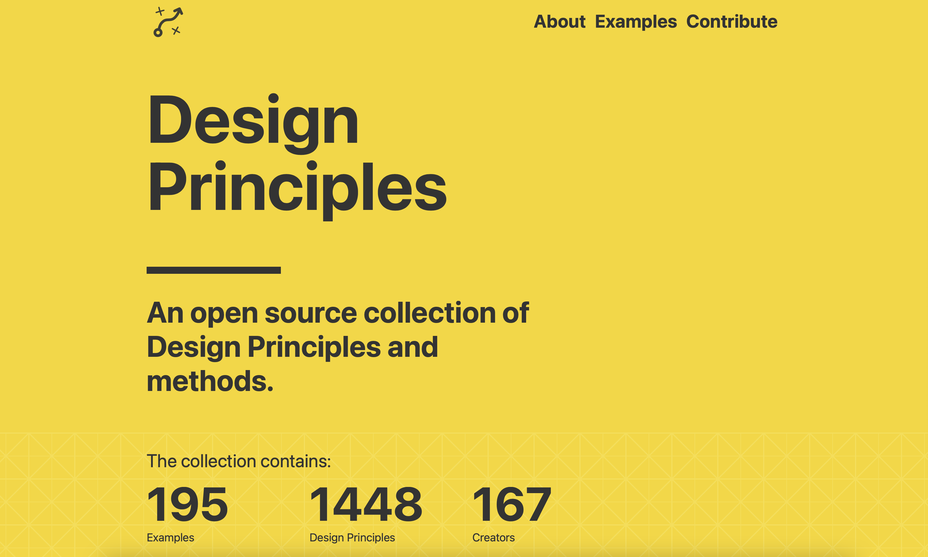
Design Principles: An open source collection of Design Principles and Methods
Category: Design Essentials, Resources
Design Principles is a place to learn about and create Design Principles; an open source work-in-progress managed by Ben Brignell @benbrignell an independent product designer from London.
→ https://principles.design
An example of one of the many contributions, is by Tim Berners Lee, called Principles of Design:
I am utterly obsessed over finding the Color Parrot bot; what a brilliant idea, and so well branded.
To know a name ask: `@color_parrot What is the name of #dd3333` or `@color_parrot What is this color? {with image}`.
Below is an example of what Color Parrot will come back with upon Tweeting the bot:
Color Parrot’s Twitter Profile page; What a lovely featured header image bitmap illustration:
Color Parrot — The Color Companion
And the Color Parrot website is so beautiful as well:
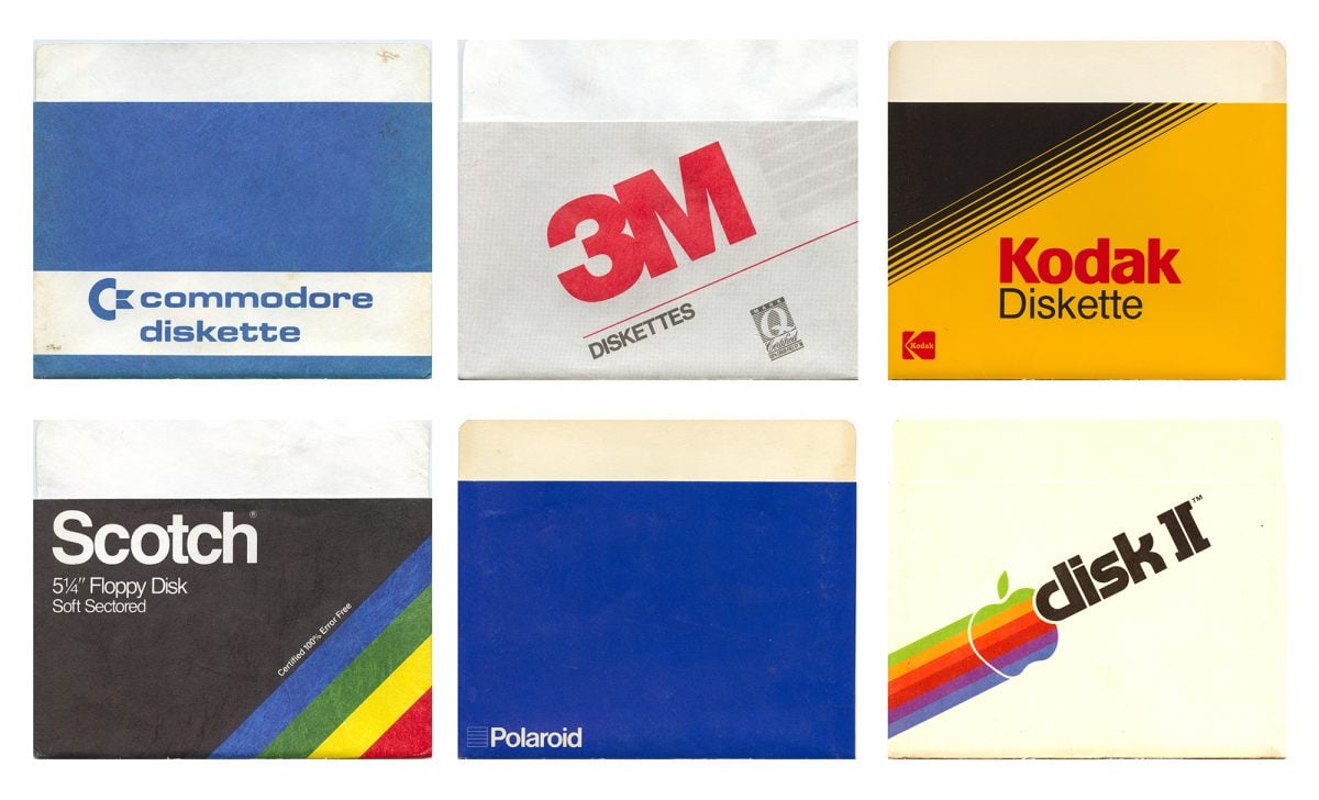
Floppy Disk Nostalgia Alert
Floppy Sleeves: Winter Frost Edition; this is just a delightful collection of some wonderful nostalgic memories of a time forever etched in my memory,
Quite a number of these I can remember from my teenage years. Quite a few seem to be quite localised to the US, but there are the other big name brands that are super familiar.
A few of my favourite vintage floppy diskette sleeves are: Polaroid, IBM, Apple, Commodore and Kodak.
Worth noting that a few of these brands are still using the same logo, or just every so slightly tweaked: Apple, IBM, Polaroid etc.
→ Found Via @presentcorrect Present and Correct – Floppy Sleeves: Winter Frost Edition a wonderful find by a vast collection of scanned in Floppy Disk Sleeves.
The Internet Archive
These are all stored as a collection on the Internet Archive website, which also offers the super cool Way Back Machine: Explore more than 769 billion web pages saved over time.
All of these Floppy Disk Sleeves are scanned in at 600dpi resolution, using Vuescan, and all are downloadable.
Not to brag; The Internet Archive is one of a few organisations that I feel are worth sponsoring, along with Wikipedia, so if you feel the Internet Archive is an amazing source of information, then please do consider making a donation.
About the Floppy Diskette Sleeve Collection by Jason Scott
A random scanning of floppy disk sleeves from contributed collections – scanned at 600dpi into TIFF by Vuescan, by Jason Scott.
In the era of the 5.25″ floppy disk (roughly 1975-1995), the disks had a window to the disc inside that exposed the magnetic media to open air. (A re-design of disks in 3.5″ form factors added a spring-loaded “door” that would automatically close down and protect the media. To reduce exposure and damage to this fragile media, a paper or plastic sleeve would be provided with the floppy disk to cover this window. On this sleeve were often instructions (somewhat standardized) to encourage careful treatment of the floppy.
Over time, the simplicity of the floppy sleeve design along with the wide open space on it encouraged the creation of custom printings, both for individual software products, and for large runs of general floppy disk sets (boxes of 10, 50 or 100). Some of these large-run general purpose floppy disk images are strongly identified with this period in the minds of those who lived through them. Many are objectively pleasant to see.
This compilation is utterly random and represents all the unique designs that were not solid colors that passed through Jason Scott’s hands in the month of January, 2019.
by Jason Scott | Publication Date 2019-01 | Language English
Floppy Disk Diskette Sleeve Collection by Jason Scott
Below is just a super small selection of the collection, so please do head over to the Internet Archive and take a look at the entire floppy disk archive.
→ Floppy Sleeves: Winter Frost Edition
Super Disk Floppy DIsk Cover Sleeves
BASF Floppy Diskette DIsk Cover Sleeves
Polaroid
IBM
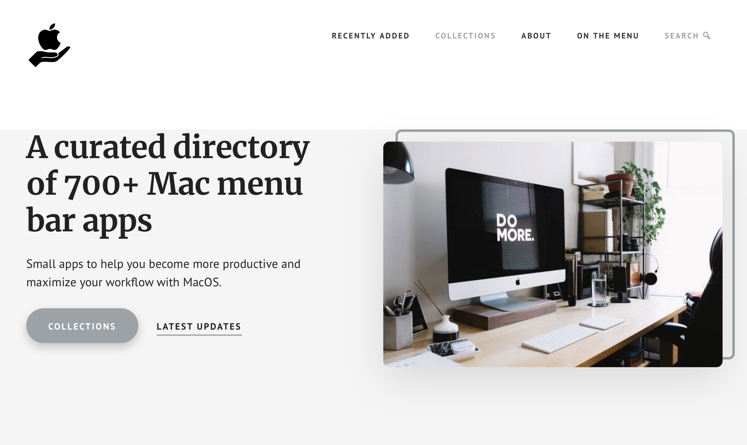
MacMenuBar
Category: Resources
A curated directory of 700+ Mac menu bar apps
Small apps to help you become more productive and maximize your workflow with MacOS.
→ https://macmenubar.com
The Mac menu bar is one of the defining characteristics of the Mac. Someone once called it ‘the north star’. 😎
Mac’s menu bar is prime real estate. It’s the best place to show little tidbits of information. But there is only so much room!
Your menu bar really can get cluttered, so it’s not practical to put everything there. In other words: you’re gonna have to choose! I mean, this handpicked directory already includes 700+ sources in 34 categories.
MacMenuBar.com is a one-man operation. I curate and maintain everything on here. Not powered by AI.
Please feel free to get in touch anytime or to submit new menu bar apps for inclusion. Just let me know: luuk@macmenubar.com
Follow MacMenuBar on Twitter: @MenuMac
→ Skip the Fluff; Warp Speed 11 to ohh.directory
The internet is seemingly trying to become clinically efficient: website speed, website SEO, website surveys, website scams, along with more and more magazine style websites loaded to the hilt with ads, pop-up’s and bloat ware.
All trying to vie for our page view, for our outbound advert link click.
In amongst all these wanna be big players, and amongst the legitimate big players, there are the personal and individual style blogs; those belonging to individuals, rather than the magazines.
These personal/individual blogs are not necessarily smaller in terms of content, as many have been around for nearly 2 decades, Kottke and Daring Fireball to name 2, and are literal internet libraries of information and narrative of recent history.
I myself started blogging on Typepad back in the day, and my first website is still live and accessible; not one I’d really go about overtly telling people about, as it WAS personal, and about the challenges I was going through at the time (indeed I am still going though similar challenges now.)
This all meant I was around when the internet was genuinely fun, interesting, amazing…
Websites like Technorati were revered; providing a means for your website to be indexed, rated to a degree, but all within a form of indexable boundary.
Google was full of black-hate SEO, but it was still easier for individual blogs and websites to be searched and found using sites like Technorati and Google, even StumbleUpon.
Even when I first started up imjustcreative.com, for my logo & brand Identity freelance business, the majority of my clients found me via Google, and I would often be seen on the much valued first page–no longer.
Recent years has seen a lot of global inter web controversy, a lot of change, and a lot of seemingly sterilisation of websites.
But for me, after having a nearly 7 month break from all social media, and blogging; in my slow and steady refamiliarisation of the internet of 2022 around me, I find something simply wholesome…
ooh.directory
The personal and individual websites are still going strong, but for many just a little harder to find; a little harder to stumble across in amongst the stench of raw internet filth.
Here comes the USP, and thank you for indulging me a little bit of nostalgia above.
When I first saw ooh.directory, I was convinced I was seeing something from the 2000-2010 period, not in a derogatory way; this was exactly the sort of website that would have been around back in the day.
A website that I would have excitedly spent ages checking out all the indexed websites, and clicking from one RSS feed to another.
But no, my radar started buzzing the clearer it became this was a newly created website directory! Almost unbelievable in this kind of internet landscape, but one that is ohh soo welcome.
As it leads with…
ooh!directory is a place to find blogs that interest you.
Explore the categories, search blog details, flip through random blogs, or keep visiting the most recently-updated blogs to see who’s talking about what right now.
The site is run by Phil Gyford. If you have any questions, suggestions, or bug reports, feel free to email him.
It really has become almost impossible for me to now be excited about anything I see on the internet.
Sure, you get the funny meme, the topical cartoon, or popular Tweet.
But for me; to be genuinely happy to have found a new website thats purpose IS to index blogs, and websites, in a handcrafted way: website by website method; not some automatic algorithm, is pretty rare.
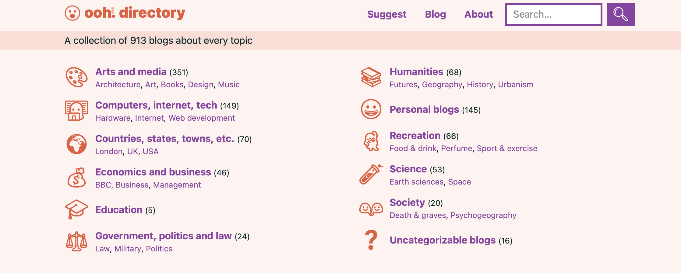
The 12 Categories
There are presently 12 Categories, some have sub categories, from which you can search, shuffle, pick and choose from:
Arts and media(357)
Computers, internet, tech(152)
Countries, states, towns, etc.(70)
Economics and business(46)
Education (5)
Government, politics and law(25)
Humanities(69)
Personal blogs (147)
Recreation(68)
Science(55)
Society(20)
Uncategorizable blogs (16)
Sure, there are some criteria, and that’s a good thing, because without some criteria, it would be like the Wild West, which is pretty much what the internet has become in many ways.
The key criteria is all about RSS, which had/has/having had bit of a rocky moment in time. I genuinely feel RSS is going to be sticking around for as long as it possible can.
There are numerous other RSS aggregators and readers out there: Feedly, Blogroll, Feedland, News Scripting, Feedle, LinkLonk, Newsblur.
The criteria for ohh.directory are as follows:
• Every blog must have an RSS or Atom feed.• Newsletters aren’t included. Some sites are a blog and a newsletter, with identical content, but only those which mainly seem like a blog are included.• Only blogs updated within the past year or so are added.• Tumblrs are only included if they’re either focused on a specific topic or feature original content.• Link blogs are only included if they include original commentary about each link.• No blogs promoting hate speech, denial of climate change, anti-vax ideas, etc.* Rules will probably be changed over time as more blogs are added.
Suggest a Blog
You can Suggest a Blog, and I can see that in recent days Phil, has a huge task on his hand with somewhat of a backlog.
I urge you to take some time out of doom scrolling on social media, and take some time to discover new and interesting blogs to actually read with a purpose.
See Random Blogs
I also appreciate the ‘See Random Blogs‘ feature, which is a bit of a nod to Stumbleupon, and it is genuinely quite fun to see what might pop up next.
Give it a go…
ohh!directory Updates and Social
You can follow blog site updates on Twitter or Mastodon (I’m on Mastodon as well… Obvs), as well as its own RSS feed, and Email Newsletter.
So all-in-all for ohh!directory
I’ve already spent quite a fair time going through the various Categories, and have already been able to bookmark a number of new-to-me blogs and websites.
So yeah, ohh!directory really has me jollied up quite a bit.
I honestly wish Phil Gyford all the very best with his project.
Phil, if you need any help Phil with ohh!directory, then please please just ping me! :)
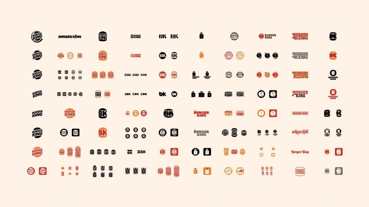
Always great fun to see a well known brands collection, in this case Burger King, of unused logo design ideas, after a major rebranding.
Enjoy…
→ Found via https://twitter.com/Aweiland
Unused Burger King Logo Ideas
About Burger King — Wikipedia
Wikipedia – Burger King (BK) is an American-based multinational chain of hamburger fast food restaurants. Headquartered in Miami-Dade County, Florida, the company was founded in 1953 as Insta-Burger King, a Jacksonville, Florida–based restaurant chain. After Insta-Burger King ran into financial difficulties in 1954, its two Miami-based franchisees David Edgerton (1927–2018) and James McLamore (1926–1996) purchased the company and renamed it “Burger King”.Over the next half-century, the company changed hands four times and its third set of owners, a partnership of TPG Capital, Bain Capital, and Goldman Sachs Capital Partners took it public in 2002. In late 2010, 3G Capital of Brazil acquired a majority stake in the company, in a deal valued at US$3.26 billion. The new owners promptly initiated a restructuring of the company to reverse its fortunes. 3G, along with partner Berkshire Hathaway, eventually merged the company with the Canadian-based doughnut chain Tim Hortons, under the auspices of a new Canadian-based parent company named Restaurant Brands International.
The 1970s were the “Golden Age” of the company’s advertising, but beginning in the early 1980s, Burger King advertising began losing focus. A series of less successful advertising campaigns created by a procession of advertising agencies continued for the next two decades. In 2003, Burger King hired the Miami-based advertising agency Crispin Porter + Bogusky (CP+B), which completely reorganized its advertising with a series of new campaigns centered on a redesigned Burger King character nicknamed “The King”, accompanied by a new online presence. While highly successful, some of CP+B’s commercials were derided for perceived sexism or cultural insensitivity. Burger King’s new owner, 3G Capital, later terminated the relationship with CP+B in 2011 and moved its advertising to McGarryBowen, to begin a new product-oriented campaign with expanded demographic targeting.
The web is a very different medium than print, but it’s not completely different either. Some differences with Web Design vs Print Design separate both worlds when it comes to design concepts, and other factors. But they both share some similarities in approach.
This article will discuss some differences and similarities between both web and print designs.
Web Design vs Print Design: Understanding DPI and Image Resolution
The first thing to understand about web and print design is the difference between resolution and dpi (dots per inch). Resolution refers to how many pixels makeup one inch.
For example, if you want to create a poster with a size of 8 x 10 inches, then you would need to use a resolution of 300 dots per inch (DPI) because each pixel represents 0.039 inches.
If you were to print this same image at 100% scale, it would take up approximately 1 square foot of paper.
On the other hand, when printing images for websites, we refer to them as being “web-ready”. This means that they can be scaled down without losing quality. To do so, we must reduce the number of pixels making up the image by reducing the resolution.
For example, if we wanted to print our poster at 50%, we would need to reduce the resolution from 300 DPI to 150 DPI. This would result in only half the amount of pixels making up the original image. However, since the image was reduced in size, it would still look exactly like the original.
Another important factor to consider when comparing web vs print designs is the type of file used to store the images. When working with web files, we typically use.jpg,.gif, or.png formats.
These types of files are known as lossless files because they don’t lose any information during the compression process.
On the other hand, when working with print files, we typically use Adobe Photoshop (.psd), Illustrator (.ai), or Corel Draw (.cdr) formats. These types of file formats are known as lossy files because they compress the data into a smaller format.
When using these different file formats, there are pros and cons associated with each. Lossless files are great for storing large amounts of data, but they cannot be compressed very well. They also tend to be larger than their lossy counterparts.
On the other hand, lossy files are great for compressing data, but they cannot hold as much information. They also tend to produce lower-quality results.
What are the Differences Between Web Design and Print Design?
There are several major differences between web and print design, but we’ll highlight the six that stand out:
1. User Experience
Web designers focus on user experience, which includes everything from usability to aesthetics. A good web designer knows what makes a site easy to navigate, intuitive to use, and visually appealing.
Print designers, however, focus more on the content itself. While a good web designer should know how to create a clean, usable interface, a print designer focuses on the message he/she wants to convey.
2. Static Design vs. Interactive Design
Designing for print vs. designing for digital media faces another factor: static and interactive projects. While print design is pretty much set once it goes to press, digital design is flexible.
You can make changes whenever you want. This flexibility allows designers to use a variety of techniques to keep things interesting.
Static Design vs. Interactive Design
3. Compatibility of Web and Print Design
Print design doesn’t get affected by compatibility issues as it’s a static product once complete.
Any design for the web including sites, emails, newsletters, and other formats needs to display and operate correctly on different web browsers and with varying operating systems.
This can get complicated, especially because there are hundreds of different browser types out there, and even within those categories, there are thousands of variations.
Browser Diversity
4. The Layout of your Content
The layout of your content is another big difference between web and print design.
Because print design involves a lot of images, typography and other forms of content that are suitable for every audience, it requires a certain structure to work properly.
It’s not uncommon for designers to have to break up long paragraphs of copy into multiple pages. With Web Design vs Print Design, you’re free to place all of your content on one page and you have the flexibility to do what you want.
The Layout of your Content
5. Color
As a print designer, you might be familiar with the four-color subtractively colored CMYK mode. This mode uses combinations of cyan, magenta, and yellow ink along with black to produce a full range of colors.
But what about those designers creating web graphics? Well, there’s another way to go — one that involves adding red, green, and blue to your palette.
These colors are referred to as additive because each color consists of a mixture of different wavelengths of light.
RGB Color Circle
The most common way to represent colors in additive form is to use three numbers, such as #FF0000. Each number represents a specific amount of red, green, and/or blue light. So, #FF0000 is equal to 50% red, 25% green, and 25% blue.
If we wanted to change the percentage of red, we could simply add or subtract a certain number from it.
For example, changing the percentage of red from 50% to 75% would require increasing the number by 25%. And, if we wanted to increase the percentage of red even further, we could do so by adding more red to our mix.
What are the Similarities Between Web Design and Print Design?
1. Creativity in Fixing an Issue
In both the print and web worlds, a designer must think about what the end goal is. Whether it’s educating someone, converting them into a customer, or selling something, the designer needs to provide a solution to a problem.
Even with requests from a specific client, as difficult as the project is, your creativity comes in to fulfill demands.
For example, let’s say I’m designing a website for a small business that sells dog food. My job is to make sure my site looks good and works properly.
But I don’t want to just throw up some text and pictures on a blank canvas; I want to help people find exactly what they’re looking for. Figuring out how to organize information and present it in a way that makes sense is only half the battle.
2. Knowing your Craft
Both web and print design require a multi-level understanding of design concepts, including the use of typography and colors to create a clear hierarchy for your end product.
It may differ from traditional graphic design, but both types of design involve a lot of similar skills and the ability to convey the message in a way that everyone can understand.
The Typography Primer Book & Glossary of Typographic Terms
3. Communicating the Idea
You also must be a good communicator regardless of whether you are working on a website or a print advertisement. Whether you are designing a website or a print advert, you should be able to communicate well with clients.
You should be able to get the information needed from them and convey it. You should be able to answer any questions they may have about your work. You should be able to explain why you made certain choices and how those choices fit into the overall scheme of things.
You should be able to respond objectively to any comments, or suggestions they might make.
4. Limitations and Constraints
Both print and web design have their specific requirements when it comes to layout.
They both require careful planning and execution and are often constrained by limitations like paper size and screen resolution.
But there are some key differences, too. Print projects must adhere to specific guidelines, such as margins and bleed areas, while web layouts can vary widely depending on the browser being used.
Which is Better? Web or Print Design?
Well, it depends on what you’re trying to achieve.
Print: If you’re trying to promote a local business, then print ads will probably be more effective.
Web: On the other hand, if you’re promoting a national brand, then the internet could be a better option.
Web design has become increasingly popular over the past few years because it allows us to reach a much wider audience than ever before. With the advent of mobile devices, websites have been adapted to allow users to access content on the go.
Print advertising is still very important, especially if you’re trying to promote an event or sell tickets.
However, most people now prefer to read online, rather than pick up a newspaper or magazine.
The internet provides a wealth of information at our fingertips, and we no longer need to rely on printed media to learn about new products, services, and events.
Guest Post by Farlyn Lucas – Freelance Writer and Communications Manager
Guest Post by Farlyn Lucas – Freelance Writer and Communications Manager
Farlyn Lucas works as a freelance writer and communications manager.
She has a knack for writing on various topics, especially tech, business and marketing.
When she’s not working, she enjoys playing badminton and baking chocolate chip cookies.
Mail
How to Develop a Brand Identity That’s All Your Own, by Grace Lau
Category: Brand Identity, Guest Post
There are a lot of brands out there. Difficult to say exactly how many but Nielsen lists over 500,000. There are actually likely to be a whole lot more than this.
With so many brands already in existence, surely it’s impossible to create a unique identity, i.e. a profile that another brand hasn’t already grabbed for itself. You’d think.
But actually, it’s perfectly possible to develop a brand identity that’s completely different from any other. Here’s how.
Nielsen
Brand Identity – What’s This Mean?
Put simply, brand identity is what makes the brand immediately recognizable by the consumer. It can consist of a number of elements, for instance, logo design, color scheme, font, tagline, company mission, music used in advertising, and the affiliates that the brand works with.
The identity thus delivered is a composite of all these different aspects, all of which create a unique pattern. Not only can the customer then immediately identify the brand but there is also the reassurance of authenticity built-in. For instance, a customer buying a bottle of Coke need only see the unique shape to be sure it’s the real thing.
Free to use image sourced from Unsplash
When done well, brand identity makes an impression that will last beyond the customer-brand encounter.
Let’s see how you can go about getting that brand identity for yourself:
1. Settle on a Brand Personality
You may have all the personality you think you need. Let’s say your brand delivers VoIP and it makes it its business to deliver new clients with a virtual number in super-fast time. You might conclude that this delivery speed is all you need to set you apart. The trouble is, lots of others think the same thing. So, you need to work on other aspects.
You need to hit on a unique personality type that will characterize the brand. It’s worth generating some keywords that neatly encapsulate what the brand is. If it were a person, for instance, would your brand be cool and chic or perhaps authoritative and even a touch stately?
It’s always worth having a look around at the kind of personalities adopted by your competitors. Can you build on an aspect they’ve used? Or have they left a big gap where your brand can establish a unique presence?
Free to use image sourced from Unsplash
Another tip is to ask yourself questions like why did you start the company and introduce the brand? Are there values there that can be leveraged into a brand identity? Maybe you started your VoIP company because of the Aircall issues you and others were experiencing. Perhaps you can use this, by emphasizing what made you different in this regard.
2. Pinpoint your Audience
Free to use image sourced from Unsplash
Brand is not just about the company and the product. If it’s going to thrive, it needs to gain traction with a demographic. You need to identify that demographic and fine-tune the brand to appeal sweetly to it.
Feedback surveys and focus groups can throw up a lot of useful information which can be incorporated into brand identity design. However, depending on the brand type and your ambitions for it, be wary of jumping on probably short-lived trends that get identified in your research.
Sure, they might position you right in the middle of Happening City, but before long, trends move on and you’re stuck in Yesterday Ville. What looks red hot one minute will look decidedly pale as time passes.
So, instead of getting all excited about momentary fashions, think about what are the underlying drives for these. Fashions are all about excitement, change, and being fresh. Perhaps you can do something with those concepts rather than hitting on a tune that’s big today but will be so small tomorrow.
Something else to consider is when it’s time to rebrand. Customer bases change as societies and economies evolve, so be aware of the need to assess matters from time to time, and look to update or redesign your current logo and brand identity.
3. Logo and Color
This is the aspect that will, if all goes according to plan, achieve recognition across demographics and territories, with no further explanatory text needed.
So, it’s got a tough job. It needs to sum up the brand identity, and in a fashion that stands out from all the others.
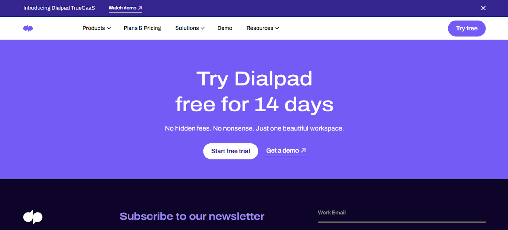
How you do this will come down to a number of factors. But let’s start by looking at an example. If you click on small business VoIP by Dialpad, you’ll see that the logo consists of the company name, in a striking lower case font and in a strong shade of blue.
Small business VoIP by Dialpad
Where the logo designer really earned their fee though is the inverted commas they’ve inserted in front of the company name. They achieve the golden combination of being distinctive and descriptive.
The business is all about spoken communication. OK, the business is actually about more than that, but spoken communication is a great starting point.
Another key factor is that the logo’s color is repeated throughout the website.
So, you need to hit on a logo that’s eye-catching and that reflects your brand personality. Not only this, it needs to work across all the many media it will exist in and have impact regardless of size. With this in mind, it’s a good idea to try to think simple.
But remember: it has to be unique.
https://imjustcreative.com/100-beautiful-colour-swatches/2021/11/15
Phew. Not easy to come up with overnight. Thankfully, there are logo designers who can help with this very task. You’ll need to be clear on exactly what you want in terms of those keywords that define the brand identity and who it is that you’re primarily targeting.
The designer should be able then to come up with some alternatives for you to choose the one that works for you. Get other eyes on it too. And if you’re not great with color, make sure you bring in help with that too. We’re not all Van Gogh, after all. Thankfully.
Free to use image sourced from Pixabay
It might be worth bearing in mind when you try to develop a color palette that different colors tend to be associated with different qualities. Blue’s calming. Green’s reliable (and, these days, environmental). Red’s exciting.
4. Fix That Font
Free to use image sourced from Unsplash
So much of what we read is not just about what’s written. Size and style of font can determine whether we bother to read something in the first place, and will affect our interpretation of what’s written.
Brand identity is revealed in no small way by the font that’s been chosen by the business. You need to find a font that will work right the way through your activities, from being emblazoned on a billboard to featuring at the top of a sample agent agreement.
It’s the received wisdom that simplicity works best. If you’re designing your own font, think about impact and readability. Consumers tend not to favor too much fussiness in a font.
History of the Coca-Cola Bottle
However, let’s look at the Coca-Cola design once again. In a way, the font shouldn’t work.
It’s quite extravagant and complicated, with its flourishes and ribbon curls.
Coca-Cola Chrome Logo – Famous Logos in Neon Chrome Designed by Martin Naumanna
But it does work.
It speaks of enjoyment and authenticity and is absolutely unique.
So, what can we learn from this?
One factor we should bear in mind is that Coca-Cola came up with its font in a less crowded brand environment than that which exists today, as far back as 1890. So they perhaps didn’t have to work so hard with it to gain traction.
Vintage 1890 Coca-Cola Logo Design
This aside, the big lesson to learn is that there are no hard and fast rules with fonts. It may be best to adopt a suck-it-and-see approach.
Try a few different alternatives on your focus groups and see which seems to work best. Sometimes you can only learn from a completed product, just like with post-mortem meetings.
You can certainly experiment with mixing fonts, but don’t overdo it. A mix of two might work wonders. Any more and it might look like you’ve forgotten which one to use.
Image sourced from catalyst.concentrix.com
5. See it Through
Once you have your brand identity established, you need to make sure it gets used everywhere your brand appears. Make sure that the color scheme in particular is adhered to on your website and in your packaging.
Sifterapp Letterpress Business Cards Designed by Smithographic
Take a look at your business cards: do they chime in well with the brand identity? Send yourself an email. Do the template and signature adhere to brand identity guidelines? Conduct an audit of your associates. When you’re creating affiliate links are they with suitable kinds of people?
On the subject of guidelines, make sure that you issue a clear and definitive brand document that tells all employees what’s expected from them in terms of anything they design or any comms they put out.
SuperblyCo Guidelines
Everybody has to fall in line. If just one person refuses to comply you can end up with a pretty messy identity.
Sure, you might encounter the odd maverick in the organization who likes to tread their own path. Sometimes this individuality is welcome in terms of creativity.
However, they’re going to have to get with the program, or perhaps they’d prefer to leave and start their own brand. This option’s always available. You need buy-in, so don’t be afraid to insist.
Conclusion
So, you’ve spent a lot of time and possibly money on getting that identity absolutely right.
You’ll be wanting to see how widely used it is, in order to get an idea of how worthwhile the whole project was. One way of doing this is to take a look at market penetration. In order to do this, you can seek to monitor your brand’s media impact. Keep an eye on how it performs. It may be the case that a little tweaking here and there will help.
Try to avoid too much meddling though. The best identities succeed because they are consistent and stand for something solid and meaningful. Do what you can to give your identity these qualities and you’ll be on your way.
Guest Post byGrace Lau – Director of Growth Content, Dialpad
Grace Lau, Director of Growth Content at Dialpad.
Grace Lau is the Director of Growth Content at Dialpad.
Dialpad is an AI-powered cloud communication platform for better and easier team collaboration as well as proactive customer care. Grace has over 10 years of experience in content writing and strategy. Currently, Grace is responsible for leading branded and editorial content strategies, partnering with SEO and Ops teams to build and nurture content. She has also written for domains such as Leadfeeder and Agency Vista. proactive customer service.
LinkedIn
Mail
Susan Kare: Apple Macintosh Icon Prints by The Original Apple Icon Designer
Category: Designer Spotlight, Icon Design
I have previously linked to these Apple Macintosh icon prints by Susan Kare (Kare Prints) on previous occasions.
I was was reminded of them again as I came to find some prints for my studio:
And well, these prints just sum up how I remembering spending my late teens playing with my friends Apple Macintosh Classic, and Commodore 64 of course, and they deserve a constant presence in the spot-light.
For those that didn’t know: Susan Kare is a gifted designer
“a pioneering and influential computer icongrapher…”, originally tasked with creating the first graphical icons for the Apple Macintosh as well as many other leading software companies.
http://kare.com/about/bio.html
There is a wonderful selection of these limited edition, and numbered, Apple Macintosh icon prints available for sale in four sizes.
I have ordered several for my newly decorated studio and will have them hanging over my desk.
There is a special affinity to a certain icon: Clarus the DogCow, there is even a special online museum dedicated to Clarus:
→ Clarus, the Dogcow: Moof Museum
→ https://vintagemacmuseum.com
Dogcow Essential facts: Clarus is a virtual small animal, a sort of genetic hybrid between a Dog and a Cow (a Dogcow). Clarus was born in 1983 in Apple Labs during the Macintosh creation under the pen of Susan Kare.
At that time she lived in Cairo font but she has an archaic form and no name. Then in 1986 she mutate (in Printing Labs) to become the pixel creature that show user the printing settings for LaserWriter printers.
Since 1986 she was recognize as "Clarus the Dogcow" and soon become the mascott of the DTS Apple Team.
In 2004 she totally disappears from Macintosh and Apple Inc.
Susan Kare: Apple Macintosh Icon Prints
Inside Susan Kare’s sketchbooks are the makings of Mac’s graphic interfaces
Paste Icon Sketch
Brush Icon Sketch
Some of the Macintosh icons Susan famously crafted for Apple, Inc.
About Susan Kare
Wikipedia: Susan Kare, born February 5, 1954, is an artist and graphic designer who created many of the interface elements and typefaces for the Apple Macintosh in the 1980s.
She was also Creative Director (and one of the original employees) at NeXT, the company formed by Steve Jobs after he left Apple in 1985. She has worked for Microsoft, IBM, Pinterest and Facebook.
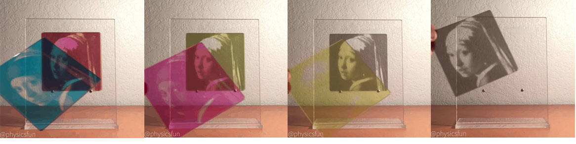
CMYK Printing Demonstration using Four Individual Colour Acrylic Slides
Category: Colour, Design Essentials, Resources
Having come from the traditional side of commercial printing, whilst serving out my apprenticeship, I found this simple demonstration of 4 colour CMYK Printing to be pretty useful.
If you’ve not had the opportunity to work in a printers, or watch a 4 colour CMYK press at work, it’s not always so clear as to how the CYMK process of layering each ink: Cyan, Magenta, Yellow and Black.
CMYK Printing Demonstration using 4 Individual Colour Acrylic Slides
This simple GIF: larger version at this link: http://i.imgur.com/DrLJmHf.gifv really does do a great job of showing how each progressive layer of CMYK builds up to the final CMYK composite:
Individual Frames
I’ve saved an individual frame, as each acrylic slide is about to be put down, in the images below, starting with Black (often referred to as the letter ‘K’).
Cyan Acrylic Slide
Magenta Acrylic Slide
Yellow Acrylic Slide
Black Acrylic Slide
Composite of all CMKY Acrylic Slides
The CMYK color model
Wikipedia: The CMYK color model (/smaɪk/; process color, four color) is a subtractive color model, based on the CMY color model, used in color printing, and is also used to describe the printing process itself. CMYK refers to the four ink plates used in some color printing: cyan, magenta, yellow, and key (black).
The CMYK model works by partially or entirely masking colors on a lighter, usually white, background. The ink reduces the light that would otherwise be reflected. Such a model is called subtractive because inks “subtract” the colors red, green and blue from white light. White light minus red leaves cyan, white light minus green leaves magenta, and white light minus blue leaves yellow.
In additive color models, such as RGB, white is the “additive” combination of all primary colored lights, while black is the absence of light. In the CMYK model, it is the opposite: white is the natural color of the paper or other background, while black results from a full combination of colored inks. To save cost on ink, and to produce deeper black tones, unsaturated and dark colors are produced by using black ink instead of the combination of cyan, magenta, and yellow.