Photoshop Patch Filter (Beta) Post date May 14, 2025 Post author By Graham Smith Post categories In Linked, Logo Design Tags mock-up, photoshop
Nordhut Logo Design by Smithographics Post date May 6, 2025 Post author By Graham Smith Post categories In Logo Design, Portfolio
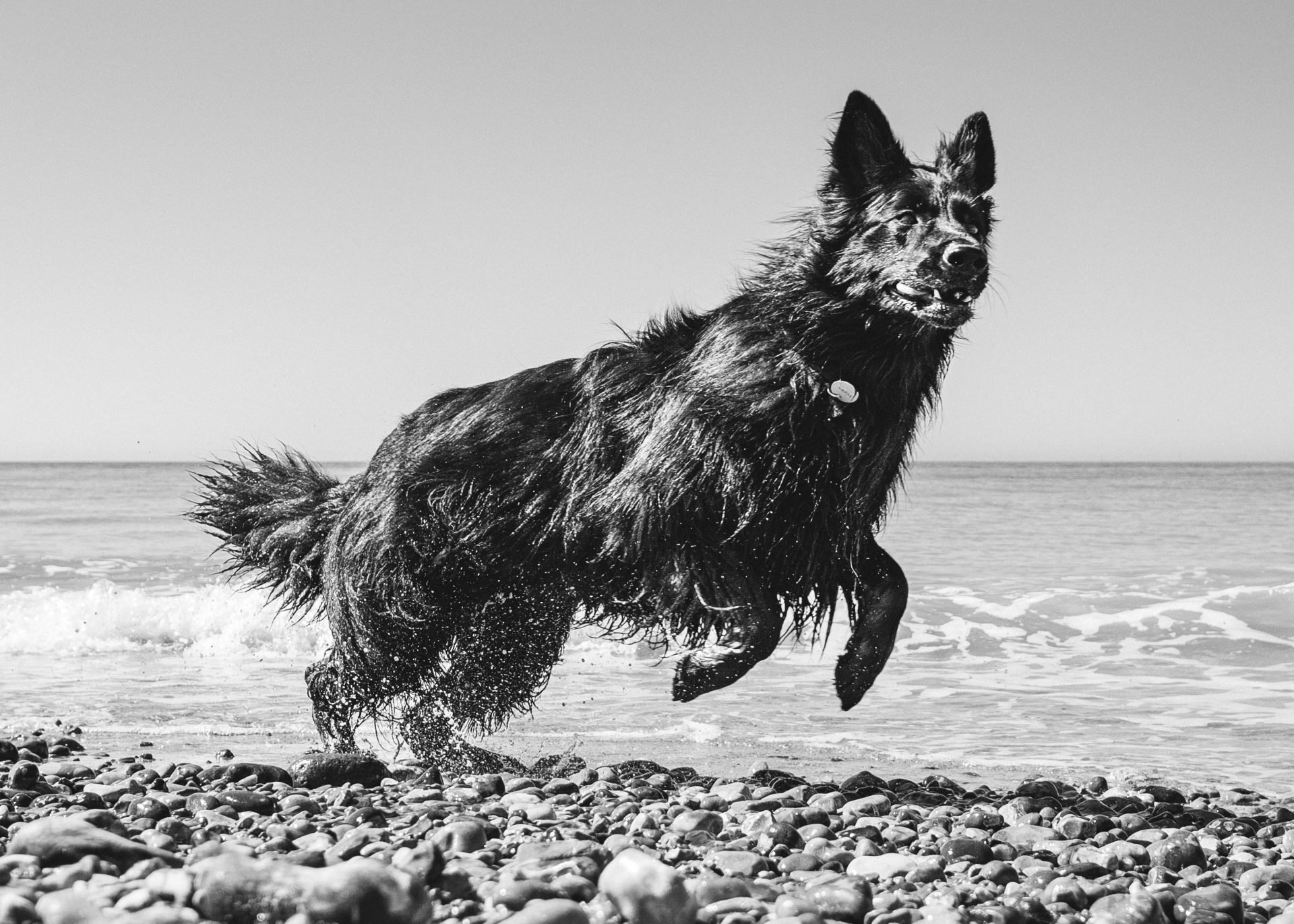
Miss Poppy at the beach Post date May 6, 2025 Post author By Graham Smith Post categories In Logo Design
Letter G Monogram Logo Design for Sale Post date April 27, 2025 Post author By Graham Smith Post categories In Logo Design
fOKOS Magazine Wordmark Post date January 10, 2025 Post author By Graham Smith Post categories In Logo Design, Portfolio Tags Logo Type, Type, Typeface
Letter A Logo Design for Sale designed by Smithographic Post date January 16, 2023 Post author By Graham Smith Post categories In Logo Design, Logos for Sale Tags For Sale
Letter M Logo Design for Sale designed by Smithographic Post date January 5, 2023 Post author By Graham Smith Post categories In Logo Design, Logos for Sale Tags For Sale
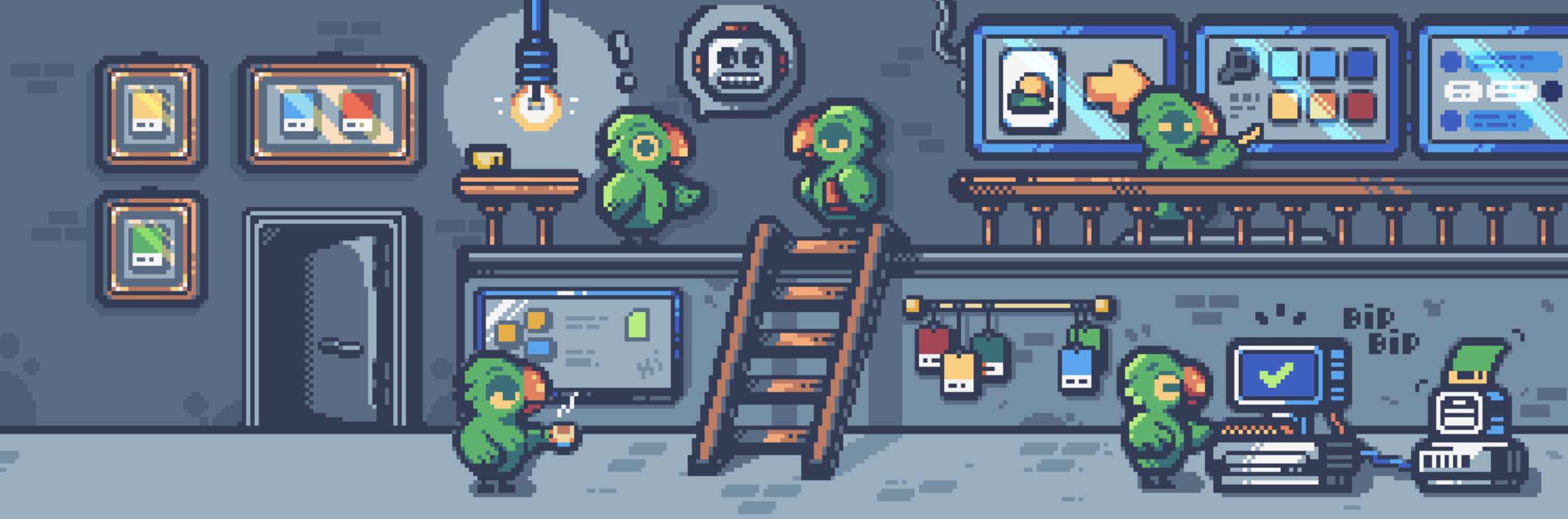
Color Parrot Bot – tweeting unique color names Post date December 12, 2022 Post author By Graham Smith Post categories In Logo Design
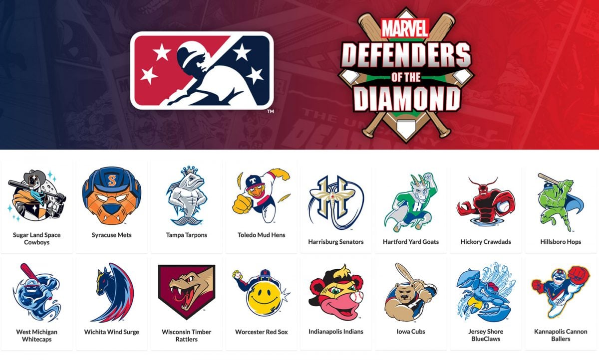
Defenders of the Diamond – Marvel Animators Reimagined Logos for all 96 MiLB Clubs Post date October 31, 2022 Post author By Graham Smith Post categories In Famous Logos, Logo Design Tags Baseball, Logo Collection, Marvel, Recreated
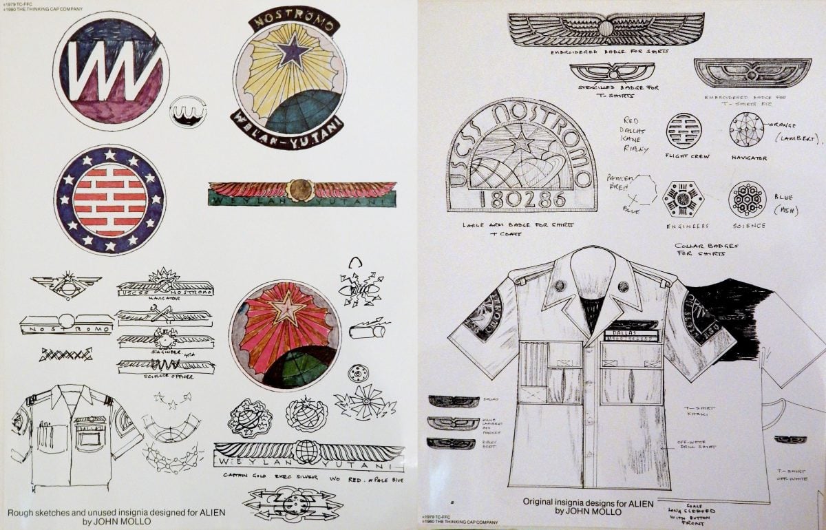
Alien (1979) — Original Nostromo Crew Badges & Insignia Sketches by Ron Cobb & John Mollo Post date October 29, 2022 Post author By Graham Smith Post categories In Designer Spotlight, Logo Design Tags Badges, Insignia, Movies, Sketches