There are a lot of brands out there. Difficult to say exactly how many but Nielsen lists over 500,000. There are actually likely to be a whole lot more than this.
With so many brands already in existence, surely it’s impossible to create a unique identity, i.e. a profile that another brand hasn’t already grabbed for itself. You’d think.
But actually, it’s perfectly possible to develop a brand identity that’s completely different from any other. Here’s how.
Brand Identity – What’s This Mean?
Put simply, brand identity is what makes the brand immediately recognizable by the consumer. It can consist of a number of elements, for instance, logo design, color scheme, font, tagline, company mission, music used in advertising, and the affiliates that the brand works with.
The identity thus delivered is a composite of all these different aspects, all of which create a unique pattern. Not only can the customer then immediately identify the brand but there is also the reassurance of authenticity built-in. For instance, a customer buying a bottle of Coke need only see the unique shape to be sure it’s the real thing.

When done well, brand identity makes an impression that will last beyond the customer-brand encounter.
Let’s see how you can go about getting that brand identity for yourself:
1. Settle on a Brand Personality
You may have all the personality you think you need. Let’s say your brand delivers VoIP and it makes it its business to deliver new clients with a virtual number in super-fast time. You might conclude that this delivery speed is all you need to set you apart. The trouble is, lots of others think the same thing. So, you need to work on other aspects.
You need to hit on a unique personality type that will characterize the brand. It’s worth generating some keywords that neatly encapsulate what the brand is. If it were a person, for instance, would your brand be cool and chic or perhaps authoritative and even a touch stately?
It’s always worth having a look around at the kind of personalities adopted by your competitors. Can you build on an aspect they’ve used? Or have they left a big gap where your brand can establish a unique presence?
Another tip is to ask yourself questions like why did you start the company and introduce the brand? Are there values there that can be leveraged into a brand identity? Maybe you started your VoIP company because of the Aircall issues you and others were experiencing. Perhaps you can use this, by emphasizing what made you different in this regard.
2. Pinpoint your Audience

Brand is not just about the company and the product. If it’s going to thrive, it needs to gain traction with a demographic. You need to identify that demographic and fine-tune the brand to appeal sweetly to it.
Feedback surveys and focus groups can throw up a lot of useful information which can be incorporated into brand identity design. However, depending on the brand type and your ambitions for it, be wary of jumping on probably short-lived trends that get identified in your research.
Sure, they might position you right in the middle of Happening City, but before long, trends move on and you’re stuck in Yesterday Ville. What looks red hot one minute will look decidedly pale as time passes.
So, instead of getting all excited about momentary fashions, think about what are the underlying drives for these. Fashions are all about excitement, change, and being fresh. Perhaps you can do something with those concepts rather than hitting on a tune that’s big today but will be so small tomorrow.
Something else to consider is when it’s time to rebrand. Customer bases change as societies and economies evolve, so be aware of the need to assess matters from time to time, and look to update or redesign your current logo and brand identity.
3. Logo and Color
This is the aspect that will, if all goes according to plan, achieve recognition across demographics and territories, with no further explanatory text needed.
So, it’s got a tough job. It needs to sum up the brand identity, and in a fashion that stands out from all the others.
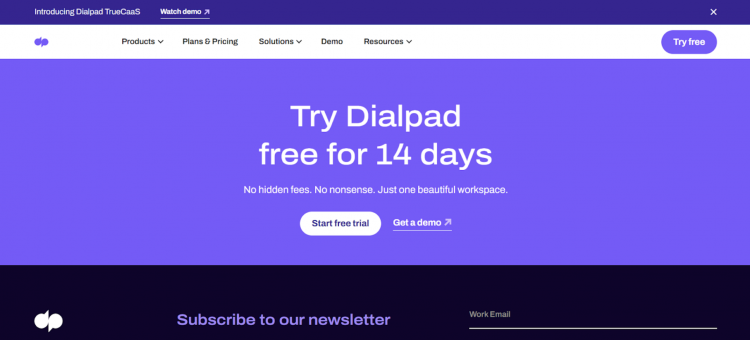
How you do this will come down to a number of factors. But let’s start by looking at an example. If you click on small business VoIP by Dialpad, you’ll see that the logo consists of the company name, in a striking lower case font and in a strong shade of blue.
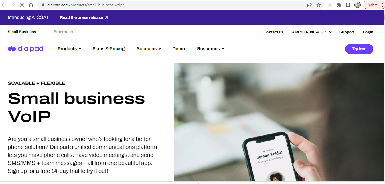
Where the logo designer really earned their fee though is the inverted commas they’ve inserted in front of the company name. They achieve the golden combination of being distinctive and descriptive.
The business is all about spoken communication. OK, the business is actually about more than that, but spoken communication is a great starting point.
Another key factor is that the logo’s color is repeated throughout the website.

So, you need to hit on a logo that’s eye-catching and that reflects your brand personality. Not only this, it needs to work across all the many media it will exist in and have impact regardless of size. With this in mind, it’s a good idea to try to think simple.
But remember: it has to be unique.
Phew. Not easy to come up with overnight. Thankfully, there are logo designers who can help with this very task. You’ll need to be clear on exactly what you want in terms of those keywords that define the brand identity and who it is that you’re primarily targeting.
The designer should be able then to come up with some alternatives for you to choose the one that works for you. Get other eyes on it too. And if you’re not great with color, make sure you bring in help with that too. We’re not all Van Gogh, after all. Thankfully.

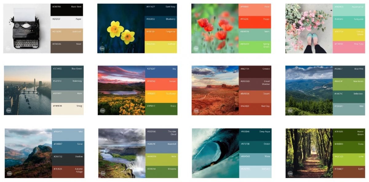
It might be worth bearing in mind when you try to develop a color palette that different colors tend to be associated with different qualities. Blue’s calming. Green’s reliable (and, these days, environmental). Red’s exciting.
4. Fix That Font

So much of what we read is not just about what’s written. Size and style of font can determine whether we bother to read something in the first place, and will affect our interpretation of what’s written.
Brand identity is revealed in no small way by the font that’s been chosen by the business. You need to find a font that will work right the way through your activities, from being emblazoned on a billboard to featuring at the top of a sample agent agreement.
It’s the received wisdom that simplicity works best. If you’re designing your own font, think about impact and readability. Consumers tend not to favor too much fussiness in a font.

However, let’s look at the Coca-Cola design once again. In a way, the font shouldn’t work.
It’s quite extravagant and complicated, with its flourishes and ribbon curls.
But it does work.
It speaks of enjoyment and authenticity and is absolutely unique.
So, what can we learn from this?
One factor we should bear in mind is that Coca-Cola came up with its font in a less crowded brand environment than that which exists today, as far back as 1890. So they perhaps didn’t have to work so hard with it to gain traction.
This aside, the big lesson to learn is that there are no hard and fast rules with fonts. It may be best to adopt a suck-it-and-see approach.
Try a few different alternatives on your focus groups and see which seems to work best. Sometimes you can only learn from a completed product, just like with post-mortem meetings.
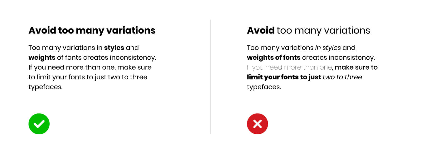
You can certainly experiment with mixing fonts, but don’t overdo it. A mix of two might work wonders. Any more and it might look like you’ve forgotten which one to use.
5. See it Through
Once you have your brand identity established, you need to make sure it gets used everywhere your brand appears. Make sure that the color scheme in particular is adhered to on your website and in your packaging.
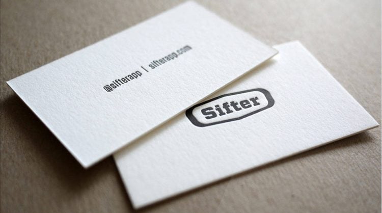
Take a look at your business cards: do they chime in well with the brand identity? Send yourself an email. Do the template and signature adhere to brand identity guidelines? Conduct an audit of your associates. When you’re creating affiliate links are they with suitable kinds of people?
On the subject of guidelines, make sure that you issue a clear and definitive brand document that tells all employees what’s expected from them in terms of anything they design or any comms they put out.
Everybody has to fall in line. If just one person refuses to comply you can end up with a pretty messy identity.
Sure, you might encounter the odd maverick in the organization who likes to tread their own path. Sometimes this individuality is welcome in terms of creativity.
However, they’re going to have to get with the program, or perhaps they’d prefer to leave and start their own brand. This option’s always available. You need buy-in, so don’t be afraid to insist.
Conclusion
So, you’ve spent a lot of time and possibly money on getting that identity absolutely right.
You’ll be wanting to see how widely used it is, in order to get an idea of how worthwhile the whole project was. One way of doing this is to take a look at market penetration. In order to do this, you can seek to monitor your brand’s media impact. Keep an eye on how it performs. It may be the case that a little tweaking here and there will help.
Try to avoid too much meddling though. The best identities succeed because they are consistent and stand for something solid and meaningful. Do what you can to give your identity these qualities and you’ll be on your way.
Guest Post byGrace Lau – Director of Growth Content, Dialpad