Smithographic was approached by OneQode to redesign their existing logo, and so I set to work with a number of sheets of sketches, and vector concepts.
OneQode provides low-latency, high-performance Infrastructure as a Service (IaaS) for the digital services of tomorrow.
The process that lead to the finished design you see was relatively quick, although there were many refinements of the OQ logo mark.
Some of the earlier explorations of this OQ combination:
Typography
The font used is ITC Avant Garde Demi, so I wanted to try and keep that lovely curve in the Q in the OneQode logo and word mark.
Getting that transition from the Q, into the O, proved to be quite fiddly, but I’m super pleased with how it turned out.
The end result is that the OneQode logo design encapsulates a modern and minimalist aesthetic, focusing on simplicity and clarity to communicate the brand’s identity effectively.
This design emphasises a clean, professional look that aligns with its core values and services companies, suggesting innovation and efficiency.
OneQode Website
Highly recommend taking at their ‘new’ website, which was done last September; it really is a thing of beauty.
https://twitter.com/i/status/1831109874257695090
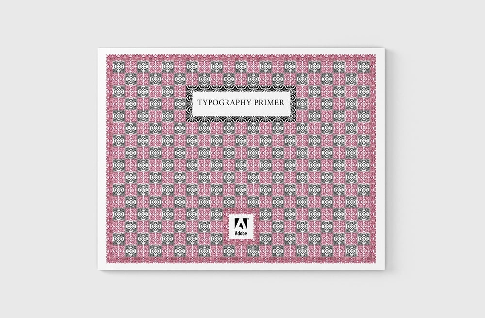
Learning about Typography: The Typography Primer Book & Glossary of Typographic Terms – Free PDF Download
Category: Design Essentials, Downloads, Resources, Typography
Learning about Typography: Typography Primer is an absolutely terrific typography and font book, covering a healthy portion of typography, as well as a decent size Glossary of Typographic Terms, provided by Adobe.
Learning about Typography: The Typography Primer Book was actually first published waaaay back in the day, circa 2000, but the contents are still very relevant over a decade later, and includes Glossary of Typographic Terms.
→ Download: Adobe Typography Primer
Sure, there are a few references that some of you may not be familiar with, mostly based on software and tech: Adobe Type Manager®, Multiple Master Fonts, for example, that has since been put out to pasture, but for the most part it’s all still relevant.
From Adobe’s blog post on the Typography Primer: “This primer for learning about typography, and Glossary of Typographic Terms, was written back in 2000, but its content is still relevant today. It talks about things like using the right character, choosing and using typefaces, combining typefaces in a publication, and loads of other interesting typographic tidbits.
If you follow our blog, you probably already know a lot about type. If that’s the case, why not take a look inside anyway? Think of it as a fun refresher when you need a break from work. Perhaps it’s even something you might share with a co-worker who longs to know more about the mysterious world of x-heights and optical sizes.”
Learning about Typography: The Typography Primer Book is an absolute treasure trove of typographical knowledge; to say it’s just primer is a slight understatement in my opinion, then factor in the Glossary of Typographic Terms!
If you’re new to graphic design, and/or typography, fonts, editing, etc, then you really have a great resource here at your finger tips, and all you need to get going learning about typography.
Even for those seasoned designers and self proclaimed typographers, this is a good resource book to have close by.
I’ve printed mine out, and actually had it spiral bounded and laminated. This is one thing that Adobe has done for you, for free. Take advantage of it…
The Index
There isn’t an index, so here’s a run-down of what’s included within the Typography Primer, the glossary at the end runs to 7 pages in and of itself!
1. What’s in a Letter2. Serif & Sans Serif3. x-height4. Measuring Type:— Type Height, Type Width5. Variations on a Theme6. Spacing– Monospaced vs Proportional, Line Length, Leading, Word and Letter Spacing7. Typographic Colour8. Using the Right Character— Italics, Boldface and Uppercase, Optical Sizes, Getting Your Quotes Right, Using the Experts, Upper and Lowercase Numbers, Small Capitals9. Alignment10. Copyfitting11. Choosing and Using Typefaces12. Choosing Text Fonts for Body Copy13. Choosing Fonts for Headlines14. Serif versus Sans Serif15. Display and Decorative Typefaces16. Combining Typefaces in a Publication17. Additional Tips — Bullets, Hanging Indents, Reversed Text, Using Styles, Keeping it Simple18. Glossary of Typographic Terms
→ Download: Adobe Typography Primer
Glossary of Typographic Terms
This section of the Typographic Primer provides a small example of terms frequently used in the type world:
alignment — The positioning of text within the text block or frame. Alignment can be flush left, flush right, justified, or centered. Flush left and flush right are sometimes referred to as left justifiedand right justified.
ascender — The part of lower case letters (such as k,b,and d) that ascends above the x-height of the other lowercase letters in a font.
Adobe Type Manager® (ATM®) — ATM Light is a system software component for the Windows® and Mac OS platforms that automatically generates high-quality bitmapped character shapes on a computer monitor from PostScript® Type 2 or OpenType outline font data. ATM Light also allows you to print PostScript fonts on non-PostScript printers. ATM Deluxe is Adobe’s personal font management application.
baseline — The imaginary line on which the majority of the characters in a typeface rest.
bodytext — The paragraphs in a document that make up the bulk of its content. Body text should be set in an appropriate and easy to read face, typically at 10 or 12 point size.
boldface — A typeface that has been enhanced byrendering it in darker, thicker strokes so that it will stand out on the page. Headlines that need emphasis should be boldface. Italics are preferable for emphasis in body text. Some publishing applications allow you to apply a computer-generated, or fake, bold style to a regular weight font. Using this technique is not recommended.
bullet — A dot or other special character placed at the left of items in a list to show that they are individual, but related, points.
capheight — The height from the baseline to the top of th euppercase letters in a font. This may or may not be the same as the height of ascenders. Cap height is used in some systems to measure the type size.
Centered — Text placed at an equal distance from the left and right margins. Titles are often centered. It is generally not good to mix centered text with flush left or flush right text.
character, character code — A single letter, punctuation mark, number, space, or any other object or symbol in a typeface set. In the context of modern computer operating systems, it is often defined as a code with a meaning attached to it. For example, the decimal character code 97 represents the letter a. Also see character encoding, keyboard layout, OpenType, Unicode.
character mapping — See character encoding.
character encoding — A table in a font or a computer operating system that maps character codes to glyphs in a font. Most operating systems are moving from a platform-specific single-byte encoding system that limited the number of possible glyphs in a font to 256to a new two-byte international encoding standard called Unicode. Unicode allows for the inclusion of up to 65,000 glyphs in a single font. Adobe’s OpenType fonts are based on Unicode. Also see character, glyph, keyboard layout, Unicode.
color — See typographic color.
condensed — A narrower version of a font, used to fit a maximum number of characters into a given space
contrast — A subjective feeling that graphic elements (such as fonts) are different but work together well. This gives a feeling of variety without losing harmony. Within a particular font, contrast also refers to the differences of stroke thicknesses that make up the characters. For example, Myriad has low contrast and Bodoni has high contrast.
copyfitting — The process of adjusting the size and spacing of type to make it fit within a defined area of the page.
decorative font — An appearance-based or usage-based category of fonts. Decorative fonts are often ornate and attention-grabbing. In her book The Non-Designer’s Design Book, Robin Williams has provided a useful working definition of a decorative font: “…if the thought of reading an entire book in that font makes you wanna throw up, you can probably put it in the decorative pot.”
descender — The part of lowercase letters (such as y, p, and q) that descends below the baseline of the other lowercase letters ina font. In some typefaces, the uppercase J and Q also descend below the baseline.
dingbats — Symbol characters such as decorations, arrows, and bullets.
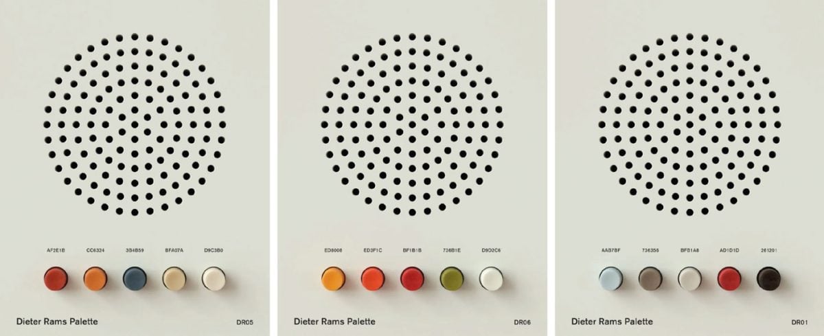
Chad Ashley @cgpov has created these beautiful images of colour palletes created by Dieter Rams for the Braun product collection.
Those colour buttons are just begging to be pushed, they are so yummy.
♡ Via: Present and Correct
Initial M / Letter M Logo Design Details
The cost for this Letter M Logo for Sale is £600, and its quite a special logo in my opinion.
The concept was initially designed for a client who needed a logo for a medical website: http://medifact.md providing information, facts and answers to questions from established and revered medical professionals. Each article is checked by 3 other medical professionals, so as to avoid any incorrect data being shown and/or biased conclusions etc.
The brainstorming process resulted in the letter M logo mark made primarily from speech bubbles (in this case representing quoted facts), but also punctuation in the form of quote marks, which together draw your focus to the initial M created from the negative space.
These shapes, when placed in a certain layout, create the initial letter M formed from the internal negative space. The concept was not used, and so I’m able to repurpose it, and sell it on.
However, the use of ‘speech bubbles’ to create the negative space letter M within makes it quite nifty and good looking.
It would be feasible to flip this upside down to create the letter W if so desired, but it doesn’t look quite so natural.
As with all my other logos for sale, there are a some extras that can be included for additional cost:
Additional Extras
Adding of Logo Wording – £45Logo Font Style Exploration – £65Logo Colour Exploration – £65Stationery Design: Business Card & Letterhead – £150Logo Guidelines Poster (See Examples) – £250
Any other changes and/or deliverables that you might need that are not listed above, then please contact me with your details.
Logo Design Exclusivity
All my Logo Designs for Sale are Completely Exclusive, and will only be sold once.
If you buy this logo design, then you’ll receive all Copyright and Original Artwork, and you’ll be free to do with this logo as you see fit.
All Logo Designs for Sale come with: Transfer of Copyright, Master Logo Sheet, Digital Files (.eps, .ai, .PDF).
Interested in Buying this Letter M Logo Design for Sale?
If you are interested in buying this logo design, then please send me an email to:
→ smithographic@gmail.com
Letter M Logo for Sale
How these Logo Designs for Sale came to be
Over the course of my 30 years within the logo design industry, I’ve accumulated 100’s, possibly 1000’s, of unused logo designs.
Many of these you can see in my Logo Design Portfolio, Case Studies, The Brand Gallery, and also in the Monomarks Portfolio.
Some of these are: client rejected logo designs, logo concepts, and many more doodles and sketches of possible logo designs that were not used.
In some cases I’m able to reuse or adapt an existing ‘unused design’ for a new client.
I’m seeing my library of these ‘unpublished’ designs just collecting digital dust, which is quite a waste I think.
I therefore decided it would be a nice little income earner to start making these ‘unused and unseen’ logo designs and concepts, available to buy almost ‘off-the-shelf’, with some minor tweaks and changes.
A lot of these Logos for Sale are the result of many weeks, sometimes months, of: research, mind-maps, doodling and sketching, designing and tweaking, backwards and forwards with the client.
These designs are not just randomly made in 10 minutes, but ARE the result of my many years of experience, and close working relationship with each past client.
You are therefore buying a supremely awesome value for money logo design, at a fraction of the cost of most bespoke logo design projects that I am commissioned to develop and design.
Design Exclusivity is so important in logo and brand identity.
View more Monomarks
Hire Smithographic℠
And remember: you can hire Smithographic to design you a completely new: Logo Design, Icon Design, Brand Identity, even if you need a logo and/or brand identity update or refresh, then Smithographic can help!
If you need something more unique, and custom fitted, for your brand, business, product etc, then…
→ Hire Smithographic℠
Letter R Custom Monogram and Logo Design for Sale
Initial R / Letter R Logo Design Details
The cost for this Letter R Logo Design for sale is just £400, and there are a some extras that can be included for additional cost:
Additional Extras
Adding of Logo Wording – £25Logo Font Style Exploration – £45Logo Colour Exploration – £45Stationery Design: Business Card & Letterhead – £50Logo Guidelines Poster (See Examples) – £150
Any other changes and/or deliverables that you might need that are not listed above, then please contact me with your details.
Logo Design Exclusivity
All my Logo Designs for Sale are Completely Exclusive, and will only be sold once.
If you buy this logo design, then you’ll receive all Copyright and Original Artwork, and you’ll be free to do with this logo as you see fit.
All Logo Designs for Sale come with: Transfer of Copyright, Master Logo Sheet, Digital Files (.eps, .ai, .PDF).
Interested in Buying this Letter A Logo Design for Sale?
If you are interested in buying this logo design, then please send me an email to:
→ smithographic@gmail.com
How these Logo Designs for Sale came to be
Over the course of my 30 years within the logo design industry, I’ve accumulated 100’s, possibly 1000’s, of unused logo designs.
Many of these you can see in my Logo Design Portfolio, Case Studies, The Brand Gallery, and also in the Monomarks Portfolio.
Some of these are: client rejected logo designs, logo concepts, and many more doodles and sketches of possible logo designs that were not used.
In some cases I’m able to reuse or adapt an existing ‘unused design’ for a new client.
I’m seeing my library of these ‘unpublished’ designs just collecting digital dust, which is quite a waste I think.
I therefore decided it would be a nice little income earner to start making these ‘unused and unseen’ logo designs and concepts, available to buy almost ‘off-the-shelf’, with some minor tweaks and changes.
A lot of these Logos for Sale are the result of many weeks, sometimes months, of: research, mind-maps, doodling and sketching, designing and tweaking, backwards and forwards with the client.
These designs are not just randomly made in 10 minutes, but ARE the result of my many years of experience, and close working relationship with each past client.
You are therefore buying a supremely awesome value for money logo design, at a fraction of the cost of most bespoke logo design projects that I am commissioned to develop and design.
Design Exclusivity is so important in logo and brand identity.
View more Monomarks
Hire Smithographic™
And remember: you can hire Smithographic to design you a completely new: Logo Design, Icon Design, Brand Identity, even if you need a logo and/or brand identity update or refresh, then Smithographic can help!
If you need something more unique, and custom fitted, for your brand, business, product etc, then…
→ Hire Smithographic
WipEout Logo History 1995-2017, Making of the Wipeout Logo Design Plus Various In-game Graphics by Designers Republic and Fans
Category: Designer Spotlight, Famous Logos
The Designers Republic (also tDR, and styled as The Designers Republic™) @ianTDR, a British design studio, designed the Wipeout logo and stunning game graphics for this groundbreaking console game; first debuted on the Sony Playstation 1.
The first release of Wipeout for the Playstation 1, back on September 29th, 1995 was a pivotal moment for Sony and the millions of Playstation gamers.
The Designers Republics groundbreaking work on the graphic design for Wipeout, which included everything from packaging to typographic selection in the game menus, has been noticed by many design and gaming publications over the years since the very first Wipeout.
Wipeout Game Logo History 1995-2017: making of Wipeout logo design plus various in-game graphics by Designers Republic, and other Designers and Fans.
The Typeface Agency
The Typeface Agency has a great article: “On how the Designers Republic sculpted childhoods” which looks at the impact the branding and audio aspects of Wipeout had on making this game such a phenomenal success; it’s well worth a read.
Here’s a couple of quotes I’ve pulled out:
Typeface Agency: Liverpool based developer Psygnosis asked Designers Republic to produce a series of brands for each of the games futuristic racing teams. Each team would have its own logo and brand language, this follows through to trackside advertisements sponsor logos and background billboards. In fact, each track is littered with adverts for in game teams and fictional products alongside real world Red Bull adverts.
This is branding at it’s best, the fictional made tangible and relatable.
Wipeout is F1 with hovercraft, it has no story but the setting is established and the experience is rich. Wipeout is peak Designers Republic; it’s confident and bold, it references its pedigree and it has an ordered, other worldly feel to it.
Wipeout v1
For me personally, I vividly remember the day that my friends and I all waited outside HMV in Brighton, to buy the game.
Getting back to my friends house and seeing and hearing the thumping soundtrack, and incredible graphics, will probably never be matched.
I have similar fond memories of getting my ZX81, Commorodre 64 and even Atari ST1040, but Wipeout when played with a bunch of great friends, was just a whole new level of awesome.
It really is a memory that is so vivid…
For this post, there are so many images, blog posts, Pinterest pins, fan artwork that it’s been quite a lengthy, but very cool journey to extrapolate the key Wipeout game logos.
Lunchbox Games Database
The following Wipeout logos, with the games’ release date, and description of each game follows. I eventually found all the Wipeout logos and relevant information in one place, on a website called Lunchbox Games Database, so big credit goes to them!
I created a profile, and saved all the Wipeout games to a collection:https://gamesdb.launchbox-app.com/collection/games/thelogosmith
If you want to look at all the Wipeout game graphics, the covers, the DVD packaging graphics then this is the place to go. For each iteration of the game, I have included the link back to Lunchbo
x Games Database relevant Wipeout game page.
I have also picked out other Wipeout images and graphics from various places, created by Wipeout fans: Pinterest, DeviantArt, Flickr etc.
Wipeout Game Series Logos 1995 – 2017
Wipeout – Released 1995 on Sony PS1
Wipeout – Released 1995 on Sony PS1
Wipeout: Set in the year 2052, players compete in the F3600 anti-gravity racing league, piloting one of a selection of craft in races on several different tracks.
There are four different racing teams to choose from, and two ships for each team.
Each ship with its own distinct characteristics of acceleration, top speed, mass, and turning radius.
By piloting their craft over power-up pads found on the tracks, the player can pick up shields, turbo boosts, mines, shock waves, rockets, or missiles, which protect the player’s craft or disrupt the competitors’ craft.
There are seven race tracks in the game total, six of them located in futuristic versions of countries such as Canada and Japan, with a seventh, hidden track set on Mars.
Wipeout 2097 & Wipout XL – (1996)
Wipeout 2097 & Wipout XL – (1996)
WipEout XL: set in the year 2097, around four decades after its predecessor. Instead of the F3600 anti-gravity racing competition, the game features an even faster and more dangerous tournament: the F5000 AG league.
The gameplay system is similar to that of the previous game: players race against each other or computer in high-speed futuristic environments, liberally picking up weapons scattered around the stages and using them against the opponents to finish the race in the highest position.
Each vehicle is provided with a shield; once this shield is breached (by weapons or other kinds of damage), the craft explodes. As in the first game, the vehicles move at very high speeds.
Wipeout 64 – (1998)
Wipeout 64 – (1998)
WipEout 64: released by Psygnosis as a follow-up to the racing game WipEout XL, taking place one year later in 2098.
Like in previous installments players control highspeed hovercrafts, pick up weapons to damage the opponents’ vehicles and try to finish the race in the first position.
In many aspects, the gameplay is pretty similar to its predecessor, such as selection of hovercrafts, visuals or the handling system.
Beside new racing tracks the main differences include a Split-Screen Multiplayer Mode (up to four players), Weapon & Super Combo Challenges as well as various Special Weapons for each Team!
Wipeout 3 – (1999)
Wipeout 3 – (1999)
Wipeout 3: a racing game that retains the same basic elements of its predecessors, and introduces players to the F7200 Anti-Gravity Race League.
Players control futuristic anti-gravity ships owned by racing corporations and pilot them on eight circuits.
Each craft is equipped with an energy shield that absorbs damage sustained on the track; if the shield is disabled, the player’s craft can be knocked out of the race.
Shields are regenerated in a pit lane that is set apart from the main course. The less time spent in the pit lane, the less the shield will regenerate.
Wipeout 3 Special Edition – 2000
Wipeout 3 Special Edition – 2000
Wipeout 3 Special Edition isn’t just a slight improvement on Wipeout – it’s a full-blown greatest hits compilation.
The highly refined futuristic racing gameplay is lifted directly from the third game, complete with idiosyncracies such as the boost button and weapons like the Force Wall, and its tracks, vehicles and music all come over too.
However, there are some slight physics tweaks and two prototype tracks, previously exclusive to the Japanese version of the original game.
Wipeout Fusion – 2002
Wipeout Fusion – 2002
WipEout Fusion: Like WipEout 3, the game contains single-race and league modes, as well as two-player split screen gameplay. The single race mode (called Arcade) is used to unlock new tracks.
The challenge mode from WipEout 64 returns with a few enhancements: each team has its own set of six challenges, which must be completed with a medal in order to unlock the next one.
A new Zone mode requires players to drive as many loops as possible on a track while continuously increasing the speed.
Another new feature in WipEout Fusion are hovercraft upgrades. Depending on their performance, players receive credits after races, which can be used to increase speed, thrust, weapon power, shield strength, lateral stability, and brake force of a vehicle.
Upgraded vehicles can be used in any other game mode, with the exception of the Challenge mode.
Wipeout Pure – 2005
Wipeout Pure – 2005
WipEout Pure: the first adaptation for the PSP of the long-running Wipeout series.
Players take part in a futuristic racing league known as the FX300 Racing League and control a fast hovercrafts on tight, cornering tracks, vying for first place in one of many tournaments.
There are ten anti-gravity vehicles available to use (two need to be unlocked), each with their own characteristics in speed, handling and acceleration.
Vehicles are further divided into classes that are unlocked gradually. In later classes most of the vehicles become much faster and require more precise steering at fast speeds. In the same vein, players can unlock new tournaments.
Wipeout Pulse – 2007
Wipeout Pulse – 2007
Wipeout Pulse: developed by SCE Studio Liverpool for the Sony PlayStation Portable, sequel to Wipeout Pure.
The game was officially announced on March 27, 2007 and was released on December 14, 2007 in Europe.
A PlayStation 2 port was released on June 24, 2009 in Europe. The game is set in the year 2207.
Players take part in the FX400 Anti-Gravity Racing League, competing in various types of race at several race courses set around the world.
Wipeout HD – 2008
Wipeout HD – 2008
Wipeout HD: now with full stereoscopic 3D support for the most realistic and immersive WipEout experience ever.
Delivering High Definition visuals running at a breathtaking 60 frames per second in full stereoscopic 3D, WipEout HD features a selection of the best tracks taken from previous versions of the WipEout franchise, meticulously crafted and fully reworked to showcase the processing power of the PS3 system.
Features eight racing teams, classic tracks from previous WipEout releases, five gameplay modes, plus 8-player online racing and Trophy support.
All set to a hard-hitting techno soundtrack of nine fully-licensed music tracks remixed in Dolby 5.1 surround sound.
Wipeout HD Fury – 2009
Wipeout HD Fury – 2009
Wipeout HD Fury expansion pack: increases the content of the acclaimed racing game with 8 new tracks, 13 new ship models and 3 new game modes, 2 of which will be available for online play!
In addition there will be new trophies to attain, a re-styled front-end and a selection of new & improved multiplayer functionality!
The Eliminator game mode will allow you to release all that pent-up aggression as you use the full arsenal of Wipeout weaponry to destroy your opponents.
Wipeout 2048 – 2012
Wipeout 2048 – 2012
Wipeout 2048: players experience the thrill and speed of aggressive, antigravity racing in the palm of their hand via the PlayStation Vita.
One of the most exciting launch titles releasing concurrently with the PS Vita, Wipeout 2048 retains the frenetically-paced, futuristic racing action and vehicular combat that has thrilled and challenged fans of the series, while also upping the ante by harnesses the PS Vita’s enhanced controls.
These include motion active tilt, touch interface and even voice-activated commands.
Filled with fast-paced, futuristic racing action and wireless connectivity, Wipeout 2048 is a never-ending battle to stay atop the online leaderboards.
Wipeout Omega Collection – 2017
Wipeout Omega Collection – 2017
WipEout Omega Collection brings together all the content from WipEout HD, WipEout HD Fury and WipEout 2048, enhanced for PS4 and PS4 Pro.
Omega Collection takes advantage of the power and memory bandwidth of PS4 to rework all textures in the game.
Compared to the original games, textures are now clear when viewed up close: you can even read some of the small text on the ships for the first time.
As well as a host of other improved graphical effects HDR has been added which massively improves contrast to what was seen before.
The Making of The Wipeout Logo
Visual Analysis of the Wipeout Logo Designed by tDR
y2kaestheticinstitute: “The Wipeout logo was designed by The Designers Republic in 1995, a landmark icon in Y2K graphic design.
Upon looking at the design closely, one can notice these letters are actually made from partial 8 glyphs. Below are the overlays of the Wipeout logo with Eurostile’s 8 glyph.”
Visual Analysis of the Wipeout Logo Designed by tDR
WipEout Logo Twitter Thread by @y2k_aesthetic
There’s a great Twitter thread from @y2k_aesthetic (seeimgly taken from their original Tumblr post) that breaks down the construction of the WipEout logo by The Designers Republic (which is where I got the above image from), and how and why the repeating 8’s was used.
I have taken screenshots each of the individual threads, and place then one under each other in order, 1st to last.
I’ve also copy/pasted the text from each of the Tweets, with the relevant Tweet Thread URL link as well.
Twitter Thread #1
Wipeout was an influential futuristic racing game, released in 1995, with art direction by The Designers Republic and a stellar soundtrack.
What’s in a logo? We will focus on tDR’s Wipeout logo and its inspirations.
Twitter Thread #2
The Wipeout logo was designed by The Designers Republic in 1995, a landmark studio in Y2K graphic design.
Upon looking at the design closely, one can notice these letters are actually made from partial 8 glyphs.
Above are the overlays of the Wipeout logo with Eurostile’s 8 glyph.
Twitter Thread #3
So why the repeating 8s?
In an LCD screen, all numerals in a 7-segment display are created with the 8 numeral.
Twitter Thread #4
Why the ‘ and “ marks?
They denotate the minutes and seconds used in racing and implies speed.
Twitter Thread #5
And finally, why is the typography set in Eurostile?
Eurostile, and its predecessor Microgramma, has been established in the sci-fi canon since the late 60s as a symbol of futurism, as seen in user interfaces, signage, and in interiors.
Wipeout is set in a futuristic world.
Twitter Thread #6
I contacted Ian Anderson, the head of tDR about this over a year ago, and he was able to confirm it.
Twitter Thread #7
Successful design is always intentional.
Every decision here made in the Wipeout logo has a logical connection back to racing, and within the in-game universe of Wipeout.
This teaches us a lesson to always make sure your design decisions hold weight.
Angryman Logotype – The Designers Republic
Angryman -> An Unhappy Human
Wip3out Racing Ver. 03.01.99.000
Team Listing:Auricom Ind AG-Sytems Goteki 45 Qirex-RD Piranha Assegai Feisar Icaras
Official Wipeout Font – F500 Ang-ular by The Designers Republic
Official Wipeout Font – F500 Ang-ular by The Designers Republic
Cover Art for Wipeout Pure, by The Designers Republic
Cover Art for Wipeout Pure, by The Designers Republic
The Weapons of Wipeout Infographic
The Weapons of Wipeout Infographic
Wipeout Logo Game Timeline by Robin Ottens
The following Wipeout Game Timeline was created by Robin Ottens, and is it’s staggeringly detailed.
The actual image size is 4800 x 5393px, so you can really zoom in and read all the text.
A great graphic to print out on a large format printer and frame, should you feel so inclined.
→ View Full Size Timeline
Robin also has sliced this massive image up, and you can view all of the individual segments:
→ View Sliced Segments
Poster mock-up by Daily Mockup
Evolution of Team Wipeout Logos in the entire Wipeout Game Series
Evolution of Team Logos in the whole Wipeout Series
Wipeout Logo – Team Logos
@BrySkyeGaming complied this awesome graphic showing ALL the Wipeout Team logos, and how they evolved over the years:
Bryskye: Evolution of the team logos in the whole WipEout series, as far as I know, this is all the team logos in the series. It’s all the ones I could gather to compile at any rate.
Edge Magazine Cover for Wipeout 3 – June 1999
Edge Magazine Cover for Wipeout 3 – June 1999
Wipeout Free Font by Paul Willocks
Wipeout Free Font by Paul Willocks
Wipeout – Typeface by Paul Willocks
This font is free to use for personal use. It is strictly not to be used for commercial projects unless you hold the commercial usage rights.
To obtain the commercial usage rights
This font costs £10.00 UK Pounds to use commercially and this entitles you to use it in as many projects as you like.
Payment can be made via PayPal to paulwillocks@btinternet.com, the PayPal receipt will act as your proof of purchase.
Comparisons to the F1 Family of Fonts
Typeface Agency: Wipeout came out in 1995, it was a snapshot of the future. Fast, smooth racing, pounding beats and slick graphic design. It referenced F1 and the brand language that surrounds modern teams and sponsors.
Now either Designers Republic had the foresight and vision to take modern F1 branding to its logical conclusion, predicting the future only a couple of decades early.
Or contemporary sports teams and brands are looking towards video games and esports to stay visually relevant. Here is the 2017 Formula 1 rebrand. It’s very slick.
I’ve previously written about the F1 Typeface, and have provided an ‘unofficial’ F1 Font download link:
→ Download the New Formula 1 F1 Fonts: F1 Regular, F1 Turbo and F1 Torque
Formula1 Regular Font
Wipeout Pulse Team Logo Collage
This lovely Wipeout Pulse Team Logo Collage was created by Deviant Art user NyaNyaSerik, and you can download some differing sizes to use as wallpapers:
Wipeout 3 Team Logos
Sugoi: Their solid work on the graphic design for Wipeout, which included everything from packaging to typographic selection in the game menus, has been noticed by several design and gaming publications over the years.
With their visually futuristic and unique design language, they also managed to appeal to a whole new target group who were not previously interested in the game medium.
Below you will find a visual series of visual eye candy produced for Wipeout 3.
I’m coming across more Wipeout graphics on regular basis, so will be updating this post ad-hoc.
Wipeout Logos & Texts in Monochrome
Olitte20: “These are the vectorized logos and texts I made while designing the fan shirts.
At least should be the most of them. Made in CS3.”
Wipeout In-game Screenshot
Wipeout HD Logo Type by JJTeam
Wipeout HD Logo Type by JJTeam
Wipeout Collage by DewlShock
Wipeout HD Ingame Branding by Alex Townsend
Wipeout HD In game Branding by Alex Townsend
Fictitious corporate brands were developed for legendary futuristic racing game Wipeout HD on the PlayStation®3.
Supporting environmental graphics and livery were applied to the 3D space and animated as interstitials by the development team.
→ View Alex Townsend’s Behance Project
About The Designers Rebublic ™
The Designers Republic™ Founded by Ian Anderson in 1986, The Designers Republic ™ is an internationally renowned pop-cultural hyper-creative design studio focussing on graphic design and brand communication across all media, fuelled by strategic thinking, problem solving (thinking and doing) and strong narrative.
We focus on people — the ambition of the client, and their story (in their voice), × the desire and aspiration of their audience, in a language (both written and visual) designed to provoke the desired response. We focus on ideas and what ideas look like.
We’re good at Creative and Art Direction; Brand, Brand Comms and Identity; Concept Development; Copywriting; Environmental Design & Location Branding; Exhibition Design; Print; Packaging; Signage; UX Design and Web Design.
We have key experience with Media and Cultural / Arts clients; the Music and Computer Games industries; TV Channels; collaborations with Architects; FMCG; Corporate clients; Universities and Festivals globally, nationally and locally. We can help you tell your story.
This Initial A / letter A logo for sale was initially one of a handful of logo design concepts for an advertising studio, who wanted the letter A (their initial) to be the focus point for the logo mark.
For this particular logo concept I started with a standard uppercase letter A, then removed the crossbar and duplicated it a couple of times, with each one sheared horizontally.
View other Logo Design Grids
The result is nicely balanced logo mark, that when using colour can help add a sense of depth, as the left and right versions can be interwoven/over and underlapped, with the primary A.
→ View More Logos for Sale
Initial A / letter A Logo Design Details
The cost for this Letter A logo Design for Sale is just £400; there are a some extras that can be included for additional cost:
Additional Extras
Adding of Logo Wording – £25Logo Font Style Exploration – £45Logo Colour Exploration – £45Stationery Design: Business Card & Letterhead – £50Logo Guidelines Poster (See Examples) – £150
Any other changes and/or deliverables that you might need that are not listed above, then please contact me with your details.
View other Monomarks
Logo Design Exclusivity
All my Logo Designs for Sale are Completely Exclusive, and will only be sold once.
If you buy this logo design, then you’ll receive all Copyright and Original Artwork, and you’ll be free to do with this logo as you see fit.
All Logo Designs for Sale come with: Transfer of Copyright, Master Logo Sheet, Digital Files (.eps, .ai, .PDF).
Interested in Buying this Letter A Logo Design for Sale?
If you are interested in buying this logo design, then please send me an email to: smithographic@gmail.com and I’ll get back to you.
How These Logo Designs For Sale Came To Be
Over the course of my 30 years within the logo design industry, I’ve accumulated 100’s, possibly 1000’s, of unused logo designs.
Many of these you can see in my Logo Design Portfolio, Case Studies, The Brand Gallery, and also in the Monomarks Portfolio.
Some of these are: client rejected logo designs, logo concepts, and many more doodles and sketches of possible logo designs that were not used.
In some cases I’m able to reuse or adapt an existing ‘unused design’ for a new client.
I’m seeing my library of these ‘unpublished’ designs just collecting digital dust, which is quite a waste I think.
I therefore decided it would be a nice little income earner to start making these ‘unused and unseen’ logo designs and concepts, available to buy almost ‘off-the-shelf’, with some minor tweaks and changes.
A lot of these Logos for Sale are the result of many weeks, sometimes months, of: research, mind-maps, doodling and sketching, designing and tweaking, backwards and forwards with the client.
These designs are not just randomly made in 10 minutes, but ARE the result of my many years of experience, and close working relationship with each past client.
You are therefore buying a supremely awesome value for money logo design, at a fraction of the cost of most bespoke logo design projects that I am commissioned to develop and design.
Design Exclusivity is so important in logo and brand identity.
Hire Smithographic for your own Custom Logo Design
And remember: you can hire Smithographic to design you a completely new: Logo Design, Icon Design, Brand Identity etc, if you need something more unique and custom fitted for your brand, business, product etc.
→ Hire Smithographic
Find me on Linktr.ee
This Initial M / letter M logo for sale was initially one of a handful of logo design concepts for a dental company, designed back in 2019.
In some of the images I have added the word Momentum. This is simply to help create more of a traditional logo design, and to help add context to this sheared or slanting style of letter M, but any brand name would work here.
It is quite a heavily styled letter M, but I feel it’s still legible as a letter M, even when shown on itself as a separate logo mark.
This letter m logo mark certainly has a more dynamic look and feel to it, but it’s not overly aggressive, and still quite a clean and stylish looking logo design.
→ View More Logos for Sale
Initial M / letter M Logo Design Details
The cost for this Letter M logo Design for Sale is just £400; there are a some extras that can be included for additional cost:
Additional Extras
Adding of Logo Wording – £25Logo Font Style Exploration – £45Logo Colour Exploration – £45Stationery Design: Business Card & Letterhead – £50Logo Guidelines Poster (See Examples) – £150
Any other changes and/or deliverables that you might need that are not listed above, then please contact me with your details.
Logo Design Exclusivity
All my Logo Designs for Sale are Completely Exclusive, and will only be sold once.
If you buy this logo design, then you’ll receive all Copyright and Original Artwork, and you’ll be free to do with this logo as you see fit.
All Logo Designs for Sale come with: Transfer of Copyright, Master Logo Sheet, Digital Files (.eps, .ai, .PDF).
Interested in Buying this Letter M Logo Design for Sale?
If you are interested in buying this logo design, then please send me an email to: smithographic@gmail.com and I’ll get back to you.
How These Logo Designs For Sale Came To Be
Over the course of my 30 years within the logo design industry, I’ve accumulated 100’s, possibly 1000’s, of unused logo designs.
Many of these you can see in my Logo Design Portfolio, Case Studies, The Brand Gallery, and also in the Monomarks Portfolio.
Some of these are: client rejected logo designs, logo concepts, and many more doodles and sketches of possible logo designs that were not used.
In some cases I’m able to reuse or adapt an existing ‘unused design’ for a new client.
I’m seeing my library of these ‘unpublished’ designs just collecting digital dust, which is quite a waste I think.
I therefore decided it would be a nice little income earner to start making these ‘unused and unseen’ logo designs and concepts, available to buy almost ‘off-the-shelf’, with some minor tweaks and changes.
A lot of these Logos for Sale are the result of many weeks, sometimes months, of: research, mind-maps, doodling and sketching, designing and tweaking, backwards and forwards with the client.
These designs are not just randomly made in 10 minutes, but ARE the result of my many years of experience, and close working relationship with each past client.
You are therefore buying a supremely awesome value for money logo design, at a fraction of the cost of most bespoke logo design projects that I am commissioned to develop and design.
Design Exclusivity is so important in logo and brand identity.
Hire Smithographic for your own Custom Logo Design
And remember: you can hire Smithographic to design you a completely new: Logo Design, Icon Design, Brand Identity etc, if you need something more unique and custom fitted for your brand, business, product etc.
→ Hire Smithographic
Find me on Linktr.ee
“When looking at the existing Tugg identity, we spotted an opportunity to build in more soul, more dynamism, and most of all, more representation of global cultures.
It turned out to be relatively easy to break a long-established category behavior. So without prompting, we proposed an alternate take on a visual identity for Tugg that brought in inspiration from around the world, beyond the US.
At its core, the new Tugg identity is about the universality of the humble hamburger, and how it can be brought to life in new ways to welcome anyone and everyone through design.”
https://kurppahosk.com/work/tugg/
→ Source: https://kurppahosk.com/work/tugg/
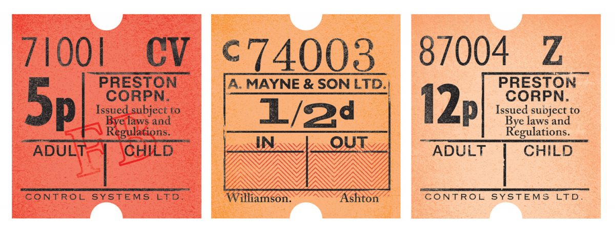
All Aboard – Vintage Bus Tickets
Category: Inspiration, Typography, Vintage
Lovely little inspirational collage of vintage bus tickets digitally; rendered by One Little Bird Studio on Flickr.
→ All Aboard on Flickr.