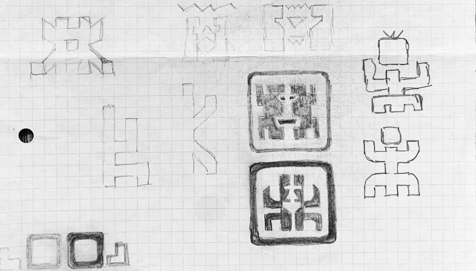
Sketches for Keyboard Kahuna Logo Design – The Sketchbook Secrets Series Post date September 15, 2021 Post author By Smithographic Post categories In Case Study, Logo Design, Logo Process Tags Logo Sketches, Sketchbook, SketchBook Secrets, Sketches
Sketches for SuperblyCo Logo Design – The Sketchbook Secrets Series Post date August 31, 2021 Post author By Smithographic Post categories In Logo Process, Portfolio Tags Logo Sketches, Sketchbook, SketchBook Secrets, Type
Sketches for PedalWorks Bike Shop Logo – The Sketchbook Secrets Series Post date August 26, 2021 Post author By Smithographic Post categories In Case Study, Logo Process, Portfolio Tags Logo Sketches, Sketchbook, SketchBook Secrets, Sketches
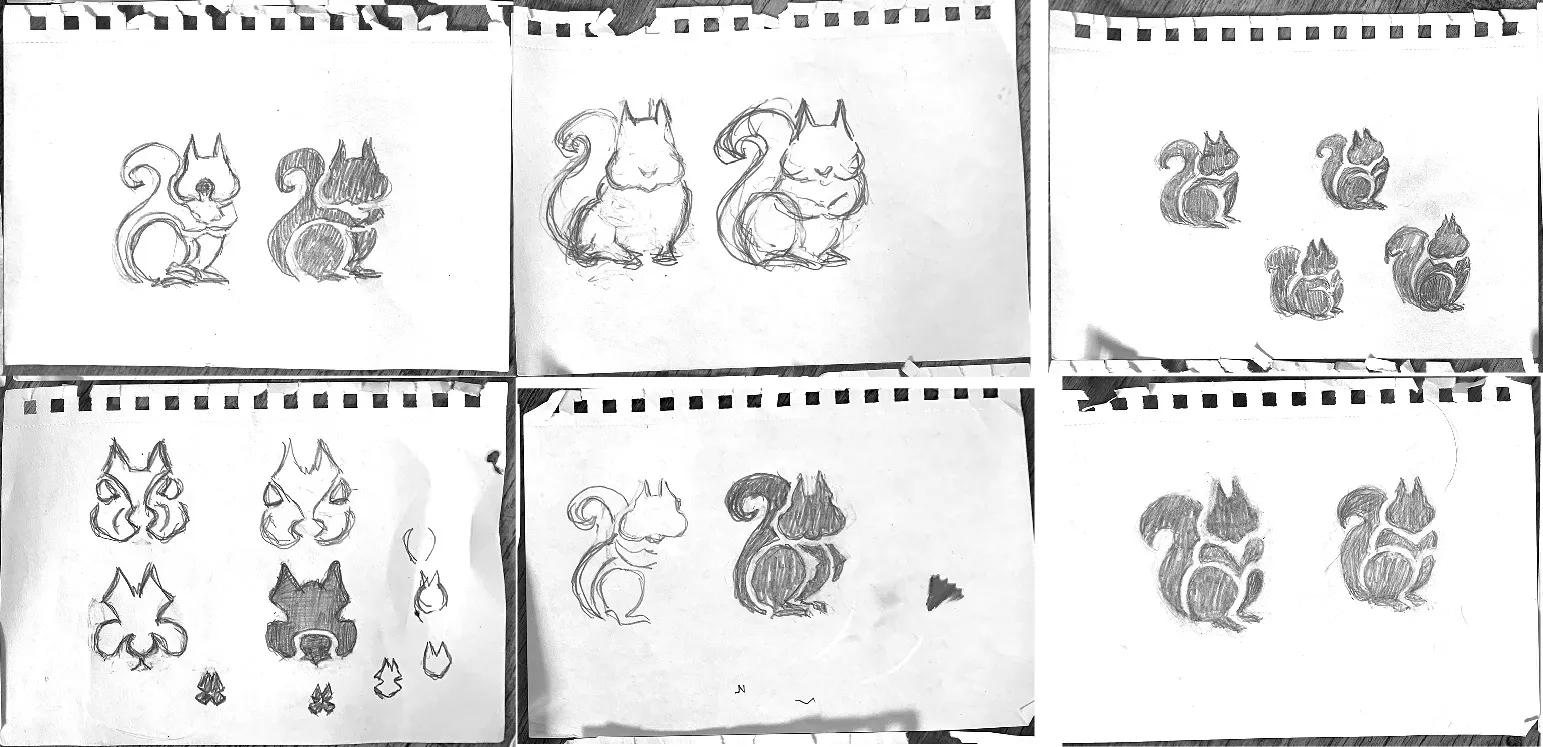
Sketches for a Squirrel Logo & Icon Design – The Sketchbook Secrets Series Post date August 24, 2021 Post author By Smithographic Post categories In Case Study, Logo Process, Portfolio Tags Logo Sketches, Sketchbook, SketchBook Secrets, Sketches
Logo Design Process Overview by The Logo Smith Post date July 7, 2021 Post author By Smithographic Post categories In Logo Process, Tips & Advice
Logo Process: RosyBee Plants for Bees Logo & Identity Designed by The Logo Smith Post date August 3, 2020 Post author By Smithographic Post categories In Case Study, Logo Process, Portfolio Tags Logo Design Evolution, Portfolio
Witness Directory, Linking Expert Witnesses with Lawyers – Logo and Icon Designed by The Logo Smith Post date January 31, 2020 Post author By Smithographic Post categories In Logo Process, Portfolio Tags Icon
Famous Brand Logos Given the Logo Grid Treatment by Joshua Ariza Post date December 26, 2019 Post author By Smithographic Post categories In Famous Logos, Logo Design, Logo Process Tags Logo Grid