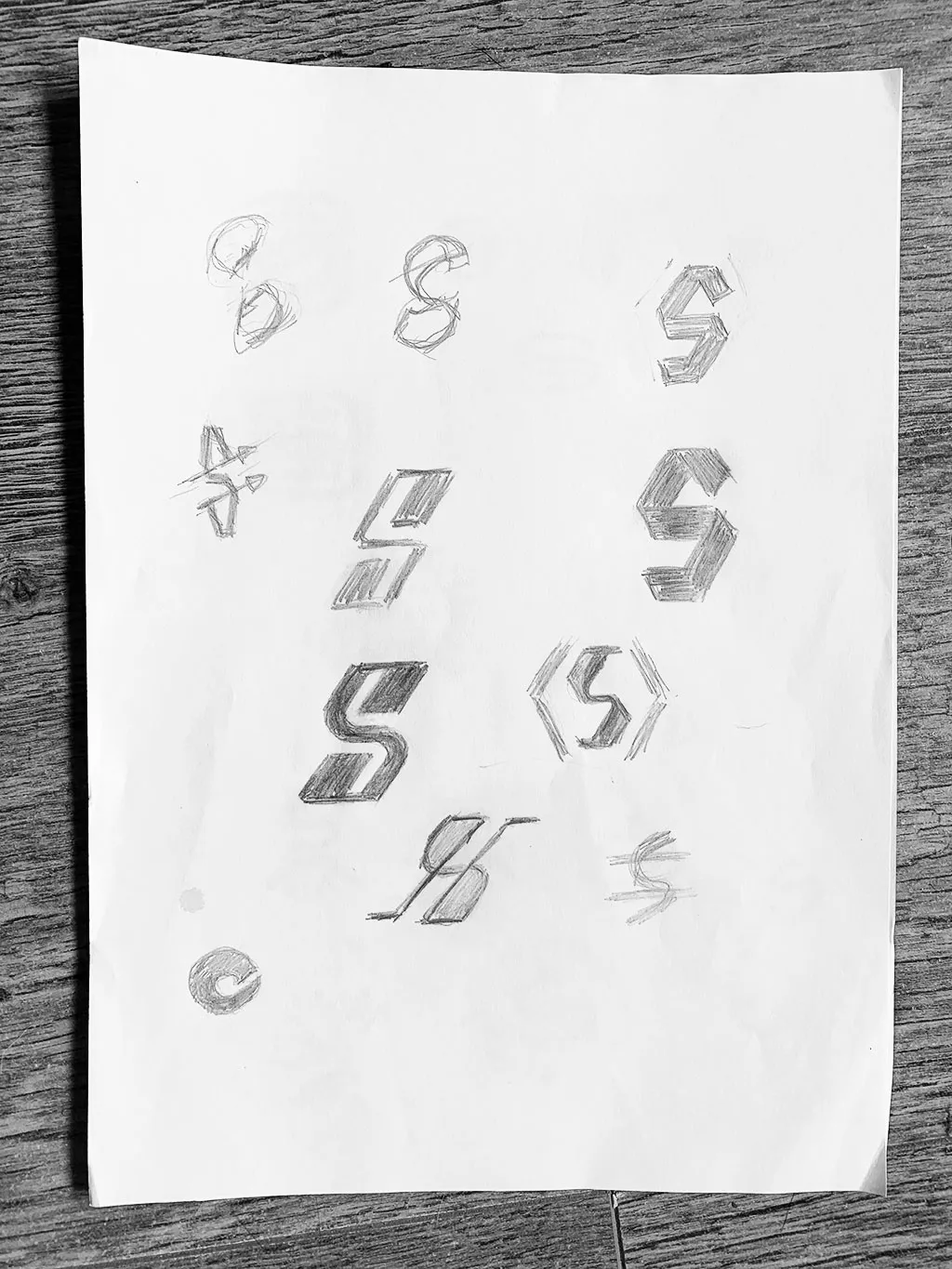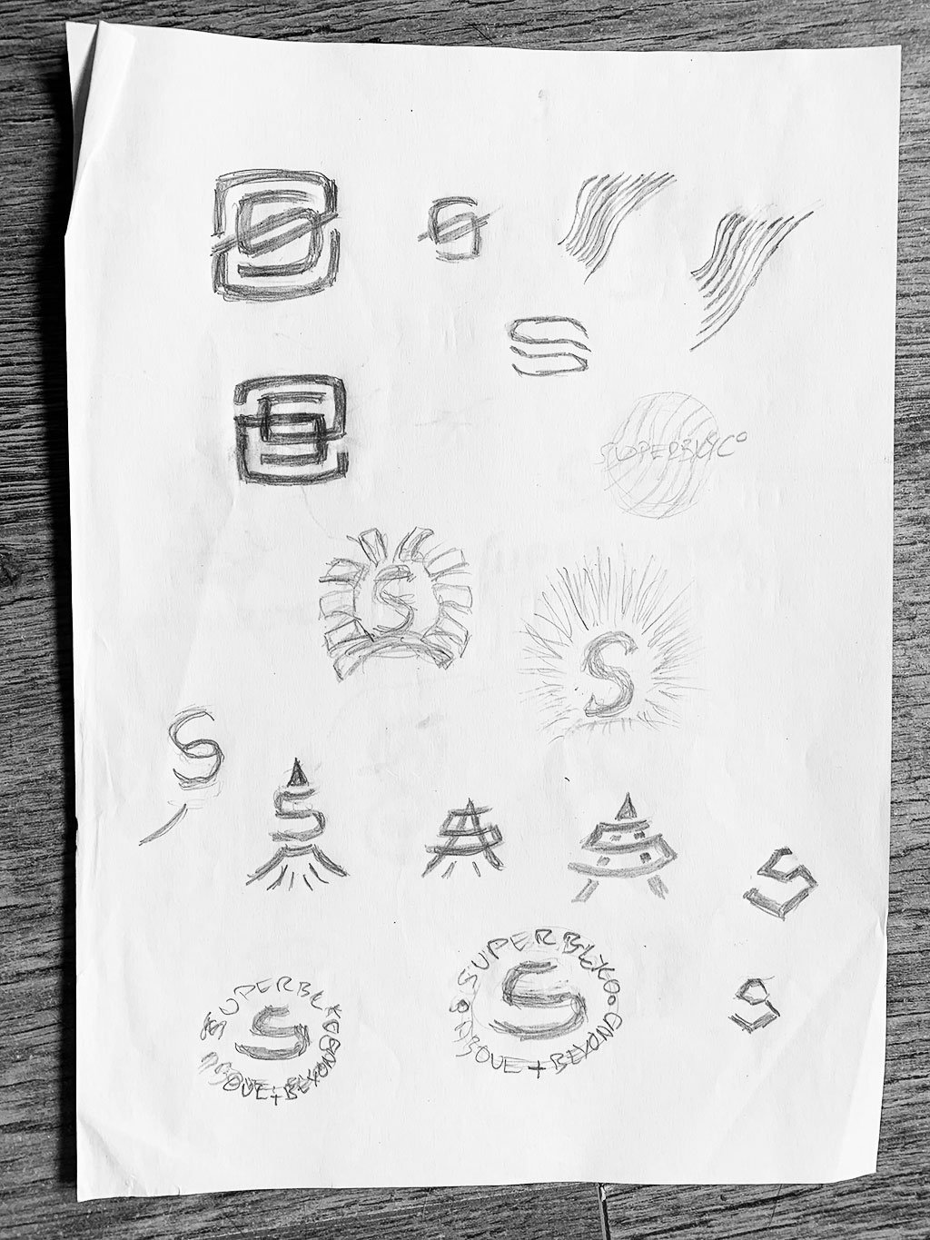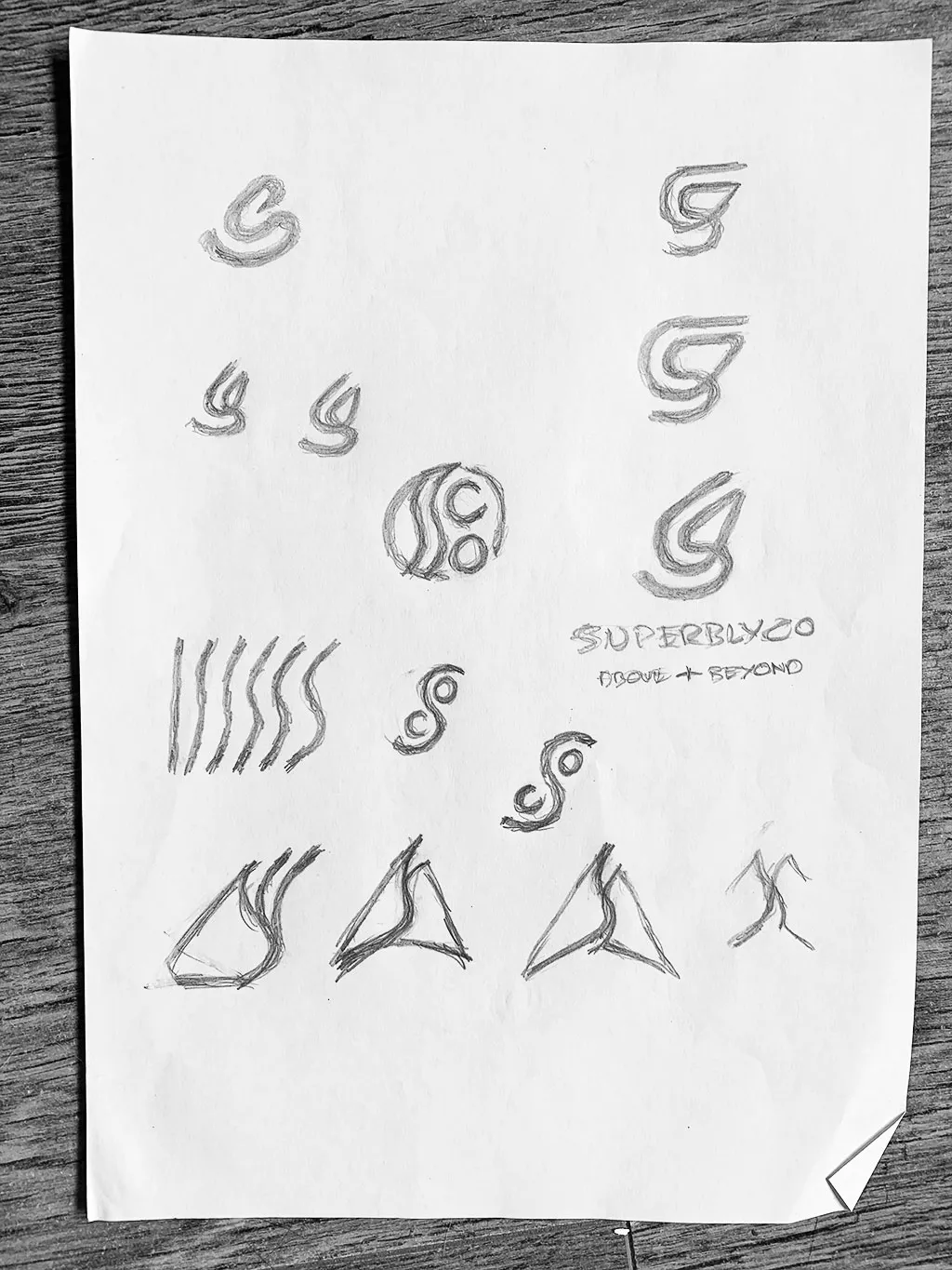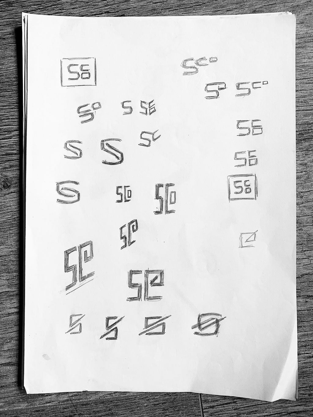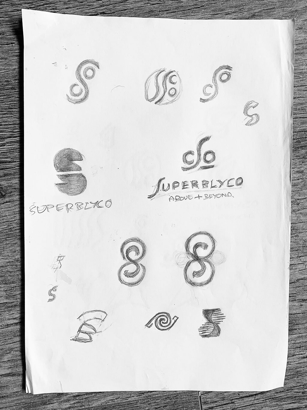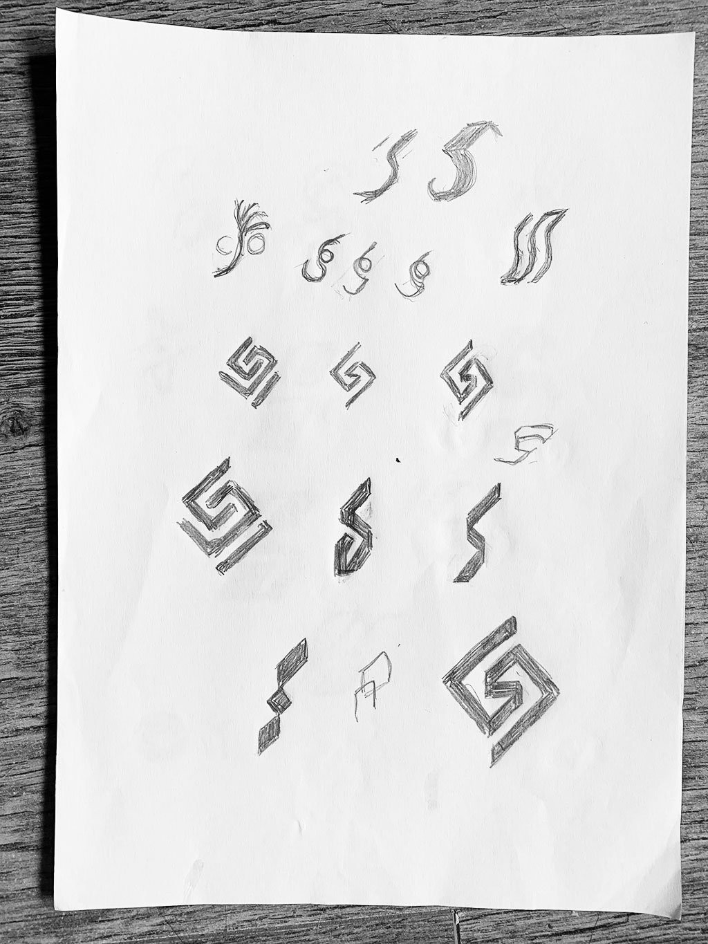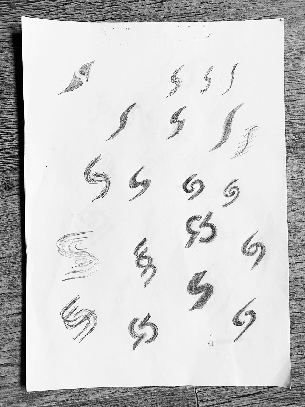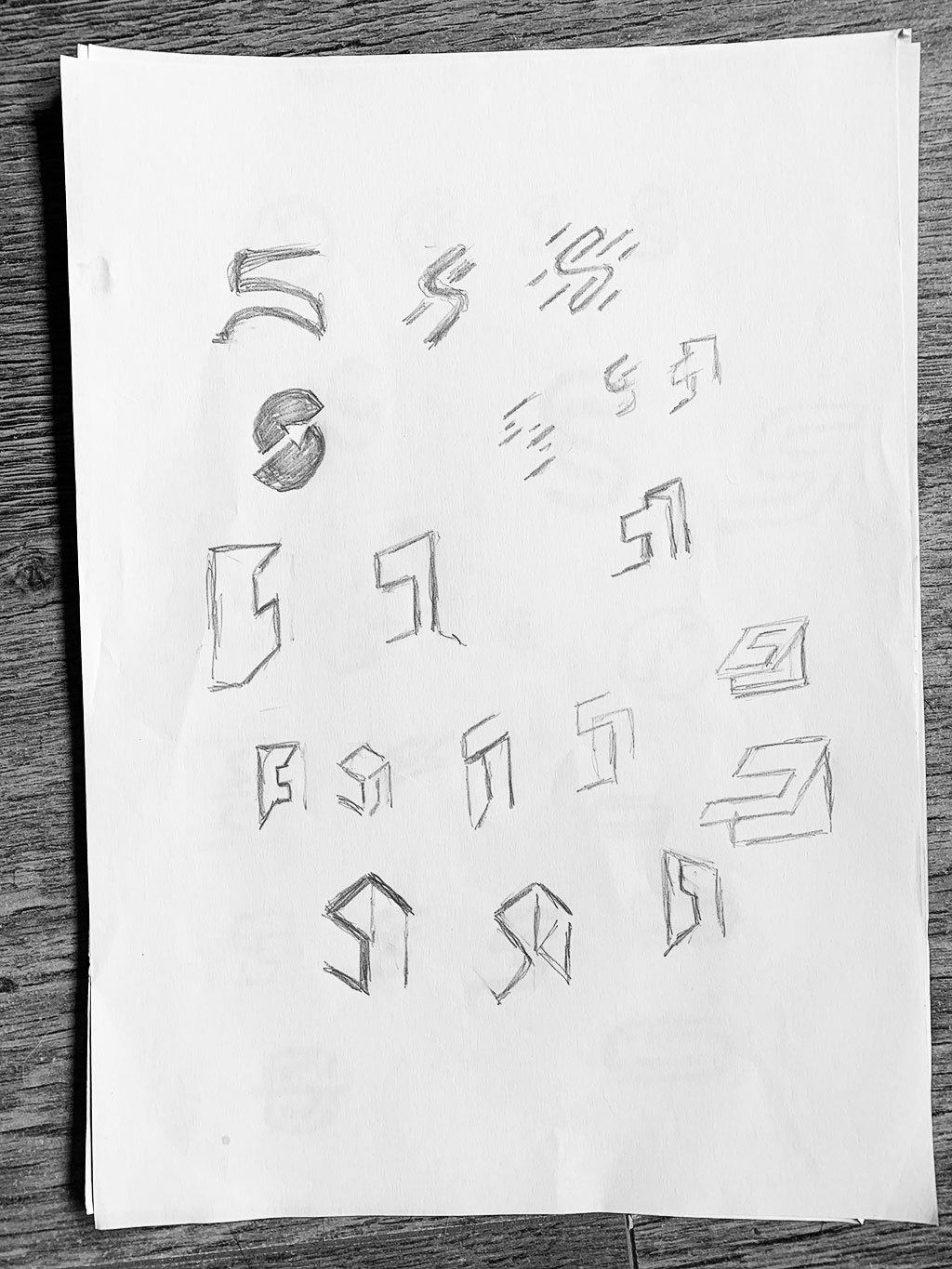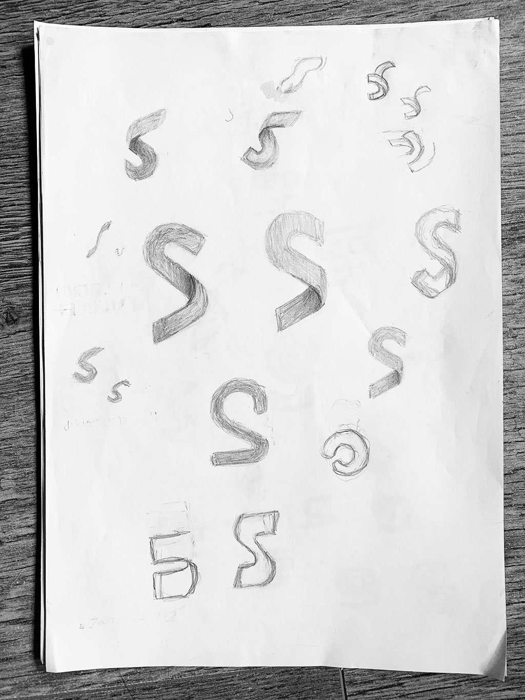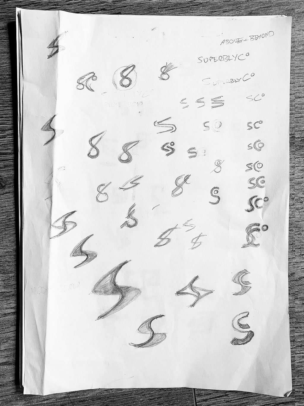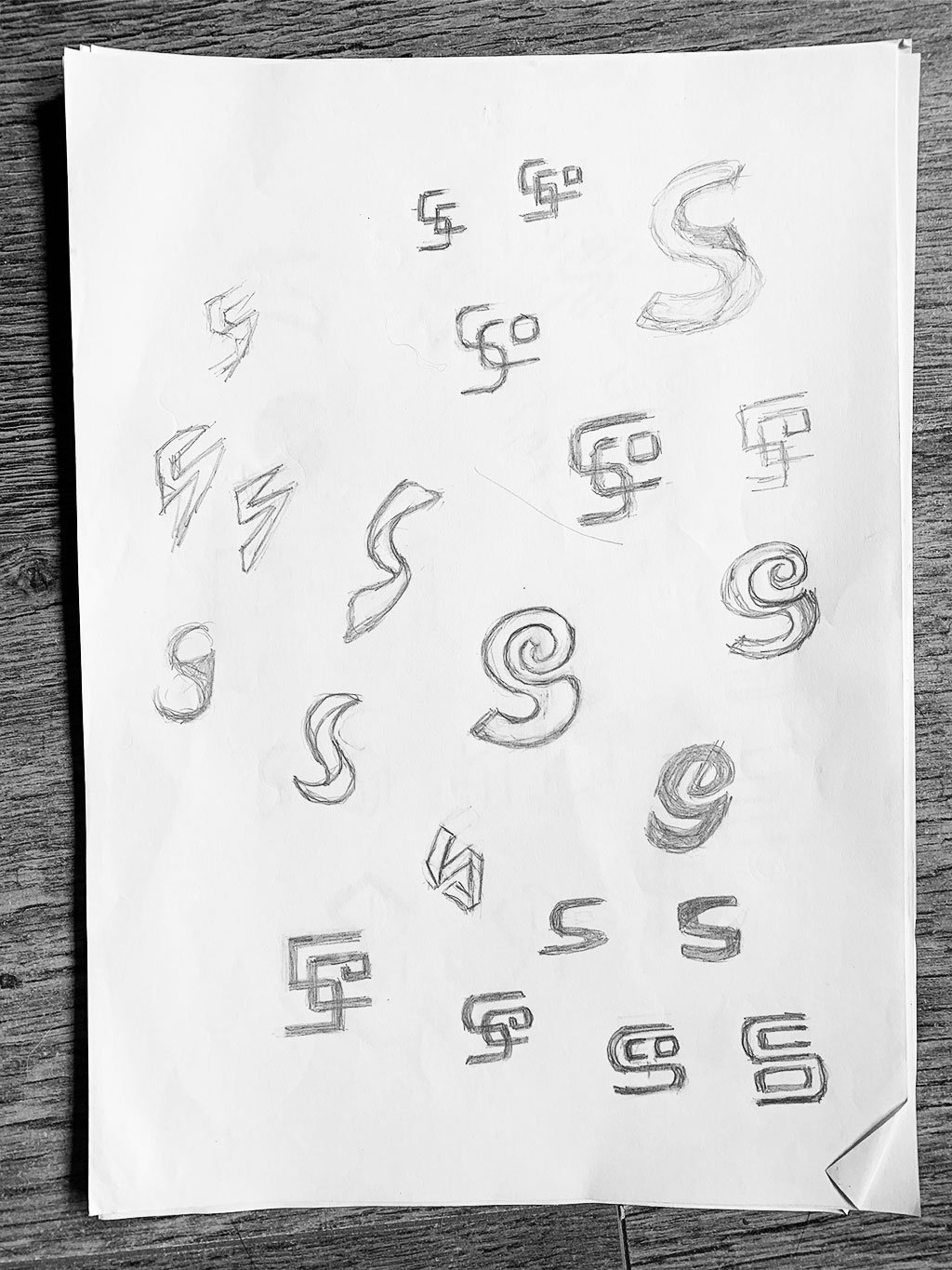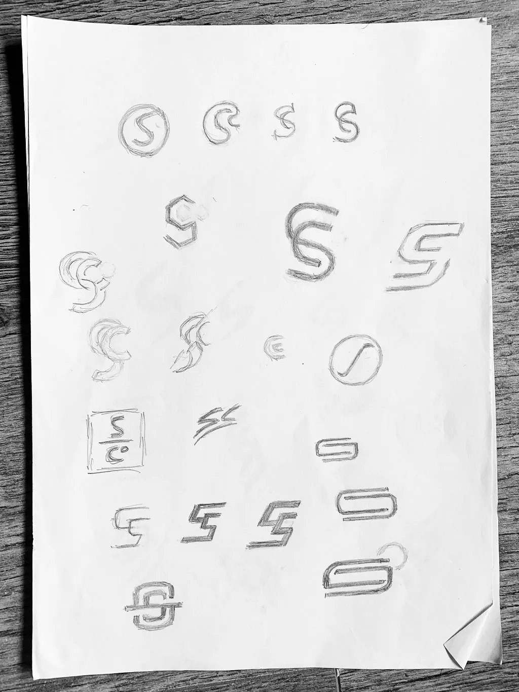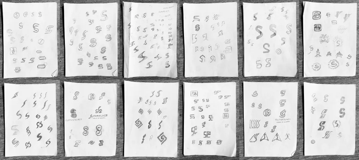
This is the 3rd Logo Design Sketch post for SuperblyCo, in my attempt to catalogue a number of my past logo sketches.
→ Previously on: The Sketchbook Secrets Series
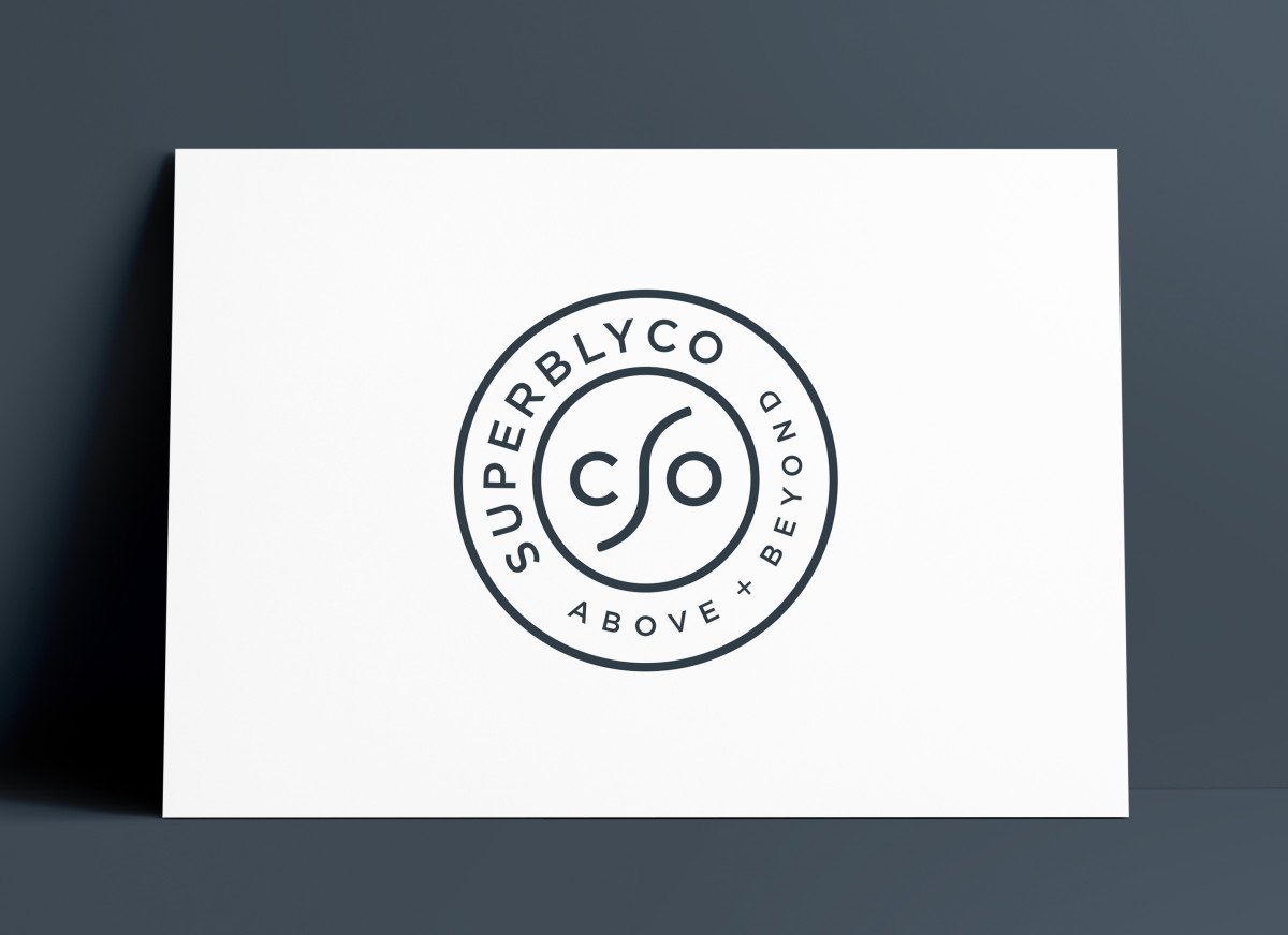
SuperblyCo was recently completed logo design project, designed beginning of2020.
Thoroughly enjoyed the sketching part of this project, as I was able to sketch a number of viable logo design ideas, concepts and style directions.
I can see that I nearly hit on the finished logo design a few times during the sketch process, but it was only really the last few pages where the Monogram idea became clearer.
Then once I saw the Monogram idea as a sketch, and also how I was envisaging it in my head, the real progress came when I wrapped up the sketching, and took to Adobe Illustrator.
When you are looking at a mostly typographic style logo, then it becomes more time consuming to keep sketching the same characters over and over again, so hence turning to Illustrator becomes quite essential.
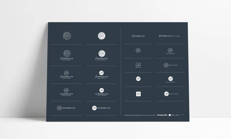
I am particularly proud of the outcome of this project.
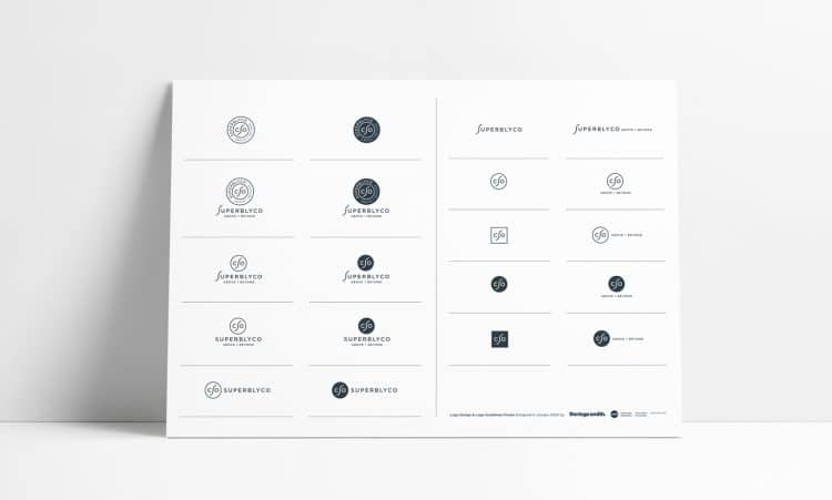
The fact that I was able to create a number of logo lock-up styles from which SuperblyCo can dip into, is particularly satisfying for me.
Usually I would be the first to say keep the number of logo lock-up’s small, but in this instance each logo version can serve a useful purpose in real world application.
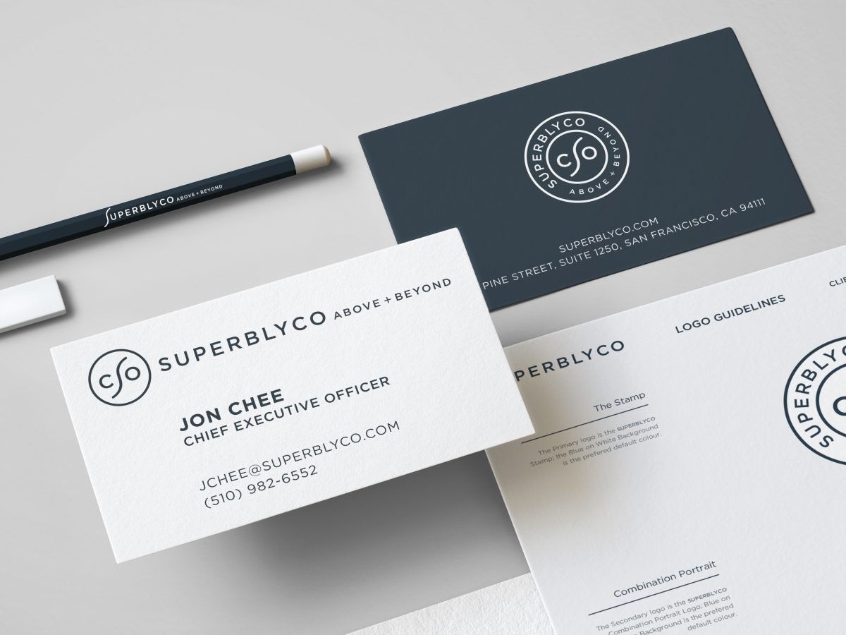
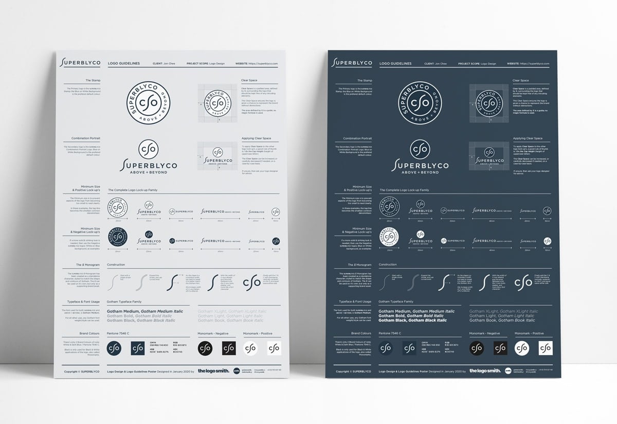
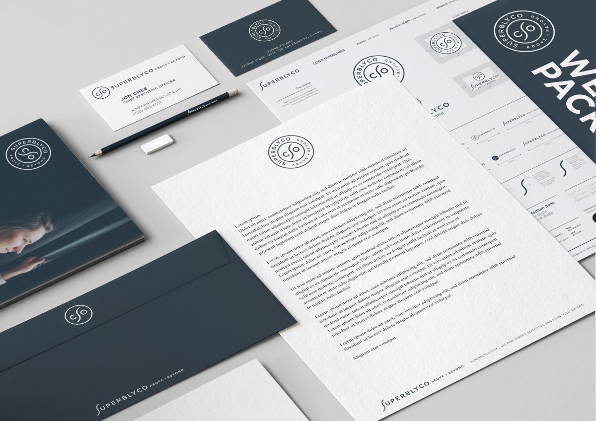
The Logo Guidelines was quite a challenge to design and layout, whilst incorporating all the logo styles, along with Fonts, Colours, Clear Space and even a how-to for the S Monogram.
This made it much easier to reproduce elements, and be able to more easily try different combinations.
The sketches are just a very small percentage of the actual vector ideas that were subsequently explored, this is all about sketches.
Sketches for the SuperblyCo Logo Design
