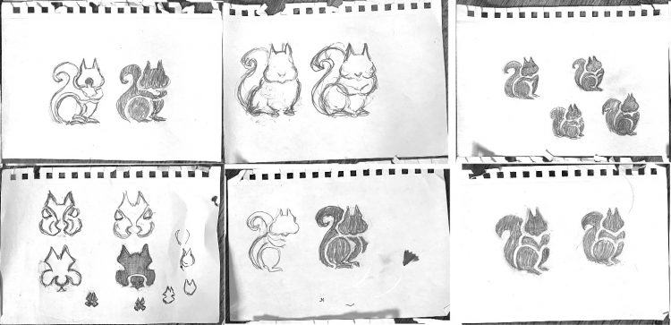
Thought I might start cataloging all my past Logo Sketches that I’ve accumulated over many years; starting with my favourite Squirrel Icon and Logo Design.
Somewhat overwhelmed by the shear number of sketch books, note books, loose sheets of sketch paper that I’m sorting through, But it’s been quite a lovely project to get stuck into.
→ More on: The Sketchbook Secrets Series
With this squirrel logo project, I had a particular look and style in mind, and it took quite a bit of sketching and playing in Illustrator to nail it.
There are so many squirrel logos, icons, symbols, clip-art, etc, that trying to style one that had some uniqueness was quite daunting.
This is a mini logo case study, mostly showing the sketches and some vector images.
Sketches for a Squirrel Logo & Icon Design – The Sketch Book Secrets Series
Evolution of the Squirrel
After the sketching was done, and I had a good idea of the overall shape, style and character of the Squirrel, I started the process of drawing it in Illustrator.
I mostly started with crude angled shapes, then slowly refined them until I was ‘mostly’ happy with the finished design.
→ I also have a similar illustrative process for a Dog logo that I created, which you can look at here.
Squirrel Logo Evolution
I realised the side profile was the most aesthetic, but the actual focal point was having the head turning right, so it is looking straight at you.
The other little feature was having one paw out, and one resting downward, as though it was caught by surprise.
Features I obsessed about include: ears, chin, cheeks, eyes, tail, feet and pretty much everything else.
As with the dog logo, things like the ears and eyes can make a dramatic difference to how the squirrel might look, from: happy, angry, suspicious, aloof, alert etc, so all need to be factored in.
I also looked at adding in a left foot, as well as some tilting of the head, all slightly different in how they are perceived.
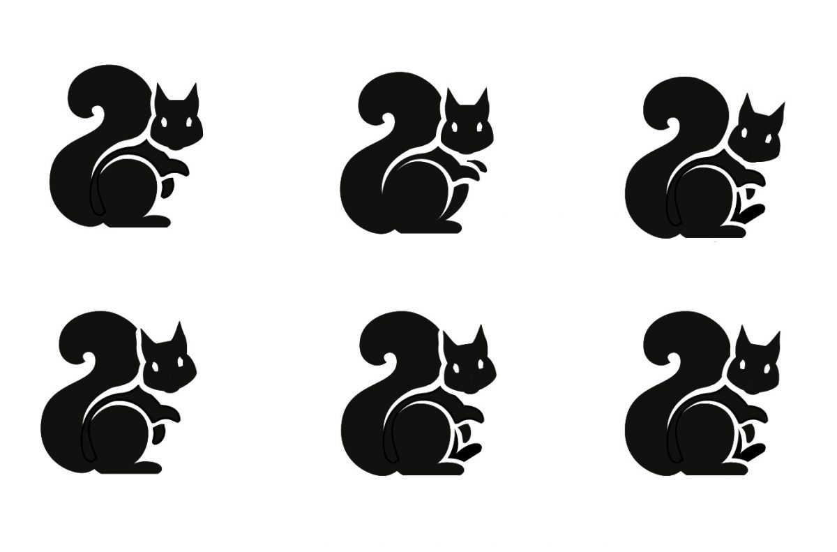
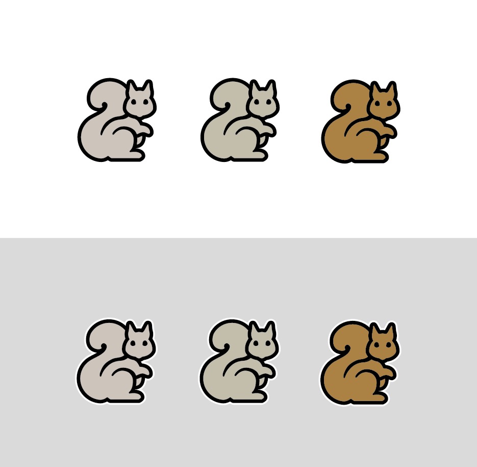
The finished logo works well as a Monomark: