Dieter Rams Braun Product Colour Palettes by Chad Ashley Post date October 20, 2023 Post author By Smithographic Post categories In Colour, Designer Spotlight
Letter M Logo for Sale designed by Smithographic℠ Post date January 26, 2023 Post author By Smithographic Post categories In Logos for Sale, Portfolio Tags Logo for Sale, Negative Space
Letter R Logo Design for Sale designed by Smithographic Post date January 18, 2023 Post author By Smithographic Post categories In Logos for Sale, Portfolio Tags Logo for Sale
WipEout Logo History 1995-2017, Making of the Wipeout Logo Design Plus Various In-game Graphics by Designers Republic and Fans Post date January 18, 2023 Post author By Smithographic Post categories In Designer Spotlight, Famous Logos Tags F1, Fonts, Gaming, Logo Collection, Playstation, Sony
Letter A Logo Design for Sale designed by Smithographic Post date January 16, 2023 Post author By Smithographic Post categories In Logo Design, Logos for Sale Tags For Sale
Letter M Logo Design for Sale designed by Smithographic Post date January 5, 2023 Post author By Smithographic Post categories In Logo Design, Logos for Sale Tags For Sale
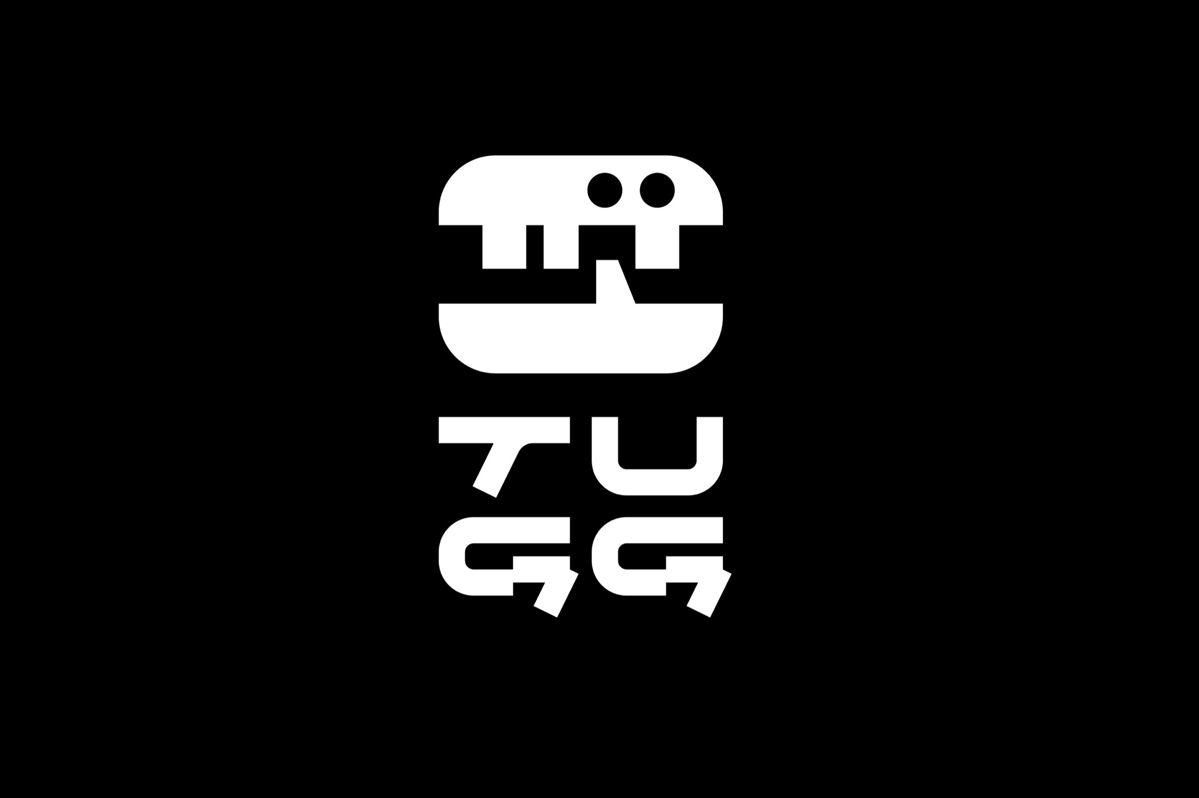
Tugg Identity by Kurppa Hosk Post date December 16, 2022 Post author By Smithographic Post categories In Designer Spotlight, Inspiration
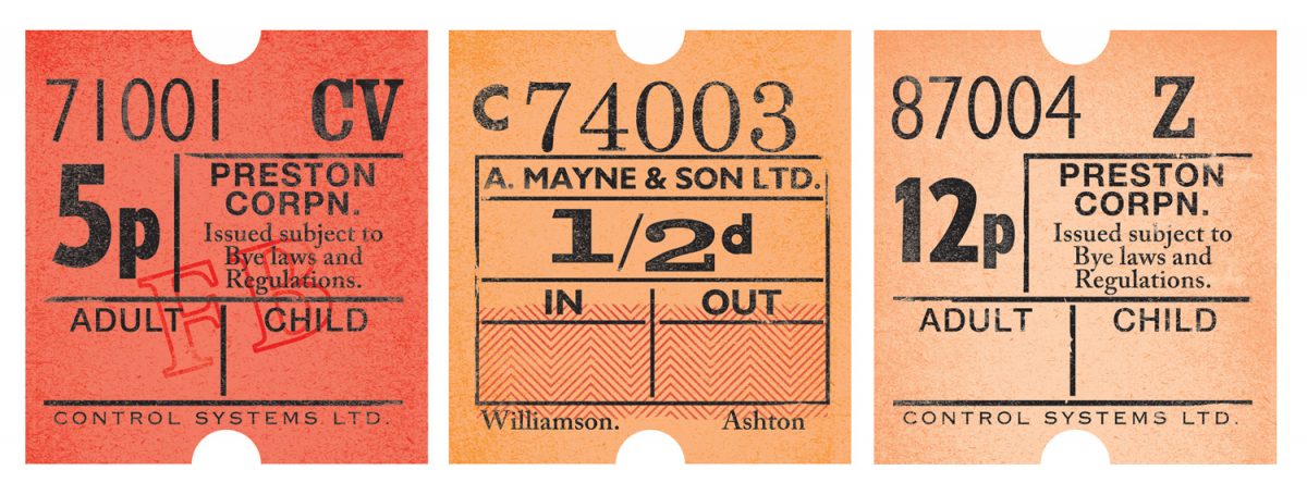
All Aboard – Vintage Bus Tickets Post date December 15, 2022 Post author By Smithographic Post categories In Inspiration, Typography, Vintage Tags Bus Tickets, Flickr, Vintage