British Steel Logo 1969-1999 Designed by David Gentleman – The Steel Symbol and its Application
Famous Logos are a dime a dozen, but the British Steel logo designed by David Gentleman — abandoned in 1999 — is one of those rare logo designs that truly stands the test of time.
It still looks good now even amongst a swarm of similarly styled monoline designs: CN, NASA, RAC etc.
I’ve also recreated the British Steel Logo Grid, which you can view and download at end of this post.
David Gentlmen
What’s extraordinary is that David Gentlemen is not strictly a logo designer. His impressive career spans nearly six decades, and his more notable work includes: illustration, stamp design, wood engraving, book and poster design.
When the British Steel logo project turned up on David’s doorstep—after the main agency had their work turned down—he was under a strict time handicap when he sketched the initial idea for the British Steel logo: two sheets of folded steel.
You can read more over on Eye Magazine & Logo Design Love:
David Gentleman talks about his identity design for British Steel.
Lost to the Archives
There really isn’t much else to show in terms of the British Steel logo applied in use: almost like it’s been wiped from history.
There are the odd references to this Eye Magazine article, but that’s about it. There are not many examples of the logo that can be found online save for same few images doing the rounds.
It would seem that Eye Magazine possible have more British Steel photographs via their Flickr account, but they are set to Private.
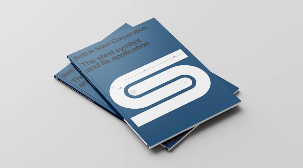
Recreating the: British Steel Symbol and its Application
As part of an ongoing side project, where I’ve been recreating old and famous logo and poster designs, I’ve also recreated the cover of the “British Steel Corporation – The Steel Symbol and its Application”, which you can see below.
The font used is actually Helvetica Neue Black 95.
As with the other recreations/reproductions, it has been created in vector and is saved as an SVG. This means you can simply drag and copy these images to your desktop, then you’ll need to drag the SVG icon over your Illustrator (or similar vector application) icon to open it.
If you double click the SVG file, it’ll likely try and open a text editor, rather than your drawing program of choice.
Compass Anyone?
There is one paragraph from an article that Eye Magazine published that took my fancy which describes the British Steel logo as a…
“Gentleman’s A size proportioned logotype, which can be replicated on site using a ruler and a set of compasses.”
Utterly stupendous. Now to find me a copy of the British Steel identity manual.
British Steel Corporation – The Steel Symbol and its Application
The British Steel Livery
Is it just me or does the British Steel logo look totally out of place on these lorries—I do, however, just love the British Steel blue; trying to search down an actual colour reference for it.
I can’t help but have this sense that the logo was ahead of it’s time when viewed with hindsight. It’s as though one expects the lorry to be a super streamlined beast rather than one that might be delivery the morning milk.
This is by no means a negative slur on the logo as I could never ever find any reason to, but it just seems like a design you would expect to see in use now rather than decades ago.
The British Steel logo much like the NASA logo, or even the CN logo, are all timeless and modern worthy classics that share this monoline style of logotype design.


LogoRIP
If you have a particularly belated sadness about the passing of the British Steel logo then you can leave your thoughts, prayers and condolonces over at LogoRIP.
Maybe light a candle as well.

The Old British Steel Logo vs The New British Steel Logo
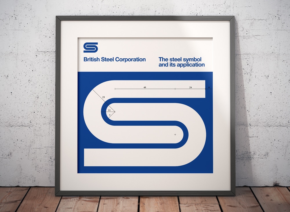
British Steel Logo Recreated for Download
The image above is one I created with a more up-to-date aesthetic for the symbols’ application guide; simply using the brighter British Steel blue, rather than the darker greyer blue, and set against a white background, with a nice little reversed headed above the British Steel symbol.
The image below is also an SVG, so you can drag and open as the ones above: