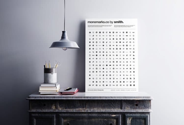
The monochrome logo mark poster is special collection of all my individually crafted: Logo Marks, Brand Marks, Type Marks, Emblems, Symbols and Icons, taken from my Logo Portfolios; Displayed in Glorious Monochromatic Techniblack, and specifically called Monomarks and/or The Monomark Collection.
I’m immensely proud of all the creative work I have done over the last few decades, and creating these posters has been a wonderful way for me to look back at some of the work I have created for so many clients.
The monochrome logo marks on the posters are not the entirety of my careers work (28 years now), but they are a good representation of some of my favourites and popular works.
Some of these logo marks are still in use by the companies I designed them for, nearly coming up to 10 years now, nearly Pure Storage (designed circa 2011), and Feedly (also designed 2011).
There are a few logo marks still being used that I designed around 2005/2006, so this is all so heartening and reassuring for me, that my work seems to stand the test of time, in some cases anyway. :)
I also created the monochrome logo mark poster as a way for potential clients to have a more accessible way to view a particular aspect of my logo design process, namely trying to ensure that each logo mark works in both colour, and solid black & white.
I’ll be first to acknowledge that not all of the monochrome logo marks look as good in reverse (white-on-black), purely because there was no call for the logo to be used in this way, but for the most part, they do work in reverse quite well.
Monochrome Logo Marks: The How
Some months back I went through my complete library of logo designs, and the monochrome logo mark designs—that were previously all bitmap JPG’s–and resaved them all to SVG (Scalable Vector Graphics) format.
This took like forever…
This now means every single one of my logos and monomarks in my website portfolios are fast to load; you can zoom in without any loss of quality whatsoever, and are generally very user friendly.
To make the posters, I simply imported each of the SVG monochrome logo marks onto the posters, then resaved the poster as a PDF.
So the downloadable versions of the posters are entirely vector artwork; no bitmaps in sight.

Download PDF version of the Monomarks Poster
As I mentioned above, I created these monochrome logo mark posters to display in my own website, a way to conveniently share the Monomarks portfolio online, and also to make sharing with potential clients super easy.
There are 2 version of the poster: black-on-white, and the reverse: white-on-black, both can be downloaded with the links below. The following versions of the poster are actual PDF’s of the SVG’s, minus the fancy decorate poster background (as see above).
I’ve bundled both versions into a ZIP file, and they are saved in my Dropbox, so the download link will take you to Dropbox:
–> Download Monomarks PDF Poster
About Monomarks
The following blurb has been taken from the official Monomarks portfolio page.
Some of the Monomarks you will see on this poster may not be actual logo designs in the traditional sense.
In these small cases the Monomarks will be an individually crafted: app icon, symbol, emblem or image, and therefore may not used to brand and represent a company, business or individual.
They might be used however to brand a: blog, phone app, or some other specialised/niche entity.
Why Monomarks?
Not all my logo and brand identity designs are in the Monomarks Collection, particularly if they are of a typographic stye, usual called by one of three terms: logo type, word mark or type mark.
The main focus behind the Monomarks is to focus on the graphical element of a logo design. The exception is if the logo design used by a client is wording without any associated visual imagery, and has some element of typographic design associated with it.
Examples where the logo is primarily formed from wording only, and included in the Monomarks: Pleasant Hill Grain, Focus, Grape, Black Vanilla, Skiplex, Sifterapp.
Detail masked by Simplicity
I go to great lengths to ensure that each logo I design works in its purest form; stripped of all colour and in most cases, all wording.
This allows the resulting Glorious Techniblack Logo Mark to convey the intended message in the purest way possible.
The benefit of a logo mark that works well in solid black is that it will often translate well to small sizes, such as those required for: application icons, social media profile images, favicon, avatars, etc.
And finally…
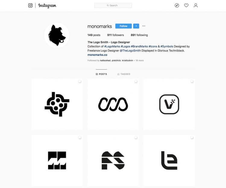
I have a domain http://monomarks.co that forwards to the Monomarks portfolio page, and additionally, the majority of Monomarks are on Instagram @monomarks :