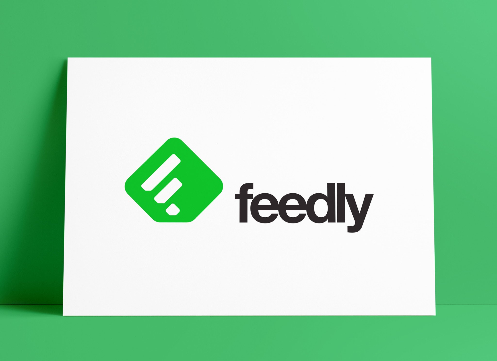
Smithographic worked with Feedly, a popular RSS application back in 201, to design a New Logo, and app icons for Android and Apple iPhone, along with other Web based icons designed for Feedly.

The initial rebranding consisted of: main logo design, general identity design, iPhone iOS application icon design, browser extension icon design, and iTunes gallery icon design.
The Feedly logo remains one of my steadfast logo portfolio pieces, along with the above mentioned Pure Storage logo.
Evolution of the Feedly Logo
For me, it’s always so heartening and rewarding to see one of my logo designs being used so many years after it was designed; the same is true for the Pure Storage logo and branding I designed back in 2011.
Since 2011, Feedly.com continues to use same fundamental logo and app icon that I designed which is a stylised initial F.
There have made some minor tweaks, to the Feedly logo and icon, over the years, including: flattening the colours and removing the gradients and shadows (trending at the time for iOS app’s etc), changing the green, and dropping the Feedly name.
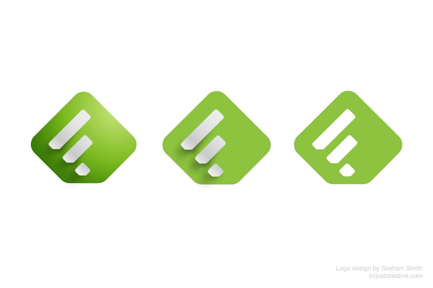
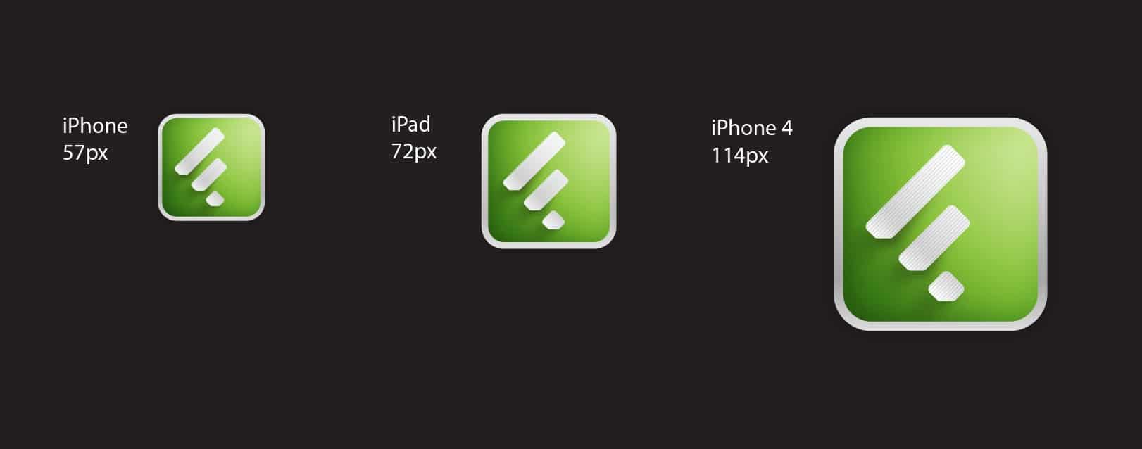
The first image (above) shows the initial incarnation of the Feedly App Icon. The first icon had full blow gradients and shadows, to help lift the icon off the screen.
The middle icon had the background gradient removed to a solid green, but kept the details in the white F.
The latest iteration is solid green and white.
The Feedly Logo and Icon Circa 2011/2013
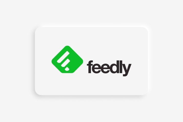
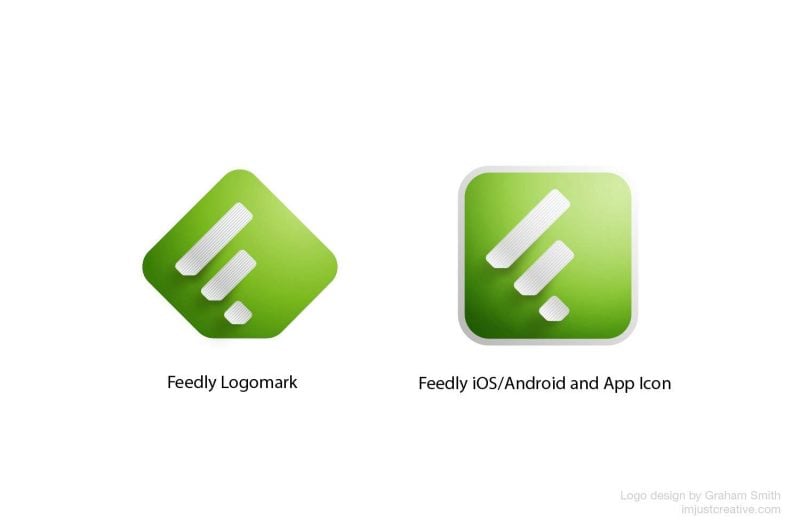
This image below shows the two original versions of the Feedly logo; the logo mark on the left was used for general branding.
The square version on the right was used solely for Application Icon uses.
This would have been the icon you would have seen on your iPhone, iPad and Android Smartphone etc.
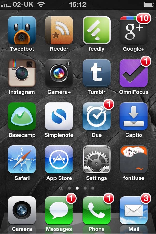
Back then there was ‘only’ the 1st Gen iPhone 3, the iPhone 4 and 1st Gen iPad to design and create all the various icon sizes for.
Even then, there were countless sizes and formats to create, and it took an absolute massive chunk of time.
Designing these realistic icons was soooooo much fun, and also quite the challenge. Aesthetics of late has become a trifle meh… Maybe we’ll see a swing back to this style of design in the not-to-distant-future.
Feedly Logo Animation
Feed Your Mind On The Go from Feedly on Vimeo
View original full-size HD Feedly.com Video
Feedly Video Credits: Motion Designer Mattias Peresini – Music OBNY Music & Sound Design
Feel particularly chuffed after seeing the above logo animation, and video.
At the time of designing the logo and app icon I had no idea that it may eventually be animated; to see it unfold at the beginning of this video has left me with quite a smile on my face.
If someone had asked me how I would have liked to have seen the Feedly logo animated, and if I was able to imagine it being animated, then this exact video sequence would have been how I would have liked it to have panned out.

The logo animation is brief, but the smooth laying down of the white strips on the green is just perfect in my mind, and really fits in with the initial concept and design process of this part of the logo.
I am so proud to be part of the whole Feedly.com experience and seeing my first ever logo animated in this way has really been a wonderful experience.
