It’s been quite a while since I shared any personal opinions/reviews on any major new brand logo or brand logo redesign, and thought I’d just quickly chip in with my initial thoughts on the Sony PS5 logo.
As to be expected, it’s taken the usual course, with pretty vocal opinions about: how unexciting the new logo is, and what a disappointment it is etc, etc, blah, blah, blah.
On a little side note: A while back I promised on Twitter that I would refrain from joining in with any online toxic criticisms of any new brand logo design and/or redesigns; I’ve been true to my word, and I have to say it feels highly liberating.
This obviously doesn’t mean I can’t share my positive thoughts on logo designs that I like, so here we are.
I’ve sat back watched all the usual criticisms of the logo, whilst I formed my own thoughts.
To be perfectly honest it hasn’t been hard, because: I liked it the moment I first saw it, even when it was with some negative headline clickbait bullcrap, so that didn’t sway me in the slightest.
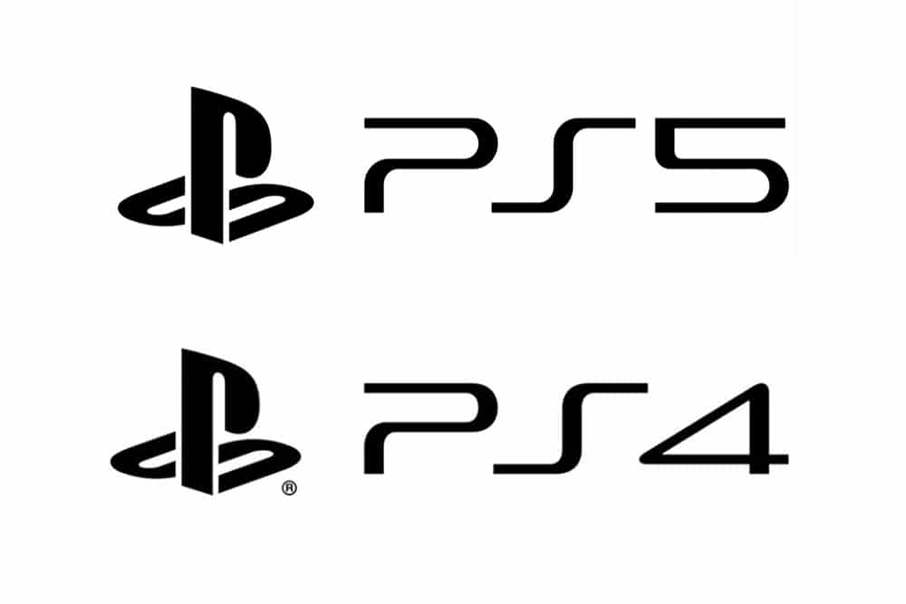
The PS4 & PS5 Logo

Few reasons why I like the new Logo:
Firstly: this format of logo style suites the number 5 more than the number 4 IMO, so straight away it’s a visual improvement from the PS4. Not that the PS4 logo was bad, I’m not saying that… just saying that the 5 seems more at home with the PS than the number 4 did.
Secondly: I’ve always loved the this style of PS logo, so sleek and modern, and one could argue possibly slightly ahead of it’s time? Regardless, Sony has a tremendous amount of brand familiarity, history and equity tied up this style of PS logo, and to simply change the logo dramatically, even for a spanking new console, would be quite the upheaval, and somewhat of a risky move.
Sure, if the PS logo sucked balls, and was raging badly, then a new design would sure be wise, but the PS logo just doesn’t seem to age… yet.
Thirdly: Sort of related to ‘secondly & firstly’, in that if it isn’t broke, then don’t fix it, and if it conveniently looks better overall than it’s predecessor, then that’s a convenient win.
I think it speaks volumes about Sony’s confidence with the PS brand in general, that it has ‘so far’ stuck with the same PS logo style going back many many years.
I say ‘so far’, because it’s not impossible that a different logo may ship when the console is launched, but I very much doubt it.
Keeping with the same is not Sony being lazy, or unimaginative, it’s simply a case of being wise and confident to stick with what works, and something that is instantly recognisable to millions of people.
Pretty sure that will have a positive effect of console sales (certainly not negative), rather than risking a brand new PS5 logo redesign, that would probably have received even more negativity than this one.
Some times you can’t win win in the eyes of the people, so it’s better to stick with what works, more so if what already works still looks awesome.
How to design the Sony PS5 Logo… in 5 steps.
Via https://t.co/tIck572kvr#sony #PS5 #PS5Logo pic.twitter.com/WqNccECqp6
— ᴛʜᴇʟᴏɢᴏsᴍɪᴛʜ.ᴄᴏ (@thelogosmith) January 7, 2020
The one thing I did share on Twitter about the logo, was a cute little animation on ‘how to design the PS5 logo‘. Who knows if that’s actually what happened, or if the process took a few detours, but it made me smile.
It made me smile because some times with logo design, we have just the right ingredients to create something totally accidentally awesome.
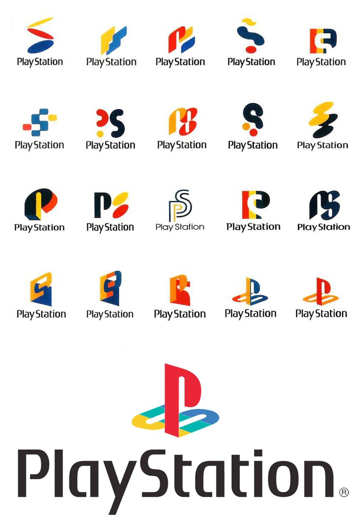
And to end with some fun, here’s sone old PS1 logo concepts:
