
This post is a run through for the Orb Web Solutions logo design. When the client approached my via Twitter, I was initially struck by the familiarity of the name and a sense of mild dread.
If there was ever a overused and rarely well executed image, it’s the orb sphere.
Orb imagery can be found in any number of places, ranging from the mystical, the now and the future.
Yet, at least in my opinion, the orb has rarely been designed with taste. Do a Google search for Orb and you will likely see 100’s of various incarnations of Orb.
You can’t really get away from the true nature of a Orb, you can’t just reinvent a whole new physical footprint for an already overused name just because it’s cliché and overused. Although in this case, I wish I was able to.
Live and immerse yourself in the pain
But these are projects that I love. It is a challenge and an opportunity to do add your own style, to maybe try and do something more tasteful. Revisit the rarely naked foundations and shed all the existing make-up, leaving the bare orb soul.
Below are just a few examples of existing Orb logos found online.
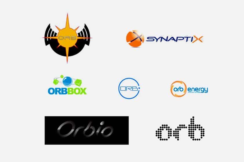
And this is what it ultimately came down to. Most existing Orb logos and images appear to suffer from the predictable gradients, the shimmering reflection, the semi-opaque and mystical layer of pixel abuse.
It’s predictable, and yes, based on what a real Orb might look like. Yet, the Orb is made to look like this vastly complicated, unwieldy and garish beast.
When the an orb logo has tried to be simplified, it has usually fallen foul of some tasteless font choice.
I know all this sounds rather arrogant and ‘hey, look at me, I can do better.’ The reality is, one needs to be critical of other examples and styles that are close to the subject matter you are working on.
You need to know in your own head what is acceptable, what is not acceptable in relation to your clients needs. Where you feel others have gone awry or been lead astray by a false sense of current trends etc.
If in your heart you feel can’t do better than what’s out there, then this is not a particularly useful place to be for yourself or the client.
So what I am saying is honest and open, but it’s based on necessity and it’s my personal evaluation. You have to make these evaluations and often harsh assessments of everything else out there that falls into the same category.
The client gives the nod
The client approached me after seeing my portfolio and my particular logo design style. It was he who requested that I try to something ‘clean and minimal’ with his logo. This was an acknowledgment from the client that a clean and fresh look was needed for the Orb Web Solutions identity. He himself was acutely aware of existing Orb imagery and needed to take the more minimalist route.
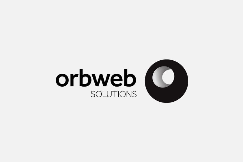
If the client had requested gradients, reflections and shimmering oil like textures I would have likely passed up on the project, it’s not really my thing. Although, as you can see from this first logo idea above, I did use a gradient to try and create this feeling of depth within and through the Orb.
I quickly took a cold shower as I felt myself drifting to the darkside, a dark damp place where gradients and reflections control the universe.
It’s so easy to get carried away.
The fact is, the Orb is a physical object, it does have reflections, it will mirror and shimmer in light. So what does this mean? Do you take it literally or do you dumb it down? Dumb it down was the decision. 2Dfy it. Make it less that what it actually is. Somewhat odd really.
You can’t always reinvent the wheel
I quickly realised that there is little scope to do anything truly ground breaking whilst retaining clean, simple and minimalist style aesthetics. In one hand this was frustrating, on the other hand, posed a wonderful challenge. Such a fine line between overdoing it and under doing it. But who is to judge what is over and underdone? That privilege would mostly fall to the subjectivity of each individual seeing the design, but more importantly, the agreeable nod of the client, in this case, Jason.
Trust is infinite
For Jason’s logo, I used personal preference more than usual. This was OK, because Jason had approached me based on my existing style of logos in my portfolio.
So in essence, that is a discrete nod from the client saying, “It’s OK, I trust you to do what’s best.” Fortunately for me, Jason also said this to me verbally.
It’s a wonderful thing when a client says that they implicitly trust your judgment on what is best.
Typography
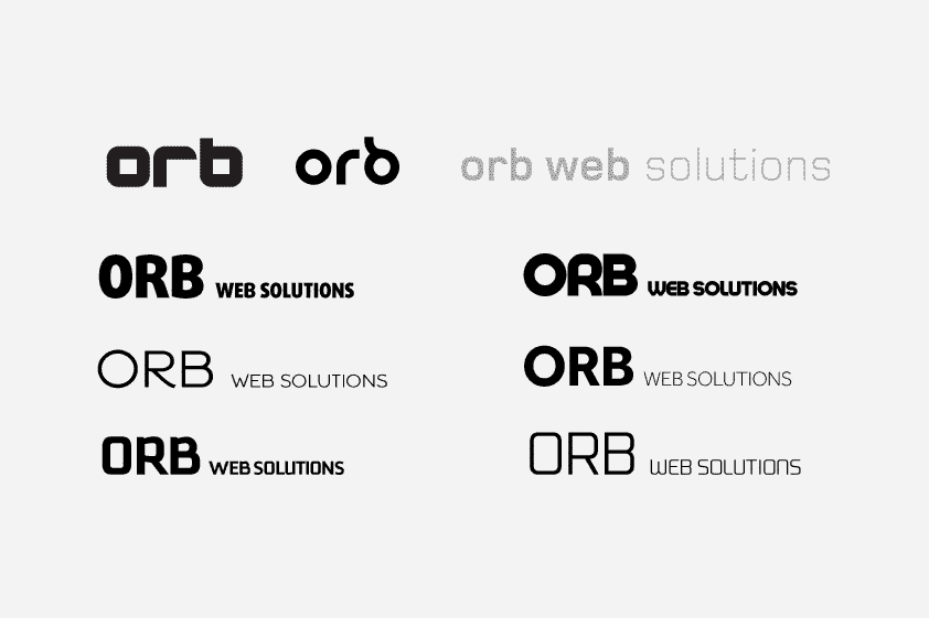
I looked at a number of fonts, and I did explore the obvious first. Checking out a whole variety of geometric styles, but all this did was to reinforce my belief that the font needed to be neutral, not too square, not too narrow and not too round. Too round and it runs the risk of being predictable and cliché.
If this was not called the ‘orb’, you would likely get away more with a more spherical font. Too square or narrow and the font would likely look out of place.
Other failings would be an overly trendy or futuristic font. This is the fine line.

I settled on Effra from Dalton Maag, this has been a reliable font for me, it has been used in a few recent logo designs. It has a fullness to it, but it doesn’t seem to be suffocating.
The all caps looks particular solid and reassuring. A close 2nd was Foundry Monoline.
Looking for ideas
With the font chosen, I had to find some way to make the logomark. Orb is the company name, so no getting away from this, not using Orb was not an option. This started getting a little tricky, really wanted to personalise this somehow, but avoiding my list of cliché imagery and visualizations.
The answer in the end was actually quite straightforward, create a custom Orb wordmark. This would provide the ownable nature of the identity, and would allow me to create something unique.
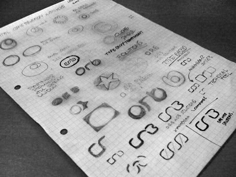
The overwhelming feeling was to start off by visualising ‘Orb’ as the company name opposed to trying to visualise a literal reference to a shiny, reflective three dimensional ‘Orb’.
Once I made that decision, it then narrowed my focus, and didn’t have to stress about falling into the ‘Orb’ cliché trap.
Sketching
The sketching started in Costa’s, looking at a number of options for the wordmark, some falling foul of the geometric curse.
The sketches at bottom of this sheet show the style of lettering that I ended up focusing on. I wanted to create a free flowing path where possible.
Each corner radius curve is identical, which helps keep the 3 letters consistent and feeling ‘as one’, even though there is a gap between the ‘r’ and ‘b’, but even with this gap, I hoped that the flow of the line would almost make up for this. Creating a sense of oneness where there wasn’t oneness.
I don’t always use a sketchbook in my logo designs, but in this case, being able to use the squared paper certainly helped visualize and experience with the letter forms.
Sadly I lost the most recent sketches showing the wordmark getting closer to the final design.
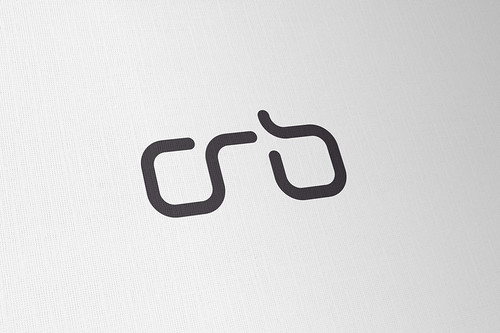
It took a number of attempts to get it looking and feeling just right, at least for me. It may suffer from being a little too ‘tech’, going against my earlier rant about modern typeface trends. My excuse is that it’s use is minimal and is not used for the main wording.
There is also the very real consideration that Orb Web Solutions is about technology, so I feel a clean tech look for this portion of the logo is more than OK.
All seeing
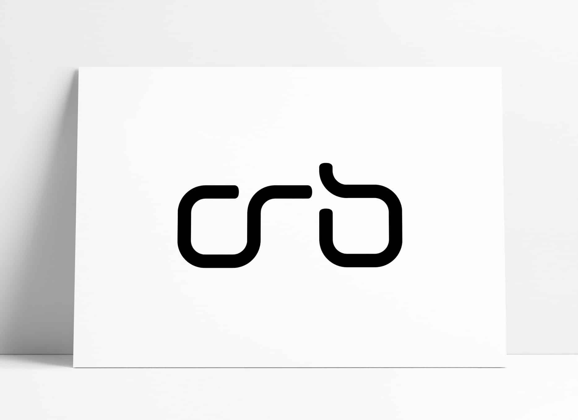
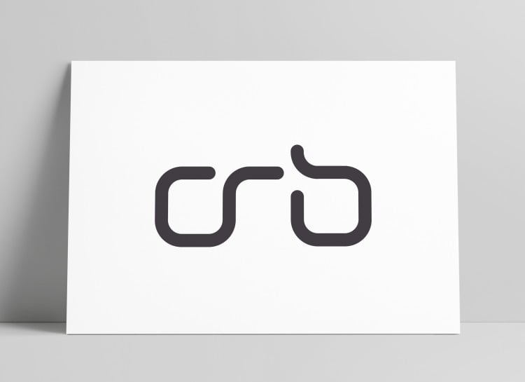
There is also an element of the Orb being ‘all seeing’ and ‘knowing’. What was interesting with the creation of this wordmark was that it ‘could’ resemble a pair of eyes or glasses’.
It’s not a strong association, and is not meant to be, but there is a subtle visual link here.
I see this more of a icon than the company name, it’s an iconic representation of what ‘Orb Web Solutions is about’, providing clean and free flowing web design and development services.
This wordmark is functional, it has form, grace and simplicity on it’s side and belongs to Jason. Because we are not doing anything dramatic or noisy with the logo in general, having this treated wordmark works.
Given that it actually appears quite small, in relation to the rest of the logo, it’s also subtle in it’s application. This image above is just for visual reference.
Trust your gut
I steamrolled with this idea, finalising it before showing Jason. I have reached a point with many of my recent logo projects where I am able to ‘trust’ my main idea.
Rather than providing too many differing sketches or concepts, on some occasions, when you feel you have a really strong idea, one that you are behind 100%, it then makes sense to only offer this one idea up to the client. Seems pointless to create choice when all that may do is create confusion.
I was able to sell this idea completely, and the client can sense your confidence and commitment to it. This goes such a long way in creating the right environment for a client to accept your idea.
Putting it together
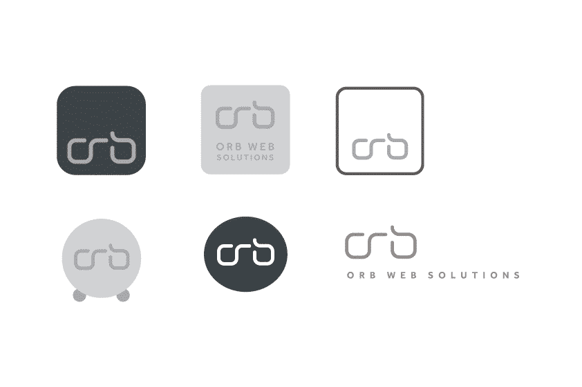
With the font chosen and now the custom wordmark, all that was needed was to put the pieces together. I did look at a number of alternative containers, some not even circular, basically giving a purpose driven 2 finger salute to the cliche and far to obvious circular Orb.
I looked at using the wordmark on it’s own, such as the lower right example, this was a desperate attempt to get rid of any 2D representation of that damn Orb. But I had to accept that in this case, an Orb is an Orb and is generally round.
I don’t see the final design, the round thing as a Orb, I view it as just another round logomark container. :) Works for me.
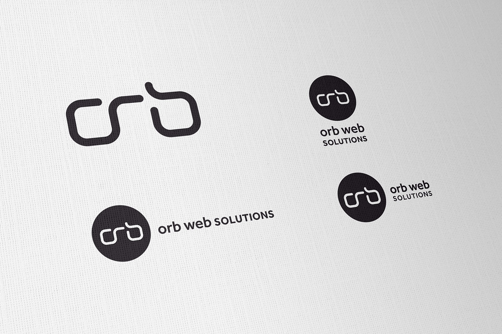
During the ‘putting it together’ phase, Jason requested a couple of logo orientations. Nothing unusual about this request, so we were able to come up with 3 logo versions, as seen below. Now Jason has some flexibility with the application of the logo.
Maybe he will use the single line version as the website header and then may use the vertically stacked version on his letterheads. Either way, the logo works well in each situation.
Final thoughts
Does seem odd that a design so fundamentally simple took as long as it did, yet this is quite common. Even though there were directions I knew we would avoid, I would still explore them as a matter of course. From the outset I was determined to design something clean, stylish, bold and functional, with an ‘ownable’ element and also a tinge of neutrality within it.
I am not for one moment suggesting this is the best Orb style logo out there, ever. Far from it. This was a personal challenge, challenging my own views and thoughts about the prolific use of Orbs in general. \
Determined to create a solution for Jason that upheld my own logo design style, the reason why Jason hired me in the first place. This is the crucial point to remember. Jason hired me for a reason, he felt I would be able to visualise the Orb in such a way that fitted with Jason’s aesthetic taste.
Keeping to the clients brief, keeping on point.
The ultimate test for any logo designer is not if your friends and colleagues like it, but if the client likes it.
If the client doesn’t approve you have failed, regardless of what your creative chums think. Jason loves this logo and is, shall we say, well chuffed.
 Client Testimonial for Orb Web Solutions
Client Testimonial: “I didn’t care about the exchange rate (US $ to UK/EURO) when I came across The Logo Smith’s logo design portfolio, and also his beautiful Monomarks portfolio.
I loved reading about Graham’s logo process and logo case study posts, both before and after my company’s new logo was completed. This is great insight into what truly became a unique mark for me / my company.
I came to Graham with a unique proposition that all high-end logo design — which is truly all we’ll ever venture to do — will be referred to him. This is more reinforced after viewing my finished product.
It IS about trusting the designer you choose, and I knew I made the right choice when I came across Graham/The Logo Smith’s style.
I tried to be the type of client for whom I’d want to provide services. By trusting his creativity, I got an end result that has received nothing but “wow” from everyone I’ve shown.
Currently, I have a very basic website up my company, but of course, the logo takes center stage… and may even suffer a bit from overuse of “make my logo bigger cream”. I could care less.
Thanks for the great work… FULL marks for The Logo Smith!”
Jason Reuter – Orb Web Solutions
Orb Monomark
