Medicine.com Logo & Brand Guidelines Designed by The Logo Smith
Medicine.com hired The Logo Smith to develop and design a new logo for it’s upcoming US based website, dedicated to providing medical facts from established and revered medical professionals.
Each article published in Medicine.com is checked by 3 other medical professionals, so as to avoid any incorrect data being shown and/or biased conclusions etc.
On a personal level, this is a lovely looking logo design, very clean, simple on the outside and looks good at all sizes. Its one of my favourites from all the logos I’ve designed in 2019, from my portfolio.
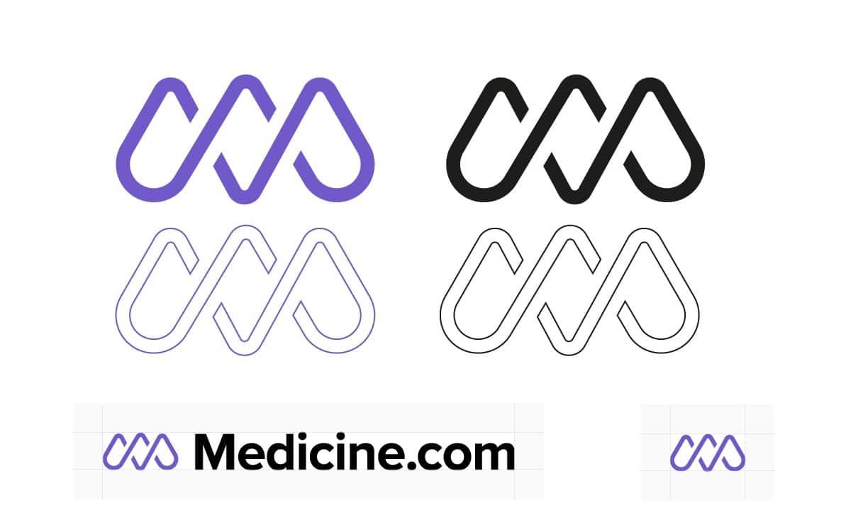
The black and white version, the Monomark version (below), of the logo mark looks particularly striking.
Medicine.com Logo Construction
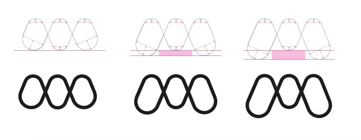
The Medicine.com logo mark is mostly based on a stylised initial M, but that also has a subtle reference to double helix & DNA.
The following two images show how the logo mark was initial formed from 3 separate angular elements.
These then had curves added to the tops and bottoms, then creating a looped strand that had spacial gaps created over the overlaps.
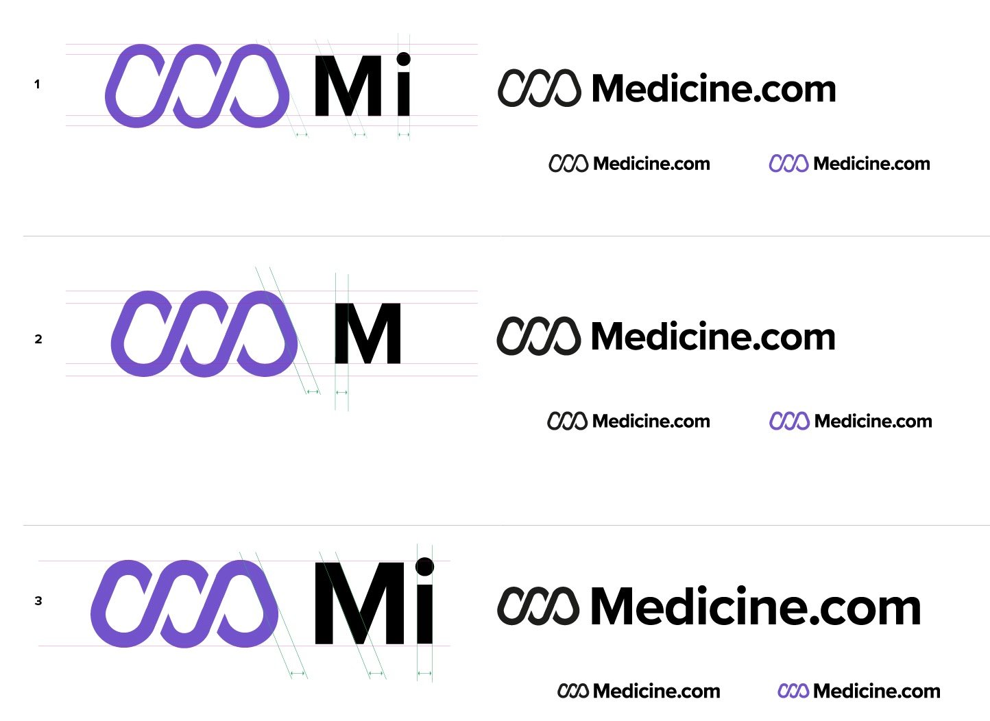
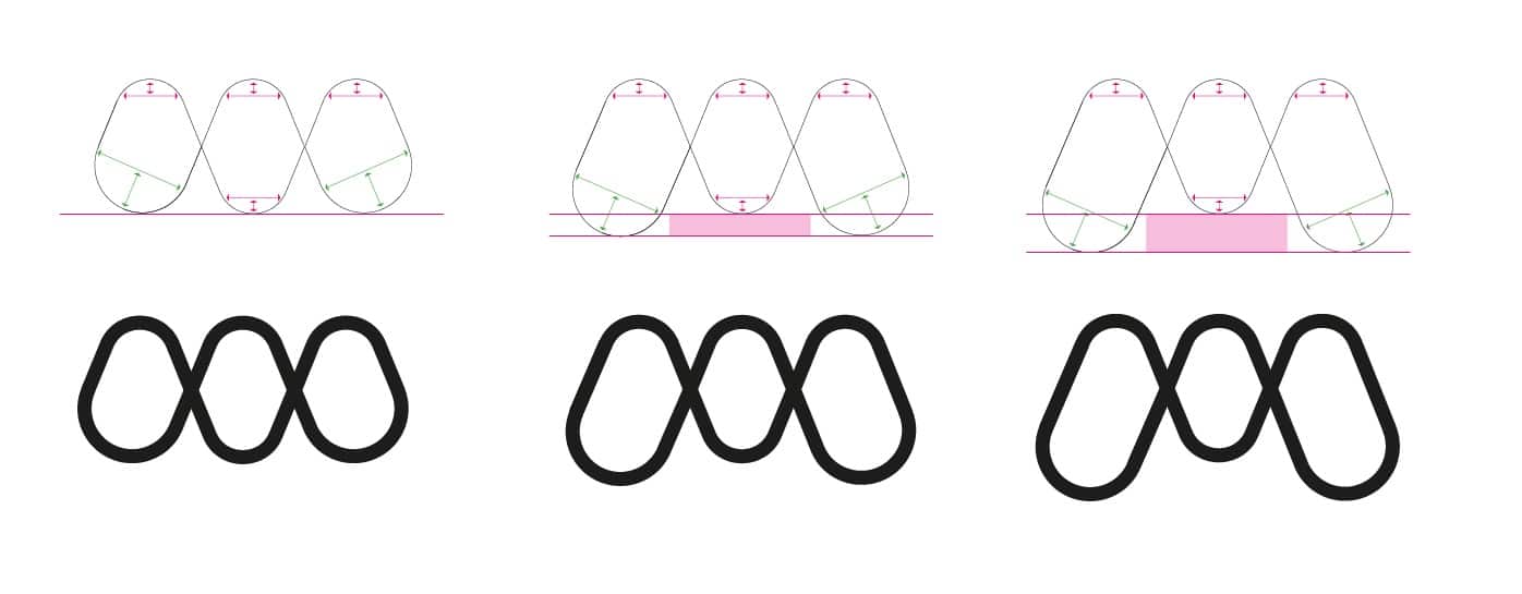
Medicine.com Logo Grid and Alignments
The image below shows a strict grid that the angles of the logo mark, and also the initial M were to follow. As well as these consistent angles 67˚ in each case, where the angles of the logo mark match the angles of the M, there is also a consistency with the vertical gaps in both the logo mark and also the brand name
The X & Y points in this diagram show the consistency of widths and heights that are used throughout the Medicine.com logo design.
The logo mark is taller than the upper case initial M, by the Y heigh, so that the inner negative space 3x X is used as for the horizontal alignments with the wording.

Medicine Brainstorming
During the development phase there were quite a few iterations of this logo mark that were developed before we settled for the final version.
Many, many, many styles of the M were looked at, along with contrasting font styles.
Ultimately it all came down to ensuring both the logo mark M and the initial M had consistent widths and angles, and that the font was suitably ‘geometric’ in style, so as to sit well with the fuller shape of the logo mark.
Medicine.com Brand Logo Guidelines Poster
Medicine.com Brand Logo Sheet Poster
Logo Usage Guidelines A3 Poster – Free Template for Download
You can download a copy of the above Brand Logo Guidelines and Logo Sheet Posters via this blog post.
I created this Guidelines Poster to a basic grid (you can see the guides in Illustrator), and created Illustrator layers for various sections and elements to keep things all neat and tidy.
You’ll probably need to adjust the layout and grid to your own specific requirements depending on your logo designs proportions and however many logo versions (portrait, landscape etc) you have, but hopefully this will provide a good platform for you to work from.
It was a nice touch I think to add in the visual step-by-step of the Medicine logo designs shape, as well as the grid and alignments, but not all logos will be able to be broken down like this, so it’s something that is optional.
For now the file is just saved as an Adobe Illustrator .ai file, so let me know in the comments below if you need any backward compatibility etc, and I’ll see what I can do.
–> Download Logo Usage Guidelines A3 Poster – Free Template for Download
About Medicine.com
Medicine.com is an Independent Peer-reviewed Medical & Lifestyle Information Website
Our aim is to be the most trusted, expert reviewed online resource for health related information. We will achieve this by presenting up-to-date and comprehensive health information that is peer-reviewed by medical experts and made available in a clear and concise format for consumers and healthcare professionals alike.
Your Health and Wellness is Important to us
We want to guide you through your health and wellness research with well written, comprehensive health information that will support and inspire you. We are only just getting started and have some huge plans being put into place to ensure we continue to support and guide you during your health and wellness challenges.
The Medicine.com Health Database
The up to date Medicine.com database is powered by a variety of independent leading medical-information suppliers. Individual drug (or drug-class) content and health articles are written and peer reviewed by medical experts and delivered by Medicine.com.
Medicine.com also publishes health content from other professional sources such as Healthday, Harvard Health, Merck Manual, Micromedex and the National Library of Medicine
Corporate
The Medicine.com website is intended for a U.S. audience and is hosted in a data center located in Dallas, TX, USA.