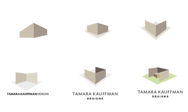
This logo process and case study post is for the Tamara Kauffman identity design; a company in design and project management on the refurbishments of domestic properties; Designing kitchens, bedrooms, bathrooms and office spaces.
Initial thoughts
I was quite excited when I read the initial brief for this project as Tamara does get involved with certain structural aspects with her job, a new kitchen to be planned, or a new bedroom suite, as well as paint and decoration.
So the fact that there was a structural element meant I could explore more than just cosmetic enhancements.
The Client Brief
The client brief seemed pretty simple at first, Tamara indicated she wanted an interior design logo that was ‘Classy. Modern yet traditional. Creative. Different.‘
As a further explanation of what she does, Tamara wrote: “interior design and project management on domestic refurbishments. Interior Design supply and install kitchens bedrooms and bathrooms to sourcing interior goods eg: tiles, wallcoverings etc. Domestic market initially with commercial market at some stage down my working career.”
It’s always a good idea to get as many visual examples of ‘liked’ and ‘not liked’ logo designs from your client. I always start the project with this request, give the client some homework and it makes them feel that they are now part of the process.
The other advantage is that some people just find it tricky to verbally explain what is in their head, so this method helps there.
It’s the easiest way to really get an idea of where there initial interests lie. That’s not to say you must blindly follow these suggestions, if you feel they are not representative of the brief or are just not appropriate, then its your job to point this out. But on the occasion where there examples tie in with the job, then it’s a painless way to ‘get on the right track’.
The other warning with this is to not let their suggestions keep you in a narrow lane of focus, it can be hard once you see their examples to automatically go down that route, but keep in mind it’s just a visual reference for likes and dislikes. Always try and find that elusive ‘magic idea’, but their suggestions may help you find that one awesome idea.
From this to that…
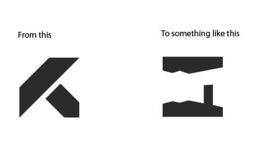
Tamara mentioned she liked the idea of a text only solution, or one with a nice monogram mark. The image above shows how I started with a stylised initial but ended up far far faaaar away from this.
This was just natural progression, and I will show the in between steps later in this post. But it did get a bit painful. :)
Expand on the brief
The initial brief many not fully encapsulate what the client, or the business is about. In Tamara’s case it’s quite a personal thing so I proceeded to ask her additional questions, further clarification on her business, asking her to define in deeper detail aspects of the job
It requires the client to think in a much more descriptive manor, this process can be very enlightening for both parties.
Her response to this was a bullet list :
- plan the layout and functionality of a new or remodeled kitchen/bedroom/bathroom
- functionality and use of a space
- consideration of the available working area, desires, and budget of the client
- consultation in the clients home
- Help clients choose cabinetry, flooring, appliances, worktops, and color palettes that fit the client’s home, lifestyle, and budget
- prepare and present a design sometimes changing through progress
- sub contract craftsmen
- oversee installation and construction
- artistic
- knowledge of building codes
- concepts
- manual drawing
- CAD design
- basic principles of architecture
The problem was that I could tell Tamara was a very busy women, and finding time to talk to each other was hard enough, so I knew that asking her to sit down and research aspects of her own business would be somewhat of a challenge.
Fortunately for me, Tamara was not above doing this, but it did have to be done in her own time. Luckily she was easy with the schedule, so we could take out time with this process.
In the end I got pages of keywords, descriptive sentences, images of logos she likes and didn’t like, lists of competitors, direct and indirect. After collating all this information you are closer to being able to visualise their needs.
It’s so important to really get into the head of your client and/or business. You are supposed to be visualising the personality of this entity, how else can you do it appropriately if you don’t push for answer and dig around.
At times you need to be quite forceful, but ultinately I find the project is a massive partnership.
I can’t design an interior design logo without their help, and vice-versa.
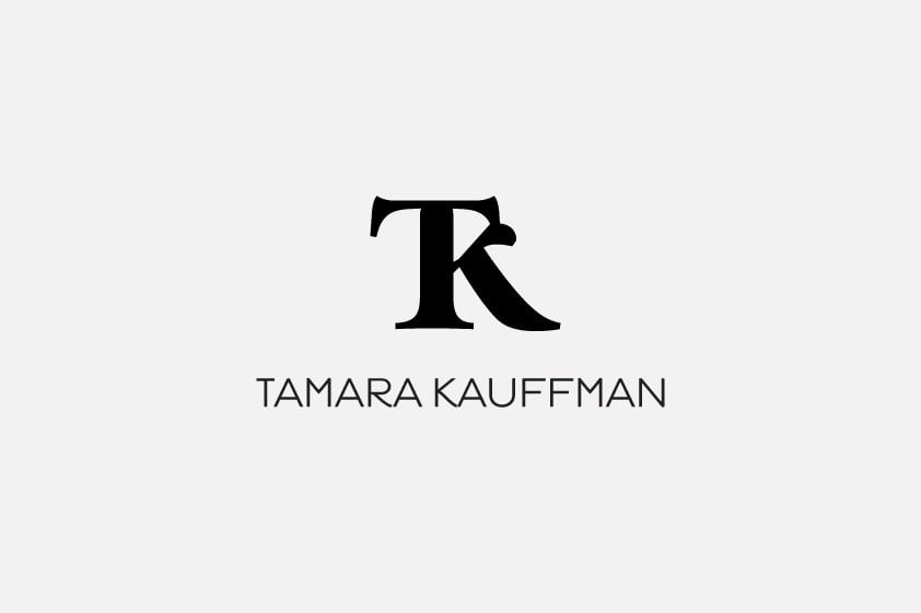
The above image shows one ‘exploration’ of the type only solution.
No sketches
Always hard to say if a project will have pages of sketches or just a few doodles. In my last two projects, I have over 10 pages of sketches for just one logo, yet for Tamara I only had one page. This one page wasn’t even really worth including in this post as it was just some mindless waffle.
Initially, I was focused on the initials, so typographic solutions I tend to go straight to illustrator, far easier to play with type this way then endless drawings of words. But as the project progressed away from initials, I still kept within Illustrator.
I think this is because it was mostly consisting of a more dimensional and straight edge look, so felt easier to manipulate the images directly.
The chances are that if I had started with the room idea first, then this would have gone to my sketchbook, but you just don’t know how a project will evolve.
Phase 1
Although I did eventually move away from initials, this isn’t to say I did so quickly. I spent some time looking at a type only solution, but it was too ‘easy’ a solution given how much background information Tamara had given me.
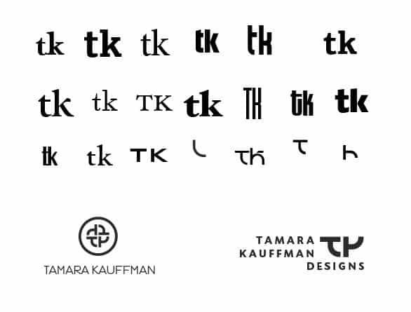
Part of this process was just collecting many font samples of the initials, to see what, if any, created the right feel.
Phase 2
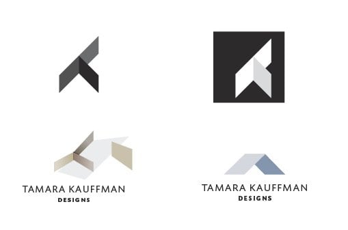
It is important to note that although much time was spent at this juncture, it was not all for nothing. This process lead me to play with a more solid type of initials. Angled blocks, at first just forming the ‘T’, but then later incorporating a vague representation of ‘K’. At this point I did look at the option of tools of some kind, but felt this would be a little too cliché.
Still no where near a logo, but this is all about exploration. What you see above is the equivalent to some sketches. After playing with these solid forms, things started to happen.
Phase 3 – Interior Design Logo Mark
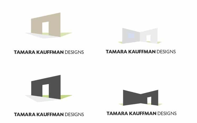
As you can see, the solid shapes started taking on a more dimensional quality, which lead me to think about ‘space’ opposed to just a flat mark. It seemed to make sense that the logo should convey the very elements of Tamara’s trade, buildings, walls, units etc.
So from playing with a rather odd shapped angled ‘T/K’, I ended up with what is best described as a wall partition, an outside wall and inside wall.
It was this progress that got me all excited. Suddenly the idea of just initials evaporated and the sense that there was something far more detailed and relevant was really exciting.
I still had no idea how it would work out at this stage, but I got the sense I was definitely on the right track. This was mostly down to the list of descriptive words that Tamara came up for me. They planted the seeds in my head.
Phase 4
So this is where things started to get more interesting for me, but also took a slight detour from my usual self restrained need to keep things simple.
I started playing with gradients, colour and what not. But the process was useful, even if I knew in the back of my head, the end result had to be less coloruful and less detailed.
As with any brainstorming or sketching, ideas that seem irrelevant help you form new ideas and new directions. So it’s important to keep in mind that nothing is a waste of time, it might seem so at the time, but it’s a process of experimentations and evolution.
You can see how the design is evolving.
I started out with a rather solid looking angled T, I have so far ended up with a colourful icon. I certainly didn’t plan for this to happen, so shows the value of having patience in this process, even if it’s still off base.
The question was how could I simplify the essence of a building or room, whilst still retaining a sense of perspective and depth, but without using colour and gradients?
The next stage seemed to just happen, more experimentation until I stumbled on something more concrete.
Phase 5
Things certainly starting to take shape. Going from top left to bottom left, then top right to bottom right.
I started with a single wall, in the middle of the interior and exterior groundwork, looked more like a paper plane of sorts. So moved back to black.
Needed to get my visual senses back to basics, colour can confuse during the development. Adding two walls seemed to balance things out, very open plan but this is where the idea really started to take off.
Removed the floor detail, I ended up focusing on just the walls. So we have gone from initials, to no detail, to lots of detail and now back to minimal detail. At this point I just took a break as I had been on this project for about 13 hours solid and my eyes were just ‘gone’. Not feeling too well at all at this point, but also pleased that I was well on the way.
Positive and Negative Space
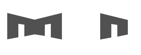
I came back to it more refreshed the following morning and sat down and just started at the two images above. Black and white, white and black. Looking for something to work with.
My first idea was to contain the image in a box, so a box I added.
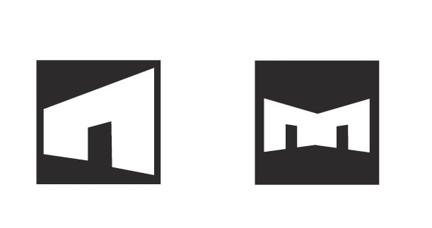
Looked OK, but I didn’t like the border at all. Felt way to ‘boxy’, even though that was the intention, I still felt it wasn’t quite what I had in mind. So what happened if I bleed the white walls out of the black box? And maybe whilst we are at it, add some tints and more detail.
So back to adding more detail, not leaving it out. But the process of adding and removing detail is what got me to this point, so I just allowed myself the luxury of playing with options, always mindful that my main aim was to keep it solid if at all possible.
Get your main idea, then simplify it.
In hindsight, it was the adding of the tints that stopped me from seeing the winning solution. Adding the tint created ‘noise’ for my brain, so I was looking at two elements, the background and the wall.
In my head I was trying to recreate some form of a room, with some minor features and door. So close. Yet still not happy.
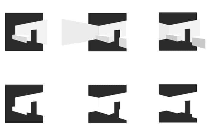
What was the answer? It didn’t have that ‘pop’ I was looking for. I was getting carried away, again. Adding units, tables and all those useful features. Needed to take stock at this point. Getting carried away is so easy, and often an important part of the process, if you can catch yourself doing it that is. That’s the key, if you don’t catch yourself then things can end up less than ideal.
The Solution
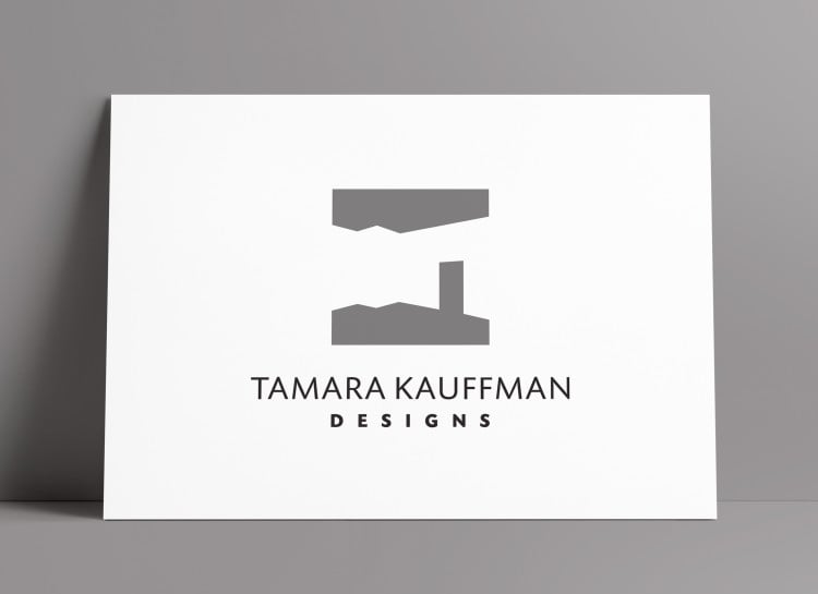
Remove all tints and gradients, once I did that I saw the ‘light’. A mix of negative and positive space, depending on which way you look at it.
The black box container actually creates the illusion of the ceiling and floor, whilst defining the two walls, the one corner unit and the door.
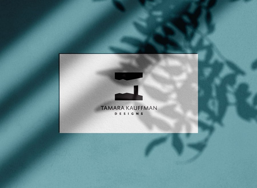
This was the answer, the simple solution I was looking for.
It was as easy as bleeding the walls past the black box container, so the whole image becomes more ‘free’, nothing obviously constraining it, yet the brain ‘should’ draw the boundaries of the black box.
At this stage it was just a case of playing around with the wall and door details. Adding the corner unit I felt gave it the extra visual lift it needed.
Typography
I ended up using Today Sans Serif Regular for ‘Tamara Kauffman’ with letterspacing set to 100. Today Sans Serif Bold for ‘Designs’ with letter spacing set to 200.
Showing the client
It terms of showing Tamara any ideas, I took a bit of a gamble. I have got into the routine of focusing on one ‘main’ idea, and prepping this to show the client. It’s a way for me to get 100% fully behind an idea, a lot of it comes down to how confident you feel about your design and if it is a viable interpretation of the brief.
So I had spent some quality time on this project and needed to show Tamara something quite soon. I felt supremely confident about this idea, and felt it captured a lot of the points in her initial bullet list.
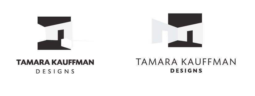
Fortunately Tamara absolutely loved it and no changes required. I made up two versions, a landscape and portrait version. The landscape version seen below mostly used for the website header, whereas the portrait version used for aspects of her stationery etc.
See other examples of my logo process posts, case studies, identity guides and download my logo templates and logo guideline resources for your own use.
Wikipedia: Interior design is the art and science of enhancing the interior of a building to achieve a healthier and more aesthetically pleasing environment for the people using the space. An interior designer is someone who plans, researches, coordinates, and manages such projects. Interior design is a multifaceted profession that includes conceptual development, space planning, site inspections, programming, research, communicating with the stakeholders of a project, construction management, and execution of the design.
