
![]()
Pretty pleased so far on progress of these icons I’m designing for a Color Picker & Swatch application, for iOS.
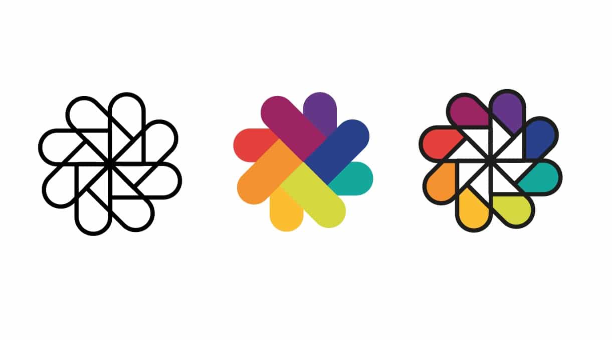
There’s already so many app icons, that are based on multi coloured elements, used for iOS applications such as: photography, drawing, photo editing etc, that it’s quite a challenge to design something striking, and hopefully relatively different and unique.
The overall theme is based on traditional coloured paper tabs, or swatches like Pantone books, but these are styled with very rounded ends.
![]()
Then the main idea was to fashion a form of ‘arrow’ into the ends of each swatch tab, so that it looks like a continuous movement of colour choice.
As this icon design project is in very early stages, I’ve so far come up with the two following variations, but I’m already leaning towards the right-hand sider version with the white arrow tips.
![]()
![]()
The overall theme is based on traditional coloured paper tabs, or swatches like Pantone books, but these are styled with very rounded ends.
Then the main idea was to fashion a form of ‘arrow’ into the ends of each swatch tab, so that it looks like a continuous movement of colour choice.
As this icon design project is in very early stages, I’ve so far come up with the two following variations, but I’m already leaning towards the right-hand sider version with the white arrow tips.
![]()
![]()