How Freelance Graphic Designers Promote & Brand Themselves
This is Part 14 of the Logo Design Round-Up series. This ongoing series showcases a collection of logos and brand marks, self submitted by a bunch of freelance designers and creative folk in many creative areas. These designers use the logos to sell, promote, brand and market their various skills.
You can view the much older series of posts here: Part 1, Part 2, Part 3, Part 4, Part 5, Part 6, Part 7, Part 8, Part 9, Part 10, Part 11, Part 12, Part 13, Part 14 and Part 15.
If you want to be part of this logo design series, then details can be found at the bottom of this post.
What this collection is not
This is not a competition, it’s not a best of, it’s not a who has the best logo, it’s not a collection of logos that I have chosen. They are logos supplied by those that wanted to be part of this post. And a huge thank you to everyone who has submitted.
This series will go on indefinitely, all the time there are designers prepared to submit their logo designs. If you have submitted recently, but your logo is not included in this post, don’t worry, it will be in the next one. I keep each post limited to around 12 logos per post, on a first come first served type of basis.
The logo submissions are displayed in alphabetical order, so no favoritism on my part here. :)
Logo Roundup – Part 14
Andrea Buck – anmadesign – Web design & Development – http://anmadesign.com
My logo has endured a number of changes over the years. I redesigned this version in 2007 for the redesign of the new anmadesign website. I should mirror a clean, simple and elegant style as I’m thrilled by a minimalistic design style. I’ve chosen simply “Century Gothic” as typeface.
The colors mostly black, grey and white which symbolize also simplicity, that approach is carried over to the whole website.
The three ladies (silhouettes or women shapes) are animated (just 1 decent loop) to give it a dynamic note and a female touch which comes back in most of my (web) designs.
Tad Dobbs – Creative Squall – Principal & Creative Director – http://creativesquall.com
The name Creative Squall came from the idea of taking a brainstorm to the next level, and since I initially work in a fury to get as many loose sketches out as quickly as possible it was a perfect fit.
I approached designing the Creative Squall logo with 3 intentions. 1) It needed to reflect my simple, clean execution of logo and brand design. 2) It needed to play up the dual meaning of “squall” as the roar of a strong storm or a war-cry. 3) It needed to be reflective of my process as a designer, specifically around the sketching.
The mark developed as I started exploring visual ways of indicating sound and kinetic energy. As I developed the visual sound wave I realized that if I stood it upright it not only implied the motion of a tornado but it allowed me to explore an “S” monogram. I opted to balance the frenetic motion of the logomark by using simple and slightly rounded letterforms while downplaying the word “creative” as more of a descriptive word. I rounded the letterforms in “squall” to further play of the symmetry particularly with the “U” and “A”. As a further play off the storm definition of squall, I modeled the tail of the “Q” after the symbol for a hurricane.
I always start every project with a flurry of sketches. Often I’ll develop up to 100 sketches before I begin tightening the pencils up, and way before I take the logo into Illustrator. I realized that as I was sketching my logo that I had been using the same brand of generic No. 2 pencils for most of my career. What was a surprise to me is that I know that the pencils aren’t that great, but that I had gotten so used to the colors combination of the light cream wood color, orange finish and grey graphite. I thought this was a fitting tribute, to build my brand color palette around an inspiration for my whole career.
David Arias – Independent Graphic Designer – http://www.arias.ca
I created this after graduating from University. I basically wanted to create the initials to my name in a geometric, and bold way. I guess it suited my personality and design style in some way. Bold, geometric and grid-like.
I also wanted to emphasize my personal design process where you can take one idea, change the angle of it or by looking at it from a different perspective it can become a total different idea. This is how I saw the “d” when I designed it, and turned it to form an “a”. I do this a lot in logo design, take one idea, flip it around, angle it, or morph it in a way that still communicates a message, but in a different way. Accidentally, the end result just ended up being an ambigram.
Martin Merida – FireTide Creative – Logo & Brand Identity Designer – http://firetidecreative.com
My goal in designing the FireTide Creative logo was to come up with something simple with clean lines and a corporate feel. I wanted the “flame-wave-swoosh” separate from “typography” so that it could be used by itself.
The design works well on both dark chocolate and white backgrounds.
Rohan Likhite – Graphic Designer – http://www.imrohan.com
My name is Rohan Likhite and I’m a Graphic Designer. I wanted to design a personal logo that would stand out while being as minimal as possible. I looked at several minimal logo designs for inspiration. I took inspiration from several places including the Leica camera logo as well as from Ikea and Catch 5.
I love typography, so I began to create a logo that would emphasize the text. Helvetica was the ideal typeface not only because of its clean and structured design but also because it is one of my all-time favorites.
Dean Hudson – Graphic Designer – http://minusfront.com
The main requirements for the Minusfront logo were a simple graphic mark paired with a contemporary typeface. The three chevrons originally represented the three founding designers of the business, but it now symbolises the disciplines we work in: print, web and logo design.
The typeface used is a modified version of Soho Gothic, although the symbol will often be used without the word mark.
SDX Media – Marketing Manager – http://sdxmedia.com
My full time job is Marketing Manager for HMG Paints Ltd, the UK’s largest independent paint manufacturer, however I freelance under the name SDX Media, which encompasses web and print design, along side logo and identity. Never done any promotion and all work has come through word of mouth or recommendations.
The name SDX comes from my initials followed by the Roman numeral for the number 10, a number that holds personal significance.
The font is a modified version of Futura at different weights, with slight curves added to certain letters.
The X icon is a version of a common doodle I draw that has been reflected to create the X shape, the doodle can be found on various pieces of paper i use with the earliest instance i’ve found being one of my school books from over 10 years ago.
Max Shelley – Freelance Web Developer – http://teachingjane.com
In my web-based freelance work I am often considered a “coder” rather than a designer, despite the fact that I often do the bulk of the graphic design for many of the sites I work on. This means I seem to be handed a logo more often than not, and there is usually little room for manoeuvre as it’s already been printed on someone’s letter-head or ‘Tracey in the factory likes it’. With this project I was able to start from scratch.
The idea behind Teaching Jane is simplicity and accessibility, with a personal touch, so a hand-written feel was important to me, but it needed to be highly legible. The website features my Mum, Jane, heavily (not in a weird way, she helps people in the lessons) and the colours are actually based on what I thought would suit her. The logo is always presented on the site and associated materials against a plain white background, to highlight simplicity throughout.
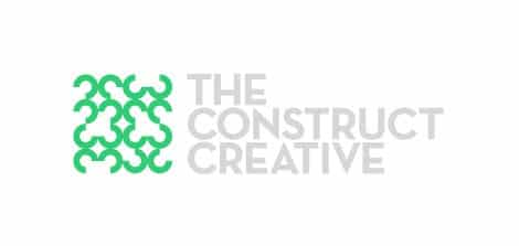
Hernan Valencia – The Construct Creative – Art Director – http://www.theconstructcreative.com
I’ve been putting off my own branding for a while now so I decided to finally nail it down. Will I ever be completely satisfied? Probably not. I’m never really finished, I’m just forced to stop working on it. I knew that the form-giving and typography had to be different from the symmetrical, clever play on initials, norm— to have a slightly more European style and to be able to use it a several different ways (think MTV’s Logo). I also knew that I wanted to include a mark or emblem that I could use as a ‘stand-alone’ without the actual words.
After submitting the work as a poll on my website, I got a lot of feedback that I really appreciated and thought over. The problem was that the mark I liked so much, no one else did (well, maybe a few people) But the majority wanted a classic play on geometry, balanced and centered. That bored me to death! Even though I could see it as a successful design, I thought that only designers would like it. And that was the problem, I want to move potential clients, to be different from the pack, to represent myself and not get lost in the myriad variations, trickery, or even get sued for ripping off such a familiar solution. What does the Construct mean? How can I convey that without looking like a construction company? I then realized that I could be very primitive and abstract, I had to be.
The emblematic component is a combination of photography (as it mimics a halftone), Illustration (as it conveys fluidity) and Design (as it conveys broken down geometrics and patterns). The Construct is a combination of different materials and parts, much like myself. I like to get involved in all aspects of communication design, from branding to conceptual and editorial illustration to photojournalistic imagery. The typography was a painstakingly long process. I broke down and had to buy Neutraface from House Industries. I also went against my design schooling and decided to go with all capitals letters. The words weren’t that long and to make it easy, I broke the words down like steps to be read. I needed them to be strong enough to balance the eye-catching emblem. I think I succeeded.
Color wise, I wanted something neutral. Aside from having an affinity to green, I wanted to convey nature and industry. I love the organic nature of life as well as the consistency and efficiency of industrial fabrication. Rural and Urban. I’ve lived in both geographical areas.
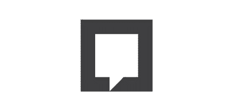
Rui Pombares – TOKENdesigners® – Logo & Brand Identity Designer – http://token.pt
The main goal of this logo is a formal meaning of “communication”. This solution was developed from what I consider a powerful communication symbol and maybe universal, speech bubble.
The final result displays a speech bubble inserted into a simple geometric form, balanced and versatile, a square.
Submit your own logo design
If you want to add your own logo to forthcoming versions of this post, then check out this post ‘I want your creative business logo for forthcoming post’.
If you do submit a logo, then please ensure you submit a few paragraphs about how the logo came into being etc. Without this information I can’t add your logo.

