![]()
How Graphic Designers Promote & Brand Themselves – Logo Series 16
After a good few years hiatus, the once popular: How Graphic Designers Promote & Brand Themselves, is now back.
Back with a fresh new selection of logo and graphic designers of many disciplines and niches, including but not limited to: logo design, icon design, graphic design, web design & development, UI & UX Designer, photography, illustration, and even fresh new talent in the form of design students and apprentices. :)
What is it?
What you’ll fine below are the brand logos of various graphic designers, and a summary of what they do, and maybe a brief explanation of the thought and reasoning that went into their logo design.
That’s it really. Nothing else other than a little showcase of designers brand logos and a brief bio.
Want to be Part of This?
If you’d like to participate in the next Logo Series, then please just visit this post for the required information: How Do Graphic Designers Promote & Brand Themselves
or grab me on Twitter:
How Graphic Designers Promote & Brand Themselves – Logo Series 16
![]()
Chloe Clements – @ChloeClem91 – Chloe Clem Designs
I offer a graphic design service that is simple but unique. I help small brands establish who they are and what they want to say about themselves. I wanted my logo to communicate to my clients that I love minimalistic, edgy but simple design.
Black and white is something that can be used in any way.
My logo can also develop using any colour to accompany it. I wanted to create a brand that represents class and trend showing people that I know how to do the same for their small business.
![]()
Sandile Mnguni – @SandileSandro
I’m a 23 year old from Pretoria, South Africa. I’m currently a graphic design student.
With the Lion Heart logo, I wanted to create a clean logo using only geometric shapes. I wanted to create a logo that could be versatile enough to be used on almost anything.
![]()
Dick Blacker — @Dick_Blacker — https://dribbble.com/xDick
I’m Dick Blacker or xDick in the design world, and long ago I started as a print-worker at medium advertising agency. But all things will pass and now I’m creating marks with all my love to design.
All my life I was trying to find my niche and here I am. So for the self branding. It’s really the hardest thing – to create a personal logo. And after plenty of time, finally I like the result.
“x” is my philosophy, it’s my life, my foundations, this is how I live. And this is me.
![]()
Alex Kirhenstein – @draward – Corporate Identity & UI / UX Designer – http://draward.com
My name is Alex Kirhenstein. Also known as Draward since 2003. My logo design / mark always has been a representation of me and the way I work. I never wanted to be or look like a company.
I present myself as individual designer and person who can help clients with their projects within a friendly and collaborative approach. Draward is a place where the designer and company owner can make a perfect work together.
Regarding the mark itself, It’s the result of large amount of iterations and ideas. This logo hides multiple ideas in it. First and most obvious is the letter “D” which is the first letter from Draward.
Secondly this mark represents a sail. My country has been linked with the sea from ancient times and this pays respect to that history of outstanding sailors and ship builders. Thirdly it’s a road. This symbolizes the never ending process of making yourself better, learning and experience.
![]()
Logo Geek – Ian Paget – @Logo_Geek
Working for an agency I’ve always had side projects that would challenge my design skills, and allow me to learn and improve. After working on a long-term personal project I turned to logo design, as it was something I enjoyed, could be done quickly, and could easily fit around a full time job without burning out. I set up Logo Geek, a name I selected after searching endlessly for domains, and finding the uk domain was available.
What started out as a fun side project has since grown into a strong personal brand, and a real passion. I frequently work on logo designs for paying clients, and run an active social media group for designers where I share the latest and greatest logo and branding resources. It’s still a side project, but I have long-term plans to do so much more!
For the logo I wanted something that was very simple, clean and precise. Something that would remain timeless, yet allow flexibility as I grow. I focused on creating my own personal typeface that I could use on everything I do, be it different websites I work on, or future books.
I feel I’m a hard working individual and can be quite serious, putting a focus on strategy and goals, so was keen to have a design that reflected that mentality. I also considered the perception of the brand when potential clients visit. Logo Geek as a name can sound low-end, so my goal was to give the impression of a mid to high-end priced design service on first look.
I believe my most identifiable mark is my social media icon, a photo of me, which I make an effort to use everywhere I go online. For me I believe this is more important than my type based logo as most of my web traffic comes from social. Because of this I include the icon in a prominent position on my website to aid visual match and recognition from social visits. For that reason I’ve included this icon within the logo image provided.
![]()
Kyle Robertson – Graphic Designer – @kyledesignman – http://be.net/kyledesigner
Creating a new identity for anyone is a challenging task. But to put the creative spotlight on yourself is an interesting experience for any designer.
I set about rebranding myself in an attempt to establish myself in the design community and present myself in a more professional and appealing way.
Using my own signature as a starter point, I roughly sketched out a few ideas of a new logo mark and settled on a crest made up of a few different elements. A Scottish lion symbol, a date stamp as well as a customised type version of my own signature. All of this supported by my surname and profession.
![]()
Gary Wai-man Kwok | Wai Logo Design | http://www.garywaiman.co.uk
Here’s the truth straight up. I’m not a designer. I’m trying to be (according to the tagline on my blog). But by trade, by experience and by formal qualifications, I’m not a designer. I only love everything about design and try to self-teach as much as possible so that I can build a career that I could love.
And the logomark is a similar story. Actually, I hope that you can see it trying to be clever (just like I’m trying to be a designer) with the negative space forming the letter ‘a’. But as well as trying to be clever, the logo represents what I love – things like the use of negative space in logo design. The orange bits aim to give it a bit of movement.
Hopefully, I can grow it to mean something career wise.

Daryl Woods – Public Image Design – http://publicimagedesign.com/
In the 30 years since I founded Public Image Design, this is the fifth logo design I’ve created to represent the company. It’s also the greatest departure from previous versions which evolved from an eye graphic in blue and gold.
The inspiration for the new logo came from the work of graphic designer John Langdon. Mr. Langdon is one of the foremost authorities in the world on the subject of ambigrams.
An ambigram is a word or symbol that remains the same when transformed by rotation or reflection. I first marvelled at Langdon’s work in the Dan Brown novel Angels and Demons.
About a year ago, I discovered John Langdon’s own book, Wordplay. As I pondered the many brilliant designs in the book it suddenly occurred to me that my company initials in lower case were a natural fit for an ambigram.
As with any design project, I explored dozens of solutions. Most of the reference typefaces I looked at were quite gothic in nature but I wanted something slightly more modern and adapted this one. The “p” is a rotated “d”. The “pid” came with modest effort.
The dot of the “i” was a greater challenge. It was one of those problems you revisit again and again over a period of days. The solution was to stray from the strict angles and geometry of the letters and introduce a more playful, freeform element. It perfectly reflects my design style.
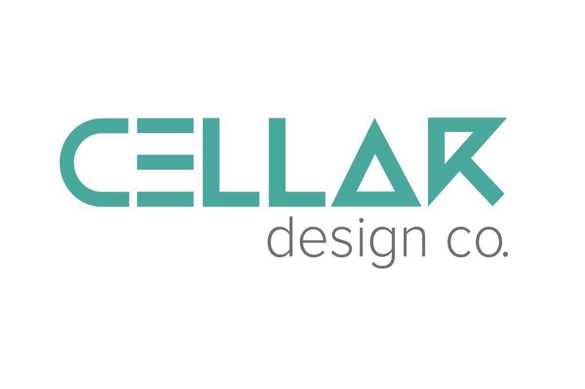
Nick Barnard – @cellardesignco – http://cellardesignco.uk – Graphic & Web designer
I didn’t want to use an existing font for the main part of my logo so I created the lettering out of simple geometric shapes inspired by some nice hand lettering I had seen a while back.
This is paired with Proxima Nova Light for the “design co” part for some contrast and improved legibility.