A previous large client of mine, Pure Storage (I designed the Pure Storage brand logo design), approached me to design a retro-cool logo that would be used to brand a fun side-project of theirs, called: Puritone Records.
This was one of the quickest turnaround logo design I have done, and especially one for such an important client as Pure Storage.
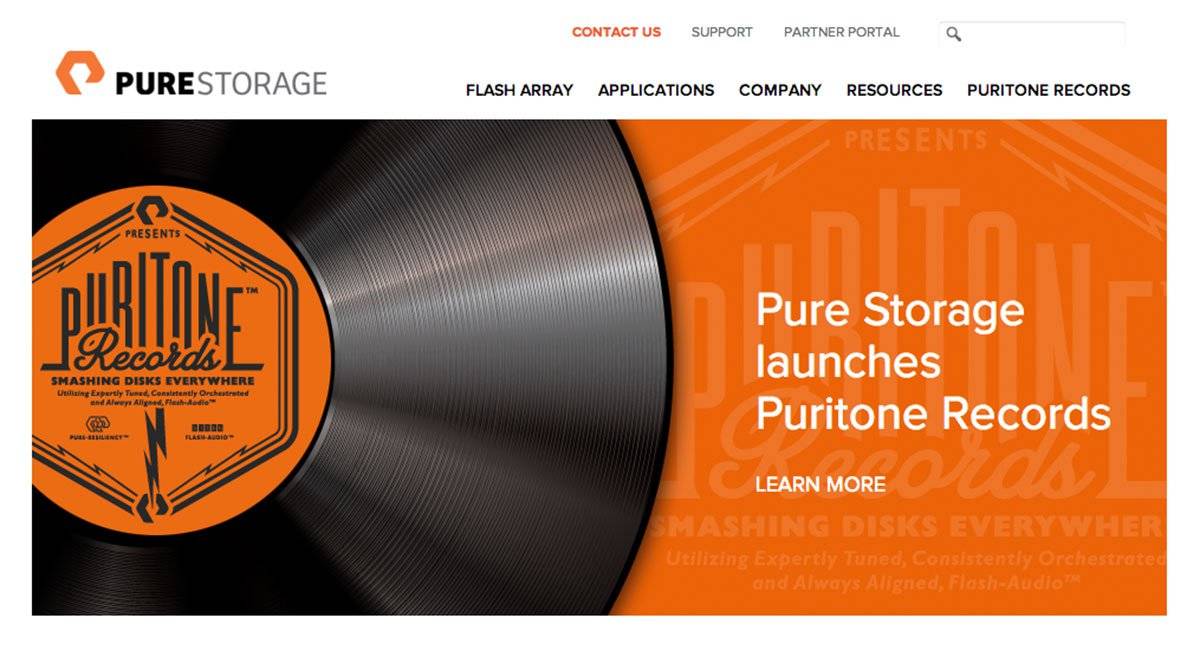
Puritone Records Logo in 5 Days!
I had just 5 days to come up with an idea, and have the files ready to give them for April 1st.
In fact, I started on Tuesday and had the main idea ready to present on Friday. The client’s response to the 1st and only idea? “Holy s**t this is awesome!!! Really, really like the idea!”
Then I had from Friday, and the weekend, to perfect and polish this idea to final files for Monday. Easy…
![]()
Background on Puritone Records
This is a truly awesome way to market your company, and provide a fun and entertaining means to entice new customers in, and provide entertainment value for existing clients.
By playing on the versatility of flash based storage, Pure Storage have created Puritone Records formed of The Puritones group, to remix popular songs with flash based lyrics!
The quality of these covers/remixes shows that no expense has been spared with this fun side-project, and going as far as to put the songs on: Apple’s iTunes, Amazon, Google Playstore, emusic, and X-box music!
If you’re interested, you can also listen to the full-length versions, for free, on The Puritones website: Puritones Records.
There are currently 4 tracks to listen to, and I have to say, they are pretty bloody amazing: SolidState, Read and Write, Timber and Flash it Like it’s Hot.
My personal favourite is SolidState, just love the original version anyway, but hearing it with somewhat nerdy lyrics really is quite a buzz.
![]()
The Puritone Records Logo Process
I started with the Puritone Records logo type, this would be just the wording, and once I had this general idea mocked-up, it was then a case of then designing a faux record label version.
A few major requests from Pure Storage: that the overall container of the logo be of a similar shape to the Pure Storage logomark (that I had also previously designed for them), a clearer visual example of their logomark within the finished piece, a sense of anti-harddisk sentiment, and an overall design style of reto-cool.
It was somewhat fortunate that when looking at where the Puritone wording would sit, within a rotated version of the Pure Storage logomark, that I immediately saw at least one way to utilise this narrowing space towards the top: which was to progressively heighten each letter of Puritone, which created a pretty funky, and distinctive, typographic style.
The retro style, and efficient use of this narrowing space, was further enhanced by the use of a heavily condensed font.
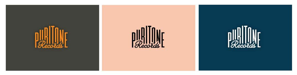
Given the somewhat quick turnaround, I really am chuffed with the results. Not only did I give them the main Puritone Record logotype, but the actual label version was somewhat of a bonus.
Or, one could look at it that the logotype is modular, allowing for a convenient and flexible logo system. So if the the main label version might be too tall, then the smaller logotype version can be used independently of the record label.
![]()
The Puritone Records Logo Design Narrative
There is an actual story, or narrative, to the logo/label design:
At the very top we have Pure Storage, the main parent company surrounded by a couple of white flash-bolts (Pure Storage is a flash drive manufacturer).
This leads into the Puritone Records wording, with the accompanying, flash storage/music themed, tag-line (which I also came up with), “Smashing Disks Everywhere: Utilizing Expertly Tested, Consistently Orchestrated and Always Aligned, Flash-Audio”.
From this tag-line a massive flash-bolt erupts out and continues it’s journey towards the bottom Pure Storage logomark.
I also added a few token elements, reminiscent of the sort of thing you might find on a vintage vinyl record, but tailored to Pure Storage, Flash, Audio etc. On the right we have a version of the Stereo symbol, but in this named Pure-Resilience, and a reference to 512kb Flash-Audio, on the right-hand side.
![]()
![]()
I did explore some more literal versions of the anti-disk theme which used various forms/shapes of harddrive disk platters.
However, the inclusion of yet more graphics in this enclosed space made for quite a messy and busy lower half, and with the time not on my side, the decision was to leave these out.
Although they may have added more weight and emphasis to the anti-disk theme, it would have done so at the expense of the overall aesthetics.
Puritones Logo Outline View
This image below is the standard ‘outline’ view mode in Adobe Illustrator. No stray bits, no overlapping/underlapping excess paths, just pure and clean vector logo goodness.
![]()
Something to look out for
Partly due to the frenzied nature of this project, but also mostly down to actually not realising this would ACTUALLY be used to go on a proper physical vinyl record, can you see an obvious, and completely unintentional, omission to this logo design?
Answer bottom of page.
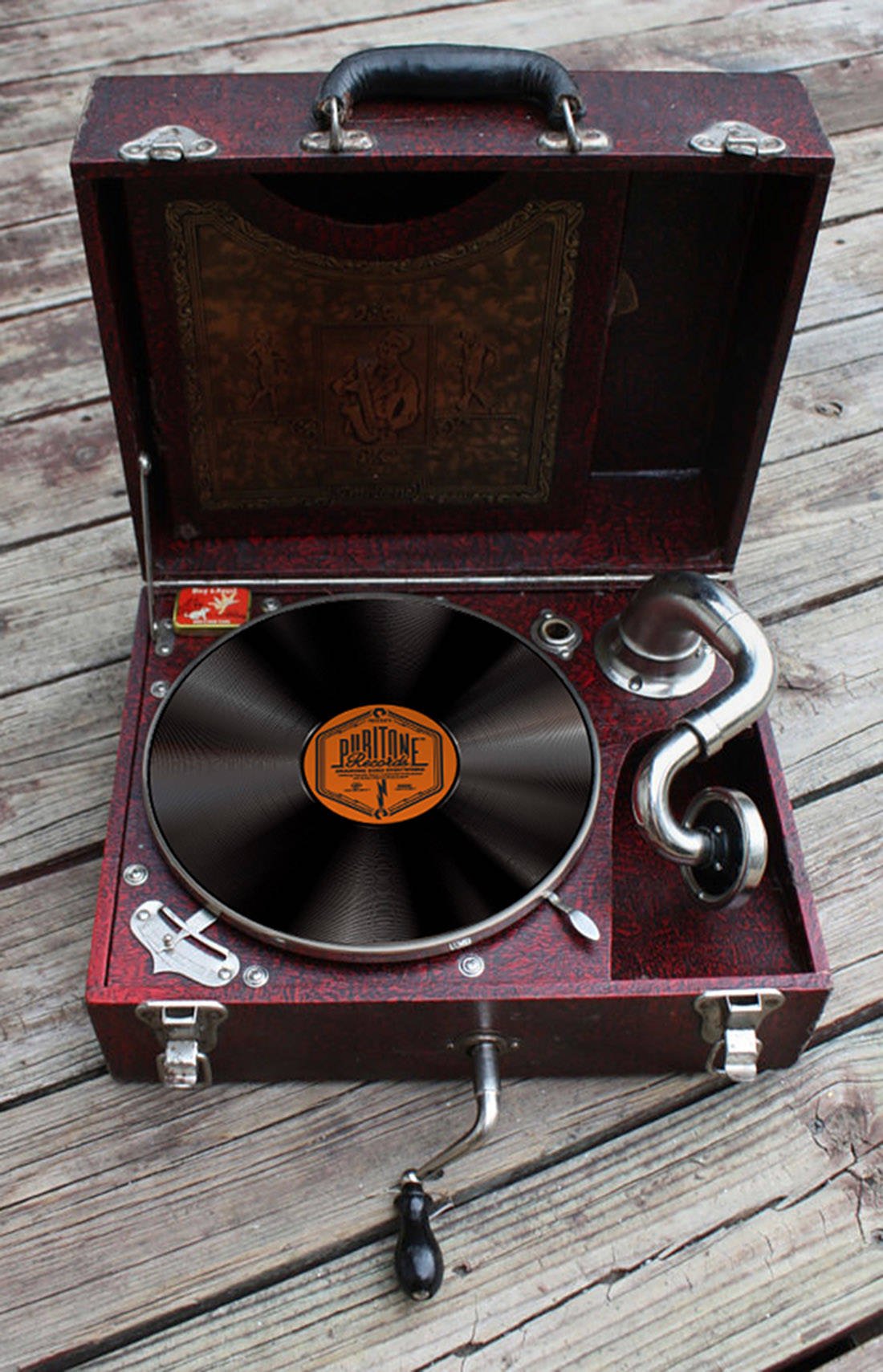
Answer: There is no hole in the middle of the Puritone Records record label!
Once we all realised the label would in fact now be used on an actual record, we can easily revise the design around this design flaw.
This proves that mistakes happen, and especially with such a pressing turnaround, that the obvious can simply pass straight by you. :)
![]()