
Smithographic presents a selection of logo grids, and logo construction design diagrams for various client projects.
These will show aspects of the design, construction and development of certain logo designs from my logo portfolio.
Some of the logo grids are inherently complex and/or detailed, whilst some are pretty simple.
Logo grids are usually applied after I have designed the logo, and have used my own eyes to balance all the elements.
Once the logo design is approved by the client, then I’ll apply the various parts of a grid to help dial-in, and refine, overall alignments and measurements.
Advatera – Logo Mark Construction

Client: Advatera
Info: Logo & Icon Redesign → Work in Process
Baze – Logo Mark Construction
Client: Baze
Info: Logo & Icon Design → Logo Process
Foehn & Hirsch – Logo Grid, Alignments & Construction
Foehn & Hirsch – Customised Ampersand Construction
Client: Foehn & Hirsch
Info: Logo & Brand Identity Design → Case Study
Keyboard Kahuna – Logo Grid, Alignments & Construction
Client: Keyboard Kahuna
Info: Logo & App Icon Design → Logo Process
Excedr – Logo Alignments & Construction
Client: Excedr
Info: Logo Design → Logo Process
The Auto Network – Logo Grid, Alignments & Construction
Client: The Auto Network
Info: Logo Design → Logo Process
Explainly – Logo Mark Construction
Client: Explainly – Explainer Videos
Info: Logo Design → Logo Process
Medicine.com – Logo Grid, Alignments & Construction
Client: Medicine.com
Info: Logo & Brand Guidelines → Logo Process
Kerr Recruitment – Logo Grid, Alignments & Construction
Client: Kerr Recruitment
Info: Logo Redesign & Brand Guidelines → Logo Process
Trepp – Logo Grid, Alignments & Construction
Client: Trepp
Info: Logo Type Design
Pure Storage – Logo Grid, Alignments & Construction
Client: Pure Storage
Info: Logo & Brand Identity Design → Case Study
ADXPRS – Logo Grid, Alignments & Construction
Client: ADXPRS
Info: Logo & Icon Design → Case Study
Wavepulse Acoustics – Logo Grid, Alignments & Construction
Client: Wavepulse Acoustics
Info: Logo Design → Case Study
Abacus Insurance – Logo Alignments & Construction
Client: Abacus Insurance
Info: Logo & Tag-Line Design → Logo Process
MoleseyCo – Logo Mascot Development
Client: MoleseyCo
Info: Logo & Brand Mascot Design → Case Study
Skiplex Indoor Ski Centres – Logo & Brand Identity Design
Client: SkiPlex Indoor Ski Centres
Info: Logo & Brand Identity Design → Case Study
About the Skiplex Logo Grid
The construction and foundations of each part of each letter was looked at in detail, to create continuity with the whole notion of the downhill/slope movement which is fundamental to the Skiplex experience.
Where possible, the ends of letters were angled, parts of the tops of letters like the k, i, p then the bottoms of the e and x align perfectly on this downward slope (indicated by the green guides), with intersections of elements (indicated by the pink circles).
The key design feature was the use of Negative Space (indicated by the green shading) that flows through the logomark and carries on into the bottom of the S. This space creates a gentle downwards slope, and leads nicely into the S.
This design feature is also applied to the ‘dot’ on the i, when the top of the k acts as the ‘ramp’ and flows into the negative space under the light blue dot (which mimics the light blue portion of the logomark) of the i.
GoGoBot – Logo Grid, Alignments & Construction
Client: GoGoBot
Project: Logo Design
Final Words on Logo Grids
A logo designer must have an understanding of form, and visual aesthetics, before looking at implementing any from of logo design grid.
You might hear of people altering letter or word spacing based on a visual/optical preference, whilst casting aside the usual precise rules and mathematical measurements that can leave some text looking a little odd.
Not all design grids that uses precise alignments and measurements will look right.
Are we looking for a natural and ‘right’ looking fit, or a forced yet unnatural looking fit?
The same principle of manual and visual tweaking opposed to mathematical precision can be applied to the various styles oflogo design grids.
The same visual tweaking in the face of precise mathematical alignment can make a great logo a super great logo.
Being able to visualise logo guides, and the pretty coloured lines and circles in your head, whilst you are designing and developing a logo, IS super useful.
This is something that comes through lots of trial and error, and years of experience.
Design grids allow you to visually gauge space, structure and proportions so it looks good to the eye. You can then apply the more rigid process of adding the logo grid, and then see if things could be improved based on a more mathematical approach, or if the design is better off formed from a more organic ‘slide to fit’ approach.
Vintage Logo Design Grids
Thought that was the end? This is a bonus bit.
There are a number of vintage logo grids from pretty famous logo designs floating around the internet, and some of these logos are still in use today, often many decades after being first designed.
I first became fascinated in these vintage logo grids, when I came across the original VW vintage logo specifications for VW’s iconic logo (image below):
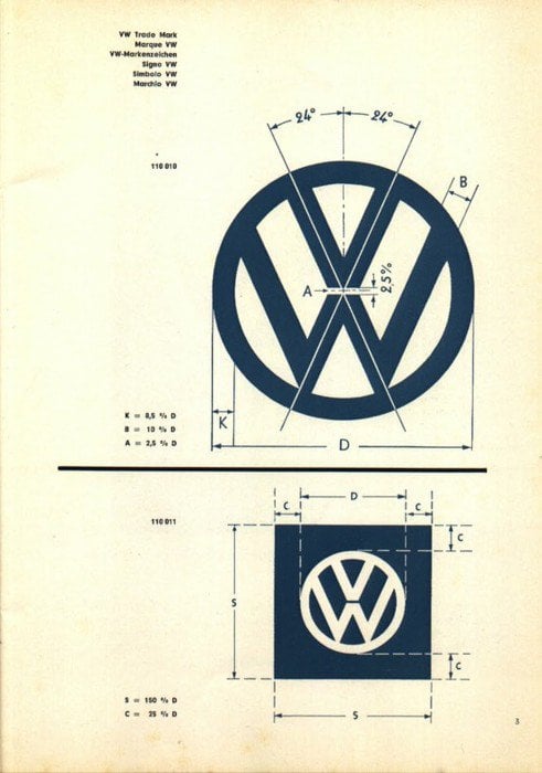
The only version to exist had been saved, resaved, shared and reshared countless times, and had become pretty pixalated.
I wanted to see if I could recreate this in vector, as true to the original as was possible in order to save a bit of logo and branding history.
After doing a blog post on my efforts to create the VW logo grid, I realised how popular and important a mission it had been.
→ Vintage VW Logo Specification Poster Recreated For Download
After doing a pretty good job, I became slightly hooked on finding more, and so it became a side project of mine over a number of years.
Montreal Olympics Logo Design Grid
Another vintage grid that I was really excited to recreate was for the Montreal Olympic Logo, which you can read about here:
→ Recreated Vintage 1976 Montreal Olympic Logo Grid Poster for Download
I made a few slight adjustments to my version, namely tightening up some of the spacing between the headers and body text, and also adding in the Montreal Olympic logo, but the actual grid is petty much spot on.
What I loved about all of this was seeing the level of detail that had been incorporated, and how each one of these grids had been drawn by hand.
I realised that there were a few perfect imperfections with these as I was recreating them, and decided to recreate the imperfections as much as possible, even though my OCD for accuracy was strong.
You can see some of the other vintage grids that I have found, and lovingly recreated in vector, at this link: