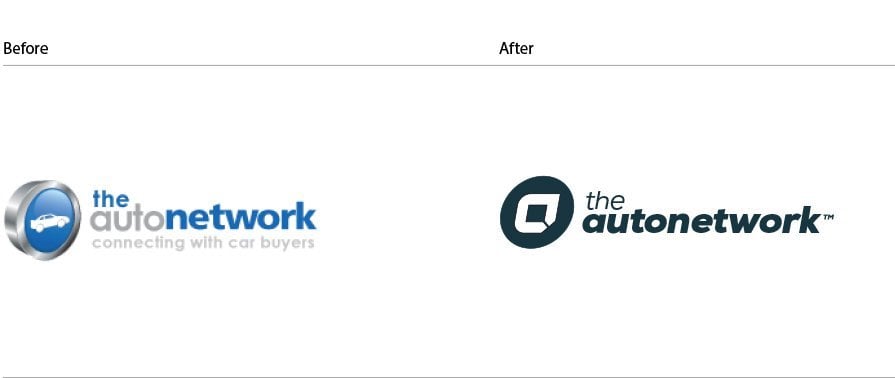
The Logo Smith was tasked with updating, and redesigning, the previous The Auto Network Car Lead Generation Company logo, with one that relies more on bold stylised typography for both the brand name, and the logo mark.
Old Logo vs The New

 The New Auto Network Logo Mark
The new logo mark uses the initial ‘a’ that has visual connections to: a road, roundabout road sign, and two arrow points that meet signalling the notion of successful car lead generation.
The new logo design allows for great colour flexibility given the clean and solid use of colour with minimal fine details, as well as the logomark working well in small locations, such as: website favicon, social media profile images etc.
The Auto Network Logo Construction Grid
In the case of this logo, a grid was useful in order to help keep the vertical angles the same for the ‘a’ logo mark, and also the slightly italicised wording.
Even the logo marks sphere is slightly ‘sheared’ to retain this forward leaning sense of momentum.
There are various horizontal intersections and alignments that ensure the height of the wording matches various horizontal aspects of the top and bottom of the ‘a’ logo mark.
Where ever possible, and if it’s not to the detriment of the logo designs aesthetics, I will design in all these various alignments and intersections in order to bring harmony and interconnectedness within the logo.
The circles show key areas of vertical, diagonal and horizontal intersections and alignments, the vertical arrows generally show where space is ‘equally halved’ once then twice, usually relating to type baselines, ascenders and/or descenders in relation to the contained logomark.
For example the ‘a’ in the circle has a middle point that aligns with the x-height of ‘autonetwork’, which half of the x-height is equal to half the width of the a’s thickness, then half of that is equal to the bottom portion of the types’ counters in letters such as the: a, u, o etc
So within the negative space; the very middle of the ‘a’ logo mark, if we follow that horizontal line it will match the heigh of the lowercase letters in autonetwork, as well as the top of the ‘a’ logo mark matching the top of the ‘e’ in ‘the’.
Each vertical, angle and horizontal line does serve a propose in this grid.
The Colour Styles
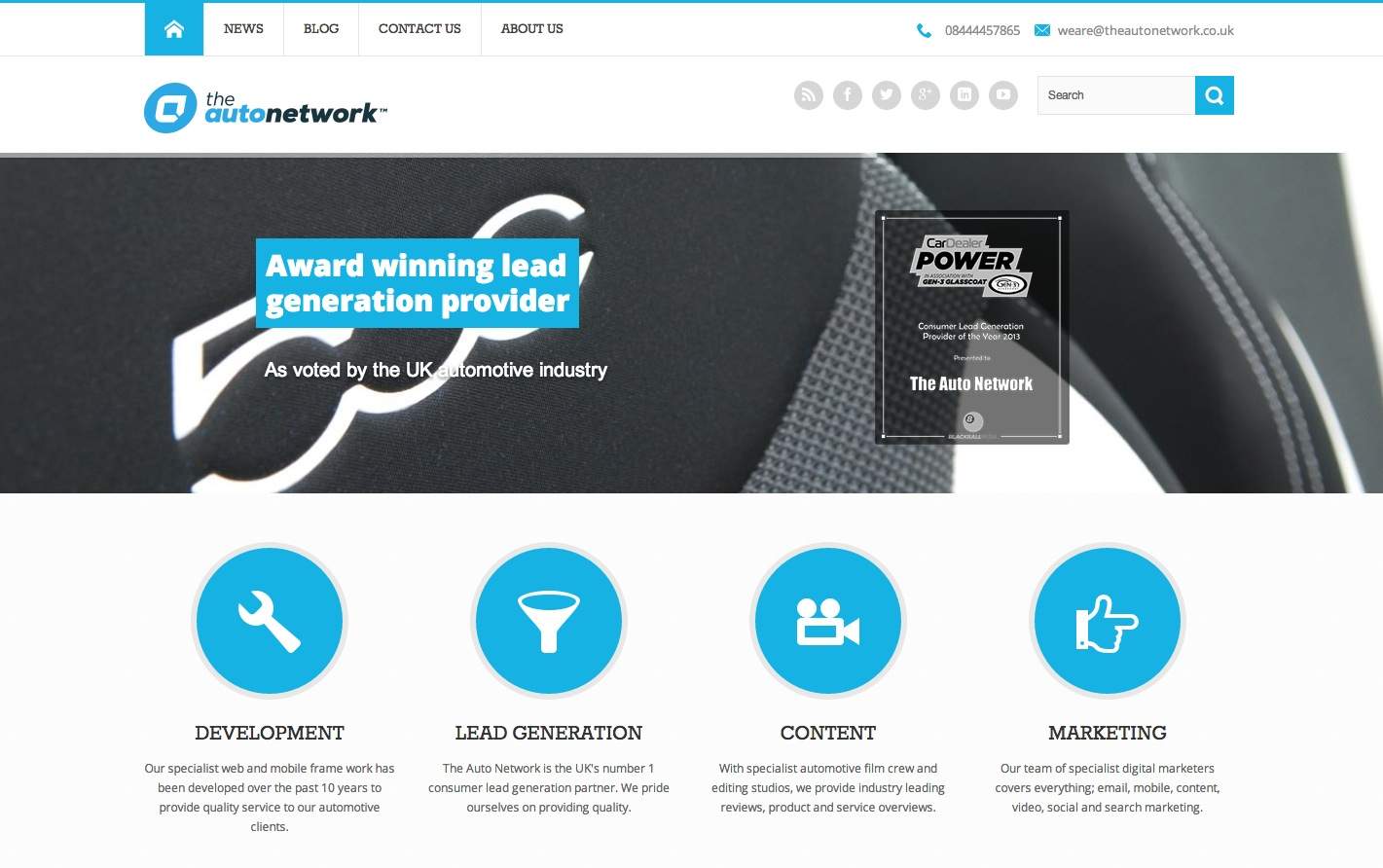
Really nice to see the fruits of ones logo design work, The Auto Network logo, proudly adorning the header of the redesigned/updated website.
Also a quick thank you to Rebecca Turnbull for the mention in their blog post: New branding for a new direction, The Auto Network works with Graham Smith
During the initial, and last, stages of the logo development I didn’t really have a clear idea of how their website would be redesigned and updated.
This is quite a common way of working, at least for me, so it’s just really nice to see how the logo and website now seem to really gel quite nicely. The favicon looks pretty neat as well!


