
Case Study for the Logo and brand identity redesign project for Abacus Insurance Brokers, designed in 2012,
The redesign included creation of a new tag-line, general stationery design, and also some ideas/mock-ups for their shop signage as well as exhibition stands (photos later on in this post).
Abacus Insurance was the first American online insurance brokers, and the rebrand is part of their continued efforts to refresh their image.
New Abacus Tag-Line
Before actually getting started with the logo redesign, I advised the client that it would be prudent to work on the tag-line first, so I spent a few weeks coming up with some ideas for the tag-line.
We eventually settled for: Intelligently Delivered. The client later explained the importance of the tag-line in the client testimonial for me:
“The concept of “Insurance Intelligently Delivered” has been our driving force ever since. We have rallied our employees, business partners, and customers around that phrase. And it is our continued call to excellence.”
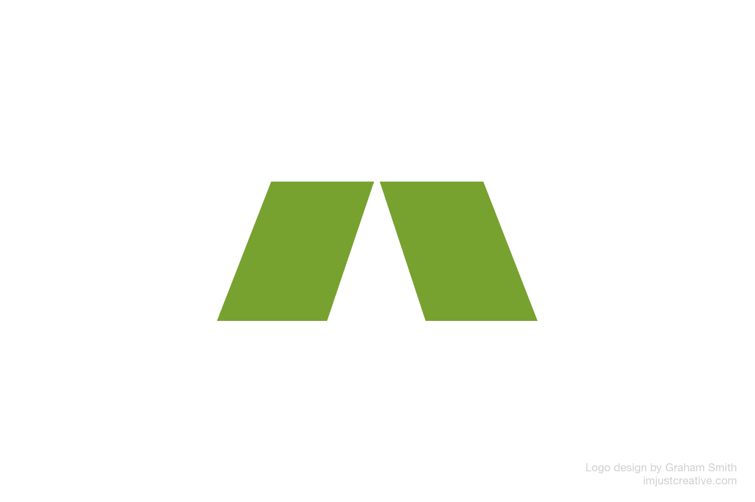
Old Abacus Logo vs New Abacus Logo
The Abacus Logo Mark Constructed
The following image shows how I took the middle portion of the initial A, and pulled this out to create the new Abacus Insurance logo mark. The same font, Helvetica Neue, was used for the logo mark, as is used in the brand name, so the downward angles are exactly the same.
![]()
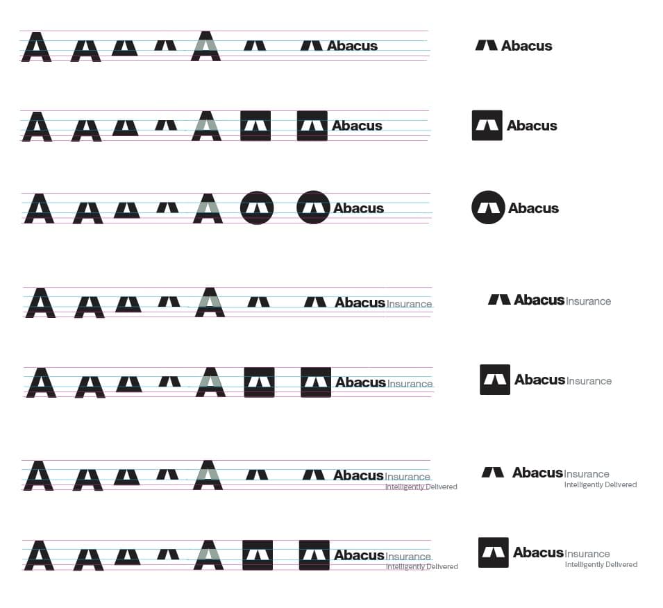
Abacus Logo Specification Sheets
The images above show the start of the brand identity guidelines, and specifically focus on the general usage of the Abacus Insurance logo.
For ease of use, and visual continuation, the right side of the logo specification sheets share common information for: typeface choices and colour palette. The top-left displays each of the logo variations.
The creation and format of the brand guidelines have taken a more modular form where additional designs and sheets can be added, with ease, into a binded folder.
We have logo versions for: interior and exterior signs, website header, stationery and print design, a short/mini logo and just the logo mark with/without a boxed container, with the contained version being used as website favicon and social media profile image.
![]()
![]()
![]()
![]()
![]()
![]()
Exploration of Hues of Green

Previous Abacus Logo Mark Variations
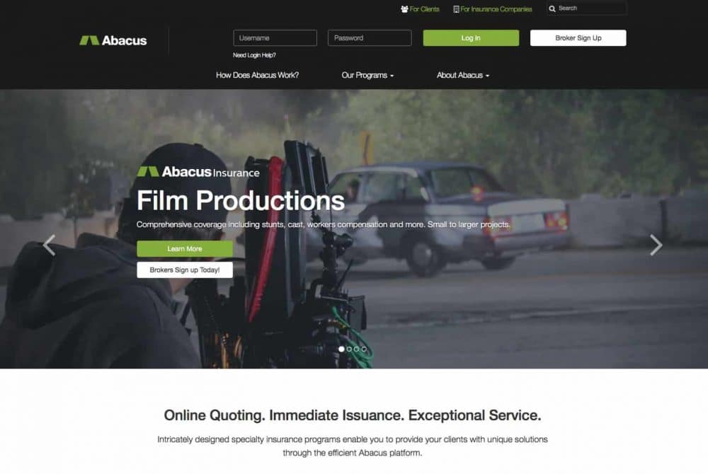
Abacus Insurance Website
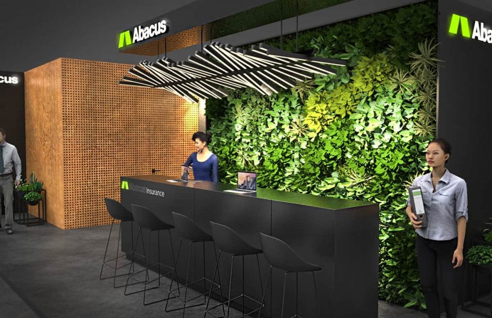
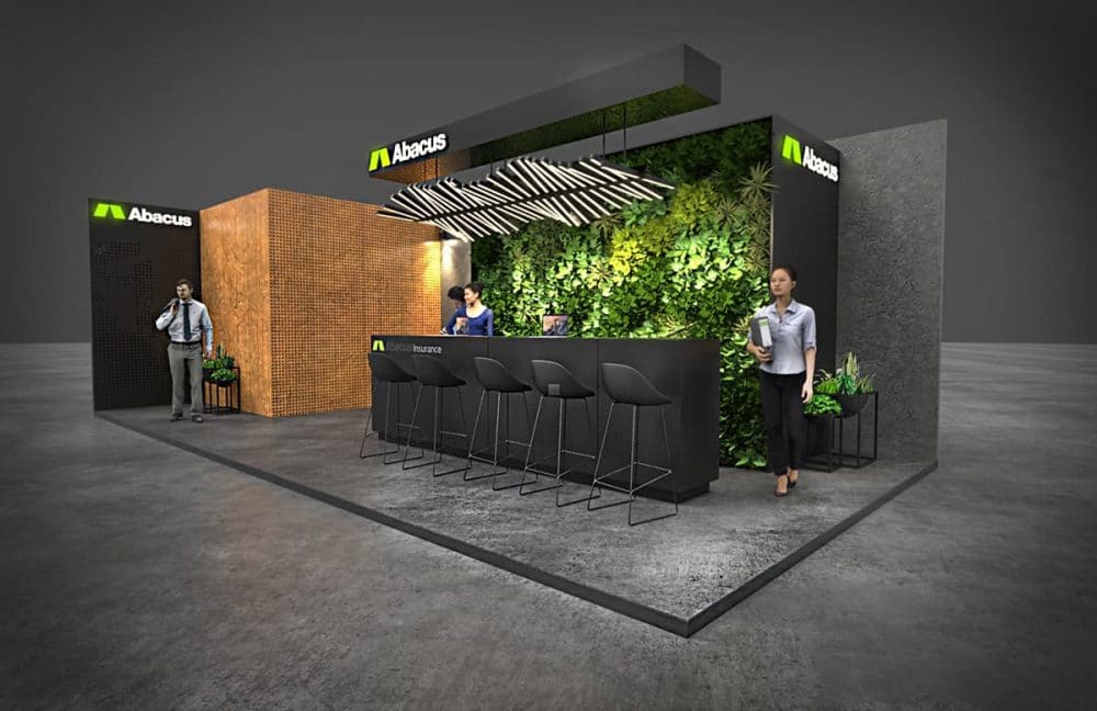
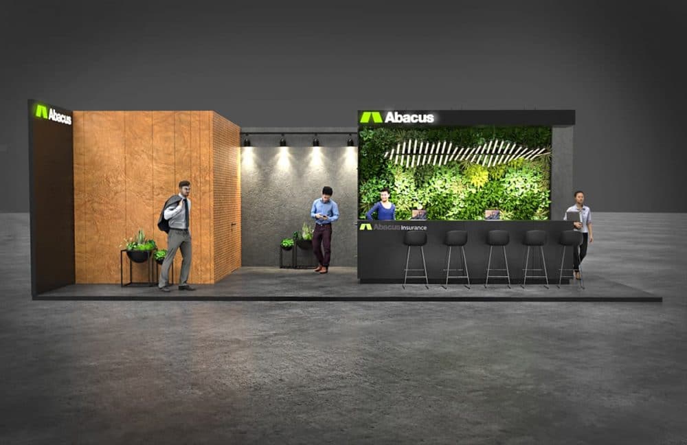
Abacus Insurance Exhibition Booth Concepts


Client Testimonial
“We approached Graham at a pivotal time for our company. We struggled with conflicting opinions about how to best position our business and unique software platform in the insurance marketplace. And what direction we should be taking to continue our growth.
Before starting on the logo design process, Graham helped us tremedously by firstly getting us to focus on a core message. For Graham, it was clear this was not just about designing a logo for us, but also help us define our new brand, something we had not expected as part of the initial project scope.
We needed a new logo and brand identity design that would convey in a simple way exactly what we stand for. The concept of “Insurance Intelligently Delivered” has been our driving force ever since. We have rallied our employees, business partners, and customers around that phrase. And it is our continued call to excellence.
Graham’s logo design process, and meticulous attention to detail, created for us a logo and branding that has far exceeded our expectations.
I believe it accurately represents the uniqueness of our business. And will continue to do so for many years to come.”
Kevin Lewin – Abacus Insurance
Abacus Insurance Monomark
![]()