
Logo and identity design process for: ADXPRS—Advertising & Design Express Production System (based in Dubai, United Arab Emirates), designed by The Logo Smith.
ADXPRS is an online publishing system for companies to manage aspects of their own marketing and advertising, in a friendly and intuitive online environment.
![]()
The ADXPRS Logomark
The idea of the logomark developed through many iterations of other abandoned ideas and ultimately proved to be a mark that best captured the essence of ADXPRS.
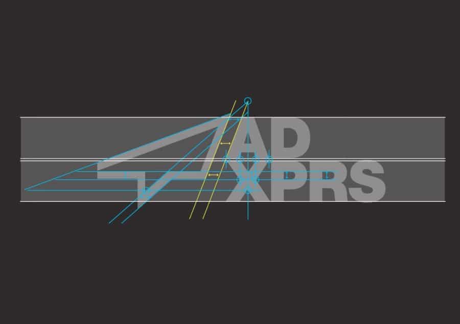
The ADXPRS logo type is somewhat precise on closer inspection—none of those guide lines are surplus.
These precise foundations provides for good overall balance, alignment and intersection of various aspects of the typography with the logo mark, on the vertical and horizontal.

ADXPRS Arabic Logo Translation
There is also a rather remarkable Arabic version of the brand name which was ultimately one of the main considerations with the design.
Very exciting to have been able to work on an Arabic version of a logo!
![]()
ADXPRS Logo Design Deconstructed
Simplified walk-thru (above) of how we got from the initial A, a paper plane and the cursor:
![]()
The fundamental association behind the logomark is that of a paper airplane. The paper airplane is something that anyone can make and instantly see the exciting results as the the paper plane flies and glides through the air.
With ADXPRS the message is not so dissimilar: it’s a flexible and efficient online system enabling anyone to produce visual results that are far superior to anything that same person might get with their PC and clip-art.
The logo mark reinforces the simplicity and efficient nature of ADXPRS as well as also being a stylised shape of the initial A. There is also a subtle nod to the everywhere computer cursor.
![]()
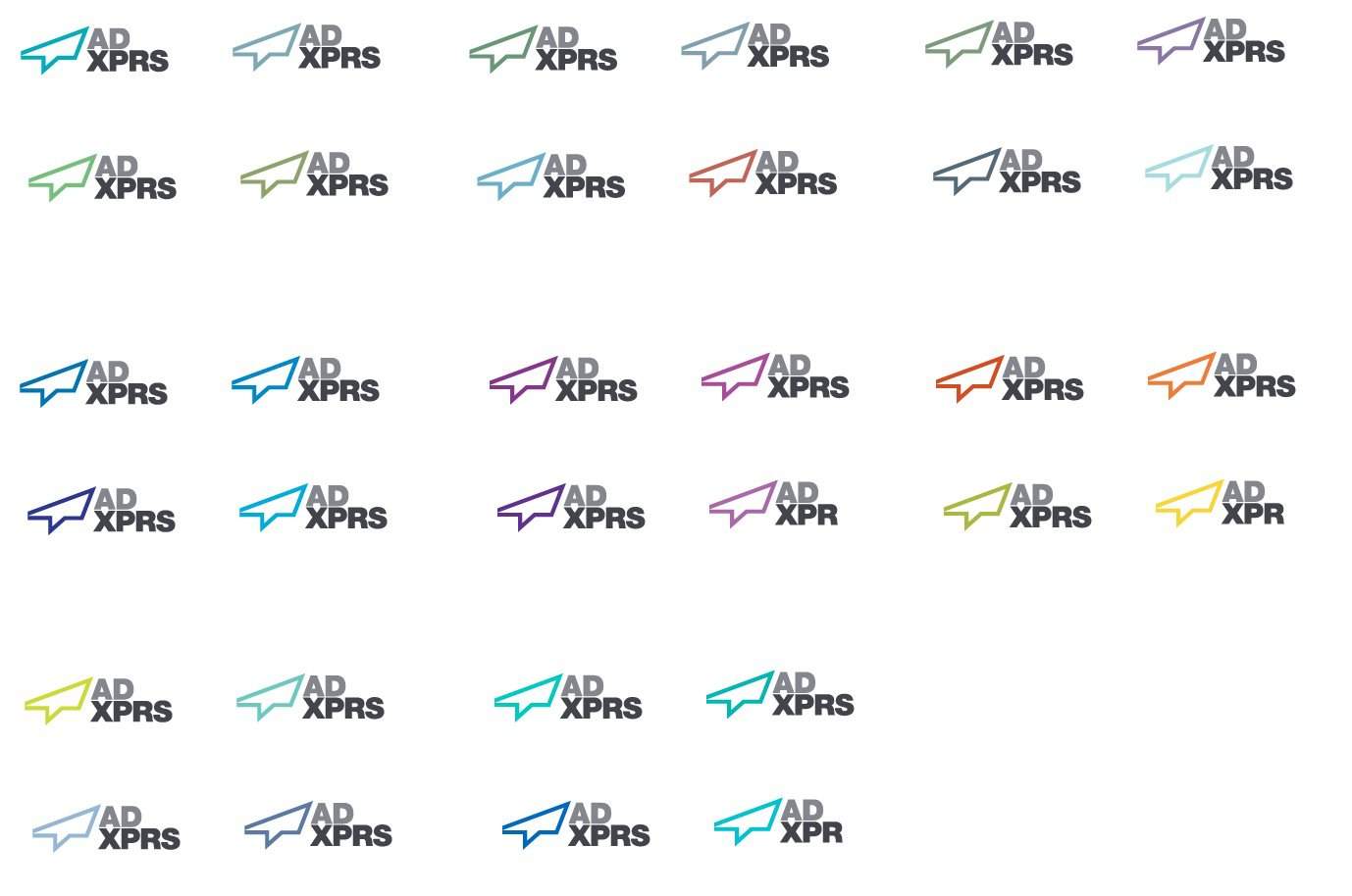
ADXPRS Typography
The typography is Helvetica Neue Heavy with some mild customisations (above).
The main changes are to the A and X where I have adjusted the width of the X to better match the A (see the cyan circles on the logo deconstruction above). The magenta halo reflects the original Helvetica whilst the cyan reflects the new.
An alternative version was created for social media profile images and other online uses where space is of a premium. I adjusted the space of the main logo type so that when the ADXRP was hauled out and placed into a square container there would be equal space on all 4 sides.
The ADXPRS Logo Animated
How I love it when one of my logo designs is actually brought to life through some form of logo animation. It really quite a buzz to see all that hard work actually coming to life.
My first logo animation was a brilliant promotional video for for Feedly, and now I’be just got my hands on a short segment of a promo video that shows my ADXPRS logo flying into shot.
![]()