Vintage Polaroid Branding and Packaging by Paul Giambarba is one of those branding treasure feasts that one stumbles on from time-to-time.
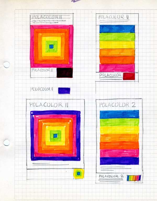
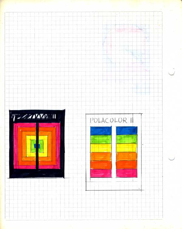
→ This post was original published in 2019, but it didn’t have those gorgeous sketches that AisleOne tweeted earlier in September, 2022.
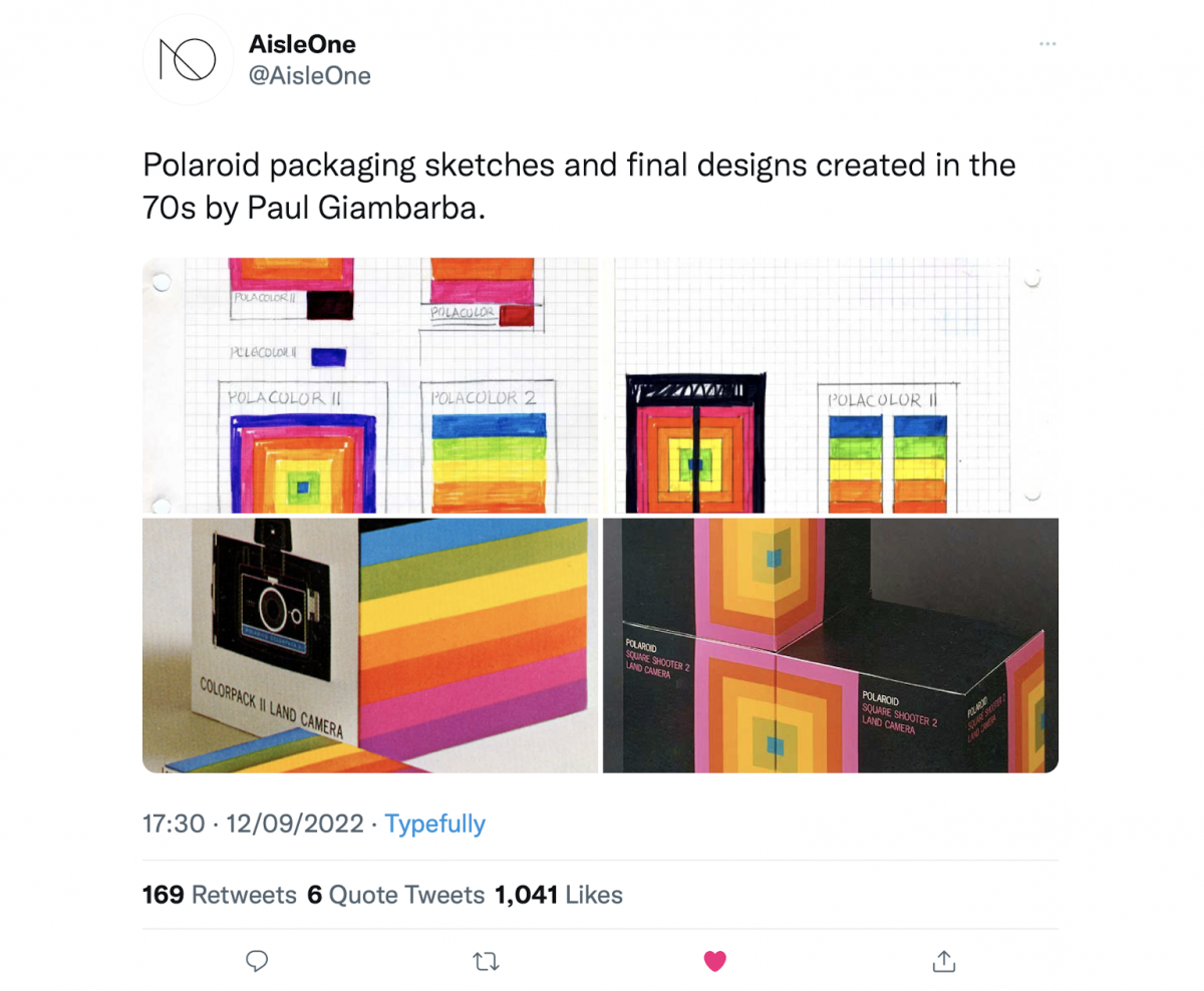
I felt it made sense for me to update the original post with these new sketches by Paul Giambarba.
AisleOne is probably one of my favourite Twitter follows, so it’s well worth a look if you like graphic design of all types; quite a focus on vintage design, and typography etc.
An additional update, is the inclusion of a simple timeline chart, designed by Paul, to show the various stages of Polaroids branding, also includes a segment of Paul’s explanation of the chart.
→ Iconography of the Polaroid Mark and Product Brand Identity by Paul Giambarba, 1958 – 1977
All of these images are from the original web article, by Paul Giambarba on his own website, posted back 2013: The Branding of Polaroid by Paul Giambarba
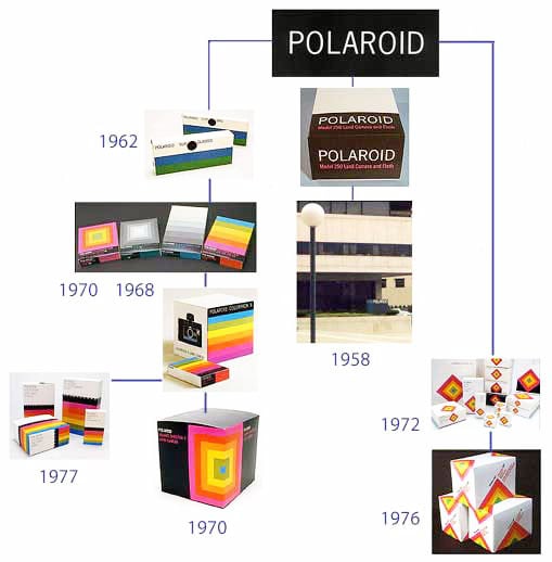
Paul Giambarba: “Beginning at the top is the Polaroid mark I did in 1958, its application to package design and corporate identity, which is the bottom panel just above the date, 1958.
Somewhere in the lower right of the photo is the corporate sign POLAROID, identical to the mark above. On the left are package designs for Polaroid Sunglasses, 1962, Polaroid Colorpack and black-and-white filmpacks, package design for a Polaroid Colorpack camera, and to the far left, package design and product identity for Polavision, 1977.
At the bottom of the row is a package design and product identity for a Polaroid Square Shooter camera. In the row on the right are package designs and product identity for Polaroid SX-70 cameras and accessories, dating from 1972, and just below is a photo of package design for Polaroid Pronto!”
Source: https://giam.typepad.com/
→ Iconography of the Polaroid Mark
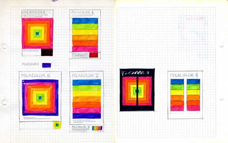
Original Polaroid Sketches
Vintage Polaroid Branding and Packaging by Paul Giambarba
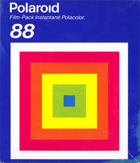
Here’s a small selection of other Polaroid Branding and Packaging images:


So turns out that Paul’s blog on The Branding of Polaroid has been around for like forever, but the post that AisleOne featured was posted in 2010, and so is once again doing the rounds.
Which is really bloody great because the more people who can experience the original Polaroid branding the better.
I did a bit of internet searching because I also wanted to nail down the designer/designers responsible for the existing Polaroid logo design—the purpose for which was to post it on Logo Stack—and so H/T to ZLOK for actually first blogging about The Branding of Polaroid website back in 2008. Which is like, forever ago.
Polaroid and Apple
As well as many graphical images to perv over there is a fun piece detailing how Alf Lenni pointed out the similarities between the original Polaroid colour stripe system, and the logo from a new kid-on-the-block called Apple from Cupertino, California.
Apparently, the old Apple logo used the same percentages of process colours as the Polaroid logo.
It’s well worth heading over to The Branding of Polaroid for this nostalgia trip and see how this epic slice of branding history was conceived.
Polaroid Packaging


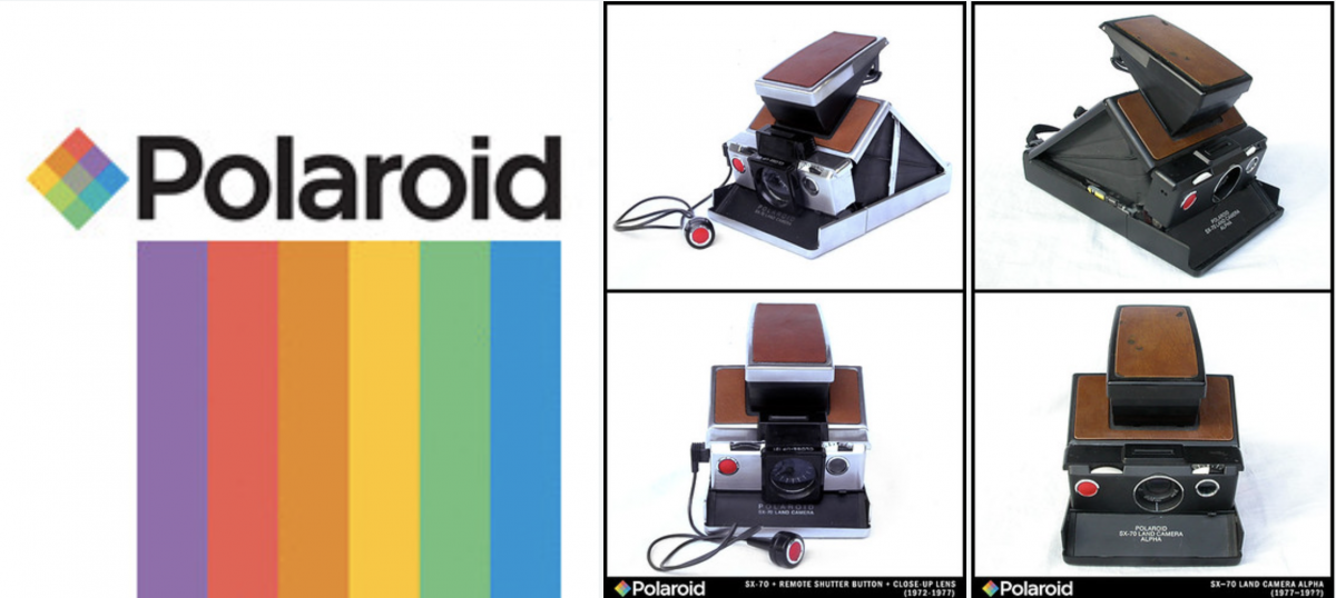
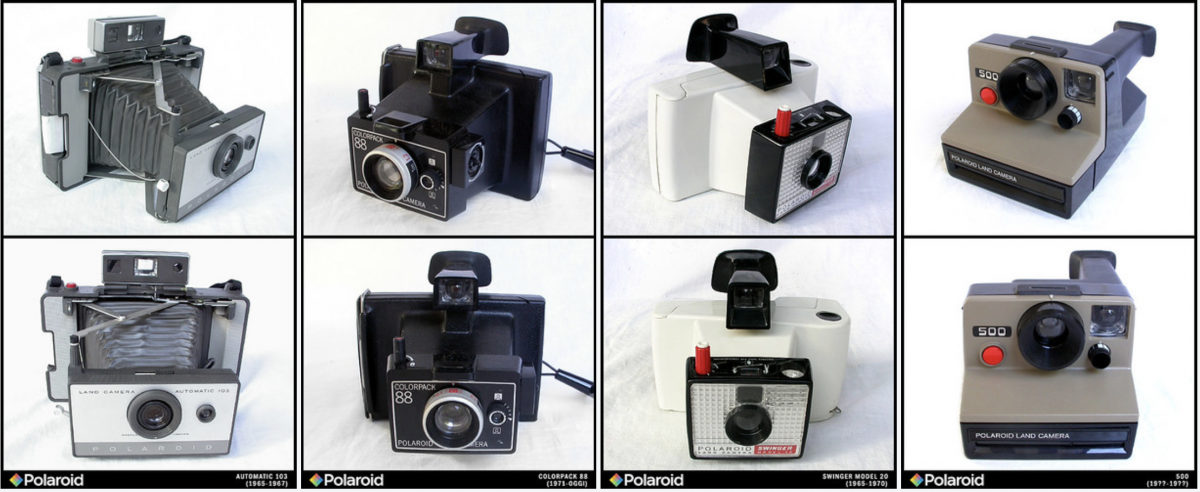
A Polaroid Camera Gallery on Flickr by Alessio Nunzi.
A nice selection of photographs of Polaroid cameras, curated by Alessio Nunzi.
→ Polaroid Camera Gallery on Flickr