
Lettering Series Designed by Rafael Serra aka FAEL
Came across these wonderfully alternative takes of various famous logo and icon designs, by Rafael Serra aka FAEL.
Rafael is a Portugal-based type designer and this is his ongoing series where he creates these unique letterforms for various words and logos.
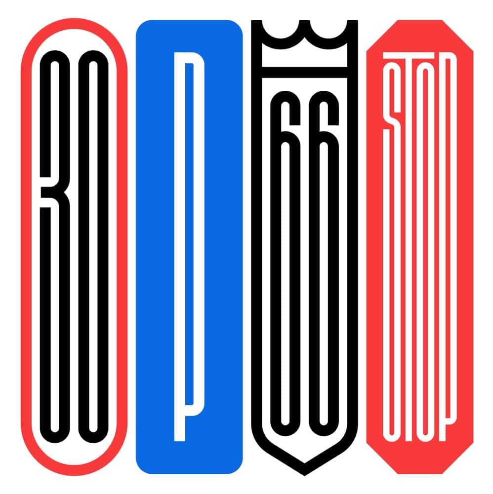
Whilst Rafael hasn’t strictly focused on reimagining famous logos, there are quite a few in his collection, with the rest being client designs, and general design exploration.
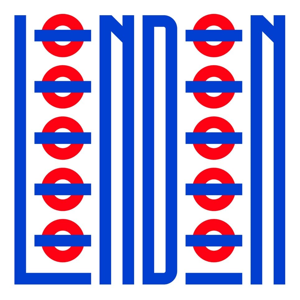
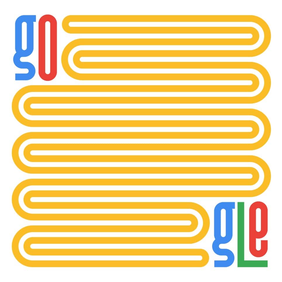
His style is absolutely amazing, and seems to swing from two core styles: the super tall and elongated ‘spaghetti’ style vs the more robust, thick and fuller shapes
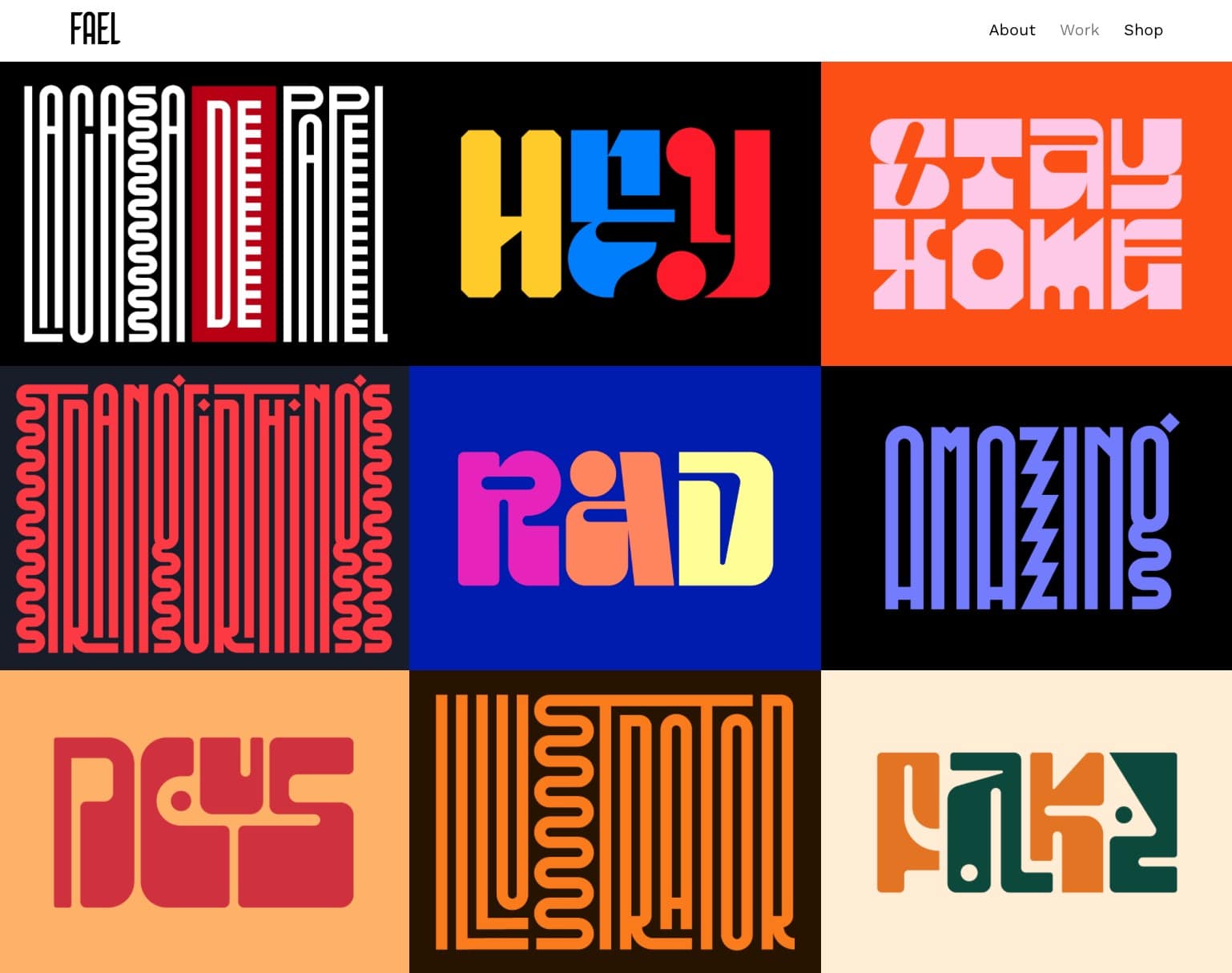
His portfolio is pretty wild (image above is his main portfolio works page!), and there’s a whole heap of alternative lettering styles that Rafeal has created.
I think focusing on the famous logos is a great way to see exactly how Rafeal uses his own aesthetic to create these fabulous alternatives.
I would highly recommend going over to his website, and further explore his various project sets in the Lettering Series and his other client pieces, which is currently up to: Lettering Series XX
His entire portfolio is a real treat to behold…
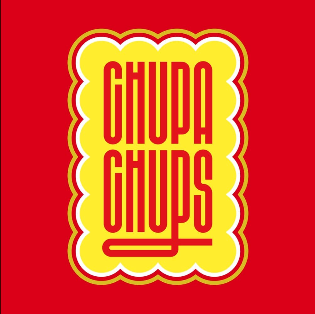
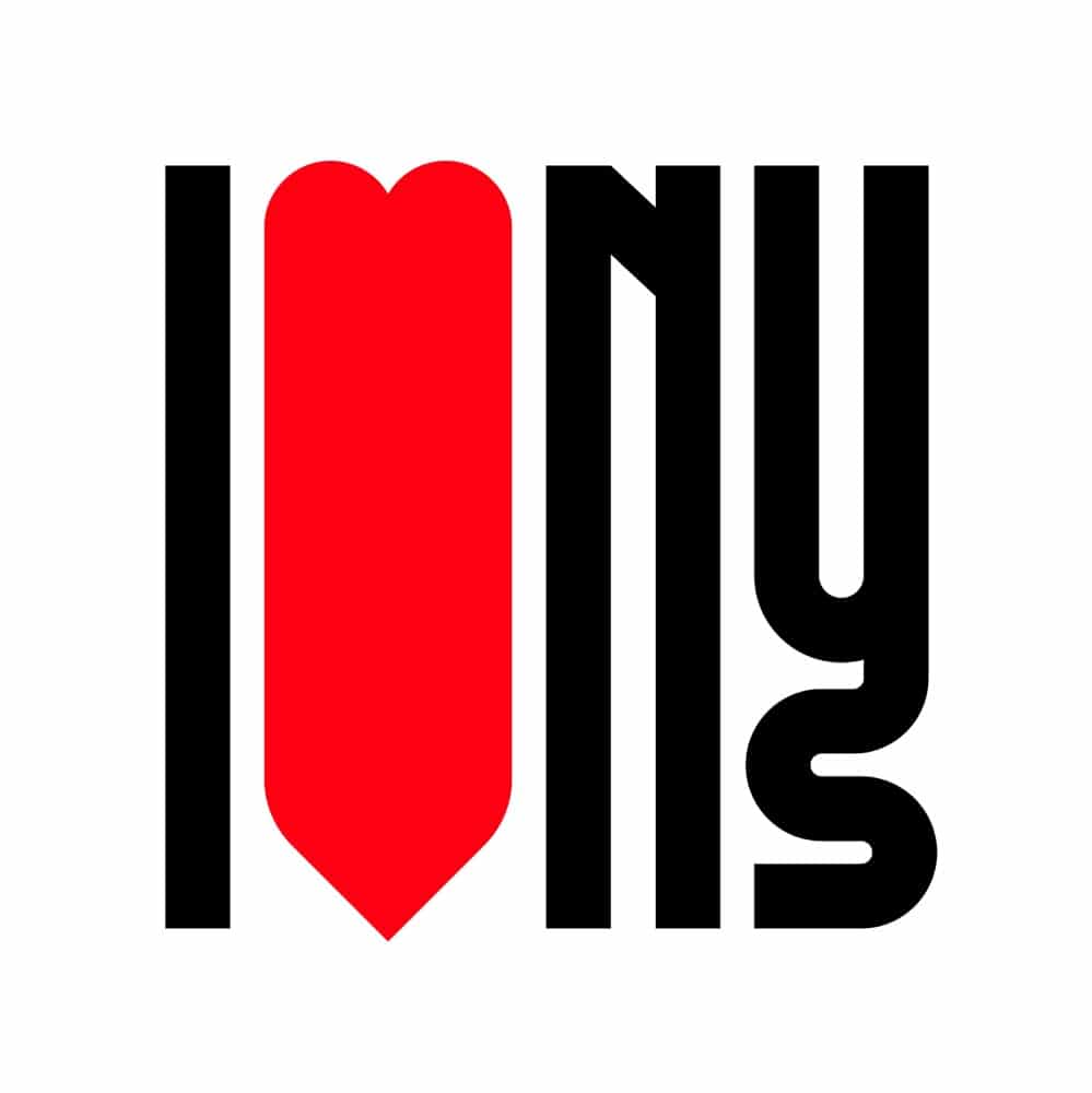
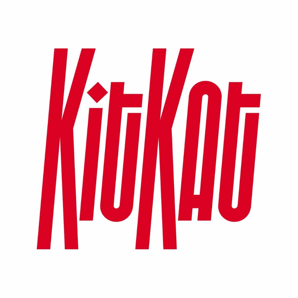
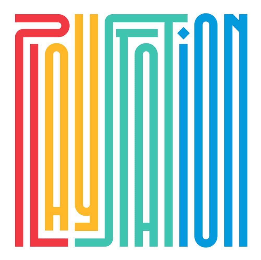
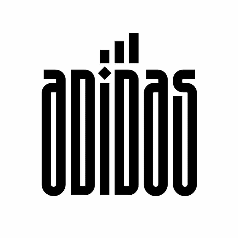
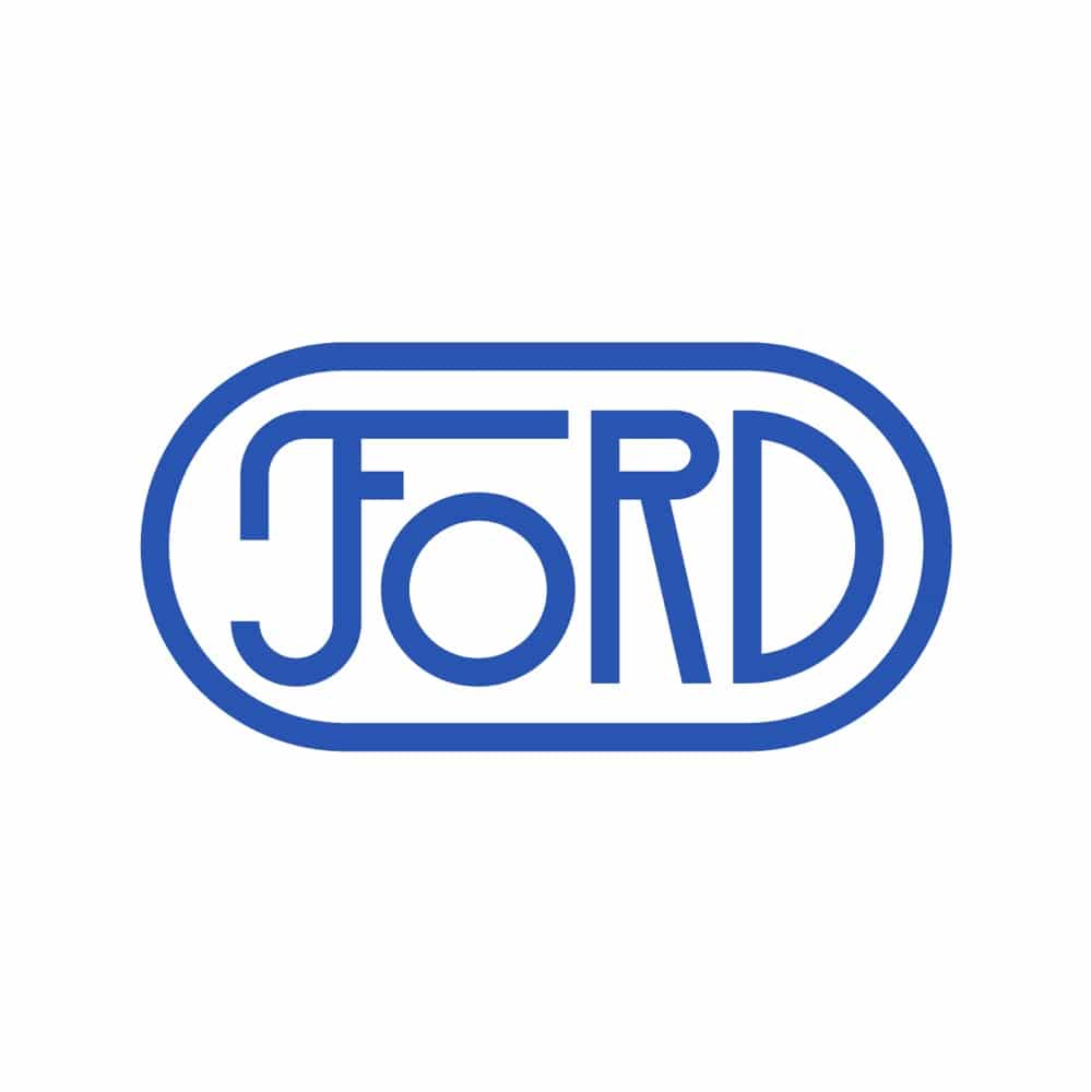
Lettering Series of Famous Logos Designed by Rafael Serra


About Rafael Serra
My name is Rafael Serra aka FAEL and I am a Type Designer and Lettering Artist based in Porto with a passion for craft.
Professional ExperienceWhile freelancing, I’ve worked for several agencies like Aspera Hartmann, QA Publicidade, Gen Design Studio, Label Brand Studio, Leo Burnett Lisboa, Triple Atelier, Young & Rubicam Lisboa and Hi-Interactive.
Press & Books
Yearbook of Type 2019/20, Collection Design Português, Computer Arts, Et & Ampersands, Los Logos 8, Lürzer’s Archive, P3, Nem Tudo Que Reluz é Ouro, Obli, The Washington Post, Abduzeedo, Designerd, WeRSM, Creapills, Domestika.