Came across this enlightening example of a ‘the meaning behind…’ in the form of Sony’s Vaio logo, designed by Teiyu Goto.
As the original artwork has been shredded around the internet for few years now, I decided to recreate a fresh new version in vector, and uploaded here as SVG.
Teiyu Goto was appointed as a start-up project member for Sony Windows computer, June 1996-December 1998.
Teiyu Goto was responsible for the brand concept, naming, logo design, and product design for the Sony Vaio.
A quick journey to Wikipedia reveals the following information on the meaning behind the Vaio logo:
Etymology of the Sony Vaio Logo
Originally an acronym of Video Audio Integrated Operation, this was amended to Visual Audio Intelligent Organizer in 2008 to celebrate the brand’s 10th anniversary.
The Sony Vaio logo concept was created by Teiyu Goto, supervisor of product design from the Sony Creative Center in Tokyo.
He incorporated many meanings into the logo and acronym: the pronunciation is similar to “bio”, which is symbolic of life and the product’s future evolution; it’s also near “violet”, which is why most early Vaios were purple or included purple components.
Additionally, the Sony Vaio logo is stylized to make the “VA” look like a sine wave, and the “IO” like binary digits 1 and 0, the combination representing the merging of analog and digital signals
The Sony Vaio Logo – The Meaning Behind Sony’s Laptop Logo
The Sony Vaio logo is made of two parts, the “va” and “io”. Both parts crafted to contain a deeper meaning based on the history of the company, the progression of the technology and Sony’s transition into the future.
Beginning with the more antiquated technology, the analog wave, the “v” and “a” are combined to reflect the image of an analog wavelength.
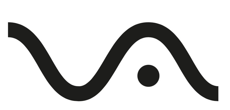
Moving from left to right, showcasing the progress into the future; the “i” and “o” then work together to represent binary code.
The movement from left to right, from the analog wave to binary code, reinforces the progress of the technology.
All this in a clean and compact brand logo, that showcases Sony’s movement from television products and into digital computing: the intended purpose of the Vaio sub-brand.
The Sony Vaio logo has three messages:
- the analog wave
- the binary code
- the logos transition from left to right, highlighting the evolution of the technology and the company.
It’s all to easy to let things like this slip under the radar; the FedEx logo is one of the most well-known secret meaning logo “aha” moments.
The FedEx logo, designed in 1994 by Linden Leader & Landor Associates, at first appears simple and straightforward.
However, if you look at the white space between the “E” and “x” you can see a right-facing arrow.
This “hidden” arrow was intended to be a subliminal symbol for speed and precision.
How many other famous brand logos have meanings like this that we are not aware of? This is why I find me job of logo designer so fascinating, and often quite unpredictably rewarding.
Not that I’ve designed anything as cool as the Sony Vaio logo, or FedEx, but still… the day may come.