I just felt the urge to share this quick image that showed the very first digital mock-ups, of what was to become, the MoleseyCo Clothing brand logo mascot, emblem and overall brand icon.
One has to start somewhere, and it’s usually a bloody awful start at that. I can laugh about it now, barely.
![]()
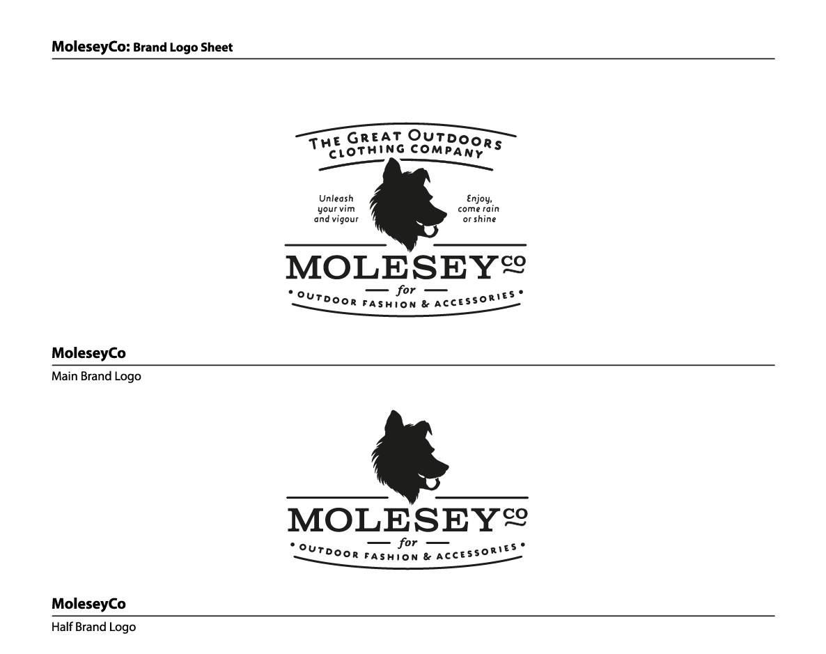
You can see some of the final logo artwork sheets in my portfolio: MoleseyCo Clothing Brand Logo and Identity Design
The Molsey ‘Dog’ Illustrative Design Process
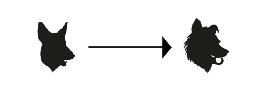
Bear in mind, even this logo sheet shows only a small example of all the variations I would end up going through, until I reached the ‘winning’ design, bottom right.
![]()
However, it is an accurate selection of the key milestones during this particular logos development, and it would be an understatement to say that this was a somewhat challenging design to perfect.
So Ok, not too hard to be able to say it was easy to eliminate the first two rows–of, well, whatever they are.
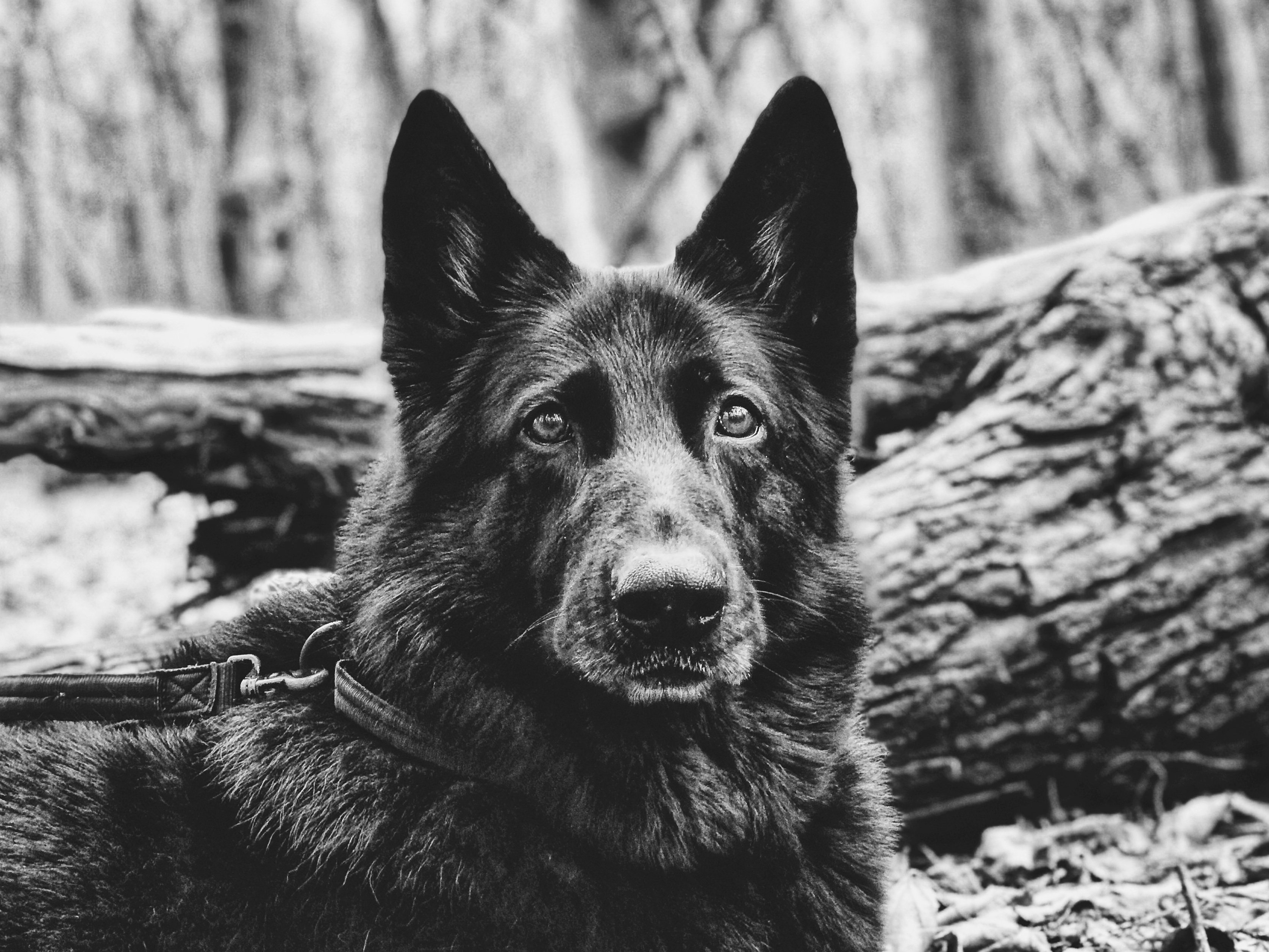
From the 3rd row down it became harder to actually achieve the look, feel, and balance of: wild outdoors wolf, Alaskan Malamute, and a German Shepherd (actually modelled on my own Miss Charley above) but also an animal mascot that had just that perfect mix of “we’ll know it when we see it”.
Overall not to be too: quirky, unrealistic, wild, vicious, cute, friendly or even comical.
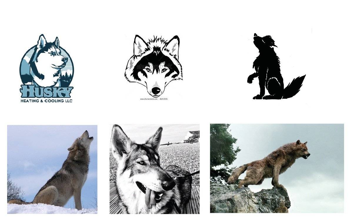
It’s only when you keep comparing various photographs of wild wolves (more furrowed and chiseled brow and forehead, shorter snout and much more neck scruff), against the domesticated dog, that you realise that on one hand, there are some very obvious differences, but on the other, it becomes quite a challenge to create this wolf/dog/dog hybrid.
Hopefully neither one or the other (above: just a few of the images I used as reference, and loving the fantasy monster wolf, bottom right).
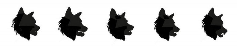
One of many challenging parts (bleow) of drawing this mascot was finding these magical balance between not being too realistically wolf-like, but had wolf-like subtleness to this wolf hybrid made-up dog mix.
Things that caught me out with the various illustrations, that made it just that little too wolfy: too short a snout, overly deep and furrowed brows, stupidly long scary canines and way too hairy neck and throat.
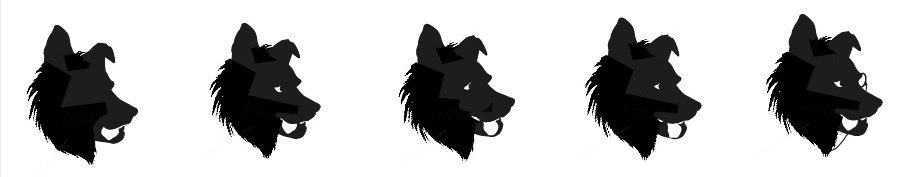
Also challenging, once I had managed to nail the overall outline shape, was to nail the: eyes, the teeth, tongue, and how much of a floppy ear it should have.
Even though the eye made for a good focal point, I realised that ‘no eye’ would create a more natural silhouette look, we could leave the trademark cuteness to the one floppy ear, and hanging tongue.
Reason for the tongue was because it’s usually after a dog has been running that the tongue flops out, and as MolseyCo is an outside activity clothing company, this was a good enough reason to add this little ‘cute’ feature.
In one version (below, 2nd one in) a somewhat creepy and evil looking eye, yet, the same evil eye, when slightly rotated (next one along), instantly looks way too cute.
Add a monocle to evil eye, floppy ear and lopping tongue mascot, and you get a somewhat classy form of villainous mascot. But again, not really appropriate.
Overall, I’m really very pleased with the end result, and it was certainly worth taking the time to work through all the various options and combinations, even though at times you feel like tearing your hair out.
But from beginning doodle, to end result :0)
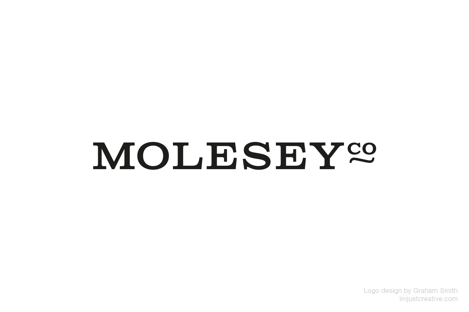
MolseyCo Logo, Brand Mascot and Identity Design
New logo, brand mascot and brand identity design for MoleseyCo Clothing Brand, a new outdoor clothing company based in the UK.
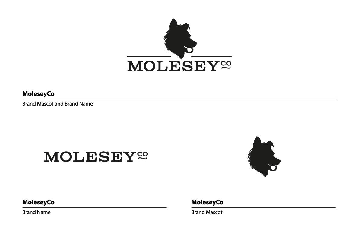
The Molesey mascot was drawn from scratch (see all above).
Predominately based on my own black German Shepherd, Miss Charley, as well as certain characteristics from the wild wolf and Alaskan Malamutes.
These included a more furrowed and chiseled brow and forehead, shorter snout and much more neck scruff than a German Shepherd.
It was also important to ensure that the main brand logo would ‘breakdown’ into smaller and less detailed versions: brand mascot, brand name, brand name & mascot and lower half brand logo, for ultimate versatility in marketing, packaging and general use of the logo and mascot.