![]()
Fourteen logo design, by WeAreMash
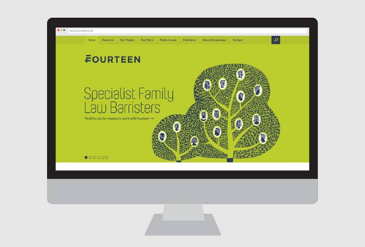
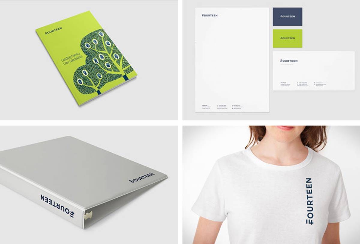
It’s quite something when I am so tempted to say that the Fourteen logo design, by WeAreMash, is one of the sweetest logo designs I have seen, certainly this year.
It’s just so so fantastically clever.
One one hand, and I remember exactly what I thought when I first saw it was a sense of slight, I was thinking “what is that symbol at the beginning?”, then it just hit me milliseconds, or so later. From that moment on: this (on the surface) simple, but so brilliantly executed F & 14, now feels like a natural letter and number combo. Nothing feels forced, pushed, shoehorned or squeezed.
I would be so interested to see if they hit this off straight away, or if it took many attempts to get the exact right balance of F and that floating bar to form the 14? I would imagine it was the latter, a number of attempts to get it perfect.
Thing is, you can come up with a super idea just like that, but then the execution of it takes weeks and weeks. The Fourteen logo design, or logotype/wordmark, just feels so natural and right, yet at the same time certainly draws you in, and gets your brain tingling on first sight. Several days in after first seeing it on BrandNew, I still absolutely love it to bits.
One of those, wish I had had the chance to come up with that one!
![]()