Looking for a Logo Design Studio then Hire The Logo Smith
If your looking for a business logo design company, then you’ve come to the right place. The Logo Smith can help you with your next logo and brand identity design project.
![]()
The Logo Smith is a very experienced (over 28years) freelance logo and brand identity design studio, who has years of experience in: graphic & illustrative design, logo design services; brand identity design, rebranding and logo redesigns, typography, typesetting, commercial lithographic & digital print, reprographics, photography, marketing & advertising.
A Logo Design Studio that offers the following services:
As a Freelance Logo Designer and Logo Design Studio, I offer the following creative & technical services: Logo Design; Logo Designs for Sale; Application Icons; Brand Identities & Corporate Guidelines; Logo Redesigns & Brand Updates; Logo & Brand Consultation; Custom Lettering & Typography; Secure WordPress Installs, Theme Customisation & Hosting.

Multi-talented Graphic Designer.
This is to say I just don’t design logos and brand identities, but also pretty much anything graphic design related: brochures, catalogues, flyers, posters, websites, signs, invite, etc.
Looking for a Logo Designer to Hire?
If you are looking for a ‘professional’ freelance logo designer to hire—I do so much hate using that overused word, professional, it just makes one sound so unprofessional, but there are reasons to use it on very rare occasions, and for me, this is that one rare occasion—to craft you a meticulously appropriate new logo design, then I’m certainly keen, and very able capable.
To help you find your feet, and steer you in the right direction, here are some useful page links for you (hopefully in order of usefulness):
- Logo Design Portfolio
- The Gallery
- Monomark Portfolio
- Logos for Sale
- Client Testimonials
- Client FAQ’s
- Hire Me & The Design Brief (this ultimately needs to be completed before a logo project can start, so feel free to jump straight right in with this)
- Contact
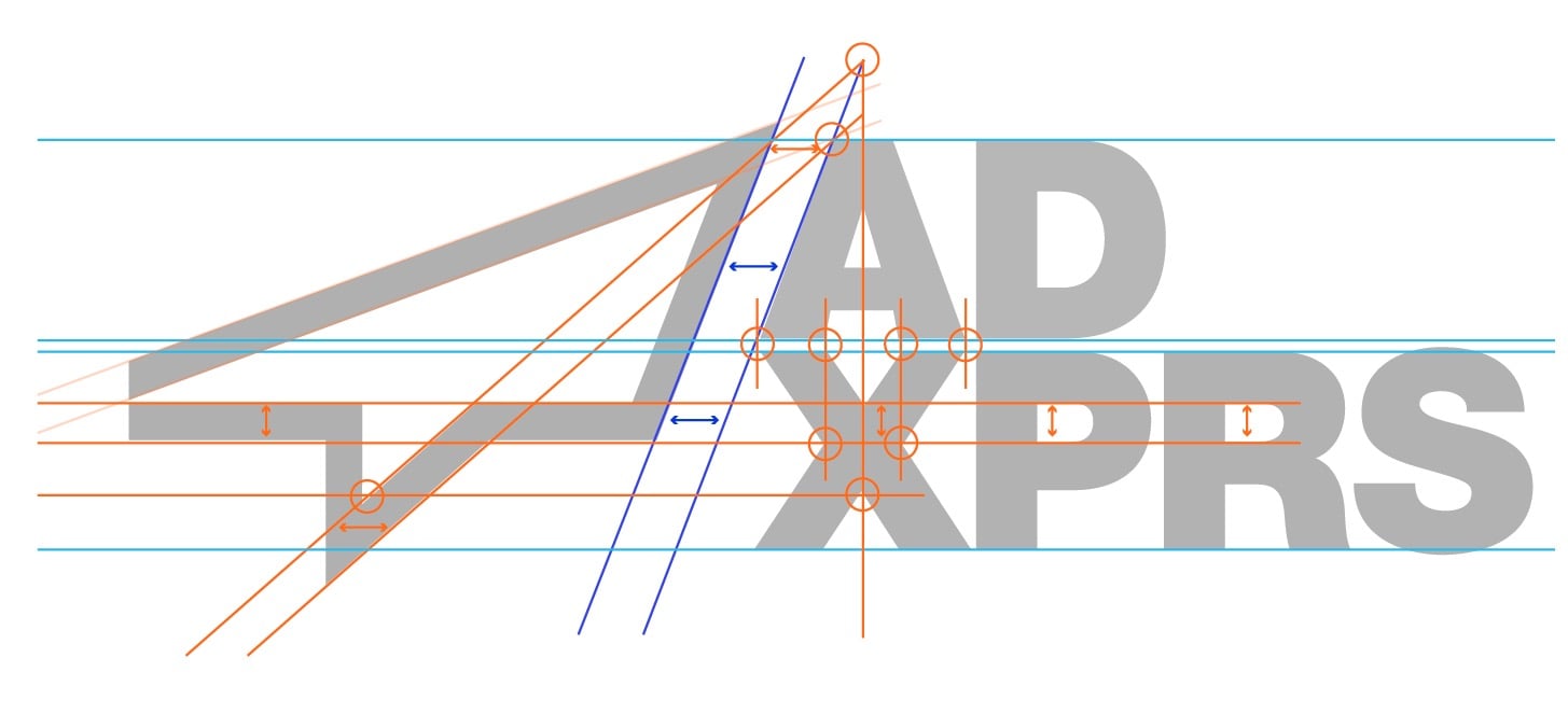
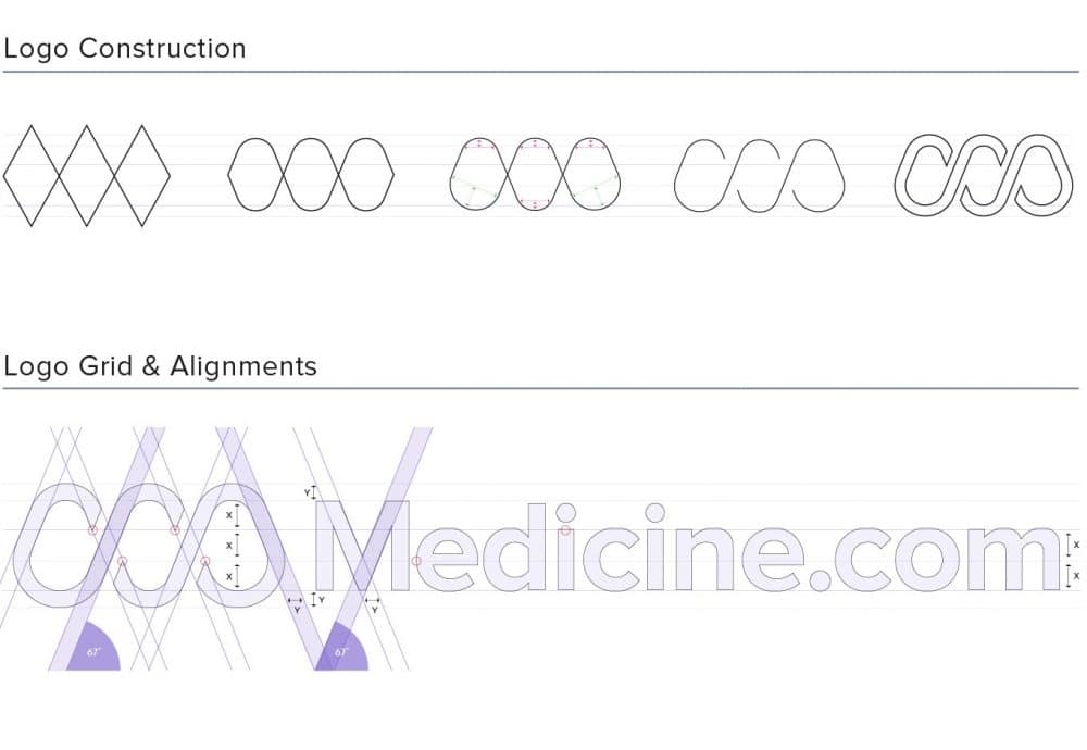
Logo & Brand Identity Examples
![]()
![]()
![]()
![]()
![]()