This case study post is for the Brokers Direct identity design; an online insurance company, offering quick, friendly and low cost insurance for landlords, tenants, vacant property, homeowners, students, commercial properties.
The main benefit is that Brokers Direct cut out the middle man and remove the frustration of dealing with other, more overwhelming online companies. They were one of the first companies to cover people over the internet.
Initial thoughts
Online insurance companies tend to be grouped into similar categories, either the big brand names likes Direct Line or MoreThan or the price comparison sites like GoCompare.com and Confused.com, giving you the apparent best deal out of a gazillion insurers you never heard of.
When I was approached with the brief for Brokers Direct I was initially a little skeptical, the name was pretty generic and it was just yet another insurance company. The more I read into it and further to conversations with the client, I realised that Brokers Direct was quite different. Their approach was to offer a voice to the process, unlike comparison sites which are mostly done online, but to also offer the best deals.
There was definitely a strong emphasis on the telephone and human contact, as well as them being a small company competing with the big names, which I liked.
And you just know that with every insurance policy sold, the fortunate customers go on a family trip to a near by field. The sun is shining and the sky is blue, and every one is just so happy now that they are insured. Oh please. Guh.

The BrokersDirect Client Brief
A lot of competition out there for insurance, so many companies and brokers all angling for your business. The main focus for Ashley was to create an image of professionalism but also one of being trustworthy and genuinely there to help navigate the sometimes chaotic business of finding insurance.
Although they mostly deal with property insurance, it was important not to make this the focus as they are expanding into other areas. That by going to Brokers Direct, customers will get cheaper quotes by cutting out the middle man, that you are dealing direct with the insurance company.
So a large focus on creating a sense of trust and reliability as well as not cutting corners to get a best quote at the expense of certain important details. That Brokers Direct is cheap, not because they sacrifice quality or customer care, but because customers are getting insurance at wholesale discounted rates.
The other focus was on how Brokers Direct wanted to be perceived in this busy market place. If you look too small and homely, you can miss out on customers who believe going big and corporate offers security and peace of mind, but that by making yourselves look bigger than you are, can cause problems in itself.
In this case, Brokers Direct wanted to appear that it belonged in the same year at school as the others, but had a more worldly head on its shoulders.
Insurance – Keep it real
Insurance is a dull concept, you can’t make it exciting because it’s just not exciting. It’s a necessity not a luxury. It’s hard to create a fan base out of anything that you ‘have’ to have, like servicing the car, mobile phone bills and insurance.
If you dress it up to look cool and funky, you are just deceiving yourself over it’s true nature. On the other hand, it is possible to make it look less stuffy and boring than it is.
The trick is to find that narrow line in that common ground.
Review the competition
Although Brokers Direct is not a massive brand like any of the above, they are well placed to be competitive with them on value and service. So we looked at the commonalities and difference of the brands to see if there was a recurring and expected theme. The 8 brands shown are a handful that I have chosen to highlight in this logo article, but there were many others that we looked at.
Strong emphasis on colours and heavy use of type.

MoreThan wins the logo design prize for it’s cunning adaption of the ‘more than’ symbol for the ‘A’.

As well as scoring points for design and aesthetics, I looked at personality and vibe. Although MoneySupermarket.com is clean, it feels way to clinical and sterile for me. This leads me to think the service or experience is the same. Not an ideal link. Confused.com has me confused. Direct Line has been around for ages and the red telephone is part of their television branding.

GoCompare.com seemingly have gone the route of visualising lots of people swarming around their company, or just am attempt at a pretty mark. Easycover.com feels a little dull.

A few still feel it’s necessary to have the.com after the brand name, something I really feel has past its usefulness. It used to be quite ‘cool’ to add .com, now it is tired and cliche.
The route in was to create something a little warmer, more friendlier, stylish but with feet still firmly rooted to the ground.
This was the challenge and it was a clear distinction to have formed, it helps enormously that this also coincided with how Ashely viewed Brokers Direct.
Phase 1 – Typography
The research into other insurance companies lead me straight onto font choice, even before I started doodling. This was a perfect example of a job where I could sense what I needed, but couldn’t direct myself to it straight away. The process involved looking at common font styles and then going with an instant gut feeling to get rid of the obvious non contenders.
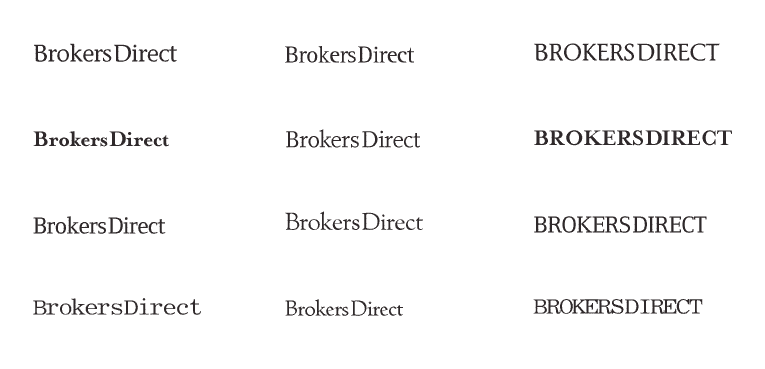
Although I knew in my head serif styles would not be used, I still wanted to check the look of them set with the brand name.
Examples of these to be trashed were serif based fonts. Way too stuffy and classic for Brokers Direct, not at all what we want.
Next stage was to look at sans-serif styles, a range of fonts were grabbed from my library and set with the Brokers Direct brand name.
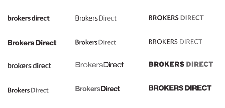
Much better as a first impression with sans-serif, gave the clean and relaxed feeling I was trying to visualise, but still nothing much leaping out at me. Several came close, 2nd column, 3rd and 4th one down.
With each style of font, I will usually create several versions: all lowercase, upper and lower and finally all caps. Sometimes if you feel you know an all-cap version will be too over powering in a few cases, with the right font, it can actually look great.
I’ll also set versions with tight and open letter spacing, this is one aspect that greatly changes the overall feel and personality of a brand name in a logo.
Just look at the examples below.
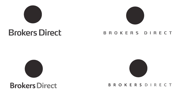
Both words on the 1st line are set with the same font in the same weight, the 2nd column is set in all caps with super wide spacing. Same applied to 2nd line. The larger point size of the mixed case looks chunky and very bold compared to the 2nd column versions. They appear more stylish, more refined.
Adding a dummy logo placeholder allows you to better visualise the whole logo in context. Even if you don’t know how the actual size, and position will pan out, this is still useful to gauge your selection of font styles with.
At this point I decided to move on from the font choice, I had a much clearer idea in my head what basic style seemed to be working, nailing the specifics would come when I had a logomark to with with.
2nd Phase – Doodles
I have a few doodles, but nothing of consequence. One idea I explored did come about through a few sketches, but the main idea I settled on came about through digital doodling and playing with nice shapes. I think I have mentioned this before, some projects like this I tend to just float around on the computer, but other projects I may end up with 10 A4 sheets full of ideas and doodles.
Depends on the project and the brief.
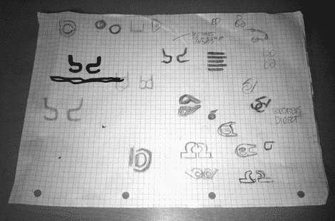
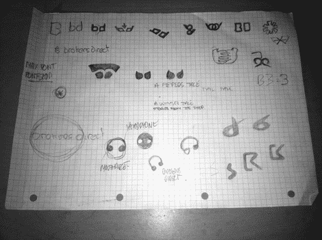
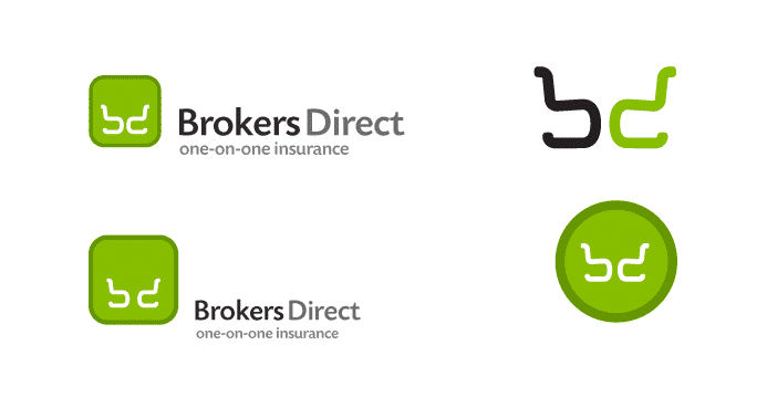
In the image above you can just about see one of the main ideas I worked on at the beginning, forming pair of chairs from a lowercase b and d. Fortunate with the lettering, the chairs were meant to convey the feeling of openness and the more human nature of talking to Brokers Direct.
Much like going into your local bank, sitting down in a chair opposite your bank manager, discussing a loan.
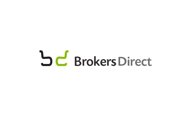
This was a positive association and liked the style of the lettering for the logomark. I played with this for a while, different sizes, proportions but each time I felt it just looked a little weak, a little too fragile. It was a potential idea but it didn’t sit right with me.
There was also the problem that it looked like a pair of glasses, steering people to a optical link, not insurance. So I left this one on the back-burner as possible option.
3rd Phase – Logomark
I looked at other possibilities, and played with an idea I had right at the beginning. I only mention it now as at the time I just couldn’t bring myself to accept it as an idea.
Time and time again this happens, I come up with an initial idea, almost formed from instinct gut instinct, in some cases I stick with it and it ends up being the chosen idea. Other times I feel so unsure, even though I feel sure, that I end up sitting on it.
I really should no by now to trust my gut, but sometimes you feel that if you get ‘the’ idea at the very start, you have not done enough work to warrant going with it. Which is utter poppycock of course, but hey ho.
The idea was simple and seemingly to me, cliche, boring and predictable. It was an arrow. You might understand my concern, arrows are not exactly priceless works of creative inspiration. Yet, this idea I had on my pasteboard looked so right. How could it look so right? It was only a damn arrow. Thus my hesitation, and my reluctance to initially go with it, hence the idea above with the chairs.

Image above shows just a small selection of exciting arrow doodles. Each basic form lead to variations and heinous hybrid designs.
For me, however basic and simple, they looked perfect, especially in this vibrant green which was specified by Ashely at the beginning. They felt fresh, clean, no nonsense and practical. More importantly, they actually conveyed the basic idea of Brokers Direct.
Go, find a cheap and reliable insurer now, over here, this way please.
Directional arrows, they lead you somewhere. In this case, they lead you to insurance.
Although I had shown Ashely other ideas, and the chair/glasses idea, I had yet to even admit to her what my gut was saying about the arrow. The more I thought about it, the more I was able to rationalize it. Which was easy, there was no hard work trying to justify some random visual image, it just looked great and worked.
I should also add that Ashely had first mention an arrow concept in her initial brief. For some reason, I felt inclined to prove that I could come up with something else, something cool and rad. In this case, it was just proving to myself, rather than focus on what was appropriate for the client, even if it required using the arrow.
Rationalize
Obviously I was a little concerned that the arrow was logo mark of choice for Insure and Go, as well as More Than and not to mention all being green as well. This was a crucial point to consider. Was there room for another green arrowed logo insurance company?
I had to be sure in myself that there was room before showing Ashely the idea, and I wanted the idea to be as perfect as possible in this case, to show her it in full context, rather than a half finished doodle, which really would have been a chronic let down.
The main mark I was focusing on was this:

It wasn’t a totally random idea, it started with being formed from a telephone key button, the arrow directing you to press stuff in order to get your quote, but this was way too literal.
The idea was to simplify and combine. We had two separate elements, which were combined into one, but overlapping, rather than being part of.
Take a break
So time for a break. Time to move on from the logomark, which I had been working and obsessing over for some time.
I need to walk away to gain some fresh perspective. This meant I could try and wrap up the typography element as the main logo idea was in view.
Phase 4 – Typography
After the first round of font viewing, I had decided on using a ’round’ font, such as Vag Rounded etc. This style of font, when using appropriately, evokes a subtle warmth and friendliness to the identity. Yet still stylish and clean to appear professional and trustworthy.
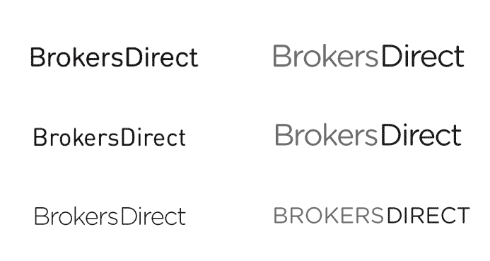
I looked at a few variations, Helvetica Rounded, Vag Rounded, Gotham Rounded, Byrant Pro and Estilo. I settled on Gotham Rounded Bold. It had just the right amount of roundness and fullness I was looking for. A very pleasing font to look at.
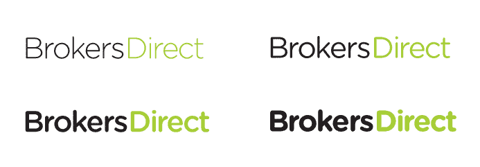
I kept the tracking quite tight, to create a feeling of trust, reassurance and security. This wasn’t the time to have super loose tracking, no matter how good it can look.
Phase 5
Things are coming along very nicely, I have the basic shape of the logomark and I have chosen a really nice font, that is more than appropriate for it’s intended use. Put it all together, with a tag line and we had something like this. Really rather nice to look at.
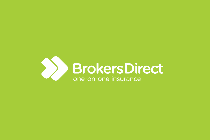
It’s at this point that I talk to Ashely and tell her my ideas for the arrow, whilst explaining why I think the table and chairs idea is flawed. I needed to explain and justify my reasoning for falling back to the arrow idea, I didn’t feel it was good enough to just say without any reasoning.
After that conversation, I was happy to send her the version I had mocked up above.
Needless to say it went down very well, although I was still harbouring some doubt that I had failed to find some awesome revolutionary idea and had just back peddled back to a poor 5th place.
Often the desire to be unique in logo design can be crippling.
Some reflection
The more I lived with this design, the more I accepted that some times, you just have to do the right thing, regardless of the fact it might not prove to be earth shatteringly groundbreaking.
This is one such case, and I have picked up a few tricks from this experience. Wondering and worrying what every other person or designer might think can drive one to despair, and can prevent you from doing the job you were hired to do. Which certainly isn’t to always impress others with your eye shattering design prowess.
Having confidence in your own abilities, and to run with it at full speed, is most definitely where it’s at.
Phase 6 – Polish
Personal issues aside, the next part was to give the graphic some polish, lavish it with some pixel love. The final coat of gloss came about mostly through playing. I wanted to lift it a little, to add some ‘surface texture’ to enhance the Brokers Direct message.
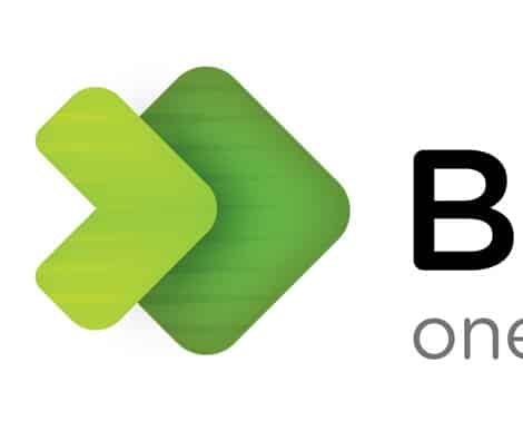
Nothing too fancy, just a flick of light to lift it. The effect, better seen at small sizes is like contrasting reflective lines or a Spot UV striped coating, the light hitting the lime green Spot UV and causing a bounce of light off the surface.
The shadow created by the lime green arrow is only found on the dark green portion, it doesn’t spill out onto the white background.
There is a clipping path following the outside shape and is created fully in Illustrator. This is a fully vectorized logo, the various shadows and layer effects are applied through Illustrator.
The logomark also works brilliantly as a website favicon, pulls quite a punch even at 16px and clearly shows you where to go.

After all the internal battling doubt, I am really very please with how this worked out. Glad that I stuck with the initial idea and saw it through.
Even in single colour, white on black, black on white, white on green it still retains the integrity of the design.

My BrokersDirect Logo Design Starts A Family
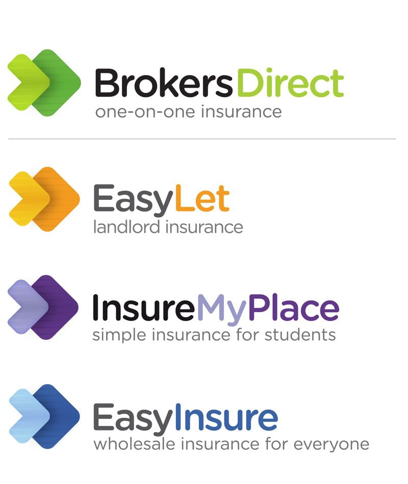
It’s super nice when a previous client shows you some stunning new versions of a logo design you previously did for them. Ashely showed me these variations on the BrokersDirect (Process Post & Portfolio) I designed for them: InsureMyPlace, EasyInsure and EasyLet.
It’s great because these logo variations look really smart as well as effectively carry the original BrokersDirect identity. The colour selection is also super nice.
Her call to me was to just run these additional BrokersDirect Logo designs past me, and to check I was cool with them creating other versions of the original logo design.
I’ll be first to say that I was initially a little concerned that the attachments to shoot over on email would be less than satisfactory, but the flip-side is that it’s her logo now and she can ultimately do as she pleases with them.
I love it because it’s all good.
