Unevolved Brands: Brand Logo Simplification Project by The Logo Smith
Please note: the original home for Unevolved Brands was over onTumblr and also on Flickr, but I’ve since been resaving each image from a JPG, to a more efficient SVG.
In the meantime, this post shows just a small fraction of the Unevolved Brands that had been done back around 2012-2014. In the coming months, after all the images have been reserved to SVG, I will create a proper Portfolio Project Page, just as I have for Brand Reversions.
See also: Brand Reversions and Humanofied Brands
History of the Unevolved Brands Project
Came across an interesting piece in one of my latest logo book purchases, ‘Los Logos Compass’. There is a small section explaining when some famous brand identities are simplified to simple circles, how they can often still be recognisable.
I thought it would be interesting to pick some other famous brands and apply the same technique and see what the results were. It’s easy for me to say this will be easy to work out, as I know already.
Goes to show that even if you are not a well known brand, how useful it is to have a logo design that is fundamentally simple in shape and structure. The Google logo may not be a ‘design wow’ but it’s certainly very memorable and recognizable.
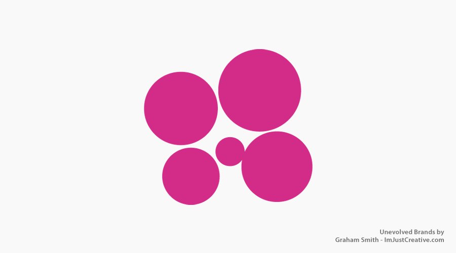
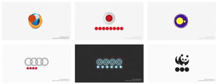
Unevolved Brands: A progressive study on brand & logo simplification by Graham Smith. How many Brand Logos can you recognize after they have been Unevolved to just circles?
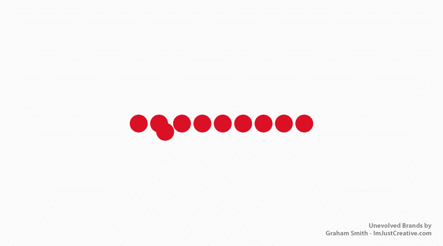
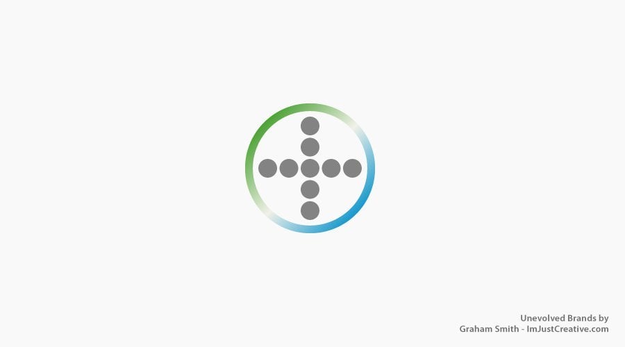
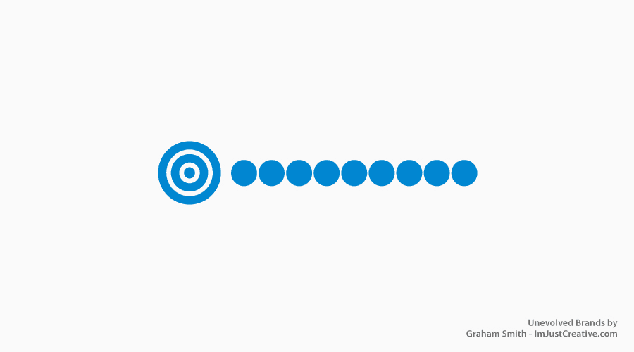
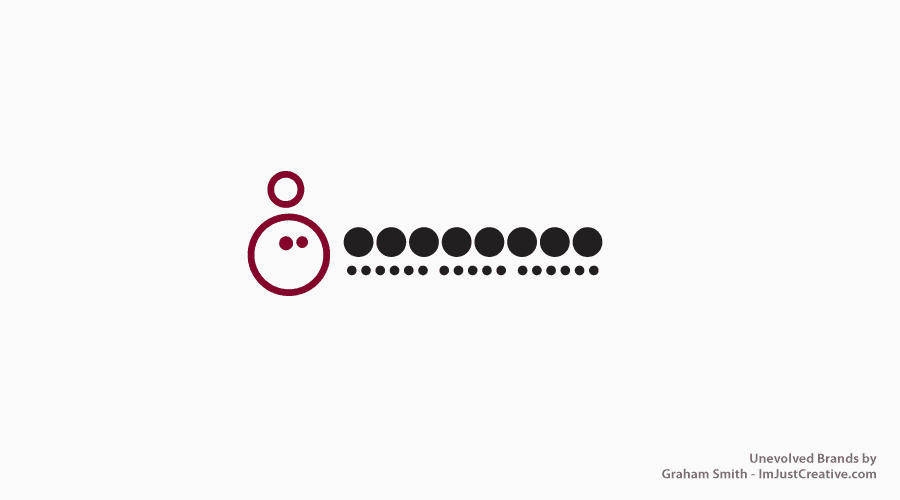
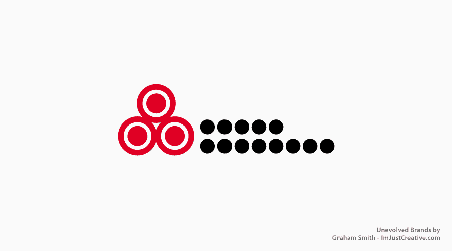
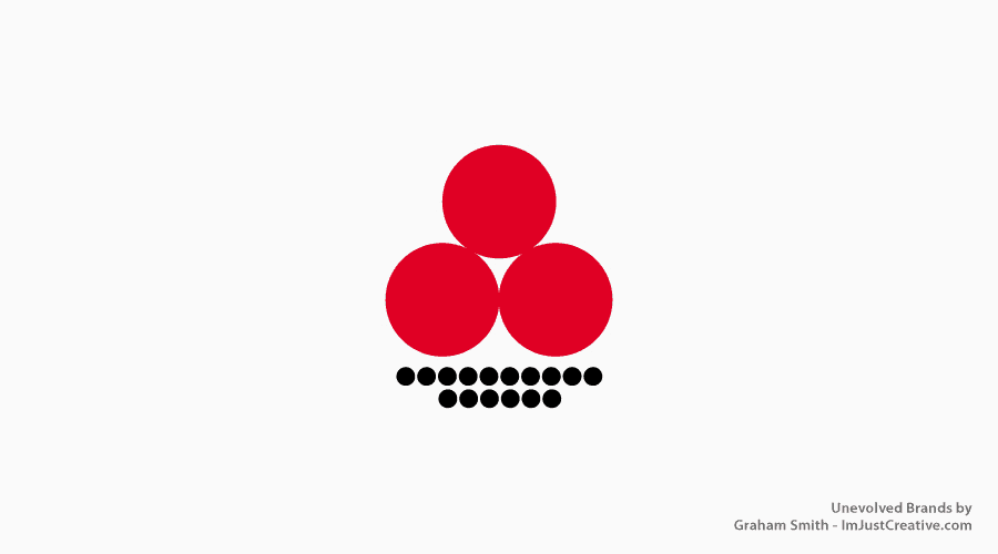
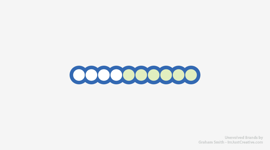
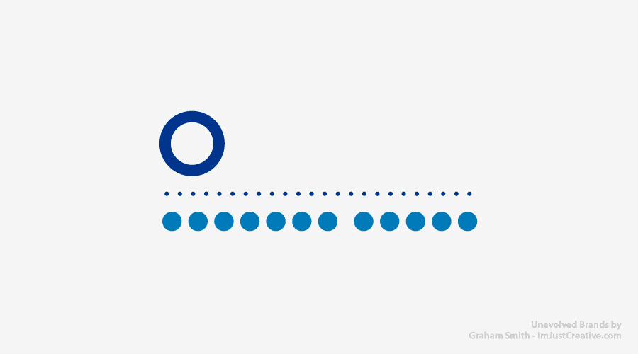
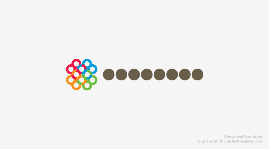
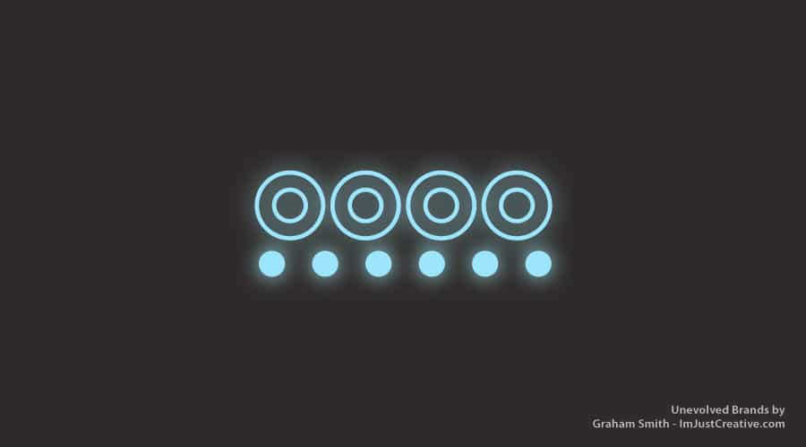
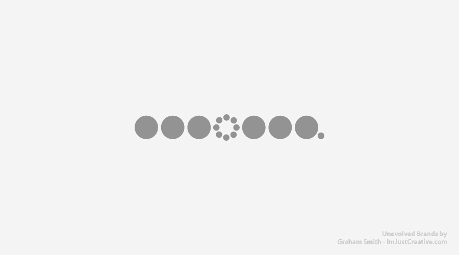
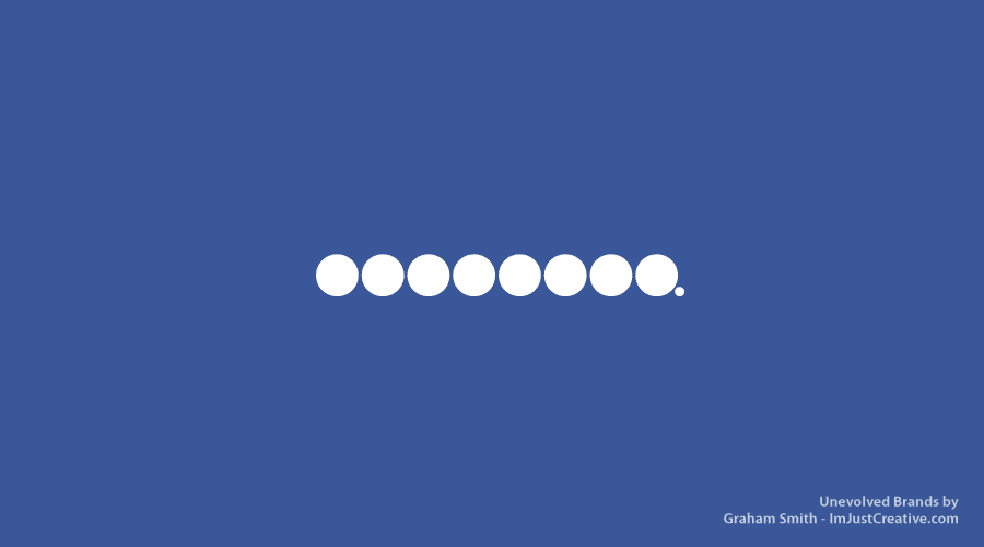
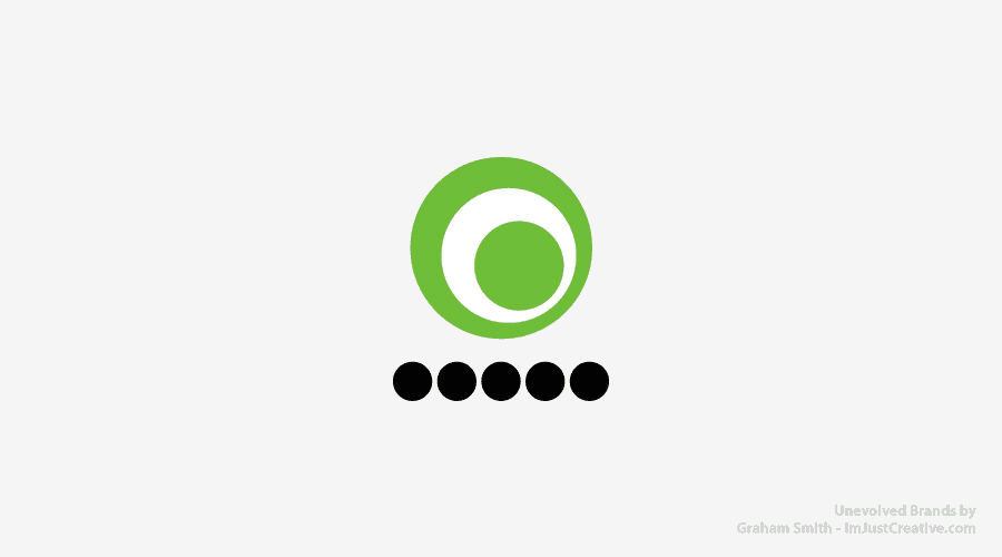
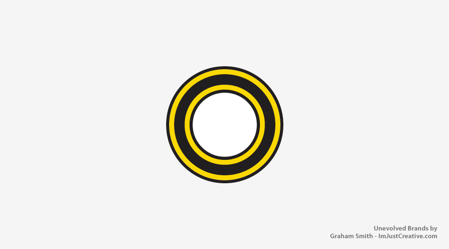
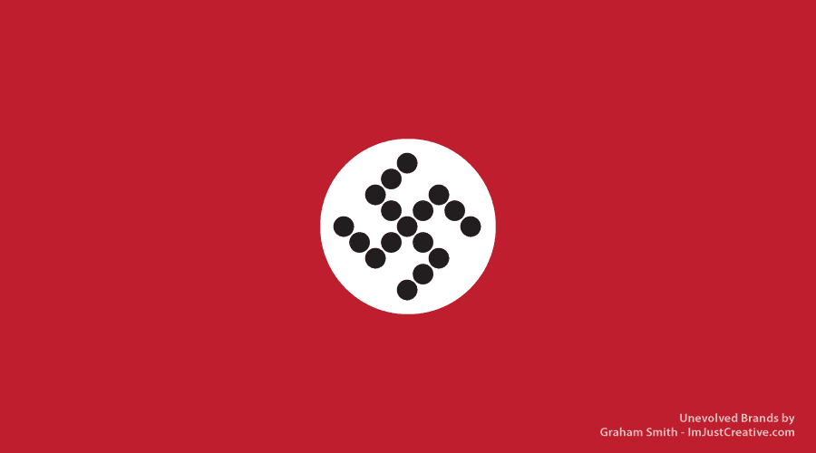
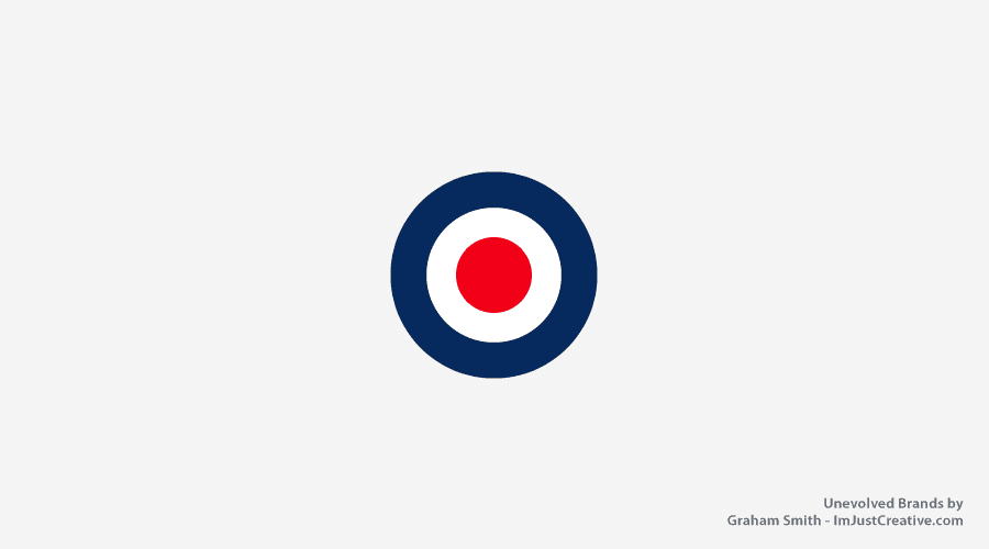
Logo and and brands that have strong and unique colours, as well as strong positional aspects, typically are the most recognisable when unenvolved to just circles.
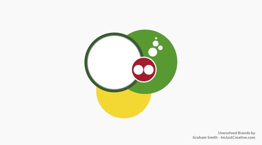
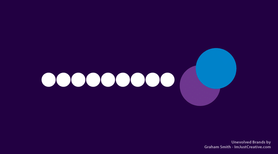
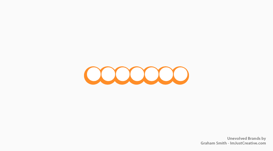
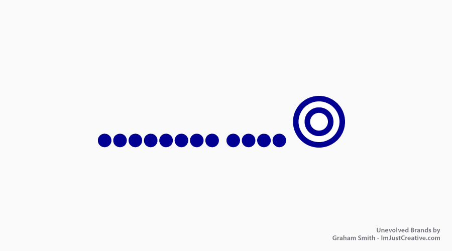
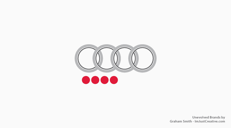
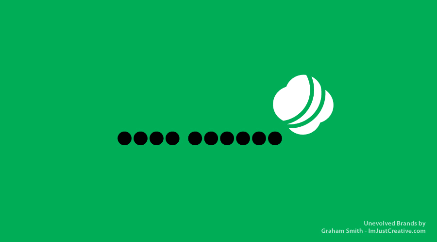
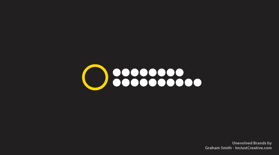
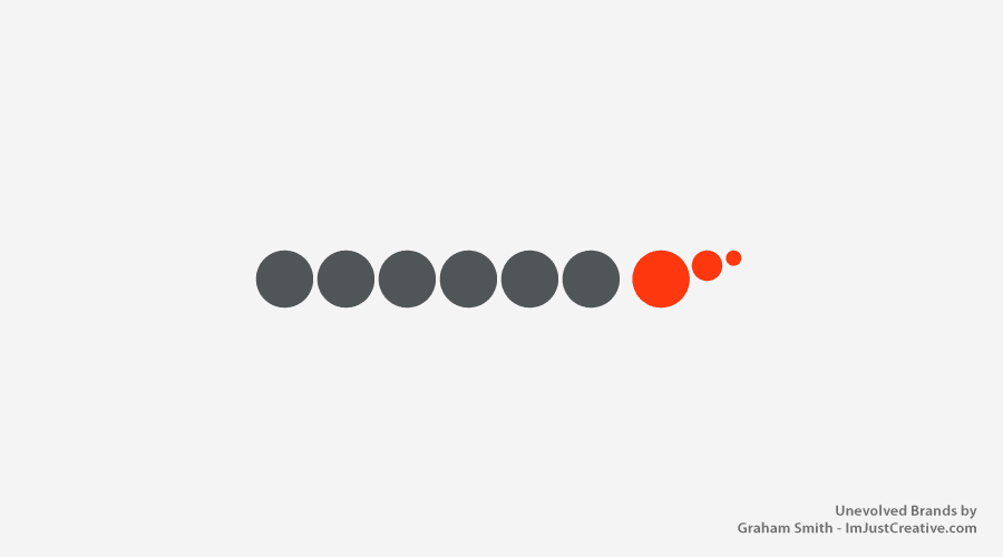
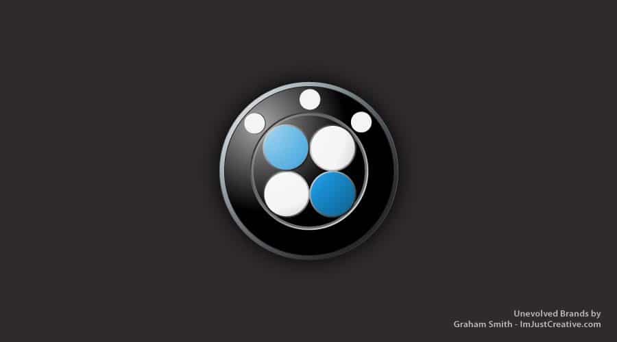
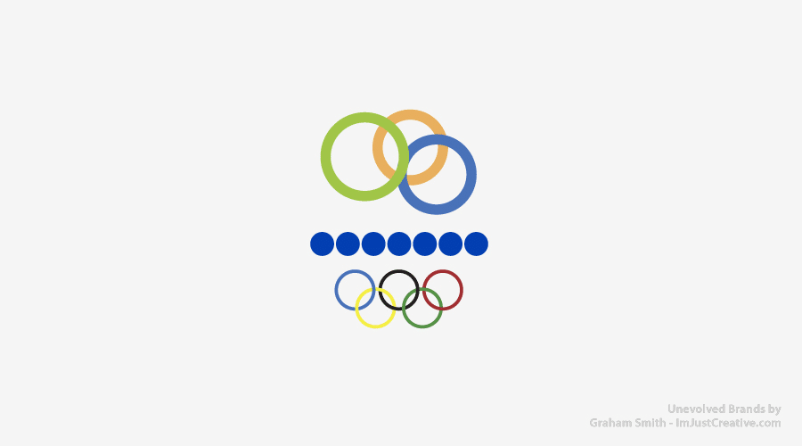
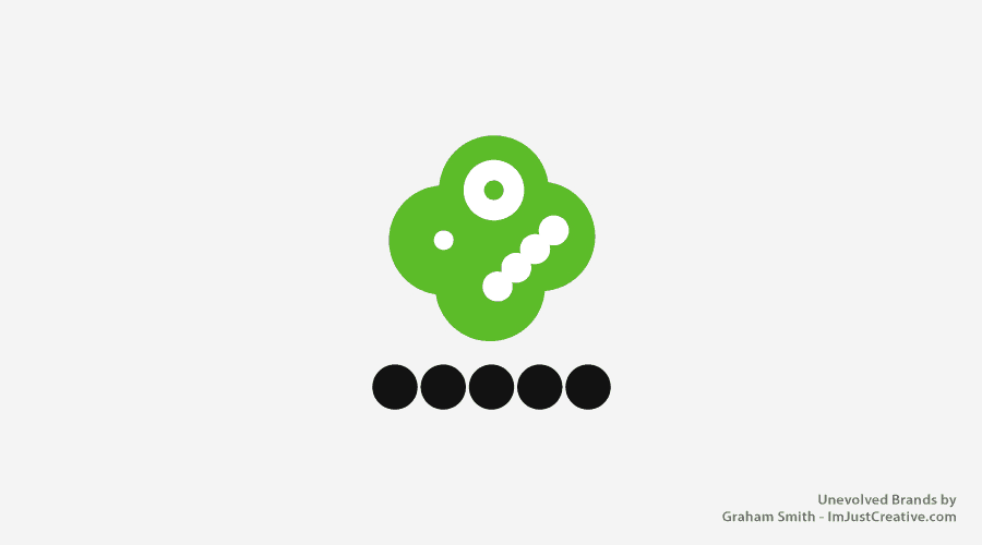
In the case of Unevolved Brands, most examples will have a circle representing one letter or one container. In the case of Orange, a self contained logo, we have one circle for the orange container and one circle for the wording. Typebased logos like Twitter, FedEx and eBay may just have one circle per letter.
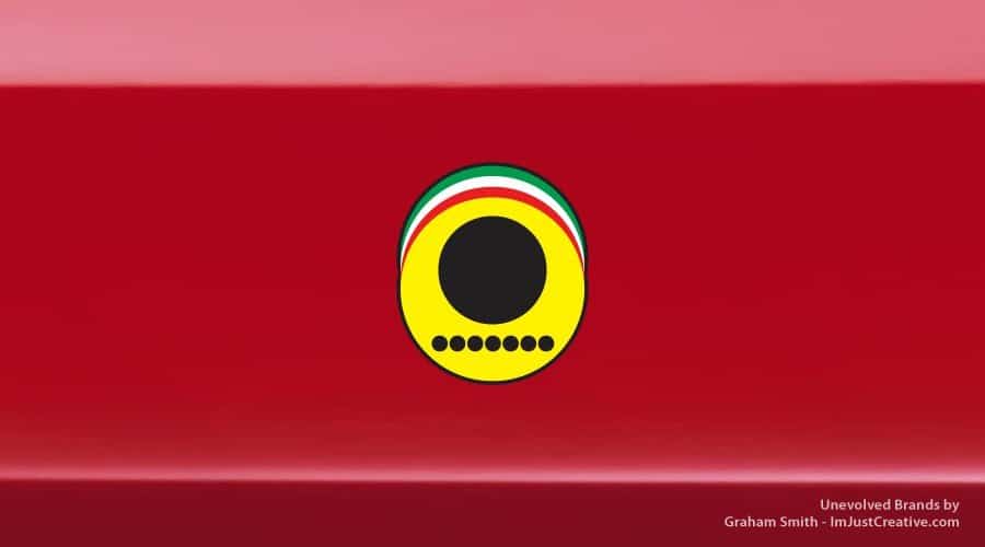
Circles are used as creatively as possible, to recreate a certain design or shape. In the case of Apple, a whole circle is used to punch a hole into the black circle. So although ‘bite’ doesn’t show a complete circle, it was formed from one. With Ferrari, multiple circles were layered to create the emblem.
It’s an ongoing study, so new logos and brands will be added.
Unevolved Brands has been Featured On:
Featured on this websites: Quipsologies, Design Taxi, Laughing Squid, Peta Pixel, BusinessInsider, MyModernMet, Gizmodo and more…
Unevolved Brands: Brand Logo Simplification Project by The Logo Smith