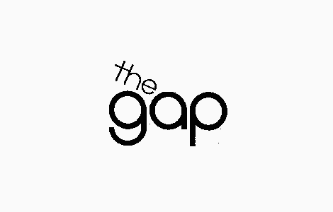
The only example of this original logo from 1972, a small and rough looking version.
The original The Gap logo service mark filed in 1972. The origins of this drawing in stylized word form is February 29, 1972 when The Gap Stores filed a service mark application for U.S. federal trademark registration.
Recycling the original 1972 ‘The Gap’ Logo
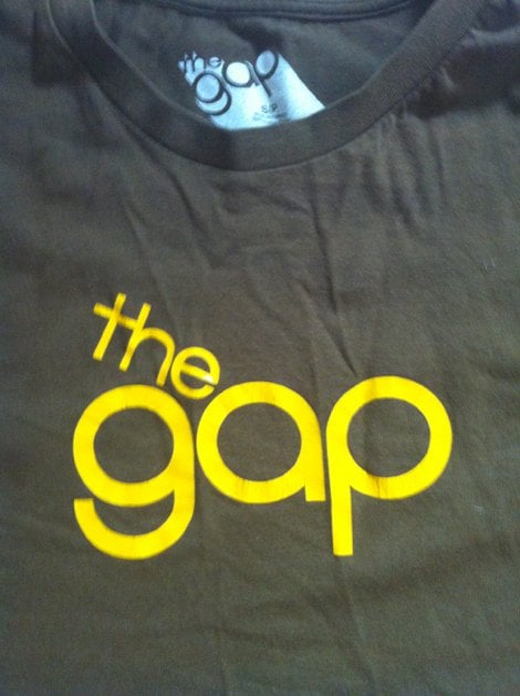
During the writing of my GAP post yesterday, I came across the original 1972 Gap logo design (service mark), then ‘The Gap’. I had no idea this was from 1972 as I have a fairly recent t-shirt from GAP with this logo printed in yellow on brown.
Redraw GAP Service Mark
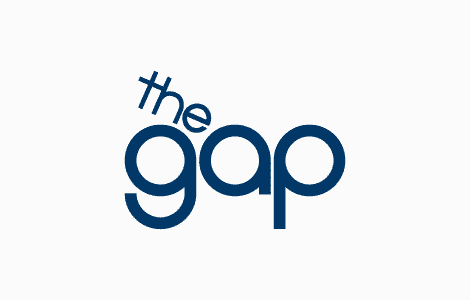
I decided to spend a few minutes redrawing this logo, tracing from the photo of my t-shirt. Remove the ‘The’ and slip it into the famous GAP blue box.
The following isn’t a suggestion for a replacement GAP logo, just an experiment using both parts of GAP’s original logo design.
In my mind, this doesn’t look half bad. It keeps the roots of the very original GAP brand, yet in a style that is still decidedly modern.
Not everyone’s taste I am sure, but I just wanted to try and experiment with old parts, recycle the GAP logo and see what gives.
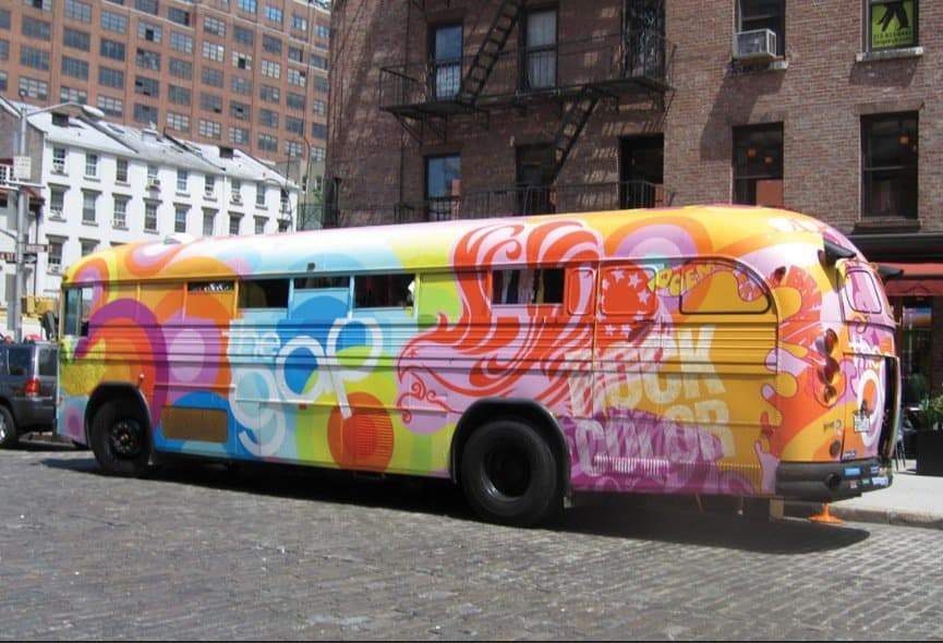
Summer 06 – Rock Colour Bus


