I have been fascinated by this whole GAP logo circus, I have made my thoughts about it fairly obvious in a previous post ‘The GAP Logo – Is the outcry and criticism justified’, I then came up with a few ‘for fun’ GAP logo attempts, one based on the very original and vintage 1972 GAP service mark.
I have tried to resist doing a ‘sensible’ design, the whole ethical debate about crowd-sourcing marginally bores me. I ultimately realised you may as well join them as there is no way on earth you will beat them. The extraordinary volume of GAP logo designs submitted from FaceBook to Dribbble and independent websites and crowd-sourcing contest sites has been just phenomenal.
Regardless of your views on ethical issues bought around by GAP encouraging people to design a new logo, the lure of the challenge is to great to ignore. After all, I do have a choice in this matter, GAP are not making ‘anyone’ design for free, they are simply working the system for all they can. After all, it’s just business. I have ulterior motives to work this project, and I will make it work for me in way’s not immediately obvious.
Who knows if their brand will take an even bigger hit over this, no one can say for sure.
Helvetica Gap Logo Design
I have stuck with Helvetica for my GAP logo redesign, I based this on the assumption that Helvetica is an existing brand requirement, specifically as GAP use Helvetica in the majority of the brand campaigns.
See image below.
Easy to improve other peoples work
The ideas you see here are not one I would necessarily suggest ‘putting’ forward as a serious GAP logo alternative, it’s just what I would do to improve the ‘new’ concept by Laird+Partners. It’s always easier to improve on someone elses designs, especially in this case.
So the actual idea or concept I have played with is nothing extraordinary. Just my suggestion.
My own opinion is that there was nothing wrong with the original boxed GAP logo, first image in this post. There is nothing wrong with it, regardless of how long it has been around. Some people are now naturally saying it’s boring and old yada yada yada.
Logos do not need or have to be super exciting, they just need to work.
The blue box GAP logo has worked for many years. To blame the logo on GAP’s downward spiral as a high street fashion shop is just naive poppycock.
Any company should feel proud to have a mark like this, it’s pretty much timeless, which is what we all strive to create, it’s stylish, its memorable and compact. So OK, time for change, most major brands go through a refresh or complete overhaul at some point, but GAP really needed to pull something special out of the bag, decades of the blue box logo are hard to forget.
It’s in out nature to compare old with new, sometimes the re-brand is a success, sometimes it goes catastrophically wrong. I do wonder if brands hiring massively expensive agencies for the initial logo design is such a good idea. Too many people involved, too many people to please and too many people interfering with the design process.
A freelance logo designer can cut through the crap.
I love the original blue boxed GAP logo. However, I certainly don’t love this one coming up next. We really need to work on this framework.
New Gap Logo
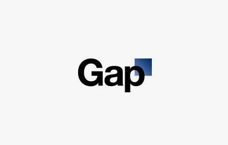
The logo causing the controversy, above, uses Helvetica. It is that hard to really make it just a Helvetica wordmark ‘own-able’, hence the need to add this dated blue graduated box just to draw some distinction. Many brands using Helvetica have done so from the start, rather than change half way through. As I mention below, 3 letters is not much to play with, American Apparel is a more substantial wordmark and so Helvetica seems to work with it very nicely.
The new logo just doesn’t work.
The wording would work better on its own, but this would hardly be unique. Just 3 letters set in Helvetica. In start contrast, the original blue box GAP logo is ‘own-able’ in every sense of the word. They will find it hard to match that level of individuality with a Helvetica logotype.
Helvetica can look sweet but it can also look bad, which I think the new logo shows. A few tweaks, a different style more suited to the letters, changing the colour and you loose the cold clinical feel that the new one currently gives.
What follows are a few of my suggestion to make the Helvetica GAP logo a little more ‘fashionable’.
A few suggestions
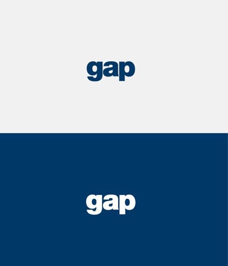
My first suggestion is to include a lowercase ‘G’, this softens it up, makes it more friendly, more approachable. The uppercase ‘G’ does not work in this combination of letters. It overpowers the ‘a’ and ‘p’. Lowercase feels much more compact and natural.
Black can be pretty harsh, especially when used next to a blue, takes on a sterile, clinical conservative feel. So changing the wording to the GAP blue sorts this out. There is now no need for that awful graduated blue box, my coloured lettering carries this ‘previous brand association’ just fine. The graduated blue box adds nothing whatsoever of value, other than an eyesore, but does prevent it becoming an elegant and clutter free solution.
I feel the particular weight of Helvetica used is too light for just 3 letters, so I have weighted it up to Helvetica Neue Black and closed up the spacing.
Custom Helvetica?
Although this is default Helvetica Black, it would be feasible to customise it a little. This would bring the advantage of it becoming more ‘own-able’ to GAP, the changes needn’t be huge, subtle tweaks word work.
This could then lead to complete customisation of the Helvetica face just for GAP. This custom designed Helvetica could then be used for the rest of GAP’s branding and print design.
As you can see from the above example, these few changes make a huge difference to the overall look and feel, it has more impact and presence, it is simpler and less cluttered than the ‘new’ logo.
It says more more with less.
Without the graduated blue box, this becomes a wordmark, typemark, logotype etc and will be supremely flexible in use.
The new heavier wordmark will now pretty much fit anywhere you want it to go, not so true with the graduated blue box version.
As it is one colour, it can work in any combination and looks particular striking white on GAP blue.
The big blue box
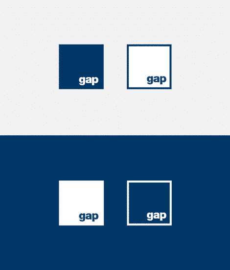
Not to suggest that the logotype needs to be contained, but if you do apply the original box style, it will look very solid and will have strong brand connections to the old logo, whilst being a fresh updated incarnation.
I do believe keeping the blue box would really help with general perception and visual uptake due to the the public’s existing familiarity of the old logo. The blue box IS Gap for many people, with a new font in a new position, it takes on a new lease of life. The upside is that GAP don’t have to start over with educating people on the visual changes of the GAP identity. This is a more subtle approach but has a deeper voice. It will yield bigger rewards all round.
The blue box adds versatility with my suggested improvements to the thicker and fuller typemark. The wordmark can be interchanged as you need.
Don’t confuse your customer with a new personality if you don’t really need to. A complete change of clothes is not always needed, often just a new hairstyle will do the job
A quick side-by-side comparison.
On the storefront
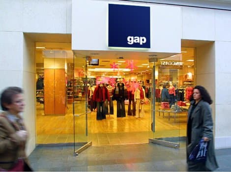
Mock-up of new GAP wordmark in blue box on a GAP store front. It feels and looks much fresher in my eyes.
When you walk pass this new look you’ll have a familiar feeling, nothing is too out of place. You know it’s GAP from a mile off but you’ll also know this is a new GAP. The two can work side by side, familiarity and change work hand in hand if you get the balance just so.
You’ll feel good about the change, you’ll be more inclined to visit.
I am really not sure what plans they had with regards to the new logo on store fronts. I can’t envisage one solution where it would look as prominent as the original blue box GAP logo or even my suggestion above. Without seeing all the research and supporting sketches, ideas, concepts it’s hard to imagine, but I do know their new logo would lack the right sort of presence, warmth, familiarity, comfort and the list does go on.

