
The Unofficial Style of NASA Logo Design Used in the Movie LIFE
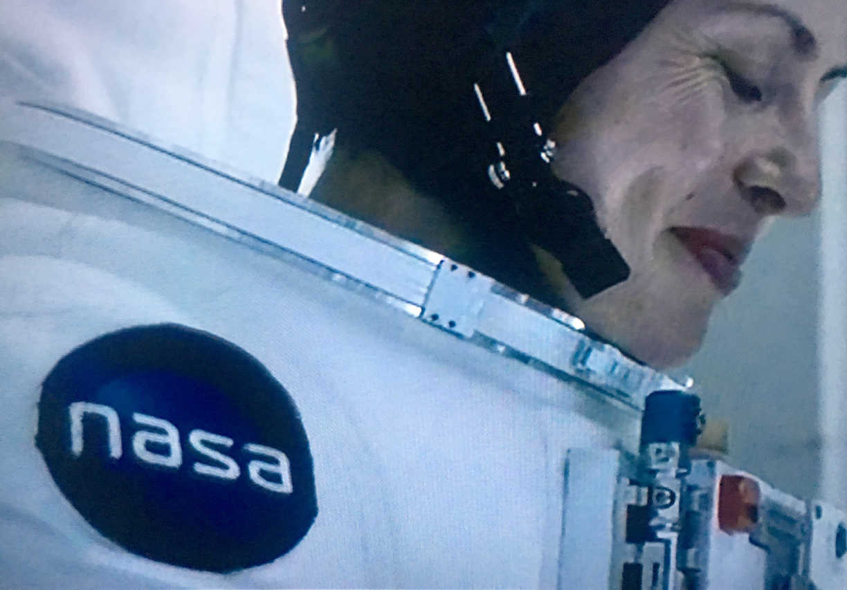
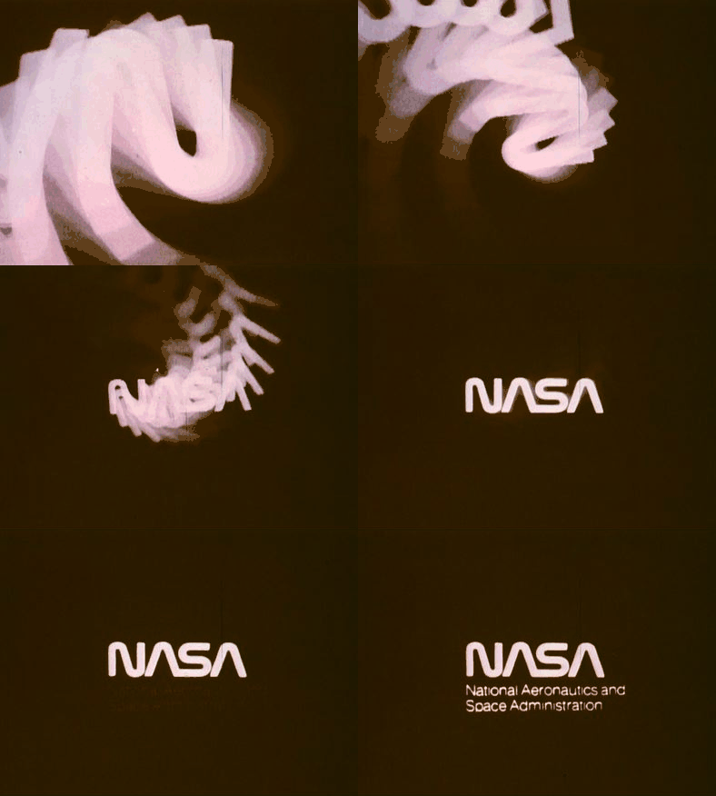
Watched LIFE the other day; noticed the NASA logo wasn’t the official NASA ‘meatball’ logo, nor the far cooler NASA ‘worm’ logo, from 1976.
IMDb: “A team of scientists aboard the International Space Station discover a rapidly evolving life form, that caused extinction on Mars, and now threatens the crew and all life on Earth.”
I only noticed it in one scene, but it likely appeared elsewhere, I just wasn’t paying attention enough.
Verge wrote a rather lengthy article on NASA, and the movie: The fictional NASA in Life is run by a bunch of psychopaths and idiots
Recreating the LIFE Movie NASA Logo
I did think though it would be a bit of fun to recreate it, as best as I could, without spending hours on it.
It’s not 100%, as from the TV screenshots, it does look like all lower-case version of the logo is a bit hit & miss, itself, in the movie.
Or just bad embroidery…

I have read on StackExchange, that NASA often grant movies permission to use the official NASA ‘meatball’ logo, such as in the movie, Martian.
In this case, presumably because it’s set in the not too distant future, that they assumed the NASA logo would have been ‘updated’ again. Fair assumption, to be sure…
I’d say they were ‘circling’ back to my favourite version of the NASA logo, the ‘worm’ variant.
It’s the version also now available as part of the official reproduction of the NASA Graphics Standards Manual.


It’s so cool, there’s even an animation of it.


