Skip to the content
The Logo Smith
Website & Logo Design Studio
  • → Work with Smith.™
    • Contact
  • Monomarks
  • Portfolios
    • Logo Portfolio – Page 1
    • Logo Portfolio – Page 2
    • → Download Portfolio PDF
    • The Brand Gallery
    • Logo Grids
    • Logo Redesigns
    • Logo Sketches
    • Logo Case Studies
    • Brand Logo Reversions
    • Logo Designs for Sale
  • FAQs
  • About
    • Website Info
  • Testimonials
  • Blog
Search
Menu
Close search
Close
  • → Work with Smith.™
    Show sub menu
    • Contact
  • Monomarks
  • Portfolios
    Show sub menu
    • Logo Portfolio – Page 1
    • Logo Portfolio – Page 2
    • → Download Portfolio PDF
    • The Brand Gallery
    • Logo Grids
    • Logo Redesigns
    • Logo Sketches
    • Logo Case Studies
    • Brand Logo Reversions
    • Logo Designs for Sale
  • FAQs
  • About
    Show sub menu
    • Website Info
  • Testimonials
  • Blog

© 2020 The Logo Smith.™ Logo & Brand Identity Design Studio.

NASA 60th Anniversary Logo Designed by Matthew Skeins

nasa 60th anniversary logo design


NASA Releases Logo For Upcoming 60th Anniversary Designed by Matthew Skeins

The New NASA 60th Anniversary Logo Designed by Matthew Skeins

NASA has released the NASA 60th Anniversary Logo for use in observing this milestone anniversary, designed by NASA graphic artist, Matthew Skeins.

The logo depicts how NASA is building on its historic past to soar toward a challenging and inspiring future, offering a nod to the past with a few elements borrowed from the original program emblem, and a glimpse into the future.

NASA will celebrate its 60th anniversary on Oct. 1, 2018. In six decades, the agency has not only put astronauts on the moon, but fundamentally changed how we look at the Earth and the cosmos, pushed the limits of technology and continued to improve aircraft and aviation — not to mention building the first weather and early telecommunications satellites.

As NASA looks forward to such milestones as the launch of the James Webb Space Telescope and the Space Launch System, this page will look back at some of the milestones we’ve reached along the way.

NASA 60th anniversary logo (vertical format)

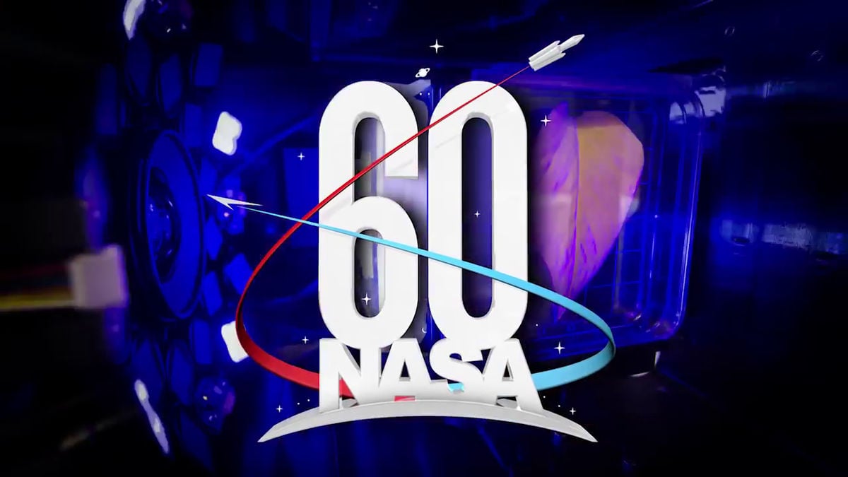
NASA Releases Logo For Upcoming 60th Anniversary: “NASA” and “60” are stacked, bold and tall, atop the continental United States, the curvature of Earth, and the light of an approaching dawn.

This placement captures the spirit of a metaphor about knowledge and discovery, often attributed to 17th century physicist Isaac Newton: “If I have seen further than others, it is by standing on the shoulders of giants.”

Similarly, NASA was built from the legacy and expertise of giants in government-sponsored research and development, including the National Advisory Committee for Aeronautics (NACA), the Naval Research Laboratory, the Army Ballistic Missile Agency, and the Jet Propulsion Laboratory.

Two vectors, one blue and one red, circle the alphanumeric elements and point toward the dark outer edges of the logo as if zooming into the unknown. In doing so, they form a “6,” which is emblematic of the number of decades since NASA was established.

The blue vector represents NASA’s roots in aeronautics research and the societal impact of our first views of Earth as a solitary “blue marble” in the vast blackness of space. The red vector represents NASA’s leadership of an innovative and sustainable exploration program that engages commercial and international partners; enables expansion of human presence to the Moon, Mars and throughout the solar system; and brings new knowledge and opportunities back to Earth.

Depicted at the tip of this vector are the key elements of NASA’s deep space transportation system, the Space Launch System rocket and Orion crew vehicle.

A crescent moon, a ringed planet and a field of stars amid a nebula of light blue represent NASA’s scientific underpinnings, particularly the enduring quest for answers to age-old questions about the workings and evolution of our planet, our solar system and the universe

The New NASA 60th Anniversary Logo Designed by Matthew Skeins

NASA Releases Logo For Upcoming 60th Anniversary Designed by Matthew Skeins


  • Post categories In Famous Logos, Logo Design
  • Tags Anniversary, NASA Logo, Space

Post navigation

←Previous post:Gelpacks Logo Design Project in Process
→Next post:Social Decay Brand Logo Series Designed by Andrei Lacatusu

View Posts by Category


Subscribe To Updates

→ RSS Feed

I'm not a prolific blogger, usually 1-3 posts a week, sometimes there maybe a few weeks of nothing. If you'd like to receive Blog updates, then you can subscribe by a generic RSS feed which you can feed into any RSS compatible app/reader.


Posts of Note

→ 1970’s Vintage Racing Logo Decals.
→ Manor Racing F1 Posters.
→ Brand Reversions: Logo Swap.
→ Unevolved Brands: Logo Simplification.
→ Typography Primer: Free PDF Book.
→ Paul Rands Unused Ford Logo from 1966.
→ Vintage NASA Animated Logos.
→ Retro Apple Corporate Identity Guidelines Notebook.
→ IBM 8-Bar Logo.
→ Fender Logo Design Evolution.
→ Download the new Formula 1 Fonts.
→ Vintage 1960's Air Canada Poster.
→ NYC Transit Authority Graphics Standards Manual.
→ Denver 1976 Olympic Bid Poster & Logo.
→ 1976 Olympics Discover Denver Hockey Poster.
→ Pantone Colour References for Boba Fett.
→ Unrealised DC Metro Subway Map Designs.
→ Tokyo Olympics 1964 Logo Guidelines.
→ Behind Sony's Vaio Logo.
→ Vintage Pepsi Ad – Pepsi Cool Cans.
→ Vintage Polaroid Branding, by Paul Giambarba.
→ CN Logo Designed by Allan Fleming.
→ Pantone Colour References for Boba Fett.
→ 1980 Moscow Olympics Logo Grid.
→ Vintage Beano Brand Guidelines.
→ 1976 Montréal Olympics Logo Standards.

→ WipEout Logo History.
→ NASA Style Guide - The Full Version.
→ Historic Coca-Cola Logo from 1890.
→ NASA Graphics Standards Manual, 1976.
→ Evolution of Batmans Logo 1941-2007.
→ British Steel Logo 1969-1999.
→ 80’s TV Show Action Figure Brand Logos.
→ Social Decay Brand Logo Series.
→ Ideas for the 1st iTunes Icon.
→ Susan Kare: Apple Macintosh Icon Prints.
→ Famous Logos Redesigned in Retro 1980’s Style.
→ Monster Compilation of Record Label Logos.
→ Vintage Swissair Poster Designs.
→ Vintage Carl Zeiss Jenna Logo Specs.
→ Argentina Football World Cup Logo 1978.
→ Vintage Porsche 356 Color Charts.
→ Vintage Colour Charts through History.
→ Famous Brand Logos MUCH MUCH Bigger.
→ 3M Logo Evolution, 1906-2012.
→ Evolution: 007 James Bond Movie Logos.
→ 5 Phrases Of Massimo Vignelli.
→ Chinatown: Western Logos Translated to Chinese.
→ The Evernote Logo & Icon Design.
→ Sony Playstation 1 Logo Concepts.
→ 1968 Mexico Olympics Logo & Brand ID.


Thank you for Visiting The Logo Smith aka smith.™ Forging the Highest Calibre: Logo Marks, Brand Marks, Type Marks, Word Mark, House Marks, Signature Marks, Emblems, Symbols & Icons, way back since the 1986's.


Smith’s Footer

  • Smith at Home
  • Hire Smith
  • Portfolio’s
    • The Monomarks Collection
    • → Download Portfolio PDF
    • Logo Portfolio – Page 1
    • Logo Portfolio – Page 2
    • Brand Logo Reversions
    • The Brand Gallery
    • Logo Sketches
    • Logo Grids & Construction
    • Logo Redesigns
    • Logo Case Studies
    • Logo Designs for Sale
  • About The Logo Smith
    • Client FAQ & Q&A
    • Client Testimonials
    • Website Info
  • The Design Blog
  • Contact Smith

Smith has over 29 years of commercial experience, and has accumulated a wealth of knowledge in: Logo & Brand Identity Design; Logo & Brand Redesigns & Updates; Website DesiPrint & Digital Design; Typography; Photography; Reprographics, Lithographic & Digital Printing; Advertising & Marketing.

speak: +44 7816 527 462
write: hello@smith.gl
google: g.page/thelogosmith
tweet: @thelogosmith
subscribe: RSS Feed

The Logo Smith aka Smith
10 Badgers Copse
Seaford
East Sussex,
BN25 4DF. Great Britain.

© 2021 The Logo Smith aka Smith.

Hey! Work with Smith