
This is Part 11 of the Logo Design Round-Up series. This ongoing series showcases a collection of logos and brand marks, self submitted by a bunch of freelance graphic designers, and creative folk, in many creative areas. These designers use the logos to sell, promote, brand and market their various skills.
You can view the much older series of posts here: Part 1, Part 2, Part 3, Part 4, Part 5, Part 6, Part 7, Part 8, Part 9, Part 10, Part 11, Part 12, Part 13, Part 14 and Part 15.
What this collection is not
This is not a competition, it’s not a best of, it’s not a who has the best logo, it’s not a collection of logos that I have chosen. They are logos supplied by those that wanted to be part of this post. And a huge thank you to everyone who has submitted.
This series will go on indefinitely, all the time there are designers prepared to submit their logo designs. If you have submitted recently, but your logo is not included in this post, don’t worry, it will be in the next one. I keep each post limited to around 12 logos per post, on a first come first served type of basis.
The logo submissions are displayed in alphabetical order, so no favoritism on my part here. :)
Logo Roundup – Part 11
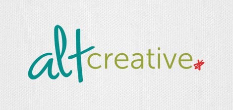
Lindsey Gregory Tyner – Alt Creative – Designer/Developer – http://alt-creative.com
The Alt Creative logo is part of a recent re-brand of my company (formerly ATX Multimedia) so I feel I should give a little background… When I first started doing freelance web design, I had a really hard time coming up with a name. I ended up choosing ATX Multimedia because I felt it encompassed many forms of interactive design.
As time went on, I realized that the name made it difficult for potential clients to immediately understand what I do, which is web & logo branding for small businesses.
I chose to re-brand as Alt Creative. The new name stands for A Lindsey Tyner Creative and provides a throwback to the “alt” tag used in HTML (I am a hand-coder, after all). I knew I wanted the logo to have the young, urban-hip, modern feel of South Austin (if you’ve ever been to Austin, you know what I mean).
I chose 3 colors to symbolize each focus of my business — Design, Development, & Consulting. The scripted lowercase “alt” symbolizes my creativity and the fact that I try not to take myself too seriously. The modern font of “creative” symbolizes my belief that simplicity and efficiency is key in all aspects of my work. The red script-y star represents punctuation or the completeness that the consulting aspect of my business provides my clients and the solutions I implement for them.
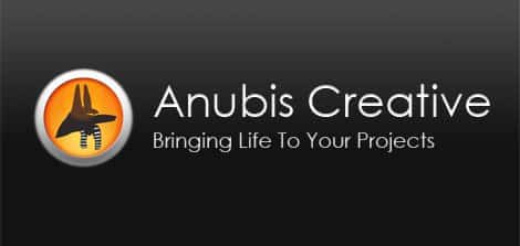
Kevin J. O’Leary – Anubis Creative – Web & Graphic Designer – http://anubiscreative.com
As a kid growing up I went to the San Francisco Tut exhibit and was hooked, and a rabid fan of anything Egyptian thereafter. I became fascinated with the mythological god Anubis, the dark jackal who is associated with embalming, but who actually takes the deceased to Osiris and the Afterlife after the weighting of the heart ceremony as written in the Book of the Dead.
The tagline of “Bringing Life to Your Projects” plays into the mythological aspect and also that Anubis Creative can step up your game and take the job to the next level.
I wanted to capture his image with just the head with a pharaonic lappet Menses headdress. I also wanted to have a little touch of the web 2.0 feel, with a subdued glossy button – the icon evolved into what I have today.
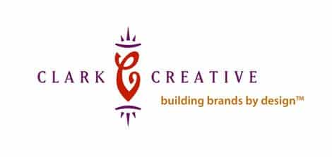
Martha Clark – Clark Creative – Brand Identity & Print Design – http://clarkcreative.net
I am a more traditional designer and work on mainly identity design and print projects – thank god there are companies that still want to actually print things! Although I do design the look behind websites when I’ve developed the identity, I leave the programming to the people who make it their specialty. I also love typography and always take note of type in others designs.
Several years ago I changed by business name from Clark & Company to Clark Creative – I think it helped explain more about what I actually did for a living, plus it was only me so the “company” part became irrelevant. I always liked my Clark & Company logo which was created and unveiled in the mid-nineties. The mark was inspired in part by Margo Chase’s work, whose style I admired and saw her approaches to design as elegant, fresh and unique. Our stationery system actually made it into David Carter’s Letterheads in the Third Dimension and also Creativity 26 – although in C26 our page was out of register so it ended up looking kind of crappy.
I’m not one for change so it was hard to go out with the old and in with the new. My personality in design, and life for that matter, include elements of classic style, sincere creativity and thoughtful process. With the name change I didn’t want to remake my brand, so the new logo needed to reflect those same characteristics. I think the Clark Creative mark successfully captured the feel of the brand I was so accustomed to already.
Danny Hinde – Graphic Designer – http://dannyhinde.com
This is my latest version of my logo which brands myself and is featured on my website. When I set out designing I sketched countless ideas and managed to narrow it down to a simple ‘flowing’ d and a h which are my initials. This was then designed in Illustrator using the font ‘Galette’. I have recently modified my logo to include my full name however for avatars and smaller areas where my logo is featured I stick to the single ‘dh’ initials version.
I love how the logo looks in the small ‘dh’ initials version however I think it fails to make a statement about who I am or what I do. The main problem I have had is with the modified font I have chosen, with the full name version of my logo I think the logo looks too crowded.
I’m still not entirely happy with the design and could happily start re-designing it now! Instead I am trying to develop my skills more before I set out re-designing my logo again – so watch this space!
Mert TOL – Creative Director & Owner – http://merttol.com
I kept simplicity and typography in this logo. Black area is big letter “M” and the white zone is my last name. But, some people says “It looks like an elephant…” and “Looks like tiger or something…”
These mentions are great for me because people are thinking about my logo and something realize in their brain. And my job is creating brilliant ideas for wired minds. Thank you.
Alexander Rodríguez – Visual & Design Specialist – http://mindclay.tv
The idea behind Mindclay’s logo was largely based on the image we wanted to project about our team’s personality and our services.
In our opinion, most logos for design and creative houses express so much about their own personality, that they become an intimidating factor to clients seeking to materialize their own identity. The conundrum is then: How do we solidly represent our own identity, while at the same time projecting our capability to handle other identities without imposition?
The obvious (thus unacceptable) solution was to model a brain out of clay, or some other “mind” icon (a light bulb, etc.). We decided to reduce the clay reference to its most minimal form, while retaining the essential traits.
In our observation, the first thing most people do when they grab a lump of clay is to roll it between both hands into a ball, to then begin forming it into more complicated shapes. Therefore, it’s false that the ball of clay represents nothing; it’s an icon for the fundamental moment before creativity happens, when nothing has yet been established. It’s very much like other similar images, such as “blank canvas” or “clean slate.”
Our solution, then, was to not go too deep into what we thought about ourselves, but to represent what we wanted our clients to see us as: simple, malleable, and receptive totheirideas.
Recently, we have begun exploring some other clay shapes, as seen at the end of our most recent behind-the-scenes video (16.5 Mb Quicktime here), and in our site’s nav bar. The reduced icon, in its purest and most simple form, still works best to represent our brand image.
Arif Gangji – Web Development – http://neonrain.com
Our logo was meant to mimic the sky and a light airy feel. At the same time, we wanted something that could be broken apart. So, we can use the raindrop box as a favicon or just an icon, etc.
Lauren Thompson – Nymphont – Type, Web & Graphic Designer – http://nymphont.blogspot.com
Nymphont is the name of my independent font “foundry” and digital type experiment as well as the handle I use as a type, web and graphic designer. I make humble yet serious, quality, and unique TrueTypeô fonts which are predominately free for personal use and with commercial use licensing options available for a nominal fee. Fonts are all made from scratch and vary from decorative hand drawn to entirely digitally-created geometric sans-serifs and anything in between.
Simply described, the logo is winged-coffin bearing in it’s center a lowercase letter ‘n’, with the name “Nymphont,” placed below. I really am quiet proud of the creation and branding of Nymphont, though it brings me no real accolades or prestige, but because it is very personal, symbolizing me quite well. And I just like the design, and have a lot of with it.
Inspiration for the winged-coffin actually comes from a tattoo that I have on the back of my neck, which is also something I am quite fond of. For the lowercase letter ‘n’ inside the coffin, I used an as-of-yet unreleased black-letter typeface design of mine called, LT Libitina; therefore, it is also totally unique to, and a perfect representation of Nymphont.
Then the lettering of “Nymphont,” located below is set in Herb Lubalin’s fantastic typeface, Avant Garde, bold and all capitals. This is my favorite typeface of all-time, even though I design typefaces and fonts myself, I wouldn’t have it any other way!
“Nymphont,” itself is a play on words that makes an indirect sexual reference, though intentional, that theme has no other role within the brand and it’s logo. Carrying it’s own measure of shock-value due to it’s sexual connotation, that aspect of the name “Nymphont,” of course needs no emphasis.
The emphasis is (hopefully) re-directed from that symbolism, to what Nymphont is all about, –fonts, by the different coloring used on it’s two syllables. The first syllable, ‘NYM,’ is in a gray shade, whilst a hot-pink/fuchsia shade is used on the second, ‘PHONT,’ which phonetically sounds like the word “font.” And there you have it, Nymphont: I really like to font. If you’ve got it, font it.
Rafael Armstrong – Graphic Designer – http://rafaelarmstrong.com
I’ve gone through atmost a dozen different logos (as my website will currently attest) since I started doing occasional freelance work 6 years ago.
I finally decided on something incorporating the signature I use (for non-legal matters), since I’ve been signing my work like that since college, and ultimately the idea of just “trading on my name” made sense to me.
Kevin Vasconcellos – Rise – Multimedia Designer – http://risedesigns.com
The logo for Rise, my freelance design company, is of a man on a foot powered flying device. The more obvious reasons for creating such a symbolic image are equating the man on the contraption to the ability of rising into the sky. But there is much more to it than that.
It symbolizes innovation, risk, compassion, and experimentation. All things that I hold dear, and are always involved in my design work, whether I’m designing a logo, a printed design, a website, or an animation, .
![]()
Ryan Olson – sleekpixels – Web developer & Designer – http://sleekpixels.com
Well, I am not an artist, I will start with that. I had a real hard time coming up with any idea for a logo design and went through many variations. For some reason most of the sketches I had came out with some sort of loop thing in it, not sure why, though I am glad I finally dumped it.
I finally decided on this design for a few reasons. Mainly, it is pretty simple. I like that sleek and simplicity, for me at least, go hand in hand. I felt that keeping it as a font based design let me put more of myself into it, which is where the fonts came from. For the sleek letters, I chose a type that showed smooth, rounded lines and gave the impression of fluid movements. Whereas for the pixel text I contrasted this with a monospace font that I use when coding.
I modified the kerning of all the text and the ligatures a bit, most noticeably on the ‘els’ of pixels so that it remained a separate font but carried over the fluidness of the beginning.
AJ Teachout – ulu Marketing – Design & Marketing Professional – http://ulumarketing.com
The name ulu comes from an ancient Eskimo knife used because of its unique curved blade and that only half the amount of downforce is needed as a traditional knife = versatile and results with minimal effort.
After trying to make a logo shaped like an ulu knife, I realized that the name intrigues, but people are really buying my services, so I need to make my logo personal and reflective of my style, therefore, the logo is my traced handwriting. The simple handwriting logo is also somewhat rudimentary to show that all marketing and designing starts with a sketch, or a simple plan outline. To me, the logo shows personal, creative side, as well as a trustworthy business side.
I really like the simplicity of the logo and the way that it flows and can see this lasting quite a while as my mark for my freelancing business.
End of Part 11 – Submit Your Own Logo
If you want to add your own logo to forthcoming versions of this post, then check out this post ‘I want your creative business logo for forthcoming post’.
If you do submit a logo, then please ensure you submit a few paragraphs about how the logo came into being etc. Without this information I can’t add your logo.
Flickr Group Pool
I have recently started posting all previous submitted logo’s to a Flickr Pool called ‘Designers Brands & Logos‘ to further max the self promotion for you guys.
Woop.
