This logo for Zulu Safari from my logo portfolio, is a long time favourite of mine.
I designed the logo mark, formed from the initials Z & S, for Zulu Safari (@ZuluSafari) for an American missionary travelling around South Africa, who hired me in the early 2000’s.
The client, who spends a lot of time travelling around Africa, needed an identity to distinguish himself. The aim to try and modernise the, sometimes antiquated, perception of missionaries as a whole.
The challenge was to avoid any obvious cliché associations with safari, zulus, Africa, religion etc.
It was a potential field of cliché mines whilst not making is so clinical, or generic, to have no meaning at all.
I instinctively went down the route of the obvious at first, herds of animals, zulu warriors, desserts, trees, tribal patterns, and then once suitably hacked off with the amount of clichés on one pasteboard, we moved on.
After many sketches and head banging sessions, I developed this very symbolic icon that has several meanings and associations.

The Initials S & Z to form the Eyes & Nose
The main logomark consists of the initials, ‘Z’ and ‘S’. Yet, when drawn in a certain style, creates the impression of a face: the eyes and nose that has a tribal look, and feel to it.
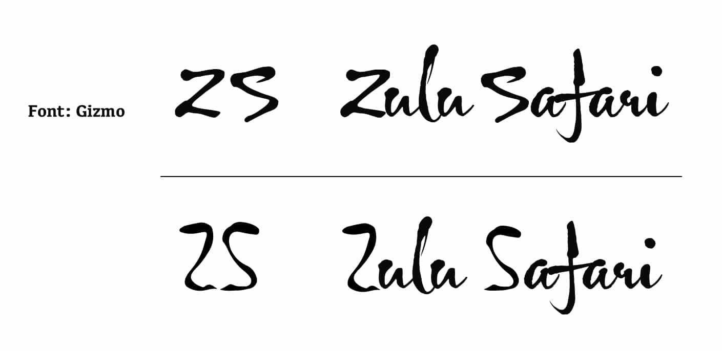
After designing the rather unique logo mark, I then tasked myself with searching for a font that could be used along side my logo mark.
I eventually found a font called Gizmo which shared some of the characteristics of my ZS logo mark, and I used this for the wording; substituting the original Gizmo ZS initials, with the ZS I designed.
The overall finish is a word mark that looks pretty well formed, and didn’t require the extra time and expense of designing the other custom letters, which was important as the logo design was on a ‘tight’ budget.
![]()
Wiki: A missionary is a member of a religious group sent into an area to promote their faith or perform ministries of service, such as education, literacy, social justice, health care, and economic development.[1][2]
The word “mission” originates from 1598 when the Jesuits sent members abroad, derived from the Latin missionem (nom. missio), meaning “act of sending” or mittere, meaning “to send”.[3]
The word was used in light of its biblical usage; in the Latin translation of the Bible, Christ uses the word when sending the disciples to preach The gospel in his name. The term is most commonly used for Christian missions, but can be used for any creed or ideology.[4]