This is big big news. Starbucks are preparing the next chapter in their identity evolution. The image above shows the few changes the Siren has been subjected to for this new design. Thanks to Mark for the head’s up.
This is a fine way to bring in a new identity. Sure there will be people dissing it, indeed, there are already negative comments on the Starbucks website. To be expected. But once you take it all in, see how it works across the brand, I think most people will welcome the change.
It’s 40 years you know, so this is a wonderful way to bring in the decade next. See the few changes the Siren has been subjected to over the last few decades, clearly the biggest shift being some 16 years after Starbucks came into being, then the second change being a evolutionary tweak.
Now they have released the fair Siren from it’s center stage, it’s free and open, much more expressive.
The biggest change is the removal of the brand name. This is really quite a confident move on behalf of Starbucks. This is sending a clear and strong message. This move to remove the brand name follows Apple and Nike, who have for some time just relied on the brand mark to tell the story.
When a brand reaches a point where their identity is no longer determined by the visuals of the brand name, but of a prominent symbol/icon/logomark, the brand has evolved to a state that is almost untouchable.
It can afford to say less but achieve much much more.
In Starbucks case, you could even just rely on a green circle and most people would be able to take a good crack at what brand it represents. Add some white random elements and you are almost certain to know it’s Starbucks. That level of brand awareness is just priceless.
This logo designer likes it. It will take a while for people to adapt and come to terms, but it’s a positive step. The logo now looks more vibrant and more dynamic, yet it has been simplified.
The curvy lines really draw you in, the Siren is doing her job.
There is a slight nod back to the original one colour logo here, removing the harsh black and just reverting to the green. I also like the way middle circle in the Siren almost looks like a semi replacement for what was the black hole.
But in reality, not much actually appears to have been redesigned. It almost looks that they have literally just dropped the entire outer green ring and just enlarged what was the black and white Siren. Job done. Without getting some close ups of the artwork, it’s hard to tell if any minor tweaks have been made the the Siren, but it initially looks like a cut and paste.
That’s not to take anything away from the redesign, often the simplest solutions are the best.
To quote Michael Peters: “All jobs should have a Big Idea and be executed with sheer simplicity.”
Now, what would be interesting is to see how they got to this solution. Were there other more elaborate designs, or maybe even more simplified Sirens? There could of been 100’s of variations on the table, but the end result clearly has to be the simplest solution.
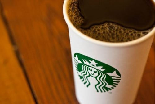
Just look how cool and clean it looks on the bright white cups, the removal of the black really makes this POP. Expect to see the new logo introduced this Spring. But boy, do they have a massive task in refurnishing it’s stores. This is a HUGE and costly rebrand, but clearly worth the investment. Just think how many stores there are worldwide, the scope of the physical update is just mind boggling.
I pose this question on Quora : Has Starbucks taken a positive step forward with its rebranding?
Oh, and Gap. This is how you introduce a new logo. Just saying.
Read more on this : Looking Forward to Starbucks Next Chapter
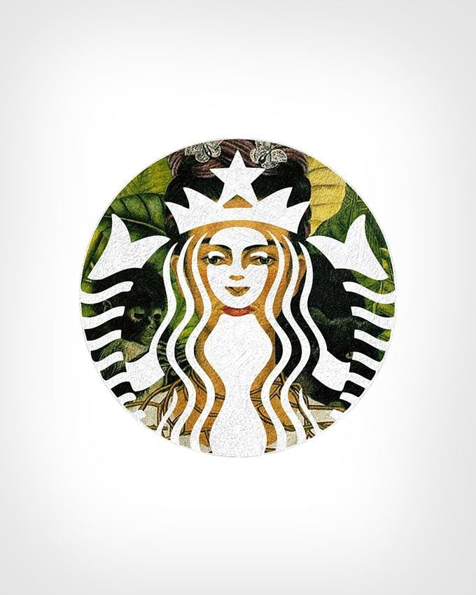
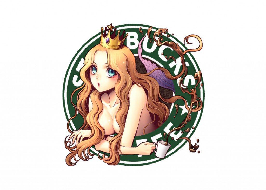
Some alternative Starbucks logos
Not a fan of the redesign? You may like this alternative below. Thanks Mike Tums.
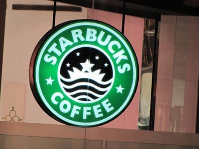
Starbucks in Saudi Arabia
Found by @R27 on Creative Bits in a comment by Waleeds Gallery @waleedalzuhair
I realise that putting the tamer Saudi version under the rather scantily dressed mermaid is a little awkward. Can’t be helped until I get some more images to spread them out with.
What is curious is if they will apply the same logic as the rebrand. So, remove the outer ring and just have the non mermaid portion in green?
Here is a link for a tongue in cheek version of the new Saudi Starbucks logo.


