
Helvetica Font Alternatives From Typecache.com
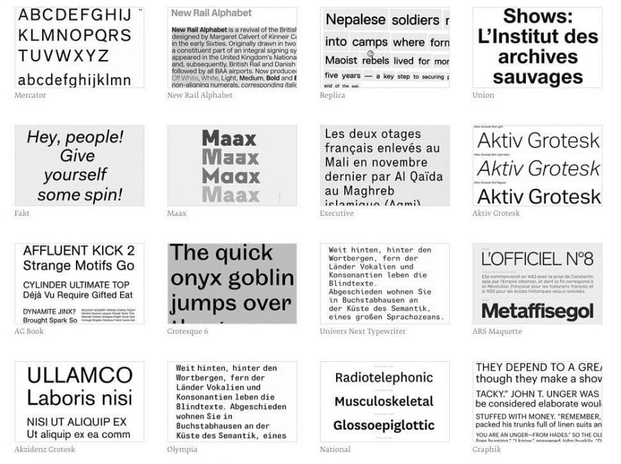
Helvetica Font Alternatives From Typecache is a remarkably concise list of typefaces, or called Font Clusters, that could be used as an alternative to Helvetica.
I have a number of the typefaces listed by Typecache in my own library, but there are quite a number here that are new to me.
You may also be interested in my own, and far less impressive, list of Gotham typeface alternatives—which could do with updating thinking about it.
I found this Helvetica list by Typcache: 30 of the Best Alternatives to Helvetica, via an article on TheNextWeb. Here they interview Typecache co-founder Taro Yumiba on the creation of Typecache.
Via Typecache & TheNextWeb
Yumiba from Typecache on why this list was put together: Obviously Helvetica is overused and we think designers are constantly looking for alternative typefaces to replace it. However, I am not surprised to hear that designers often give up on finding one and just go for Helvetica.
It is almost becoming a default or a given option as a San Serif font. We think that finding a good typeface is part of the designers’ job, and through the list, we would like our fellow designers to explore other options so that they can start embracing all typefaces.
Wikipedia on Helvetica or Neue Haas Grotesk is a widely used sans-serif typeface developed in 1957 by Swiss typeface designer Max Miedinger with input from Eduard Hoffmann.
Helvetica is a neo-grotesque or realist design, one influenced by the famous 19th century typeface Akzidenz-Grotesk and other German and Swiss designs.[2] Its use became a hallmark of the International Typographic Style that emerged from the work of Swiss designers in the 1950s and 60s, becoming one of the most popular typefaces of the 20th century.[3] Over the years, a wide range of variants have been released in different weights, widths, and sizes, as well as matching designs for a range of non-Latin alphabets. Notable features of Helvetica as originally designed include a high x-height, the termination of strokes on horizontal or vertical lines and an unusually tight spacing between letters, which combine to give it a dense, solid appearance.
Developed by the Haas’sche Schriftgiesserei (Haas Type Foundry) of Münchenstein, Switzerland, its release was planned to match a trend: a resurgence of interest in turn-of-the-century “grotesque” sans-serifs among European graphic designers, that also saw the release of Univers by Adrian Frutiger the same year.[4][5][6] Hoffmann was the president of the Haas Type Foundry, while Miedinger was a freelance graphic designer who had formerly worked as a Haas salesman and designer.[7]