Fender Logo Design Evolution By The Unknown Logo Designer
Fender Logo Design Evolution: Fender has used several styles of logos, usually referred to as: “Spaghetti”, “Transition”, and “CBS” which were used to adorn the headstocks of their guitars.
The term ‘spaghetti’ wasn’t official, but was penned by Fender enthusiasts and collectors in later decades.
This original version of the logo was used in the 1950’s and 1960’s on most of the Fender instruments, including: Esquire®, Broadcaster®, Telecaster®, Stratocaster®, Precision Bass® and Jazzmaster® guitars, as well as several other Fender instruments of that period.
The “Spaghetti” Fender Logo Design
The original ‘spaghetti’ style Fender logo (above) designed by [someone unknown], although general chatter suggests it was based on Leo Fender’s own signature with the ‘F’ being simply reversed!
It’s a detail like that that can really create a truly ownable brand mark. Not happy with letters the right way round? No problem, just reverse them! :)
The “Transition” Fender Logo Design
The gold logo (above) with black outline was called the ‘transition logo’, and was designed by adman and graphic designer, Robert Perine.
The main reason for deploying a new logo was that Robert wanted to cut down on all the various Fender trademarks in use, and thus adopt one single logo type.
Perine’s new logo was used up and till CBS took Fender by the reigns which was introduced in 1967. The gold version of the logo was called the ‘transition’ logo simply because it spanned the ‘spaghetti’ style Fender logo of the 1950’s, and pre Fender CBS-era of the late 1960’s.
CBS-era Logo
Information on the CBS-era Fender logo is somewhat scarce, but it was a thick black logo that was used between 1968-1980.
You can see the difference in all 3 versions below, the last one being the style used by CBS until the 1980’s when Fender changed back to using the “transition” and “spaghetti” logos, depending on the model.
The Current Logo
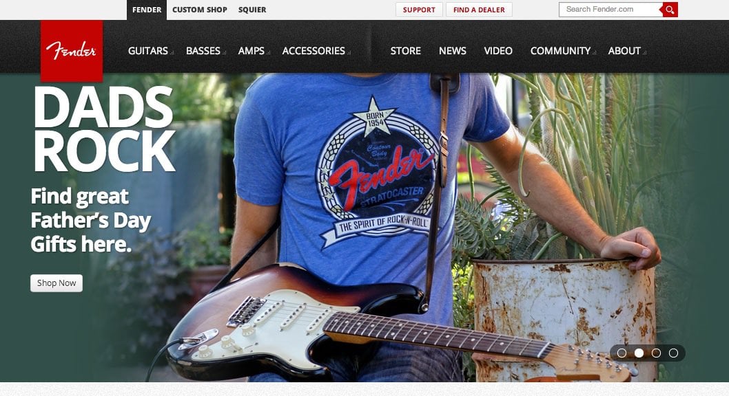
What’s interesting is that the logo you know see on the website (below), white lettering on red background, is pretty damn close to the first ‘spaghetti’ style logo but for a few positional changes, curves and proportions.
Who designed the current Fender logo?
I can’t find any information on who ‘tweaked’ the newest logo now used by Fender, but I think it’s safe to say that who ever designed the first one takes credit for the Fender logo overall give it’s closeness to the original logo design. Unless you disagree?
Old vs New
I have crudely over laid both the original, and new logos (below), for comparison. The red lettering is the logo currently is use whereas the slightly pixelated black/grey version is the original ‘spaghetti’ style.
Resources
Some official information on the history of the Fender logo over on Fender.com and you can download various Fender brand logos and style guides on their Brand Logo page.
About Fender
An American icon, Fender was founded in Southern California and has established a worldwide influence that extends from the studio to the stage—and beyond. Everyone from beginners to the world’s most acclaimed artists have used Fender instruments, amps and gear, making the company not only a revered industry leader but a cultural symbol that resonates globally. Nearly seven decades since founder Leo Fender built his first electric guitar, Fender’s reach transcends instruments and accessories, encompassing a range of innovative digital experiences that fuel musical expression and serve players at every stage–on every stage.


