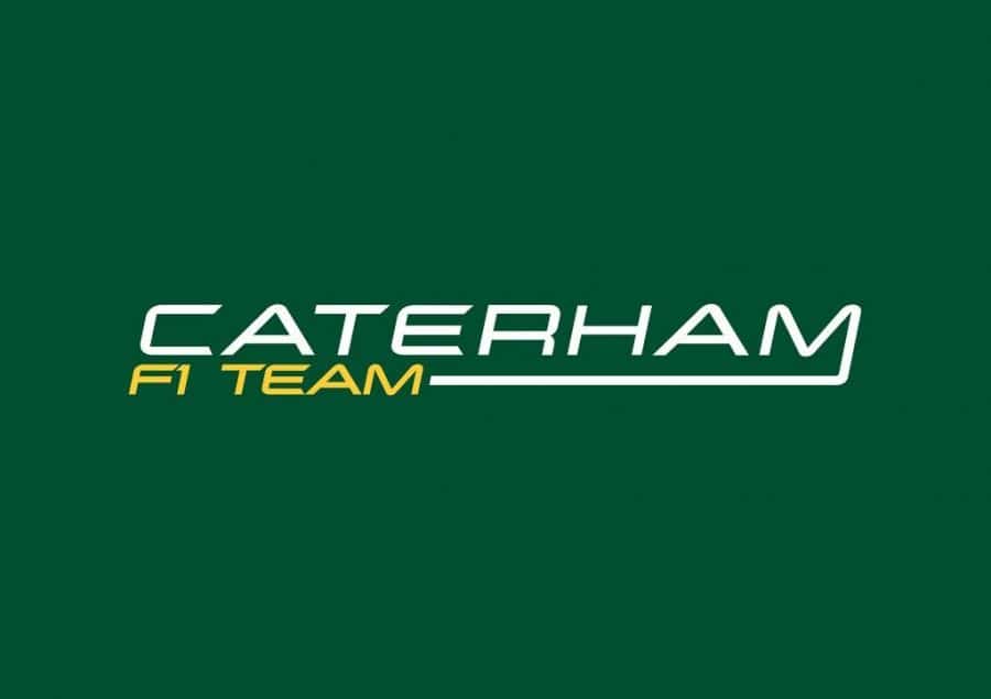
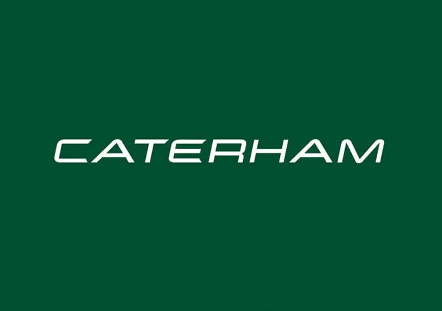
It was recently announced that Caterham will start the 2012 season under their own name, Caterham 2012 F1 Team.
In 2010 they went under the name of Lotus Racing, then in 2011 it was Team Lotus. Due to lengthy legal proceedings with Lotus Renault GP, team boss Tony Fernandes opted to name the team for 2012 as Caterham F1 Team.
Caterham’s new F1 Team logos (click on images above for maxisize versions) will adorn the 2012 race cars.
Team boss Tony Fernandes insisted the Caterham move makes sense for his outfit.
“With Team Lotus, I would have battled to the end if I felt it was the right thing to do, but when you take a dispassionate look at where we were it made absolute sense to start with a clean sheet, and Caterham has given us that chance,” said Fernandes in the team’s magazine.
“It’s the best possible solution for where we want to go – partly because it gives us complete control over everything we do and, obviously, because there’s simply no point racing to promote a road car company I don’t own. The road car business has always been a sector I’ve wanted to explore and so here we are.
“But I can’t stress enough; this is a serious business venture for us. If I just needed a new name, I could have called it anything, but the synergy with Caterham works better – and it’s what I do – take a small business with the correct core values and purpose and expand it and grow it into the global marketplace.”
My Thoughts
My first thoughts were a little less than positive. In fact I was more sad than anything else as I just felt—I don’t pretend to be a motor racing enthusiast, or know anything about Caterham other than a little bit of their heritage—this new logo lacked an initial presence and style I would consider appropriate for a English sports car company.
I look at it, and feel it’s missing it’s true soul which has been replaced by this F1 italicised style of typography. Feel is a little soulless and maybe a little unoriginal.
But that M on the team version looks decidedly odd. A small suggestion would have been to rang the F1 TEAM line far right so as to keep the main brand name style consistent with the regular Caterham logo version. It’s not as “flash” but feels less awkward and more consistent.
Once it’s adorned on the side of the F1 cars it will undoubtedly take on a totally different persona, which is quite common with logo designs nowadays—which could get me started on a whole new subject about logos still needing to work and reflect a personality on their own when not viewed as a whole brand identity—and will be enough to shut me up.
I look forward to seeing how the logo is applied to the cars livery especially on an all green F1 car with this wicked yellow lettering.
British Racing Green for the win.
No details yet on who designed the Caterham logos, but you can view the original Caterham F1 Team logos over on their Flickr page.
Caterham’s F1 website also provides ways in which to follow Caterham via YouTube, Twitter, Flickr and FaceBook.


