
HP Rebrand – Adopts A Minimal Approach By Moving Brands
Caught this on the wire yesterday over on Serif and Sans, and you know what? I have totally taken to the new HP rebrand created by Moving Brands.
Shame, at least for the time being, it is not being implemented by HP. I was so caught up with the graphics that I neglected to read a little deeper which would have enlightened me to the full story.
I’m not overly familiar with HP stuff so don’t, or can’t really share a lot of other peoples negativity about the overall lack of vision with it’s products etc etc. This is just about the aesthetics for me at this point.
You can read a far more in-depth analysis of the redesign used over on BrandNew.
But, regardless. Let’s move on as though HP had opted to use it.
Feels great to actually have a rebrand that feels like they are grabbing the bulls by the horn and moving enthusiastically forward opposed to some of the utter crap recently churned out over recent months. Looking at you British Gas!
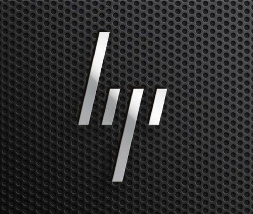
This is sharp, I have to say. The stationery rocks it out with that slanted vertical alignment following the angle of the logo mark. Details! I mean, just look at that black presentation box with the cut-outs even following the cut of the “HP”. Details.
The successful application of a new, and reenergised brand identity would be what companies like Moving Brands stake their, and their clients, reputations on.
With a company like Moving Brands the evolution of an identity generally takes on dynamic proportions, so best to head over to the HP project page on Moving Brands and watch some of the video’s to see how the new HP brand has been brought to life.


