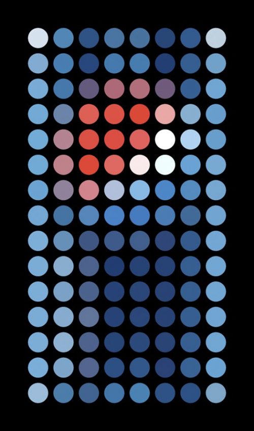
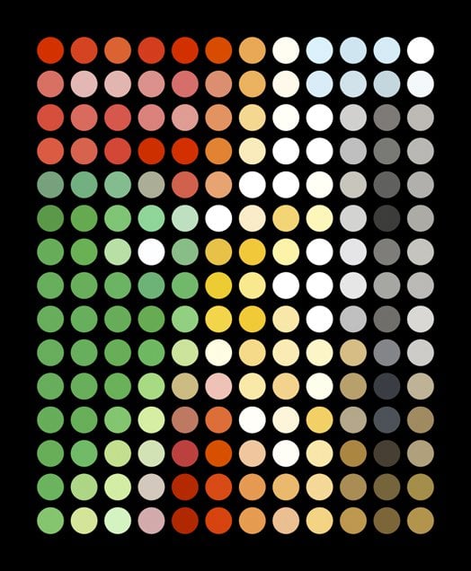
I originally posted this Iconic Brand Packaging Simplified way back in 2014, and in my recent ‘thin content’ post updates, I’ve not been able to find the original project by Silas Amos on his website, or anywhere for that matter.
Best I can do is link back to Silas’ website, and have updated this post best I could.
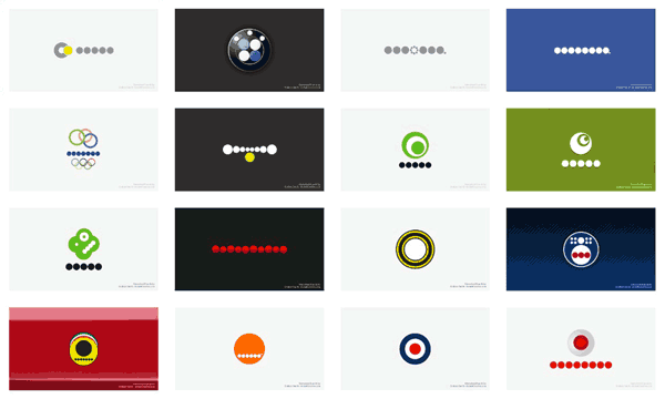
Iconic Brand Packaging Simplified & Abstracted to Dots by Silas Amos
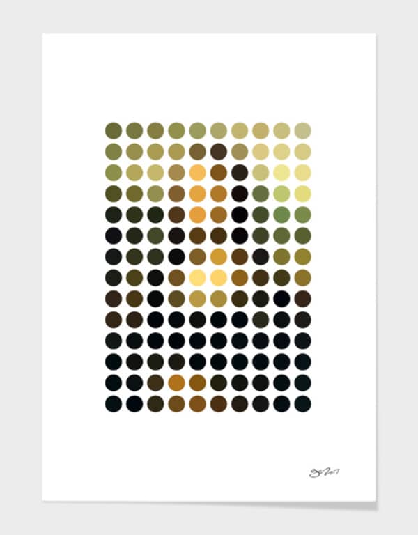
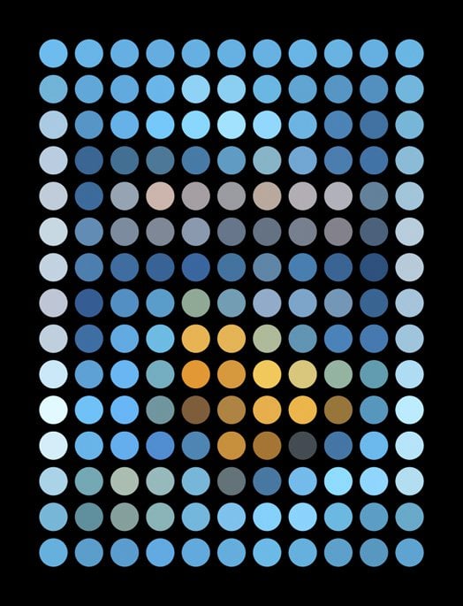
A while back there was a super duper cool study on dots, well, to be more precise, an interpretation of the Mona Lisa by Gary Andrew Clarke.
Andrew took the Mona Lisa and remixed it down to 140 exact circular dots and even with this over simplification, and somewhat abstracted nature, it is clear to all what the dots represent (below).
→ Gary has these Mona Lisa Remix Prints for sale on his Curioos page.
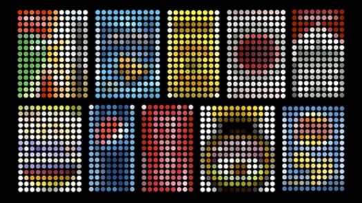
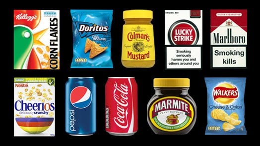
From that particular art exploration of the Mona Lisa, Silas Amos took the ‘dot’ idea in a slightly different direction, and applied the abstract ‘dot’ simplification to certain icon brand packaging.
Some of the packagings are pretty clear, some maybe not so much.
The not-so-much-of-a-trick, is to look at these at almost thumbnail size, then the appearance of them becomes far clearer.
But I really do love any logo/brand project like this, and I in fact had my own ‘dot’ brand logo project called: Unevolved Brands, which ‘unevolved’ brand logos down to a most basic shape: a ‘dot/circle’.
Iconic Packaging Simplified & Abstracted to Dots by Silas Amos

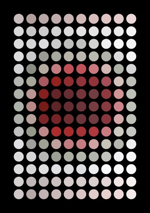
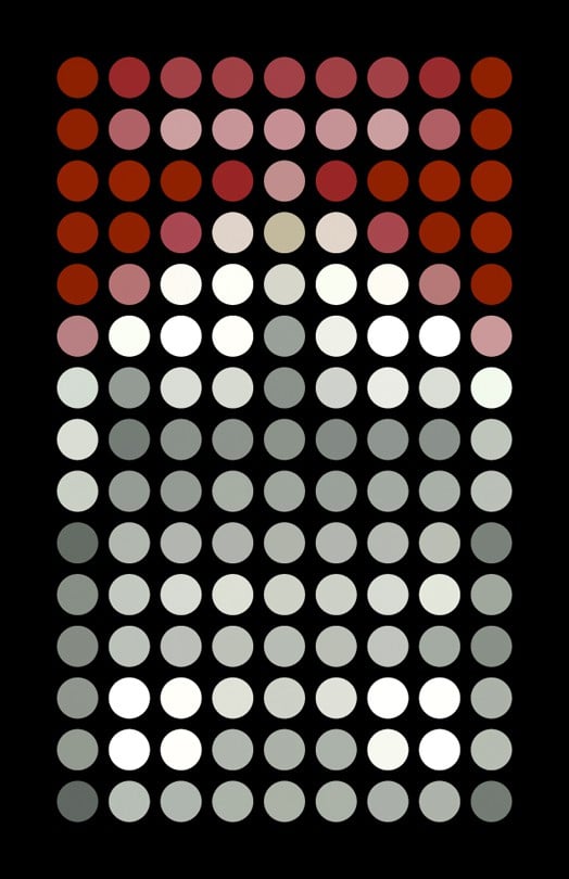
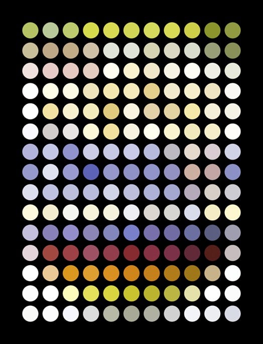


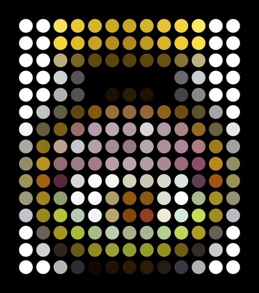
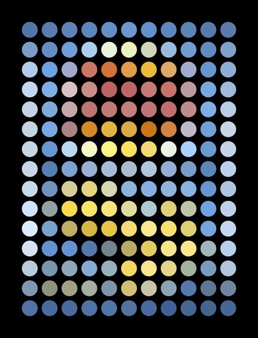
Design Gazette: “I had a few surprises – I naturally assumed Coke would reign supreme, but the slightly fiddly nature of the line and script did not survive the test. Kellogg’s though, with its more distinctive shape, fared far better. Colman’s turned out to have little left at this degree of abstraction, whereas Marlboro clearly still reads.
A couple of conclusions: firstly, the brands abstracted look pretty cool as art huh? Secondly, one would assume that putting super-bold graphics through the same filter that was applied to a murky, mostly brown, old master’s painting would leave them comparatively well placed – that this is not always the case suggests they might not all be as recognisable when abstracted as we would have assumed.
And finally, strong shapes on pack prove to offer the best chances of survival of this process to retain recognition. This is interesting if one considers that many consumers are shopping products with impaired vision and no glasses on – it’s quite an illuminating test of graphic equities in a world where packs are ‘read’ at a glance without 20-20 vision.