The one thing that you should come away with after viewing this entire set of Logotypes is that:
What ever logo you do now, it has probably already been done before, in one form or another.
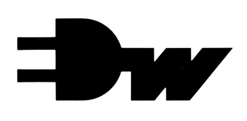
The logo example above is from the 1960’s for Electro-Walser, Switzerland. The E formed from positive space to make the 2 prong plug has been done recently, in fact a few variations of this exist that I know of, and one of them is pretty well known. I’m not going to show examples of these recent logo designs, it’s not about ‘calling them out’, it’s about realising that there is a daily diminishing pool of workable and unique designs.
That variations and similarities in logo design WILL always occur. No one logo designer can truly be aware of every single logo design ever produced. The odd’s of us inadvertently creating something similar is really rather possible and quite likely.
Sobering
It should be a sobering thought for all logo designers, coming up with a truely unique idea is pretty tricky, if not extremely challenging. More so because it’s just impossible to really be sure that your idea has not been done at some point in the past.
When I say ‘past’, I don’t mean within the last few years, or even decade, we are talking about many decades.
When you sit down to work on a project, keep this im mind. You are a small part of an ever increasing pool of designers with an ever decreasing pool of uniqe ideas and concepts. Even creating passable logos that are clearly ‘influenced’ from existing logos is becoming a harder task to pull off so you dont look like a thief. We each have our own view of what is inspired from and what is blatantly copied.
You are more likely to be called out as a plagiarizer now than ever before if someone sees your logo that just happens to look like a logo done last year or even 50 years ago. We jump on designers when we see something similar, call them out big time and generally make them feel like criminals.
Just because you haven’t been called out yet, doesn’t mean you are home free and can sit high above that moral ground passing judgment. The moment that you upload a new logo to Logopond then subsequently see a comment from someone saying ‘this logo loks exactly like this one from last year’, you’ll know exactly how frustrating and hurtful it can be.
I really believe that it’s something that is likely to happen more than one in a persons logo design career. When it does happen to you, you will likely be surprised at how quickly things can seemingly go against you.
Don’t be quick to judge
When you see a logo design that looks like another one you know of, don’t be so damn quick to accuse. Some people really seem to believe that only one person can have one unique idea ever and that if a logo looks just like another, that it was orchestrated to be so.
The fact is, more than one person can have the same idea in any given timeframe and coincidences are very likely.
All this means that it just takes more effort and more research for each project. Taking time to really find new angles and routes into visualizing a brand is challenging but very rewarding when it does happen. At the very least, you know that you did everything you could to create a unique personality for your client, and that’s all that can be asked of you.
Image From World Of Logotypes on Flickr