

![]()
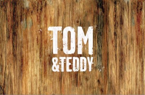
Initial artwork for an ongoing project Tom & Teddy, this is pretty close to what the end logo will be like, finer details such as optimum spacing, colours etc are still being worked on. Further descriptions and a detailed logo process article to follow.
What follows is a brief outline of the brand.
Tom & Teddy is a premium beach and summer fashion brand, focusing on matching fashion wear for father and ‘younger’ son. Tom being the father and Teddy being his son.
![]()
The objective was to create a strong but clean type orientated brand mark, something that instilled a sense of a classy modern vintage style. One that would be straight forward to print onto clothing and various materials and that would also create a visual image of the differences between father and son, namely the physical size but also suggesting the protective nature of the father. A wordmark that would work well in mono as well as 2 colours, stamped onto a metal badge, branded onto a leather patch, stitched onto a shirt or just embossed onto a rubber badge.
Focusing then on these aspects, using a condensed font allowed for some snug fitting typography, killing two birds with one stone. Tom is clearly dominant, but is also out front, taking the lead and has a careful arm around his son.
The image below is a good example of the sort of brand imagery Tom & Teddy are aiming for.

A fashion conscious father and mother should be encouraged to check out the Tom & Teddy brand without feeling it looks cheesy or tacky. Possibly the mother would buy both father and son matching shorts as a gift or the father would just feel proud to buy himself and his son something cool and jazzy. That the actual brand mark when printed onto shirts and shorts should look cool as well as stylish.
Colours have yet to be confirmed, but this gives you an idea of how the logo can work easily with various colours and combinations without muddying the core identity.

The Gap brand mark has greatly inspired me for this project. I have been a long time fan of their blue block logo, and have appreciated how it can be used to market and brand the company. Looking at how Gap have used there logo over the years, minus their previous indiscretion, has been a valuable research example in the production of this logo for Tom & Teddy.
In reality the contained version of Tom & Teddy will be a secondary logo version, the primary logo will be floating free as shown in the very first two images.