NASA ‘Worm’ Logo Design Upside Down – Very Sexy and Very Naughty
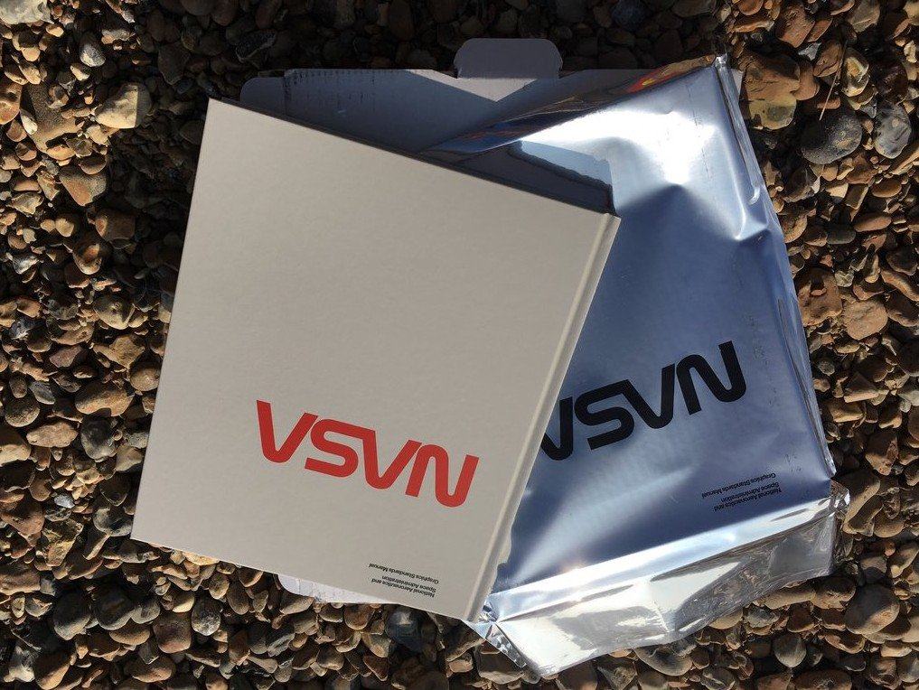
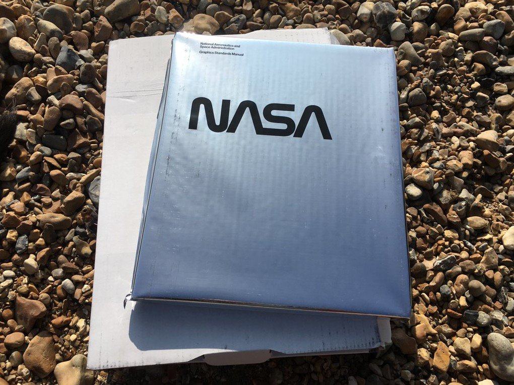
After the excitement of receiving my copy of the Kickstarter project, “The NASA Graphics Standards Manual reissue“, I hurried down the beach to show some of my ‘designery’ friends.
One of them, who was sitting opposite me, got to see me pull the NASA manual out of it’s gorgeous foil envelope, showing that famous NASA Worm Logo in it’s upside down glory
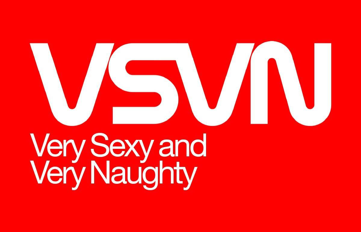
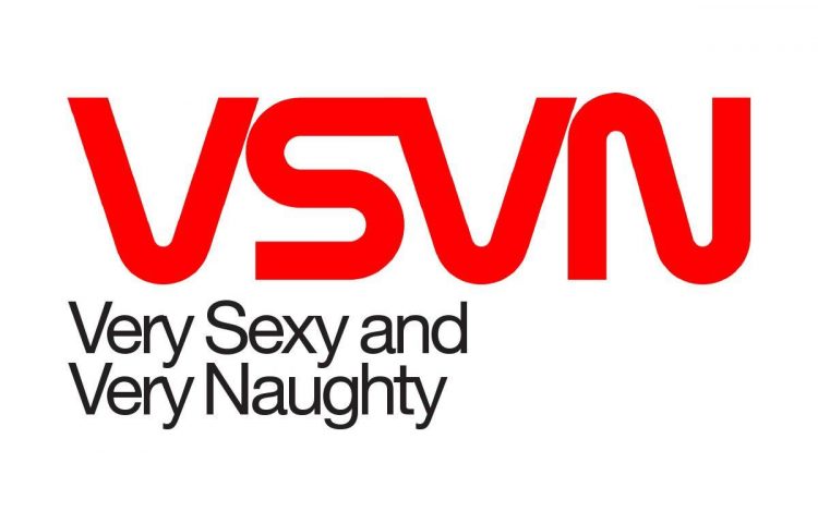
The first thing that he said was, “That reads, “Very Sexy and Very Naughty”.
I now can’t unsee this, and the juvenile in me had to whip up a version of the NASA ‘worm’ logo, as an upside down ‘alternative’, along with the tagline (in the correct typeface and styling of course).
Hey, I know it’s not a cool thing to do; to cheapen this iconic brand, but it did make me smirk.
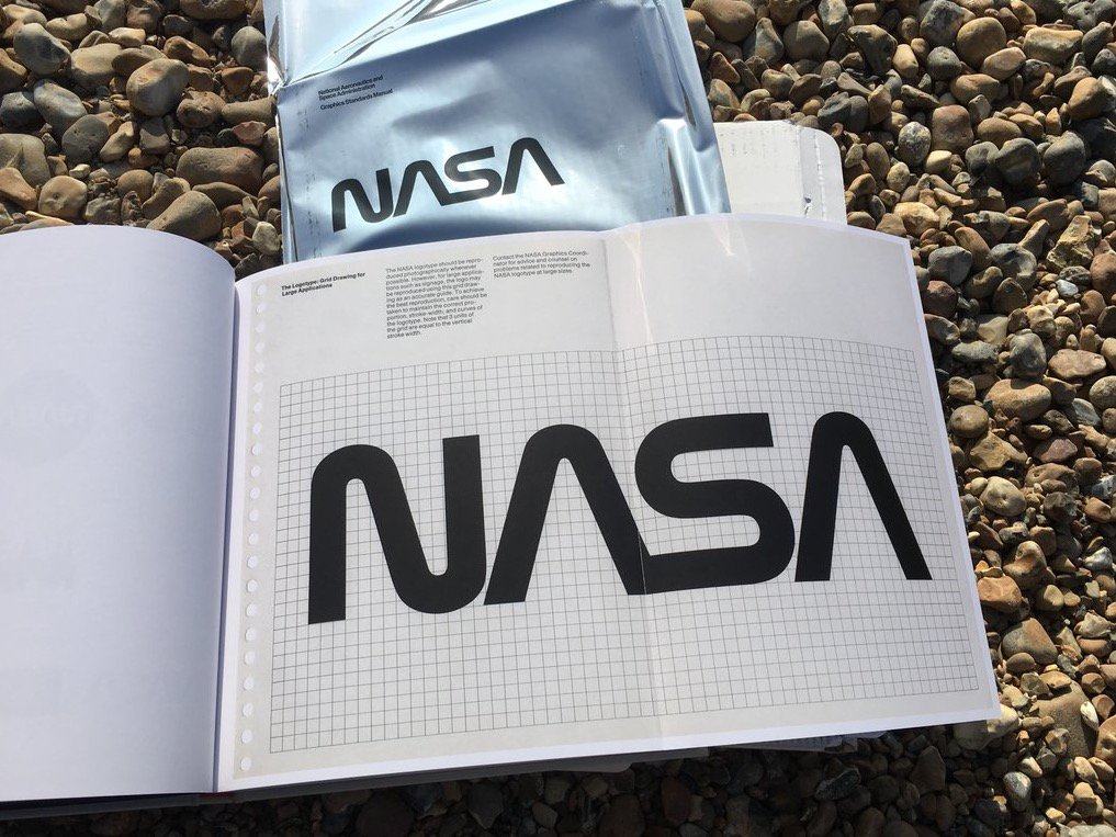
Symbols of NASA: After it was introduced, the “meatball” was the most common symbol of NASA for 16 years, but in 1975 NASA decided to create a more “modern” logo. That logo, which consisted of the word “NASA” in a unique type style, was nicknamed the “worm.” That logo was retired in 1992, and the classic meatball insignia has been the most common agency symbol since.
