
![]()
Foursquare’s New Logo Redesign Goes Superhero
Just to clarify: the Superhero wording wasn’t my idea, this comes direct from the folks at Foursquare, and I quote:
Thought I’d open with that quote because I’m just not sure if they are being serious or not. Superpowers? Vision? Homescreen? Superhero?
Let me be blunt: the new Foursquare logo is anything BUT super anything.
The Good
Let me get the positive out the way, just to show you I can see good when I see it, and can appreciate good when I see it, and am willing to extend that goodness to a few positive words in my blog.
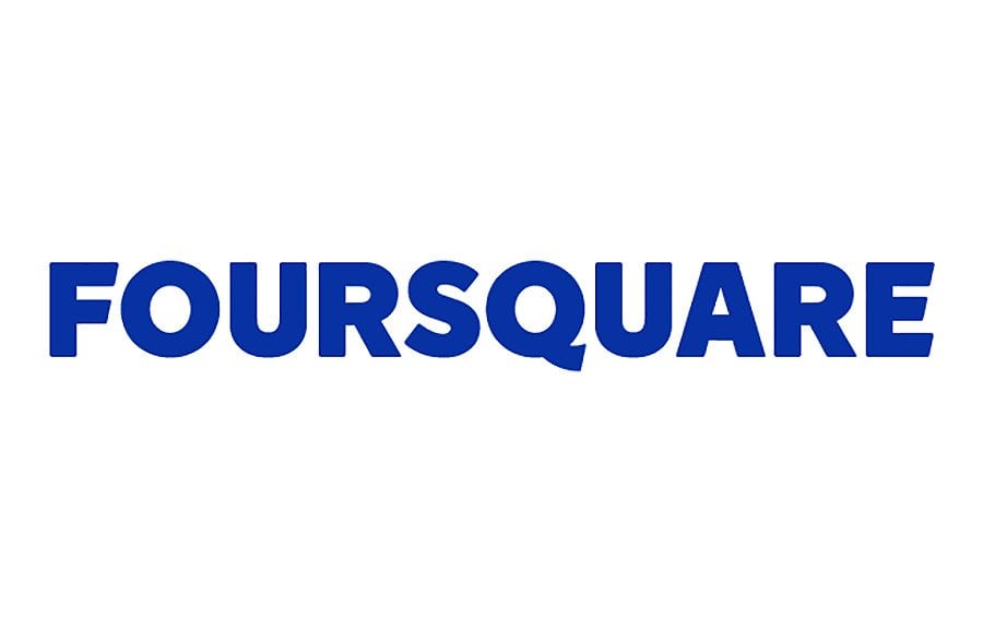
The logotype/wordmark/brand name yada yada, is pretty nice: it has presence, it’s pretty damn solid, has a nice rich almost Ultra Violet style to the colouring.
I also like the two colours, but they also remind me a little too much of the Flickr colour palette.
That concludes the good.

The Bad
What is meant to to super is really really bad.
I first saw the new Foursquare logo last night, and had a few back and forth tweets about it.
. @thelogosmith @MarkPoppen @TheLogoFactory @divinefusion I agree with Graham – definitely ‘Disjointed’ (& not particularly friendly either)
— Daryl Walker-Smith (@darylws) July 24, 2014
I totally didn’t, see or get, that it was meant to be a vision of superheroness emboldened in a classy new super emblem: that’s also a pin; which I did get by the way, albeit a rather odd map-pin.
That ‘F’, that is a map-pin, and a superhero emblem just looks awful. The pinky outer keyline is far too kludgy, the outer corner radius look far too large compared to the inner radius. Which then leads to the corner radius of the ‘F’ which looks like an afterthought, BUT don’t come close to matching the far softer corner radius on the Foursquare wording.
Why oh why could they not have at least kept some consistency with the corner radius from the superhero ‘F’ emblem to that in the main wording? That would have at least made up for one of the most awkward looking logomark and logotype miss-matches I have seen in a long time.
There is nothing in this combination logo that looks like it should be one of a nice and cohesive whole. It’s super disjointed at best.
The white-out half-cut ‘F’ looks really ill, and then we have that razor sharp point that certainly add’s a stark and rude contrast to everything else in this logo. I get that a map-pin should be sharp, when the outer pink pin is ‘super’ soft, the inner white ‘F’ is just brutally sharp.
The logomark superhero emblem doesn’t really look any better in the app either:

Conclusion
The typography for the main Foursquare brand name is really good, has a strong presence to it, and has style. What I simply cannot get my head around is how completely unsymbiotic the relationship between this and that God awful superhero ‘F’ emblem really is.
The only way I could realistically see such a lack of consistency between logomark and logotype occurring, is if: both parts were designed by completely different people, with completely different interpretations of the brief, and were not privy to what the other piece looked like. Then they took both pieces and stuck them together as best they could.
I’m not even sure a map-pin, as a visual reference, was ever needed, especially how long Foursquare has been around. It’s not like Foursquare is a new brand having something to prove about it’s mission and purpose, and almost feels ever so slightly patronising.
The map-pin reference is way too over dramatic, and unnecessary. Almost sure a classy icon could have been crafted from that really strong logotype without force serving up well used, and tired visual cliches.
Eh Voila.
It’s actually really disappointing that with such a strong wordmark, such a flop was made of the icon. More so given it’s this emblem/icon that looks like it will be the most seen, and implemented part of the logo.
The new Foursquare logotype is all grown-up, yet the icon feels it’s taken a huge backwards step in this established brand’s maturity.