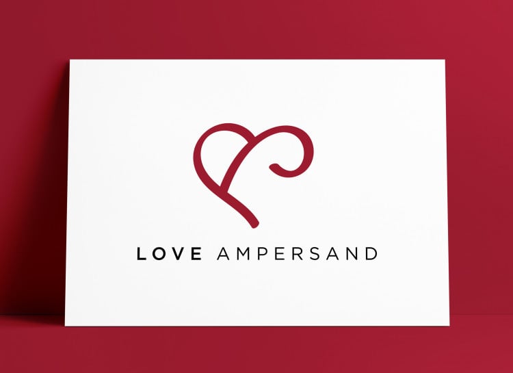
The Love Ampersand or Amperheart logo was the result of a few hours of procrastinating one Saturday morning.
I had plenty of ‘proper work’ to be getting on with, but drifted towards ‘playing’ instead. Something I am racked with guilt over.
However, pleased that the procrastination developed into something reasonably useful, and not just wasted hours on da internat.
How Love Ampersand came about
A new typography book arrived in the post yesterday morning, specifically called ‘Logo and font lettering bible‘ by Leslie Cabarga.
Ordered around 4pm on the Friday from Amazon, swiftly arriving the next morning by Citylink at 8am. As a sideline, it’s a wonderfully illustrated book so definitely recommend buying it.
My mind tends to always analyze images, graphics, signs as I walk past. I am always looking for deeper meanings and hidden messages in logos and graphics, constantly wired for inspiration.
Reading books like this can often be quite overwhelming, so much visual stimulus to soak up that I tend to switch to auto-pilot after a while. My eye’s just scanning image after image until brain is full and I have a stonking headache.
After a quick flick. I put the book down on my table whilst I grabbed a drink. When I went back to pick it up, the book cover was at a angle. The first thing to catch my eye was this striking Ampersand which is part of the book title. You can see what I mean in the photo below.
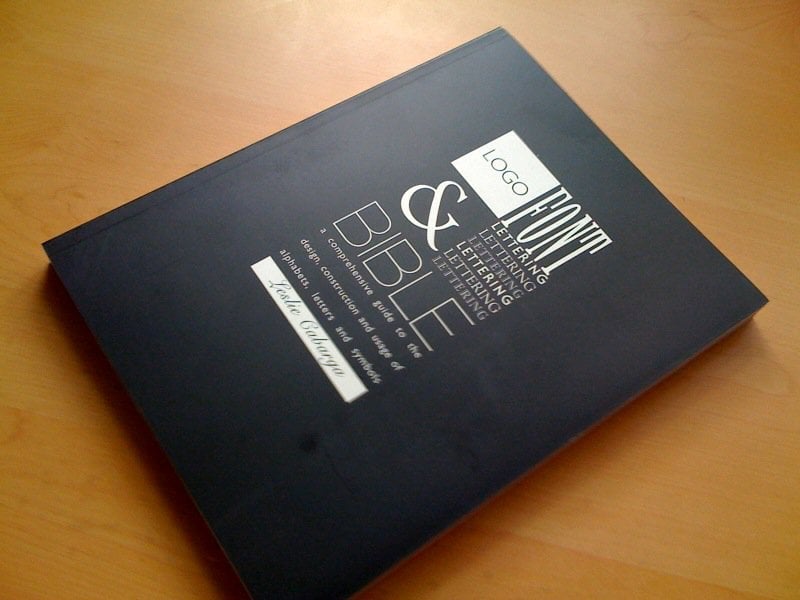
The moment you see it
The first thing that instantly came to mind was a heart. Now you see, I don’t know if that everyone else would have seen that, the book laying at a certain angle, thus seeing a image at an angle you would not generally see.
But because it was so striking and my brain just shouted out ‘heart’, I assumed this was just a massively obvious association to make. Thing is, in all my logo design research, I could not recall seeing one example of a ampersand being crafted to also look like a heart.
Feeling a slight pang of curiosity, I wanted to see if there were any obvious examples of this, so looked through Google images, Flickr, Logopond and numerous other logo inspiration galleries. Searching for variations of ‘Ampersand/heart/love’ yet nothing came to light.
Now I know that I would not be the first person ever in the entire history of typography to have made this association, but what does surprise me is a lack of obvious examples.
We do live in a world where logo design is now such a ‘cool’ thing to be part of, that when you do create something interesting, it is human nature to want to share.
I use ‘share’ lightly as there of course an element of ‘hey look at this, look at how cool and clever I am‘, but we needn’t focus on that for too long. :)
But there is that feeling of fleeting wonderment when you think for a moment you might have been the first person ever to have seen this link or association. Only to find a day later, that some designer 20 years ago also saw the same thing. It can be devastating.
But any who, like I say, I know this ampersand/combo ‘must’ exist somewhere so if anyone HAS seen a version, I would love to know about it.
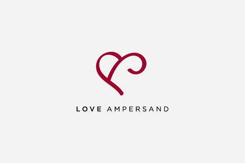
In the meantime, this is my version.
It did take a number of iterations to get the right feel, for me to be ‘OK’ with it. The challenge was to get that balance of ampersand and heart, not too much heart and not too much ampersand. That when you look at it you are not overwhelmed with one or the other. Is it a hear OR ampersand? The result you are looking for is when someone say’s, ‘it is both ampersand and heart’.
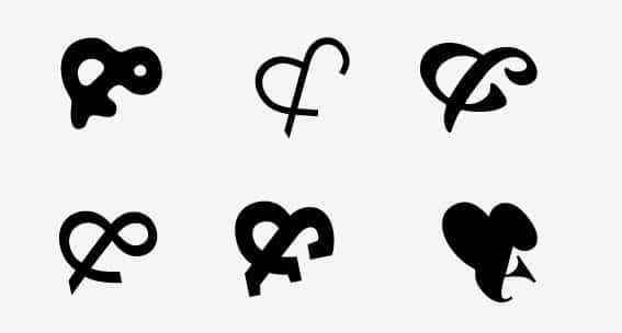
Just quickly started off by looking at some common ampersands from a small pool of typefaces, in this case a serif ampersand is the best choice, they typically are more more refined stylish than san-serif ampersands.
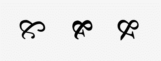
Then it was just a case of drawing the outline, time after time after time until I saw what I wanted to see. Didn’t really know until I saw it, so very much a case of trial and error. Opting for simplicity and clean lines opposed to adding any cute flourishes to the feet. Adding these would steer it much more towards being a ampersand, so leaving the ‘feet/end’ smooth helped reduce this visual association.
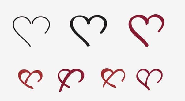
Below : Couple of abandoned ideas with a serif vibe.

The first image below is that I started with as the basis for the Amperheart, then a gradual process of tinkering with line widths, lengths and styles. Can be tricky to know when to call it a day with something like this, keep wanting to tinker and tinker. Finally decided to call it a day after about 4 hours of playing. At the end of the day, it’s all subjective anyway, I’m happy with it and considered it a fun exercise.
The typeface is Gotham Medium for ‘Love’ and Gotham Light for ‘Ampersand’ with tracking of 300.
