
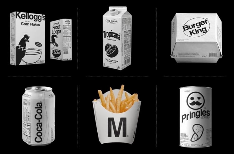
Designer Kunel Gaur, head of a creative agency called Animal, has reimagined and redesigned some famous logos and brands in a minimal monochromatic style.
On a typographic level, the brand logos also seem to be mostly set in Helvetica.
There’s quite a selection of brands here, but there doesn’t seem to be any one place where Kunel has this collection housed.
The only place they seem to be located is on Instagram, but not grouped together.
So I’ve gone through the Instagram feed, and took a thumbnail screen shot of all the ones I could find, then grouped them up all together in a grid.
→ Found via Kottke
Famous Logo and Brands Redesigned in a Minimal Monochromatic Style by Kunel Gaur
Small selection of larger images from the project:
No Name
This whole collection looks as though it could be part of a supermarkets budget line, such as the famous yellow and black packaging for the No Name Canadian brand:
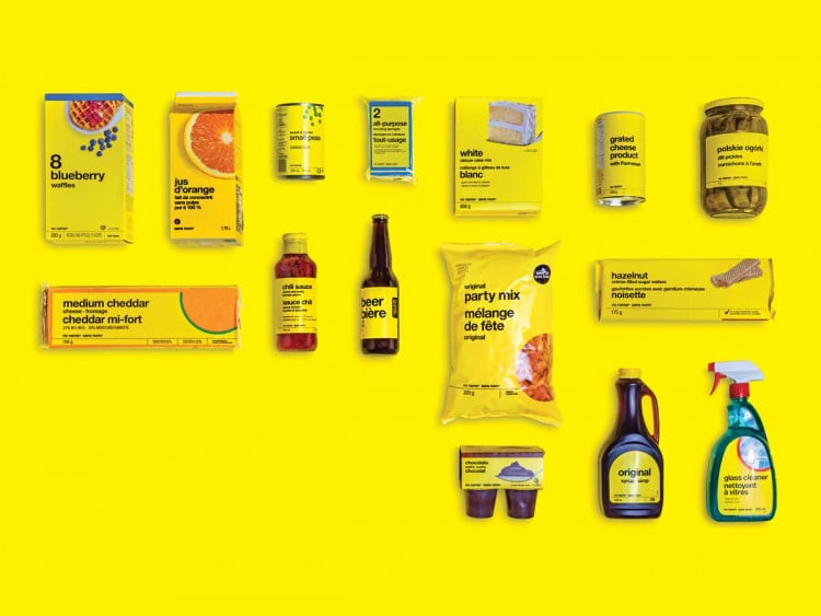
The No Name look was created by the late, legendary Canadian graphic designer Don Watt, who was hired by Galen Weston Sr. in 1973 to reinvigorate then-struggling Loblaw. He designed the No Name look as well as the more upmarket President’s Choice brand and was widely credited with turning the ailing business around. Watt, whose clients included Walmart, Safeway and Home Depot, pioneered the idea of a whole system of store branding, with uniform colours and fonts on house brands, signage, promotional flyers and interior design.
https://www.cpacanada.ca/en/news/pivot-magazine/2020-02-25-no-name-ad-campaign