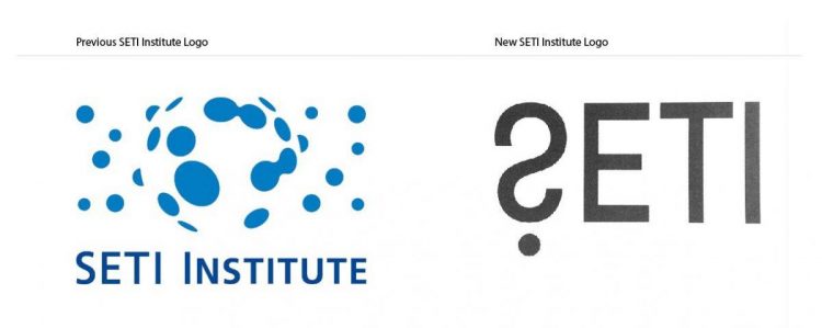
New SETI Institute Logo Designed by Trevor Beattie

Only just received a press release for the SETI Institute Logo and branding redesign, designed by Trevor Beattie, Founder and Chairman of BMB.
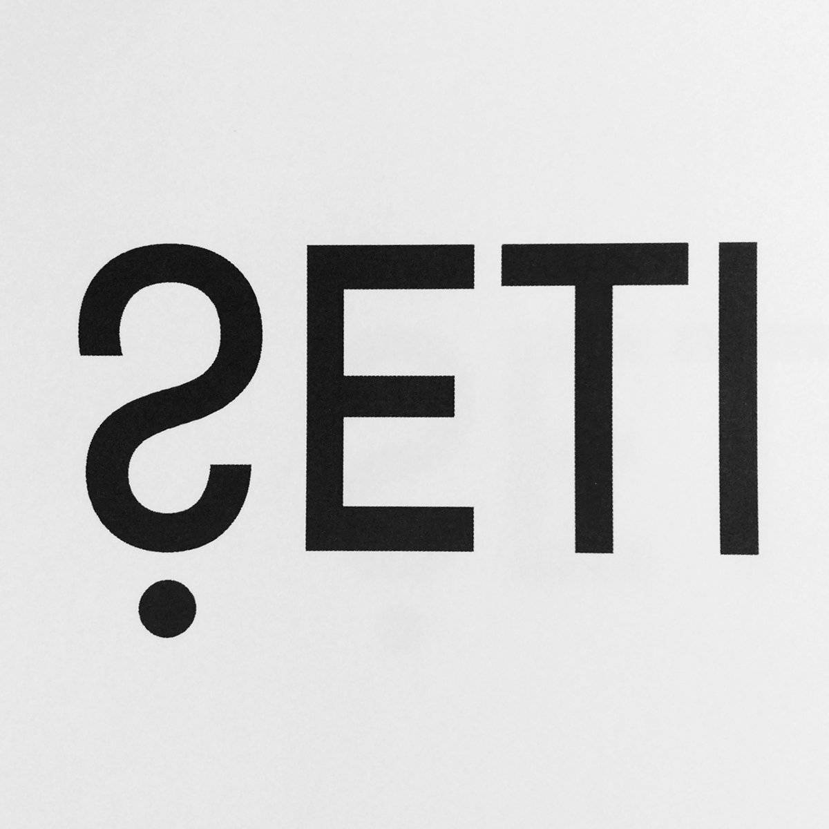
This logo design has certainly piqued my interest, and I can see what’s going on with the logo: the use of the ‘S‘ and ‘?‘
What I can say is: I still really like the original SETI Institute logo, was quite fond of that design overall. If you had to push me for an opinion right now: I’d probably been happier to have seen an update/refresh, rather than a complete redesign. The new SETI logo looks a bit ‘lost in space’ on the website header, not much of a presence. But that’s all you’re getting for now…
Am yet to fully soak this up, as I’m currently in two-minds about my initial thoughts. Going to need to see how I feel in a few days.
The New SETI Institute Logo Design

YETI Institute Press Release
Least I could do is share the news in the meantime, and here’s the full Press Release, from Persuasion, in all it’s glory:
MOUNTAIN VIEW, CA – The SETI Institute, a renowned nonprofit research organization, has unveiled a new logo and brand mark to better reflect its mission to search for, and understand, life beyond Earth.
The new logo was designed by Trevor Beattie, Founder and Chairman of London’s BMB advertising agency. Beattie is an unabashed, life-long fanatic about space, and admits that the opportunity to reshape the Institute’s graphical brand was both a challenge and a privilege.
“SETI is all about answering a profoundly important question: Are we alone?” he says. “There’s already a question mark hidden in the “S” of SETI. In designing this new logo, we simply freed it up.”
Beattie’s graphic is bold and economical, and accomplishes what famed designer Saul Bass has said is essential for any logo: “Symbolize and summarize.”
“As we embark on a new chapter in our 32-year history of exploration and discovery, our new logo is a fitting and compelling icon for our quest,” says SETI Institute CEO Bill Diamond. “With this symbol, we embrace the essence of science’s mission – to be curious, and to seek understanding through groundbreaking research.”
“We are engaged in the definition and reexamination of concepts and hypotheses in astrobiology, and are now expanding the tools deployed in the search for intelligent life beyond Earth.”
“With this bold new brand, we launch a new era in our efforts to understand mankind’s place in the cosmos.”
The SETI Institute’s interests range from the exploration of our solar system, looking for microbial life relatively nearby, to the search for technologically sophisticated beings on worlds orbiting other stars. The Institute employs more than 120 scientists, technicians and staff.
The new logo is simple and scalable, familiar and yet provocatively unique. It is intended to be quickly recognizable and sufficiently iconic that – without words – it will be instantly associated with the SETI Institute.
For designer Beattie, the unique interests of the Institute are self-evident: “No-one has a better claim on ownership of the question mark than the SETI Institute,” he says. “And soon, perhaps very soon, its scientists may find answers to the long-standing question of the ubiquity of life.”

